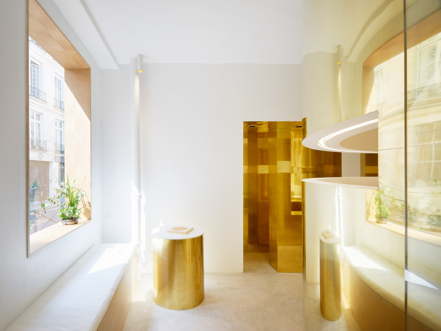
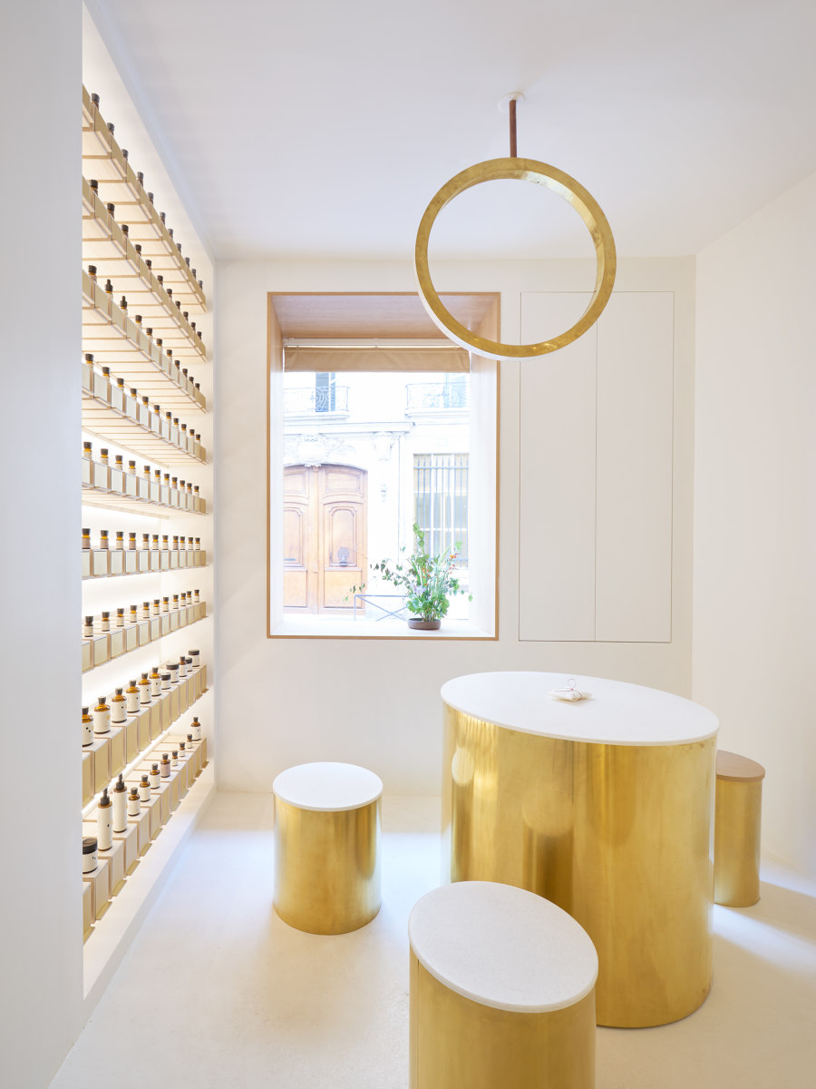
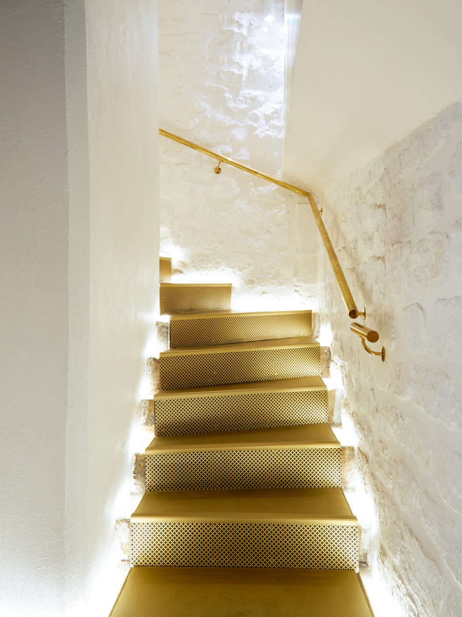
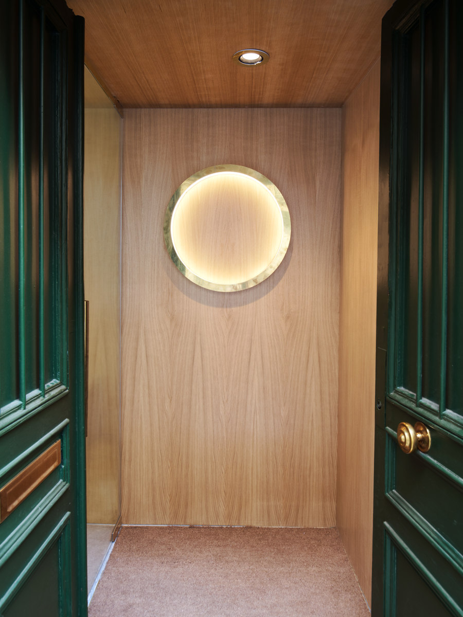
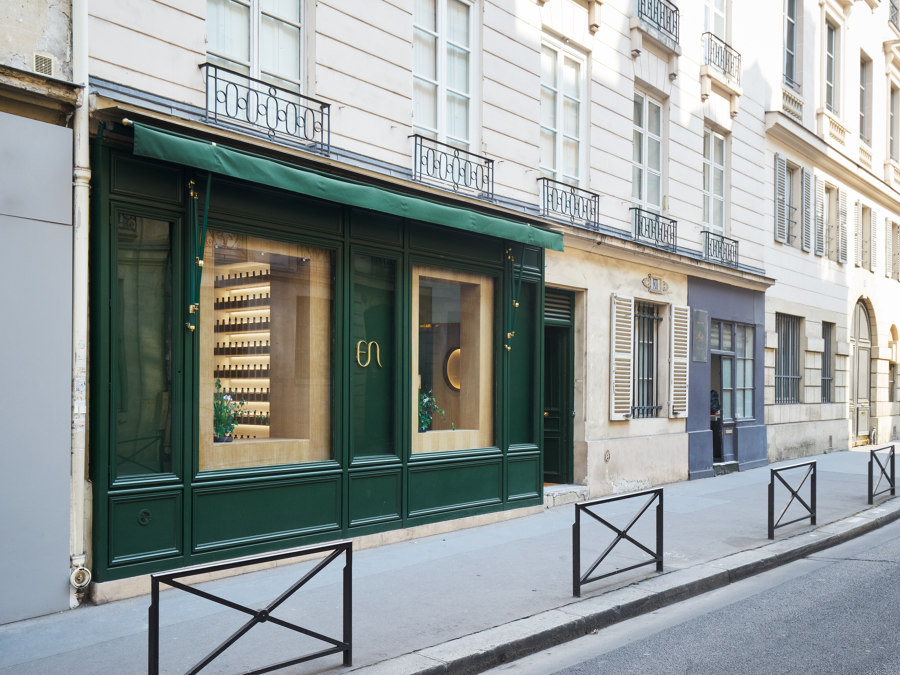
This project is the interior design of a boutique for a new Japanese cosmetic brand. An old 18th century building in the center of Paris was chosen as first shop. This brand sells around 100 types of cosmetic essence products and each customer can create an original product by mixing products. The name of the brand “en” literally means “Beauty” in Japanese.
Concepts
The Japanese phoneme “en” means not only “Beauty” but also “Circle” and “Connection”. The design concept is inspired by these three meanings of “en“.
Circle
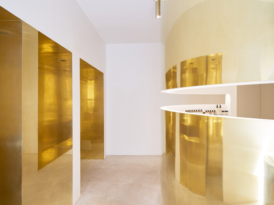
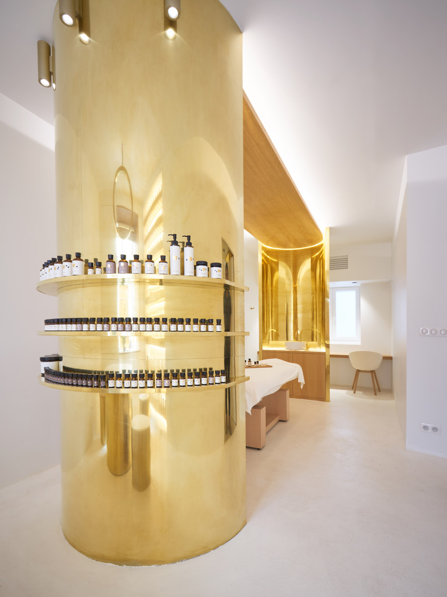
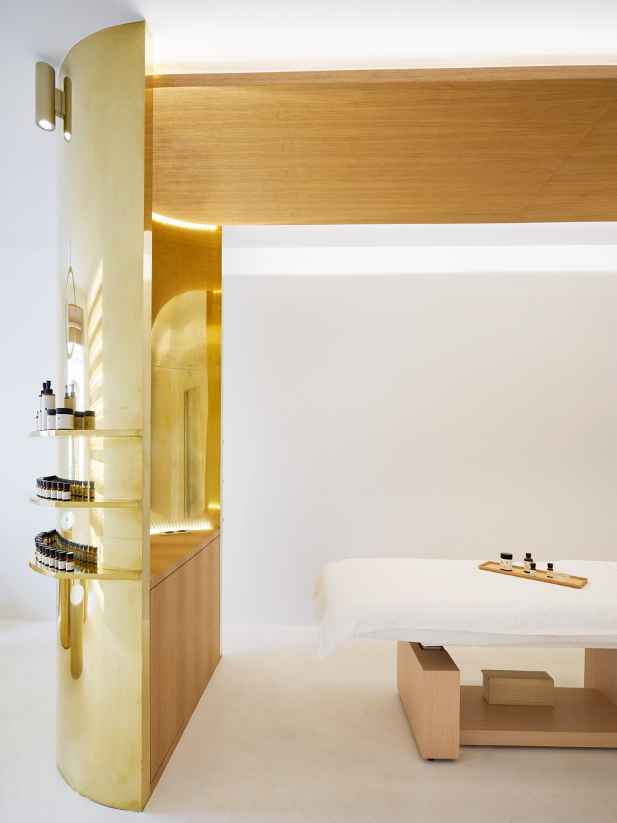
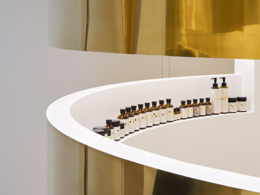
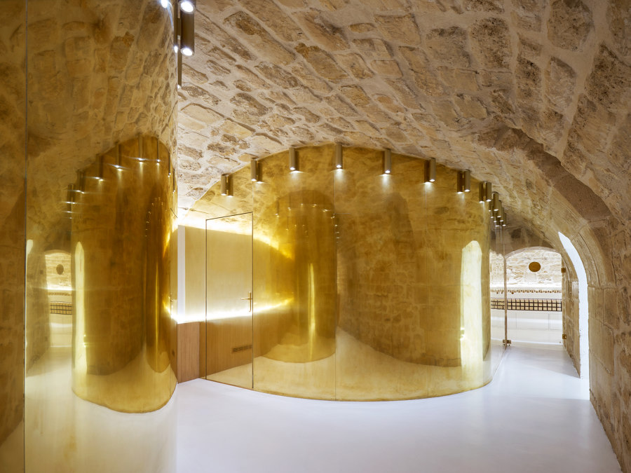
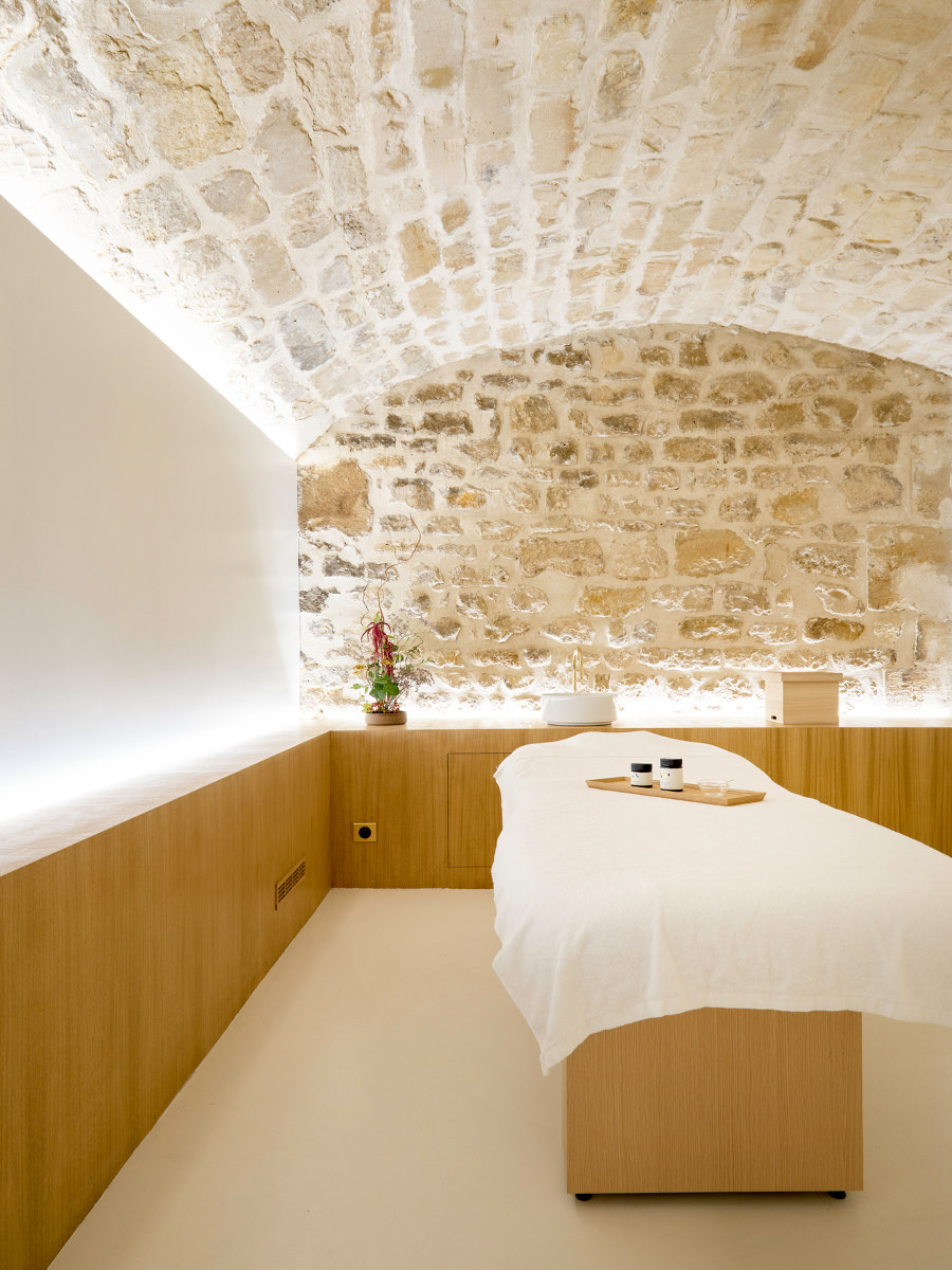
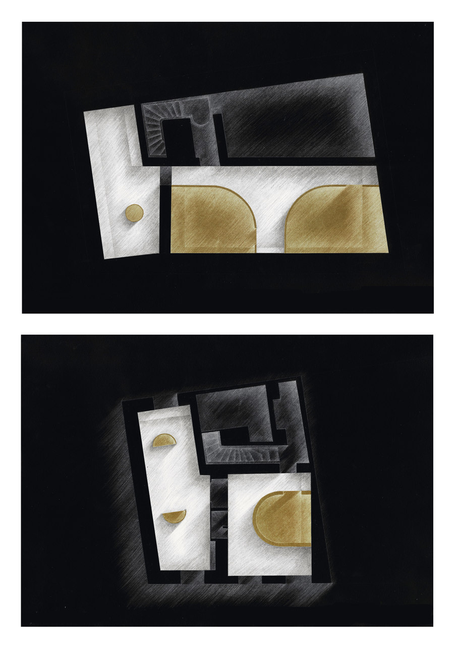
As the existing venue has a long history and the quality of space, most of existing structural elements were preserved. But new partitions were created to meet the requirements of functions. All of the partitions are composed in circle forms to create soft rounded internal spaces, which are suitable for private uses as counseling, treatment, massage and essence blending. The internal surfaces of the circle spaces are finished in white to express a pure space.
Connection
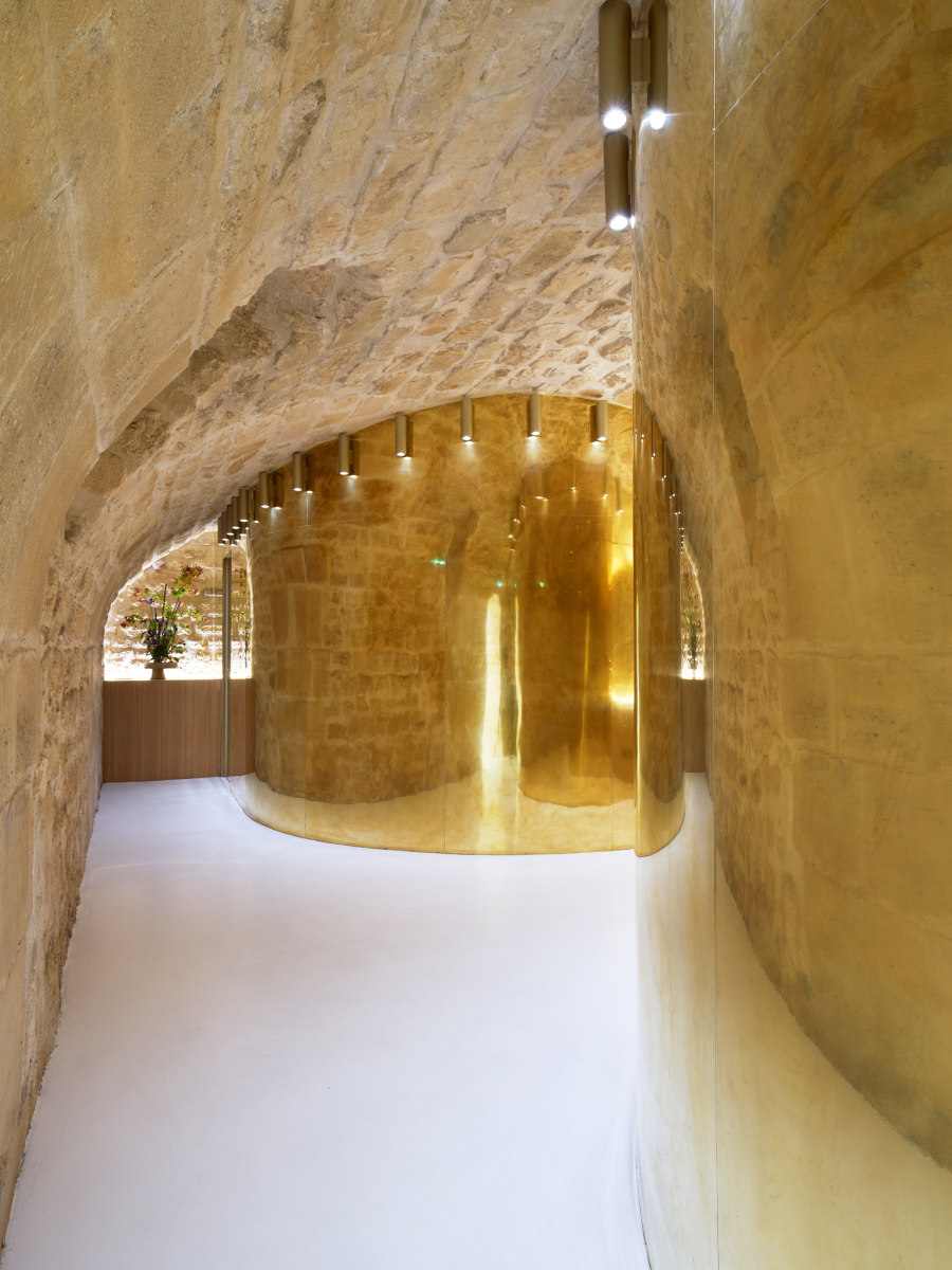
The space cut off by the circle partitions connects all the required functions. This remaining space between the existing walls and the integrated circle partitions creates a geometrically curious form and an original circulation with an aesthetical experience. The customer cannot get into each service rooms directly, but must walk along a winding path toward the destination. This method that let the visitors walk along and enhance his expectation is typical Japanese way of hospitality, as in the traditional tea culture.
Beauty
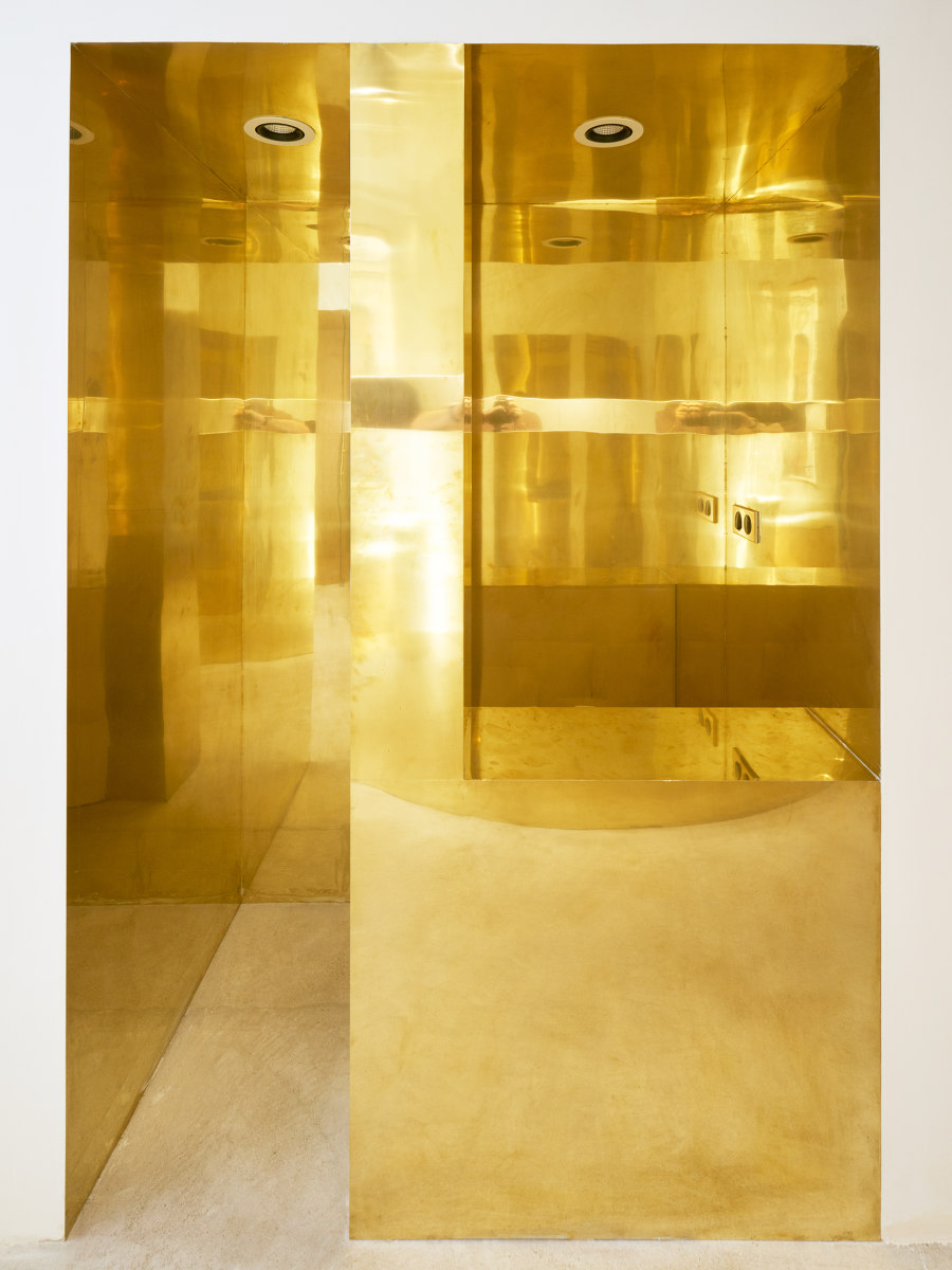
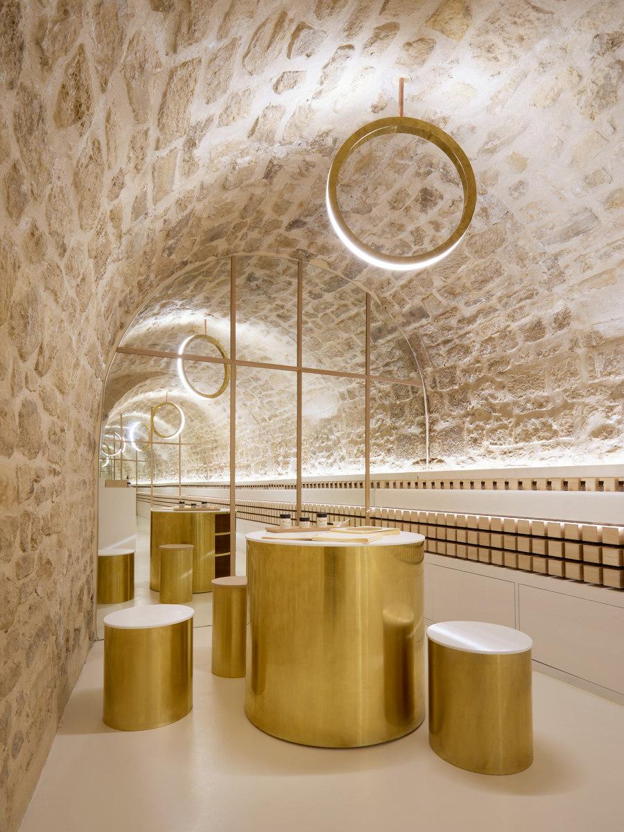
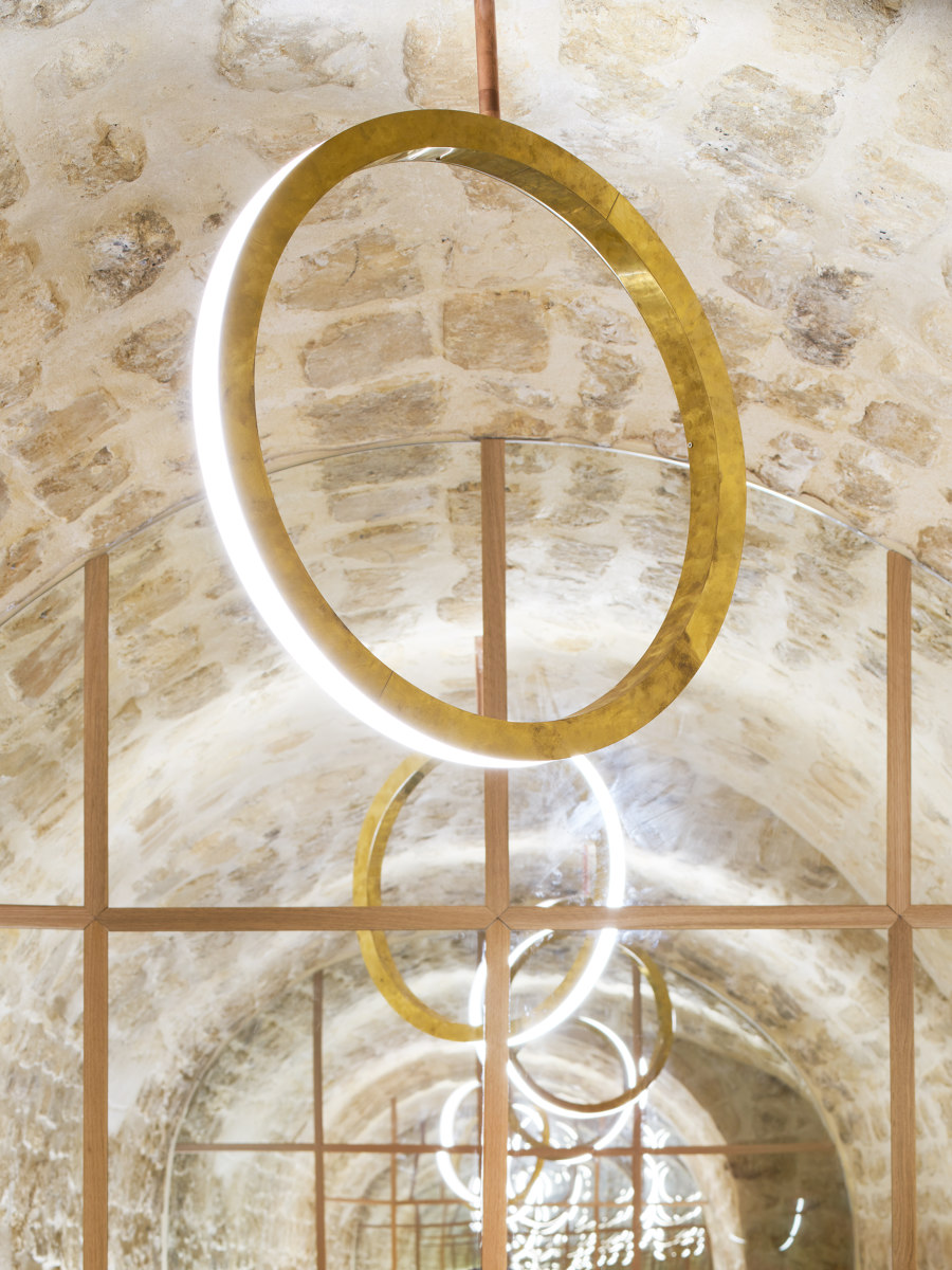
The external surfaces of the circle partitions are finished in polished brass to bring a distorted and warm reflection. This beautiful expanded space creates the feeling for the visitor step into an elegant and extraordinary world.
Composition
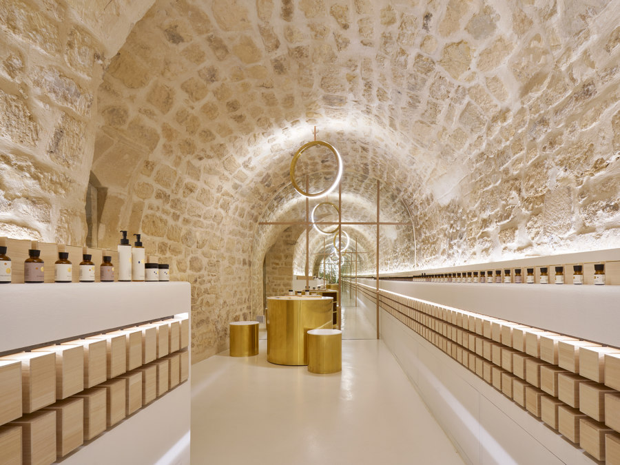
The existing spaces were divided into 4 main rooms: 2 rooms with stone vaulted spaces in the basement and 2 rooms finished with white plaster on the ground floor. A different scale of circles is composed for each room to create a functional plan. Room1: the entrance and the boutique, Room2: the counseling and the treatment space, Room3: the hall and the massage space, Room4: the product gallery and the blending counter. By passing through each step, the customer gets deeply into the world of “en” beauty.
Display
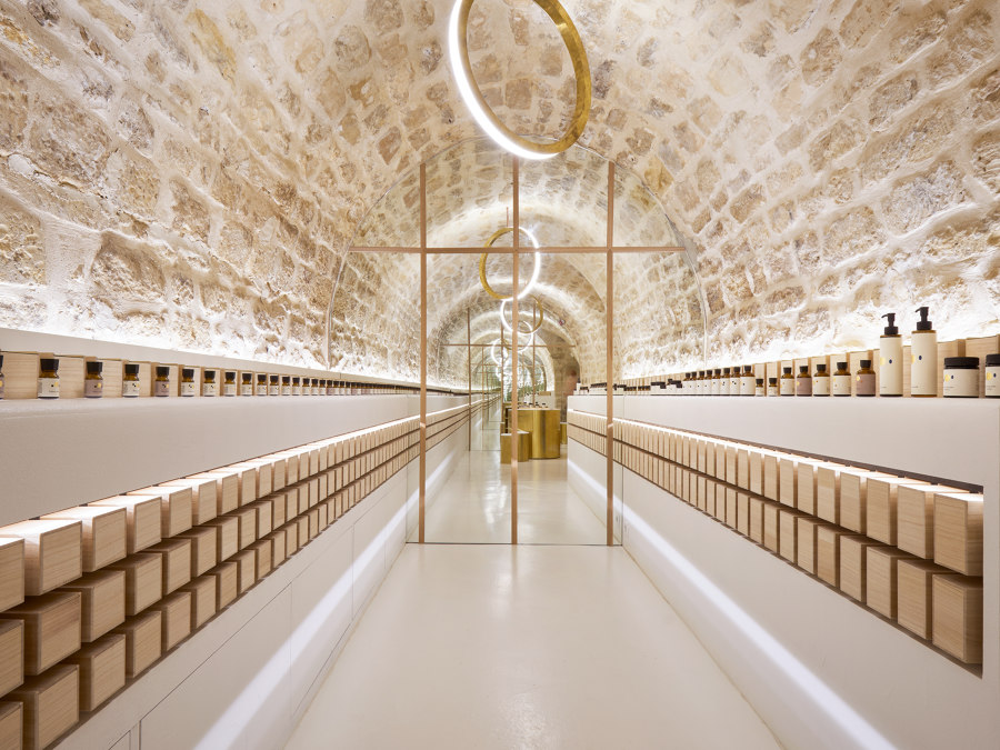
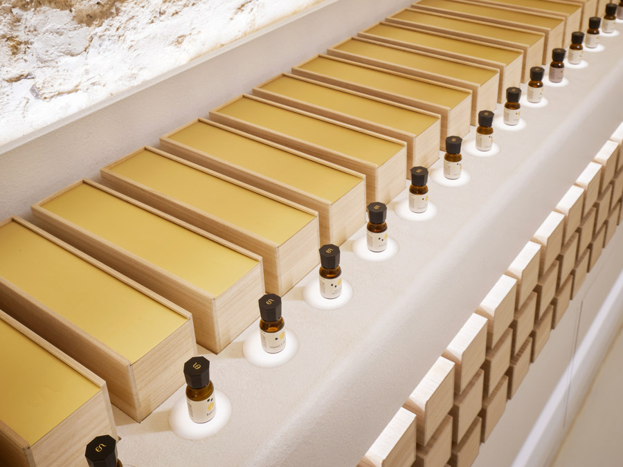
The impressive point of this brand is to exhibit all its products. This reminds the excitement in a wine cellar. The display of products is inspired by the method of storage of French wineries. Each bottle is displayed separately with special lighting. The boxes for storage, which were made with Japanese paulownia wood, are also stacked and displayed to create a cellar atmosphere.
Design Team:
ARCHIEE: Yusuke Kinoshita & Daisuke Sekine
Client: TOW/EN
