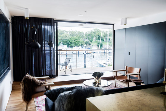
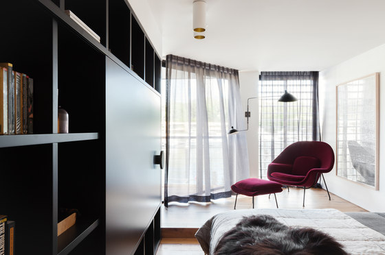
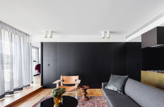
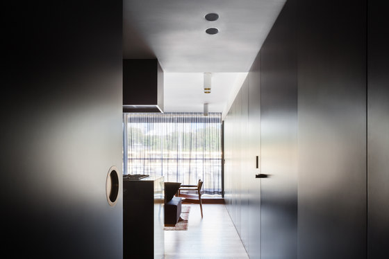
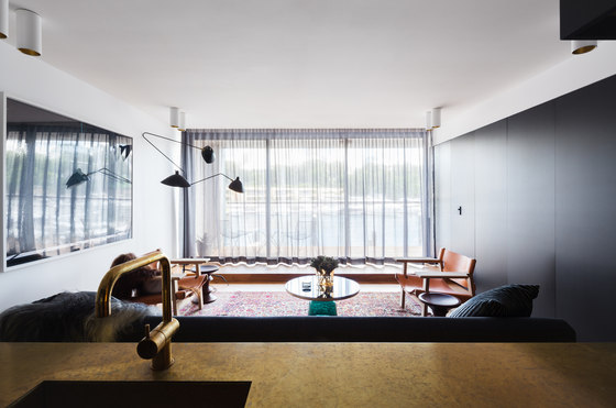
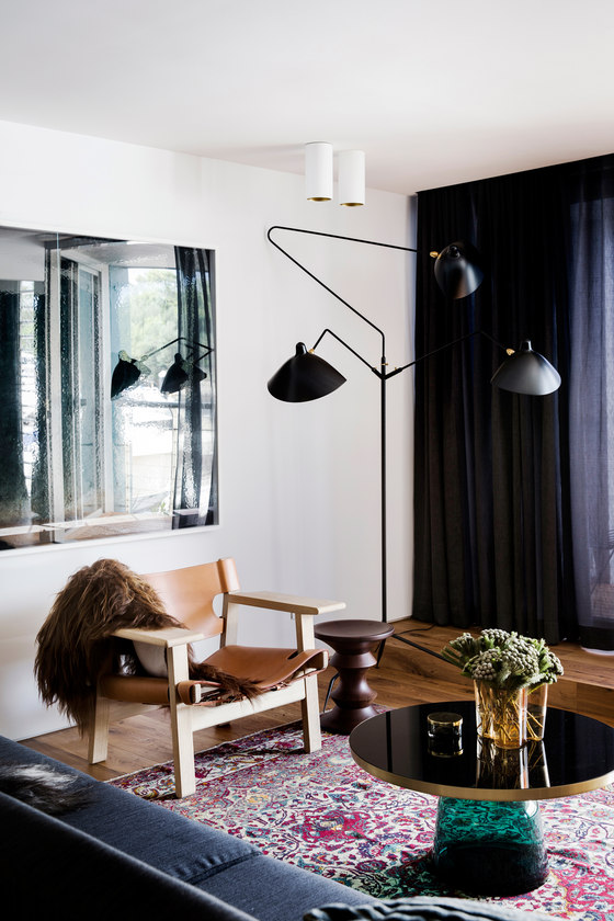
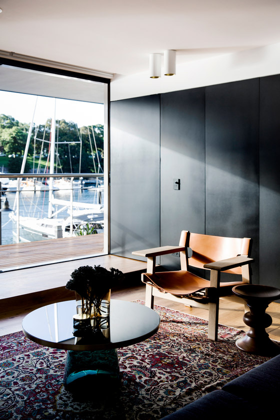
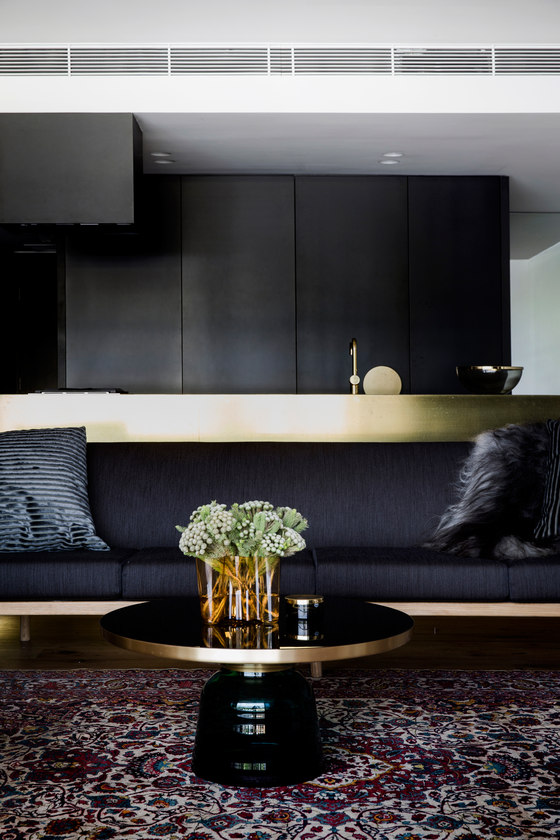
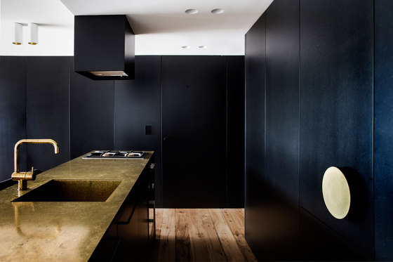
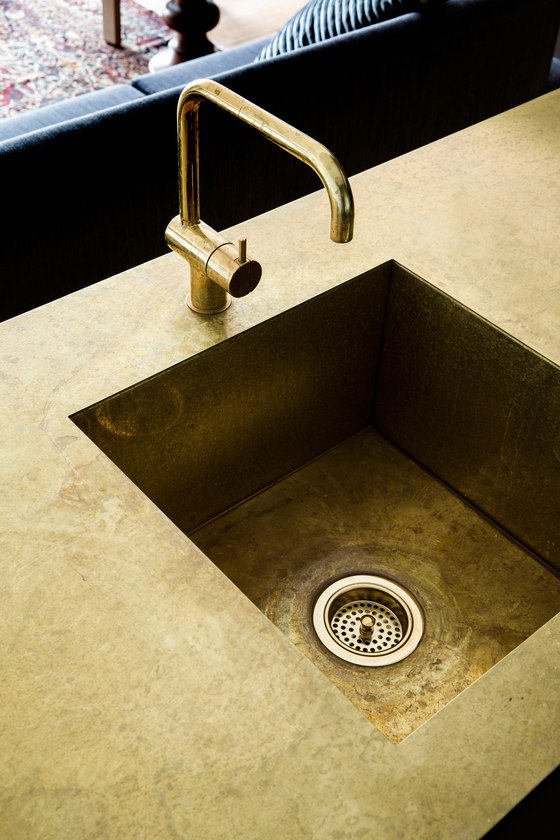
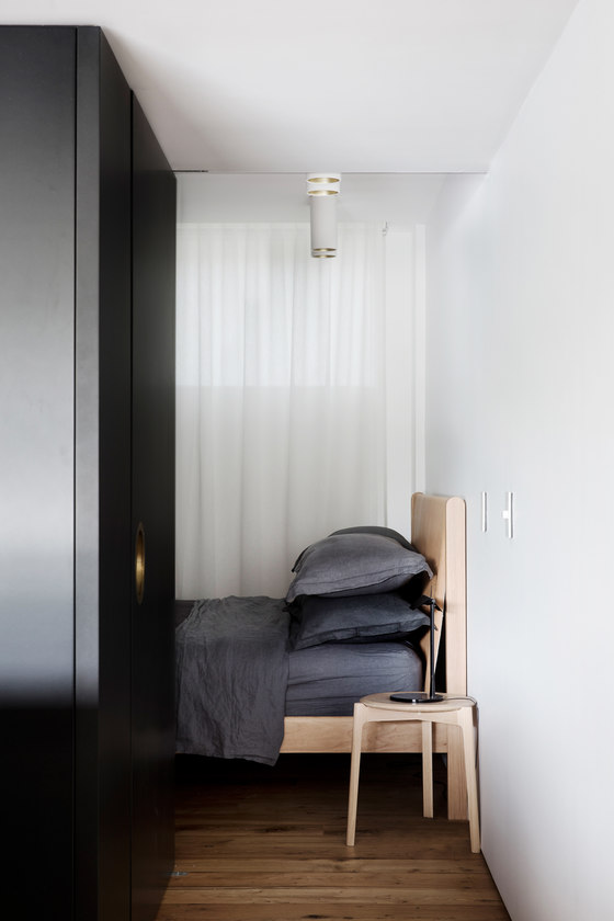
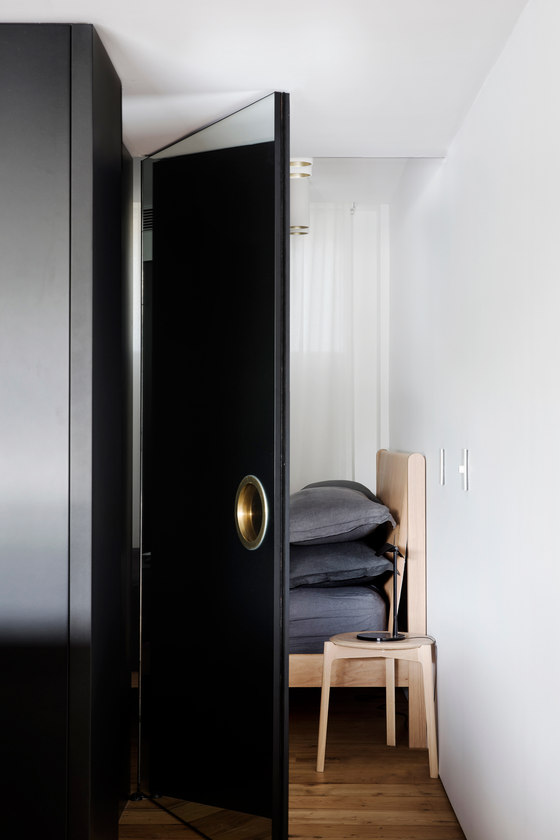
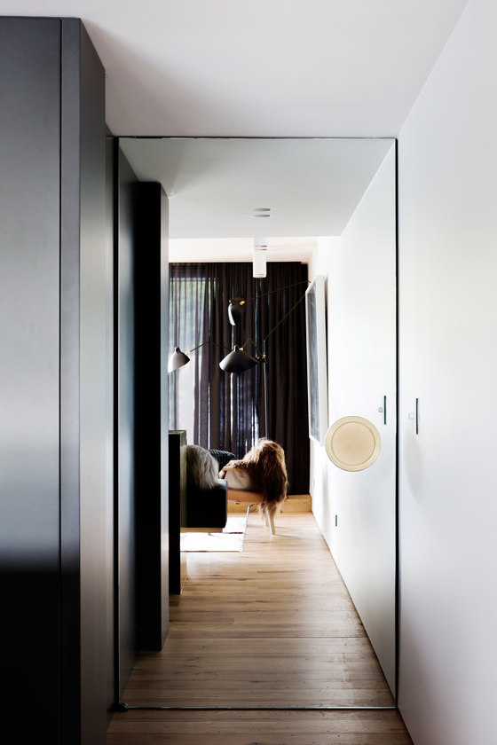
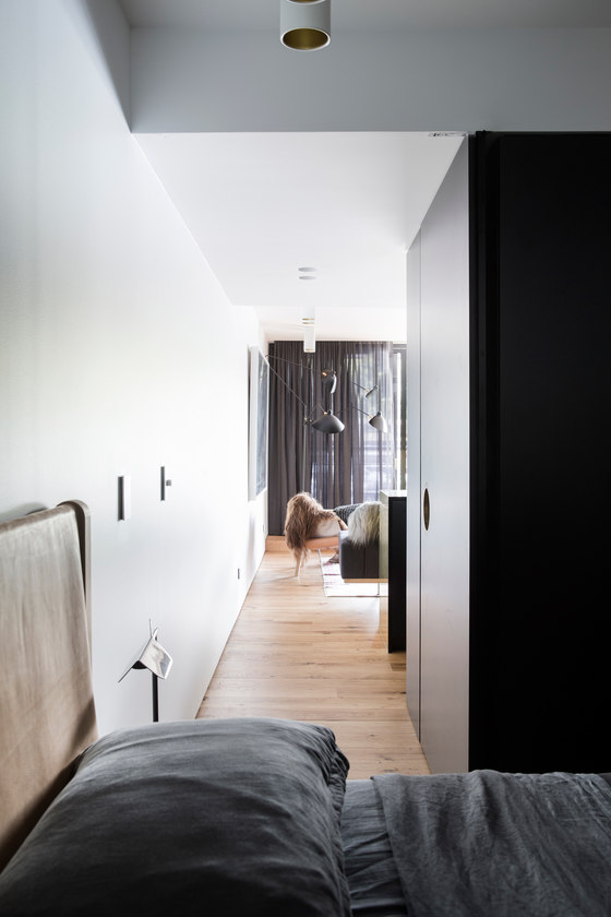
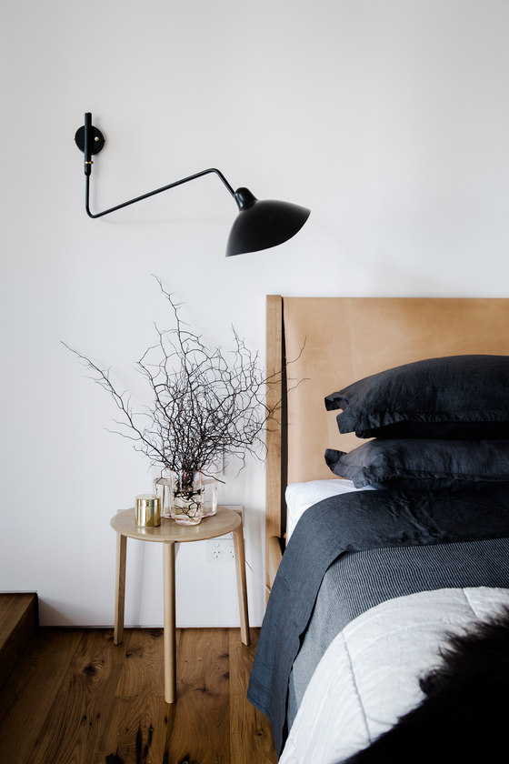
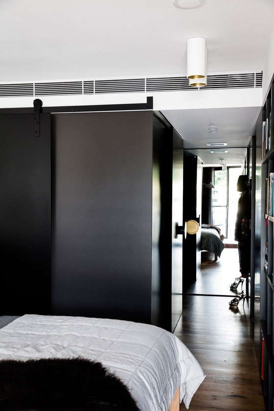
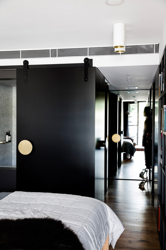
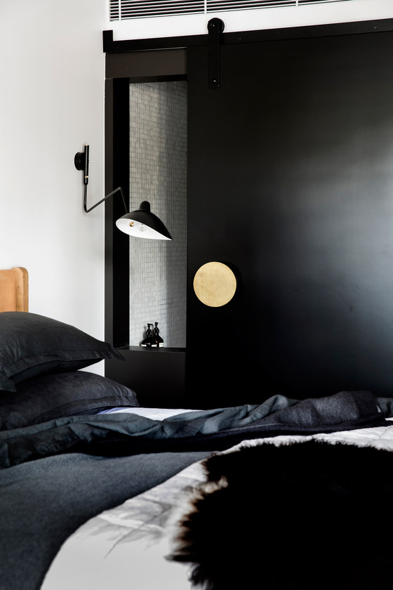
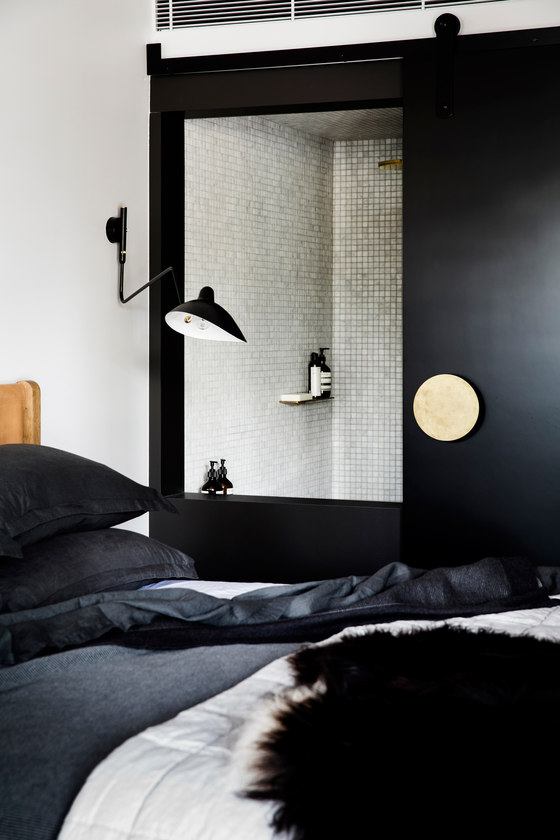
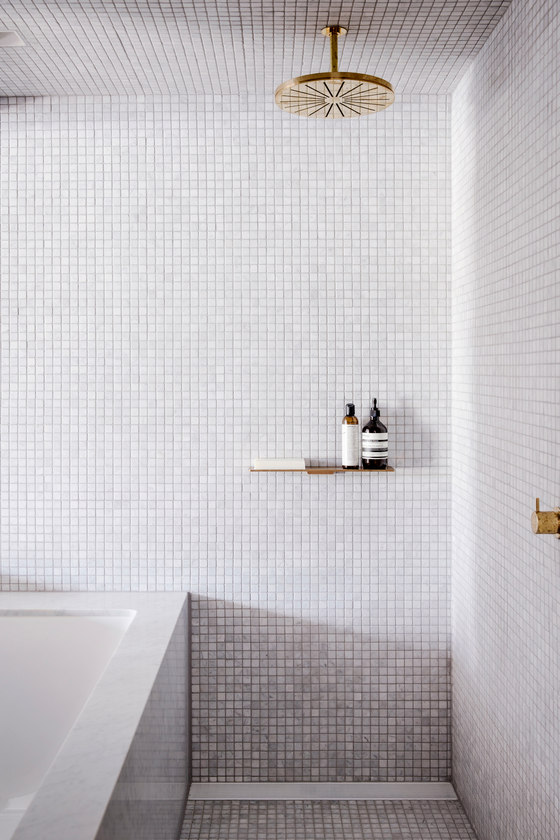
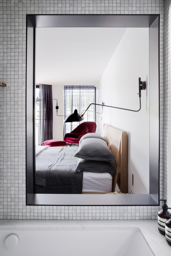
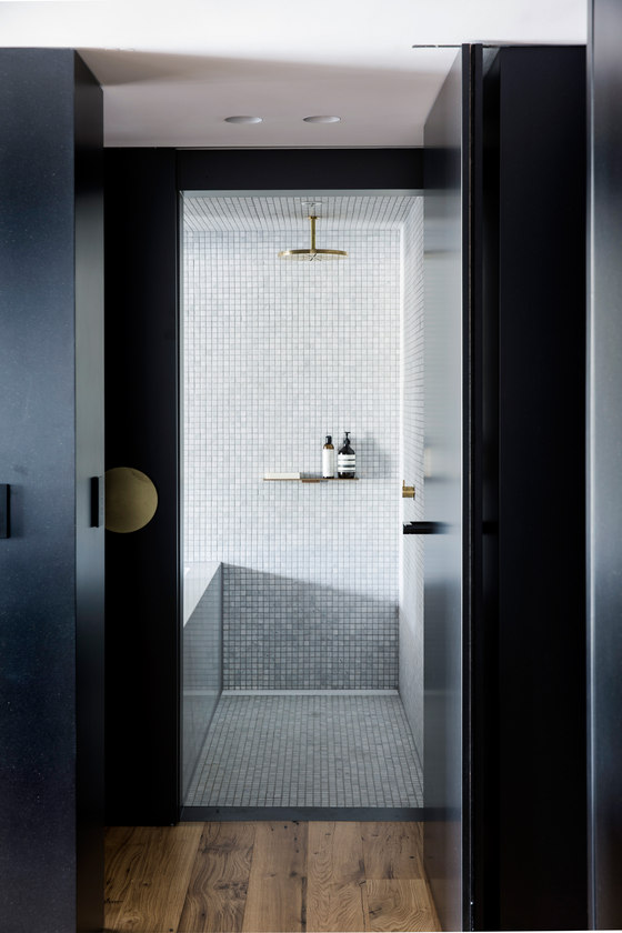
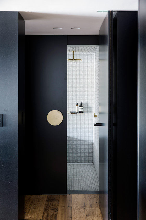
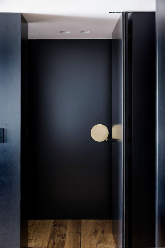
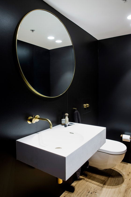
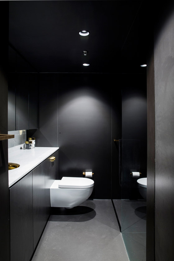
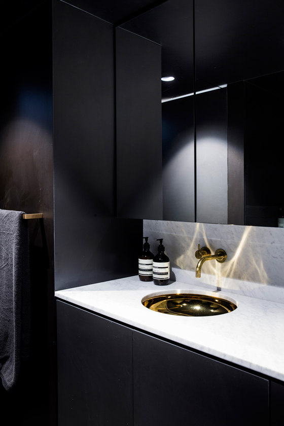
The project brief was centred about making the most of a glamorous city pad with an extraordinary harbour setting. The minutiae of daily life are concealed behind dark panels giving the apartment interior the theatricality and sophistication of a luxury hotel. Contrasting touches of unexpected materiality and luxe detail are picked out as walls are re-imagined as pivoting screens that fold flush in open or closed positions. In this way, the apartment effortlessly takes on a number of reconfigurations, becoming larger and more open.
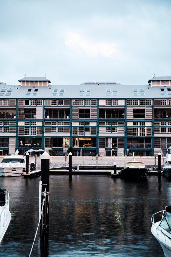
This project involved alterations to a circa 2000 refurbished apartment within the heritage listed 1915 Woolloomooloo Finger Wharf on Sydney Harbour. The scope of worked included a general reconfiguration of the interior of the apartment as well as the replacement of a single sliding door with multiple sliders. The layout of the original apartment was compromised by low ceilings, a “bedroom/media room” with no connection to the view, poor physical connection to the balcony, domestic scale doors and generic architectural detailing.
The owners sought to address these issues while completely re-thinking the approach to the apartment’s interiors. The initial concern was to provide a more generous connection to its harbour views and a more elegant solution to connect the interiors to the balcony. The underlying intent of this project was to address the connection with the harbour while creating a more generous platform for living, designed within the constraints of stringent Strata and Heritage requirements.
The design solution came in the form of a new timber platform that extends into the apartment, overcoming the issues of the existing divisive threshold in conjunction with a reconfiguration of the sliding doors. This new level change drawn into the apartment creates a language of a more intimate interior theme. The interiors strive for a level of ambiguity where a door can be a wall and vice versa.
Within the language of screens and walls, a theatrical motif is developed of an over-scaled handle - a cue to reveal a threshold to bathrooms, bedrooms and storage. The design relies on a high level of detail and craft in order to achieve the essential element of surprise and ambiguity, allowing the clients a sense of opening up and rediscovery of its elements each time they come home.
The design of this project and, in particular, the introduction of the step into the apartment, produces a more generous connection between the interior and the balcony and view beyond. In this way, the larger scale of the view is drawn into the small apartment.
Architect Prineas
