The house Limmatquai 16 is located on the shores of Lake Zurich, not far from the Bellevue junction, the Quai bridge and Grossmünster church. The property was first mentioned in 1425 under the name “Zum Goldenen Sternen” and a restaurant was established here as long ago as 1431. In 1839, Zurich's municipal architect Daniel Pfister converted the building into the “Hotel Du Lac”, and it remained a hotel until 1886. In the 1930s, the base of the building was extensively renovated by Willy Boesiger and Anna Indermaur, with the installation of Café Select and the arthouse cinema Nord-Süd. Together, the two created a unique ensemble within Zurich's cultural landscape: the Select was a favorite haunt of Bohemians, writers, actors, architects, journalists and intellectuals, and also a place where foreigners, refugees and non-conformists in general were welcome.
The Nord-Süd opened next to the café in 1935, a local movie theatre run by Anna Indermaur and Switzerland’s first arthouse cinema. Borne up by its operator's great passion for film, the Nord-Süd nonetheless became a trendsetter among Europe's studio cinemas within a short period of time.
The complete renovation of the building began with the sale of the property in 2017. The usage concept of this historic property changed once again. The former premises of the Select were no longer available for gastronomical use. The premises of the Nord Süd cinema, which was closed in 2011 as Zurich's oldest arthouse cinema, came to house the Pizzeria Ristorante Molino.
This opened the discourse in our studio:
How do you do justice to the remembered images of the legendary café and the epic cinema?
How do you respectfully breathe new life into these rooms, which have already been overlaid several times? Especially when this “new life” feels committed to a different culture, namely Italian cuisine and hospitality? To what extent can or must the building be subtly adapted to new demands? How can one do justice to the many different interests and responsibilities in such a prominent location at the heart of the city of Zurich? How do you organize a functional restaurant within the confines of such narrow and convoluted building structures
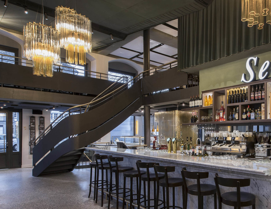
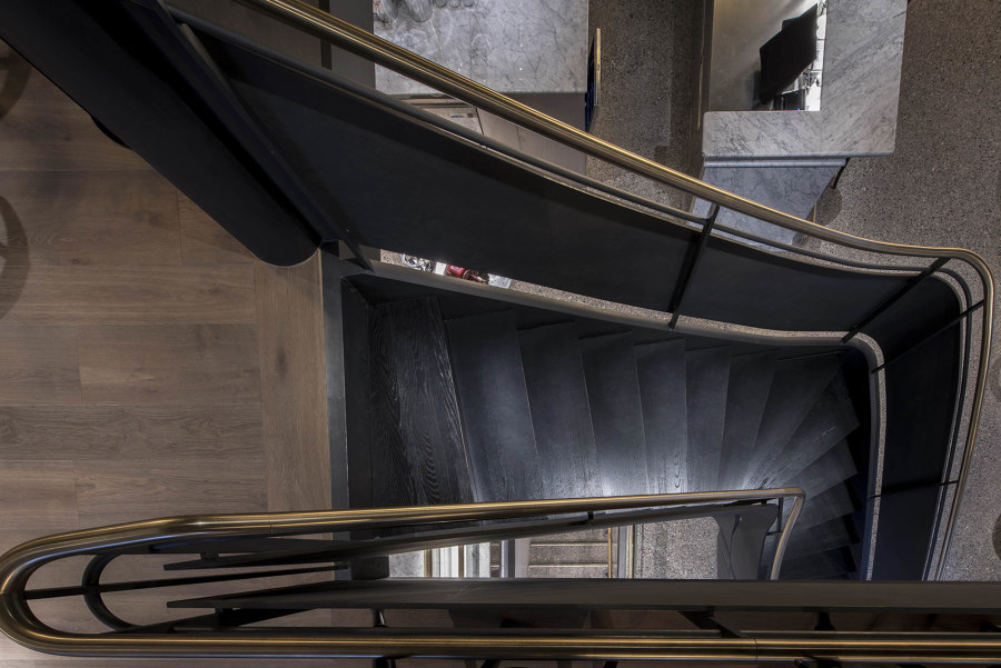
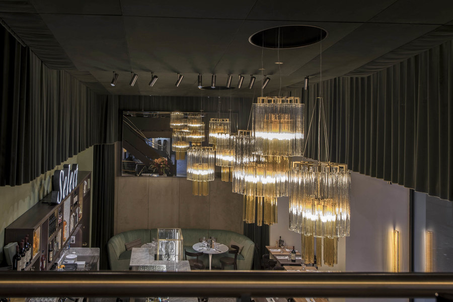
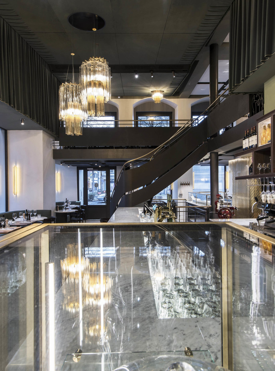
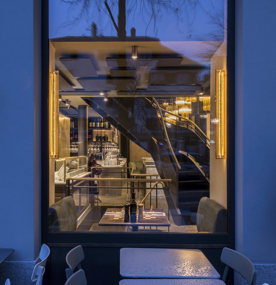
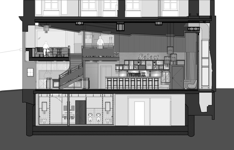
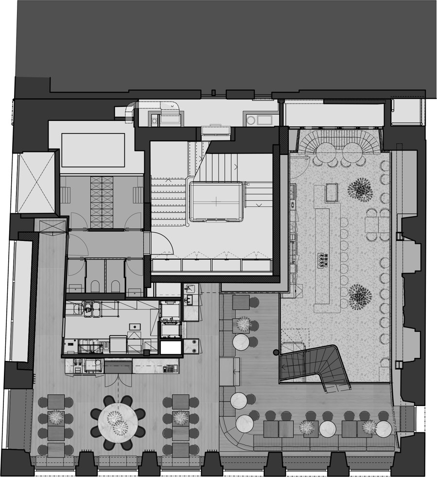
Willy Boesiger impaired significant changes to the existing structure when he converted it to a cinema. This was a challenge for us designer and architects, both structurally and creatively and the changes can still be felt to this day. The aim was to preserve the cinema auditorium, conveying the high, narrow volume of the room with its orientation towards the screen. The dimensions of the stepped, acoustically effective ceiling were to be preserved. And, of course, special attention was paid to the characteristic spiral staircase leading up to the gallery. The position, shape and style of the element quote the staircase of the existing stock. Its location ultimately also defined the further exploitation of the basement, the elegant curve was continued.
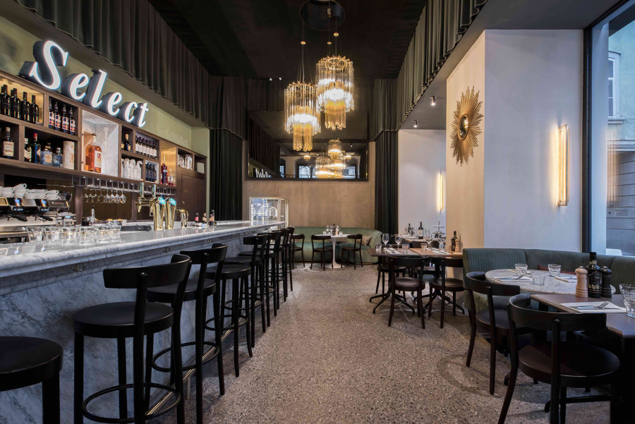
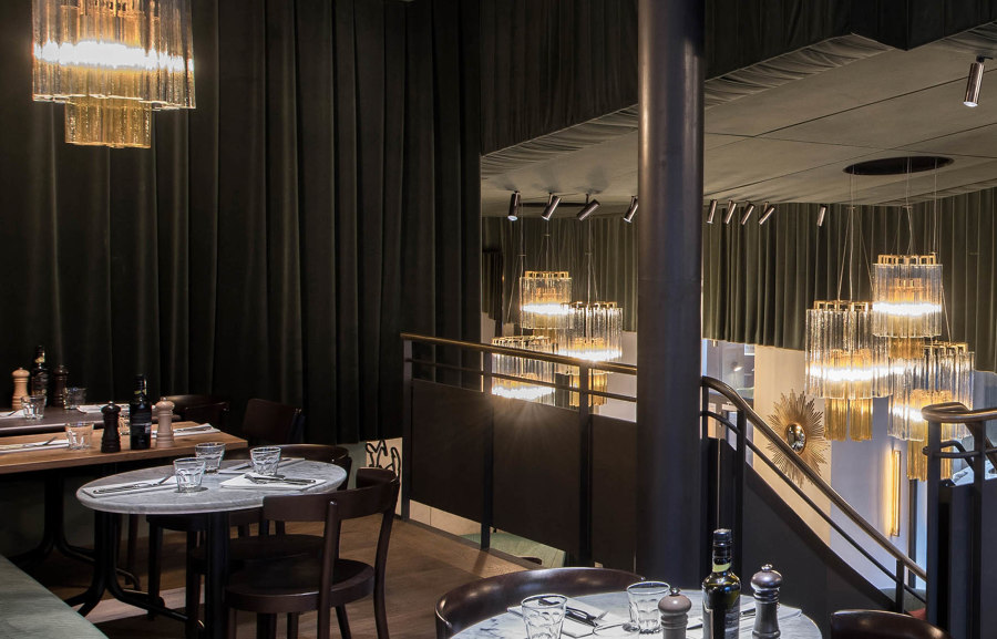
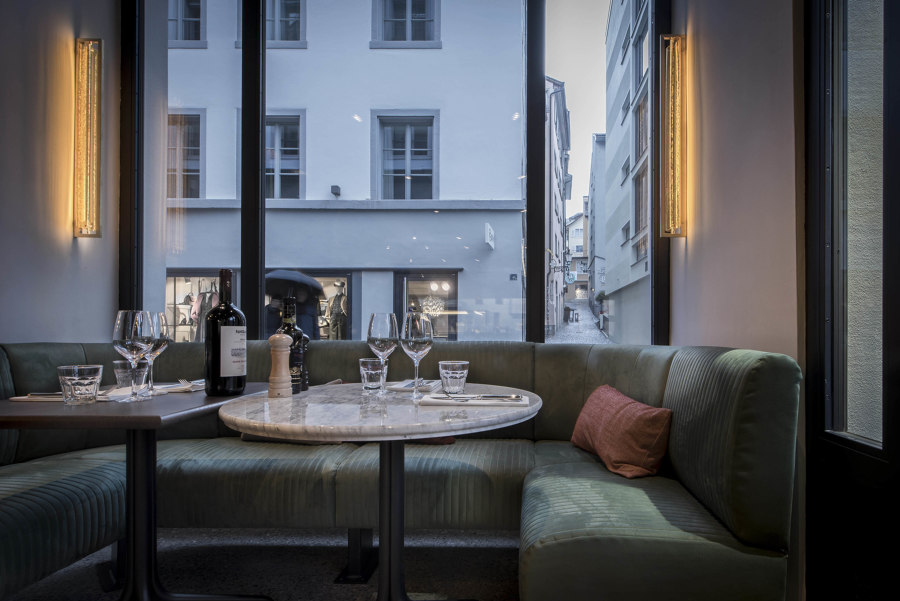
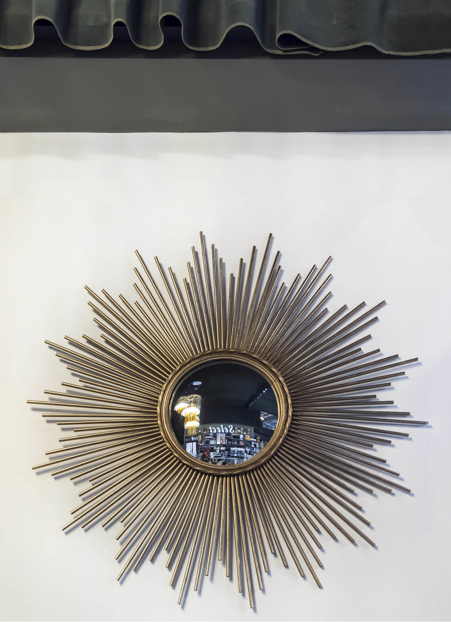
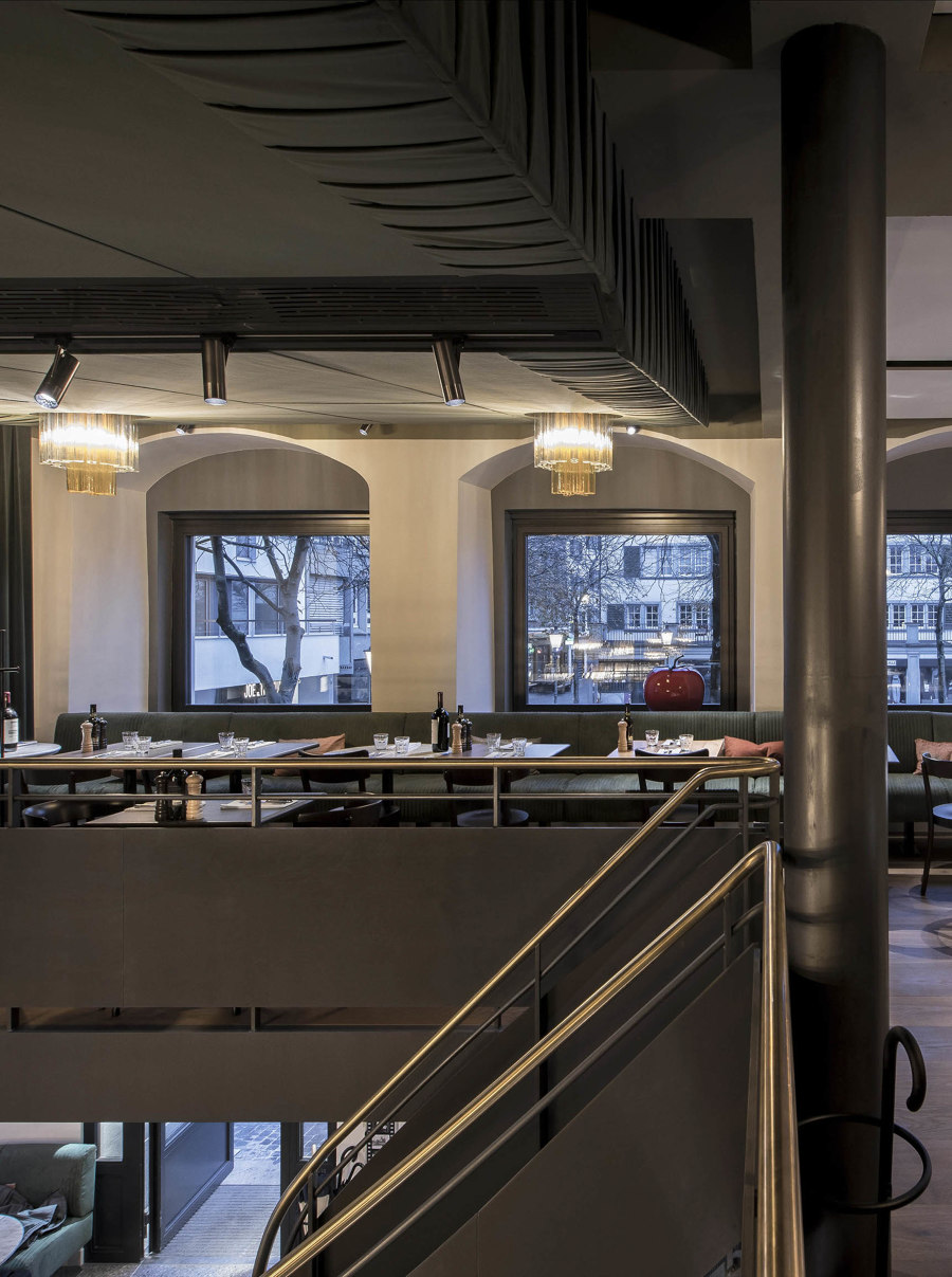
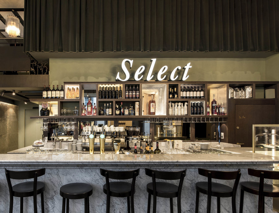
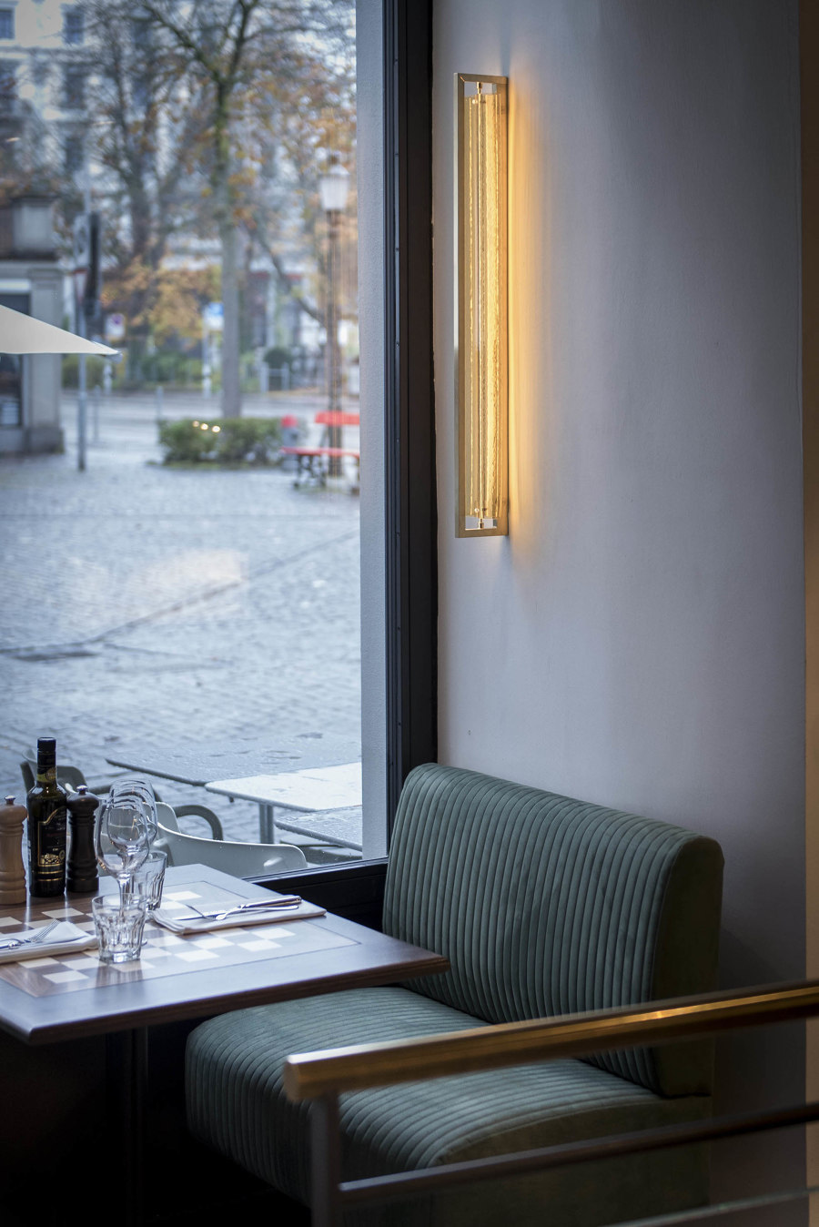
The bar is prominently positioned in front of the longitudinal wall of the former cinema auditorium, opposite a row of tables in front of upholstered benches on the façade side; their shape and materiality are also reminiscent of cinema chairs. The former projection wall bears now a large mirror – a reflection of life in the restaurant and a reminder of the ongoing pictures created by the great directors of bygone years. Then as now, the view into the space and onto this reflection is nowhere more impressive than from the gallery. The atmospheric attitude and density of the restaurant, the way it deals with structures, surfaces and colors also extends from the ground floor to the mezzanine. Three further steps lead to the last level, which dovetails with where the Select was once situated, offering views of Lake Zurich.
The classic, rhythmic division of the façade here also organize the interior of the restaurant, whose formal appearance in this area largely follows the familiar Molino corporate design components. Below the gallery lies the heart of the restaurant: the kitchen, including the pizza oven with serving station. Complex processes fit into each other here in the most confined of spaces. A large window behind the pizza station opening to the restaurant provides guests with a view of how the food is prepared. The areas in front of the kitchen are put to intense use: from here, not only are the lower and upper guest rooms supplied, with almost 100 seats, but orders are also processed for the spacious terrace on Schiffländeplatz. Incidentally, this is the first boulevard terrace in Zurich to be opened to the public; Willi Boesiger succeeded in officially providing seating on the pavement in 1940.
In addition to the important influences of the location and its history, the key conceptual notions of Molino gastronomy also provided the basis for handling the design in terms of space and atmospheric density: the appearance is characterized by quality, freshness, openness and a modern classic style. High-quality, natural materials form the background of a friendly, uncomplicated restaurant that is about one thing above all else: to encounter each other over a good meal.
Design Team:
Interior design: ushitamborriello_Innenarchitektur_Szenenbild
Architecture: Zanoni Architekten, Zurich
Lighting design: Lichtkompetenz GmbH, Zurich
Building services: 3-Plan Haustechnik AG, Kreuzlingen
Electrical planning: Enerpeak AG, Dübendorf
