The Vantaa Parish Union held an open architectural competition in the spring of 2003 for the design of a new chapel in the vicinity of the historic Church of St. Lawrence. The area has been classified as a nationally important cultural environment. The winning entry, out of 194 proposals, was “Polku” (“Path”) by Avanto Architects.
Context, Massing
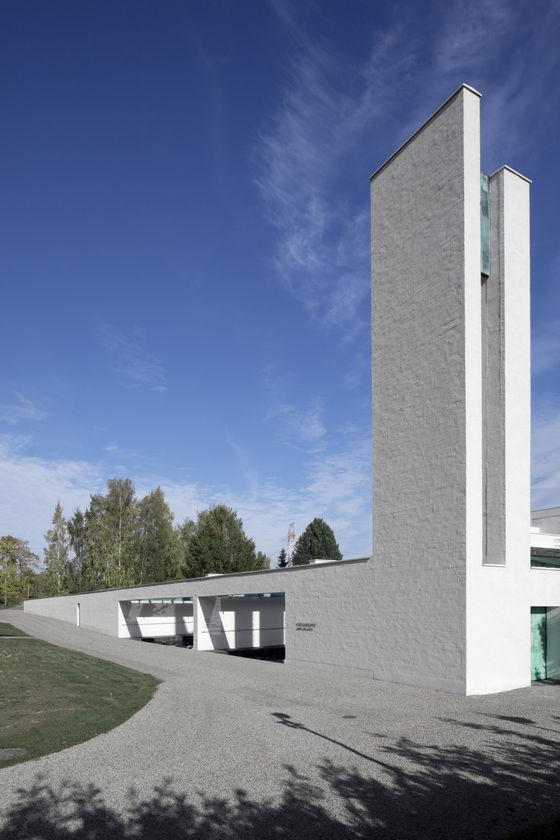
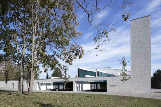
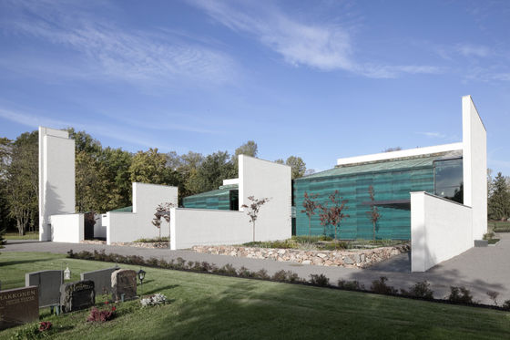
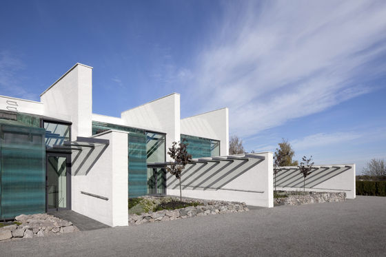
The old stone church with its bell tower remain the dominant features in the landscape. The new chapel ties together different aspects of the area without emphasizing itself. The chapel connects with the graveyard, leaving the old buildings with their own boundaries and territories untouched. It delineates the northern boundary of the graveyard and hides the service yard behind its back. The chapel has been divided in smaller parts to adapt with the scale of the surroundings. The stacked stone walls of the cemetery are echoed in the design – a series of three chapels of different sizes are nested within orthogonal masonry walls. A new bell tower in a corner of the chapel completes the composition and leads the eye skyward.
Structure, Materials, Lifespan
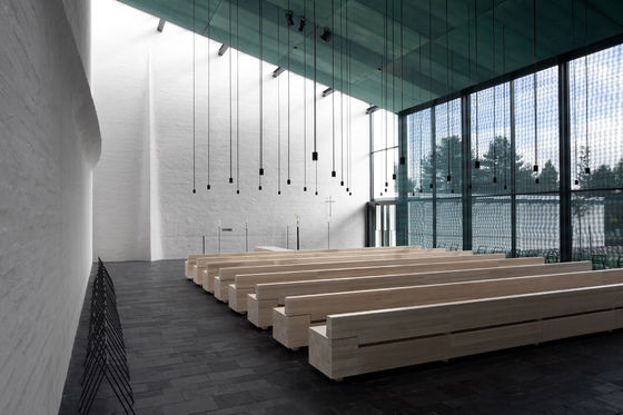
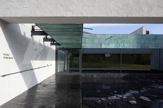
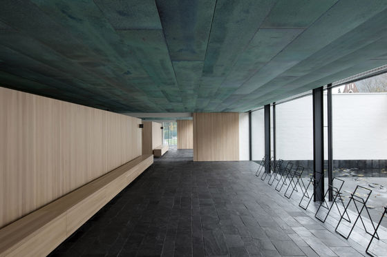
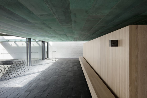
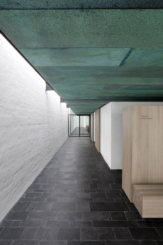
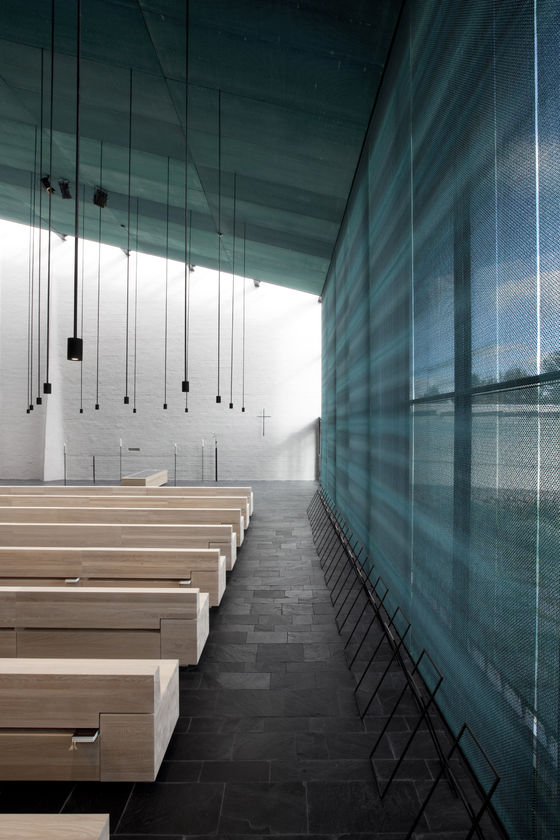
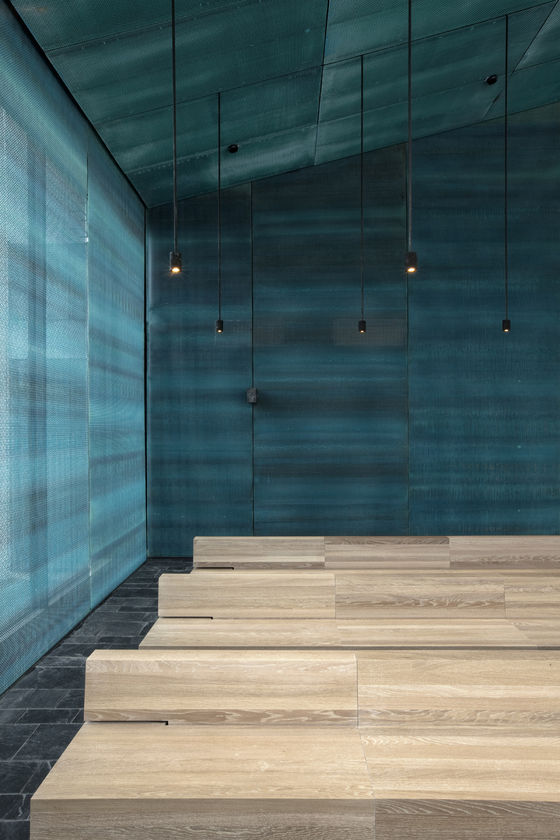
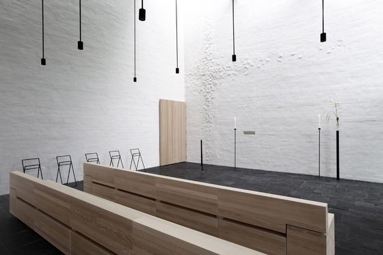
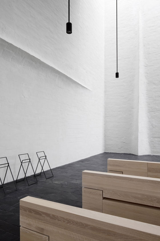
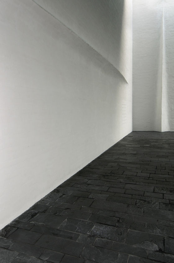
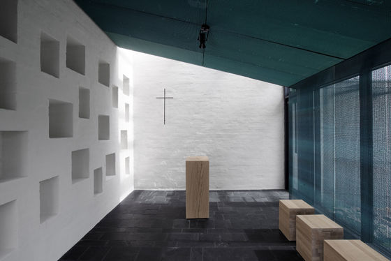
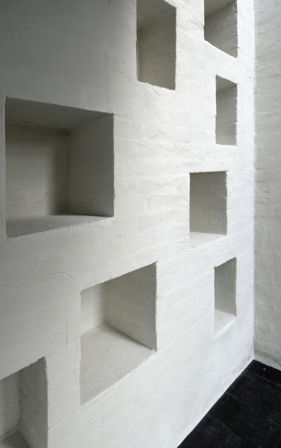
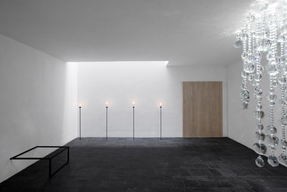
The building uses similar materials as the old structures in the area. The massiveness of the load bearing solid masonry walls balances changes in temperature and moisture. The lightly plastered and whitewashed walls are a bright, tranquil background for the events taking place in the chapel spaces. Apart from the walls, the building has a steel structure. The partition walls are in-situ cast white concrete and the roof is of patinated copper, like the roof of the church. The patina in all copper surfaces in the chapel has been added by hand. The ceilings and the glazed walls toward the graveyard in the chapels are covered with a patinated copper mesh; it functions as a screen between the outside and the spaces of the chapel. The mesh also decreases heat loads from sunshine. The low stone walls flanking the small gardens and courtyards use stone extracted from the site. The floors of public spaces are of slate.
The lifespan target for the chapel is two hundred years. The main structure will certifiably last that long and the natural materials used will age with dignity. A lifespan simulation was used as an aide for the design. An important factor in choosing the materials was locality in addition to longevity; and on-site building and an emphasis on craft were distinct features of the whole project. These ways of working ground the building in its surroundings and display the traces of handcraft.
Functionality
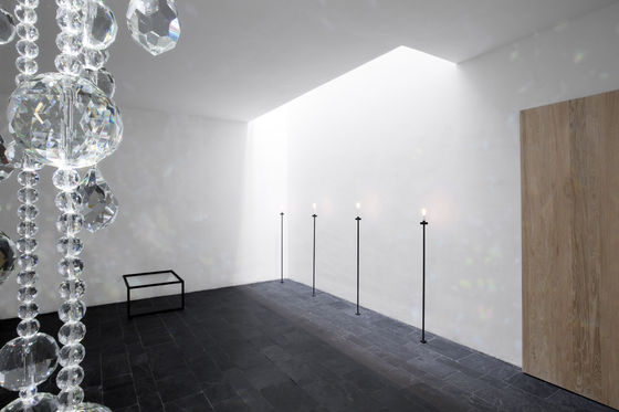
The experience of the mourner was the basis for the design process. The funeral is a unique and taxing event, and for it to go well and without disturbance is of the utmost importance. The architecture of the chapel is designed to assist the mourner, giving space for grief. The people attending the funeral follow a route through a series of sacral spaces, punctuated by intermediate rooms – along the route there is a continuous skylight. The intermediate spaces prepare the visitors for the next phase of the funeral. It is very silent in the chapel; the acoustics and ventilation have been designed especially with this in mind.
The spaces are situated on two levels, the sacral spaces, two chapels and a space for urn burials, and their entrance and lobby spaces, are on the ground floor. In the lobby there is an entry to the space for giving farewell to the deceased, which is located in the basement. The staff rooms are in-between the public areas, on the ground floor and in the basement. During the proceedings, the passage through the spaces is unidirectional. The routes used by different groups of visitors never cross.
The developer was committed to achieving a building of lasting quality. There was ample time given for planning and realization – there was an active dialogue between the designers and the client. The staff commented on the plans by taking part in a work group focusing on functional aspects. The designers accompanied the staff members in their daily duties so as to understand the work processes better. A uniform whole was achieved by having the interiors, furniture, artifacts and textiles, as well as the cladding for the organs designed in the same office as the architecture. The design process was aided by several models and prototypes that were commissioned during the planning stage.
Path
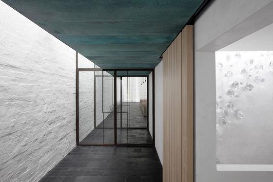
The chapel’s architecture is a depiction of the passage of a Christian soul from here to the hereafter. The route passes through the chapel, into the silent graveyard. The whitewashed masonry walls and a continuous skylight next to it lead from one space to the next, from the low and dark to the lofty and light.
We approach alongside the outer wall. The wall and the bell tower at its end speak of the earthbound journey and its ending. We turn the corner and, sheltered by an overhang, follow the wall, to a small courtyard - a small pond, with natural stones at its bottom.
We enter a dimly lit lobby with a low ceiling, we can glimpse the entrance court and the old garden of the vicarage behind us. Here it is possible to stop for a moment and reflect on the experiences and life shared with the deceased.
We follow the skylight to the chapel. The chapel opens up, a high space terminating in the brightly lit junction of the masonry wall, where the deceased will be met by the mourners. The wall towards the graveyard is semi transparent, glazed with a patinated copper mesh on either side, a screen between this life and the hereafter. From the chapel we exit, under the cover of an overhang, through a small garden, to the graveyard. The path turns – but continues.
Art
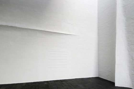
An open competition was held in the fall of 2007 for art to be commissioned for the chapel. The competition was scheduled before the final construction documents were drafted, so that the art could be integrated as a seamless part of the architecture. Pertti kukkonen was awarded the first prize with his work “the Way of the cross”. Kukkonen was able to utilize the solid masonry walls with his work. In addition to the main pieces, the walls have been inlaid with “spirits” that shine through the light plaster surface. Pertti Kukkonen was responsible also for the demanding work of adding patina to the copper surfaces of the chapel.
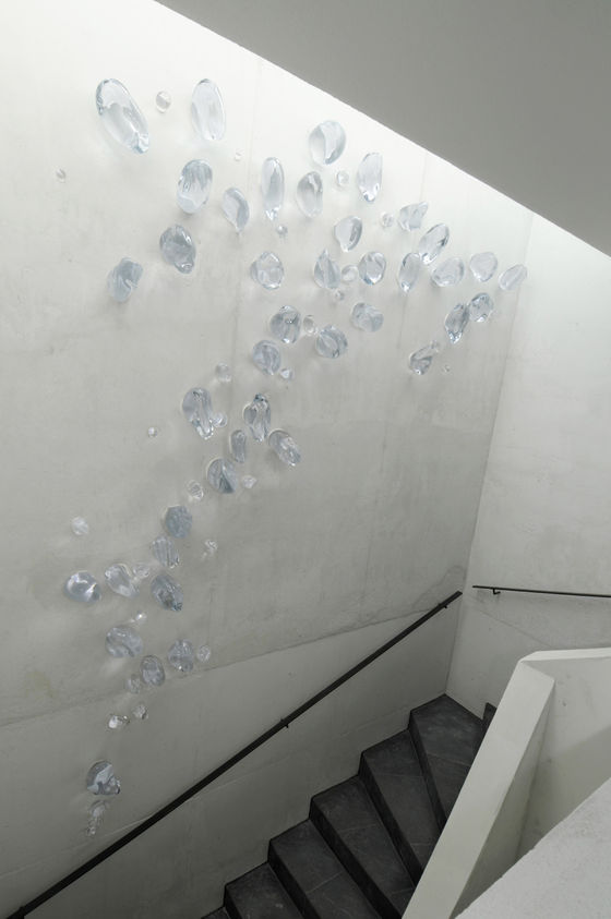
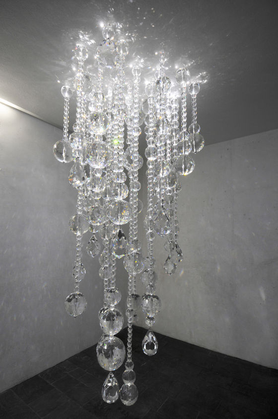
Pekka Jylhä was awarded the second prize with his work “Sacred” - his sculptures of glass reflect light around them. The shared mission for both art and architecture is comforting the mourner.
Open architecture competition, 1st prize, 2003
Vantaa Parish Union
Architects:
Avanto Architects Ltd / Ville Hara and Anu Puustinen (principal designer), Architects SAFA
Assistants:
Felix Laitinen, student of Architecture
Tommi Tuokkola, Architect SAFA
Jonna Käppi, Architect ARB, SAFA
Piotr Gniewek, student of Architecture
Asami Naito, student of Architecture
Interior Designer:
Avanto Architects Ltd / Kai Korhonen, Architect SAFA
Landscape Architect: Landscape Architects Byman Ruokonen Ltd / Eva Byman, Niina Strengell
Structural Design: R J Heiskanen Engineers Ltd / Kari Toitturi, Helena Lomperi
HVAC Design: Leo Maaskola Engineers Ltd / Jukka Sainio, Esa Leino
Electric Design: Veikko Vahvaselkä Engineers Ltd / Rauno Nyblom, Lassi Jalava
Lighting Design: Tülay Schakir
Acoustic Design: Akukon Ltd / Olli Salmensaari
Textile Design: Avanto Architects Ltd
