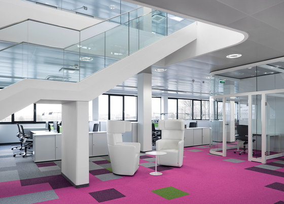
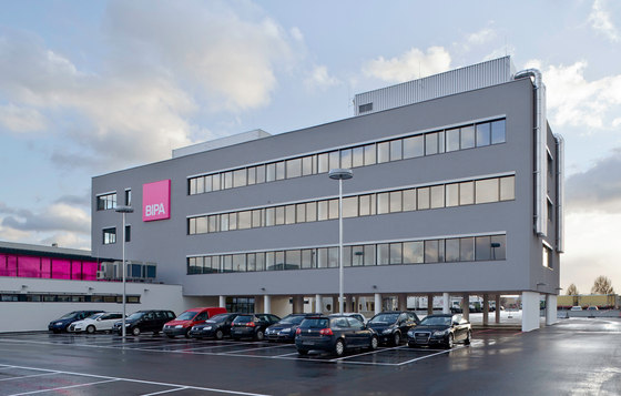
The new BIPA office building, created by BEHF Architekten, offers both architectural interest and several different communication zones where employees can meet on an informal basis.
At first glance, the four-storey building by the Vienna architecture firm BEHF seems inconspicuous and plain. The exterior is dominated by rows of ordinary windows and a pale grey plaster façade. Only the bright square of BIPA colours on the façade hints at the building’s colourful interior. That makes people curious. And quite rightly so. As soon as you enter the building, you are immersed in a world of magenta.
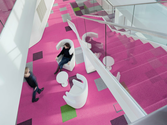
"It was easy to specify beautiful accents in the colour scheme," says Dietmar Gruber, Managing Director of BIPA. "In the buildings public areas, where there are visitors and suppliers, we set the scene with the corporate identity colour magenta as well as a few typical BIPA images." There are a couple of "beautiful and styled models" as well as some very bright carpet tiles. The Spice colour concept, available from Bene’s materials and colours portfolio, made it possible to use the characteristic colours on the furniture aswell. Violet textiles were used on the PARCS elements and RM Room Modules in the waiting and reception areas.
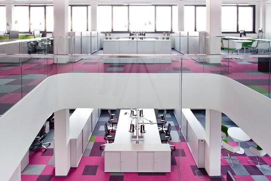
"Thanks to the building’s depth, we were able to create three work zones," says architect Franz Gruber, Managing Director at BEHF. "The areas for work requiring concentration are located in the two external zones along the façade, and we put the communication zone in the centre."
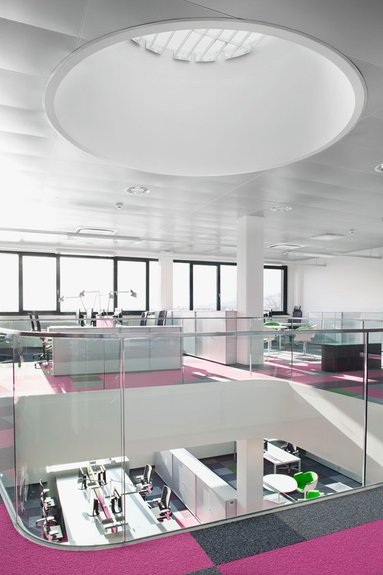
The communication zone in the middle of the building consists of different elements from the Bene PARCS series. While the Causeways and Pop-up Stools invite collaborative brainstorming and breaks in the day, people can also retreat into the peacefulness of the Wing Chairs with their acoustic and visual privacy. Magenta, violet and a fresh complementary grass green palette consciously promote creative work and relaxation. The openings in the ceilings and the internal stairway also encourage communication between the second and third floors.
"We’ve noticed that in many offices a very closed sub-culture evolves within the clusters and floors," says Gruber. "We broke down the vertical barriers to try and counteract this trend."
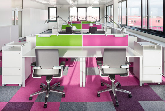
The work zone located along the façade is a counterpoint to lively coexistence of the central areas. Here, where focussed work is required, the notion of quiet concentration is incorporated in the colours. All of the tables and furniture are white and light grey. Only the panels between workstations and the characteristic Rondo meeting chairs provide colourful punctuations. Bene storage options include furniture unites that also serve as room dividers and Bene caddies for convenient mobile storage.
"The workstations are intentionally somewhat more peaceful and neutral," says Franz Gruber. "Extra-bright signal colours like magenta or violet are not suited to constant exposure. If people are going to stay in a space for a longer period of time, it’s important to turn down the intensity of the colours." Nonetheless: If the requirement specifications change, or if BIPA wants to relaunch its corporate identity one day, the furniture and floor coverings can be exchanged easily. BEHF placed a lot of importance on this flexibility.
"The emotional factor in office design cannot be underestimated. It conveys corporate culture and increases identification with the business, motivation and productivity." Katrin Gatterbauer, project leader / HR manager at BIPA
BEHF Architekten

