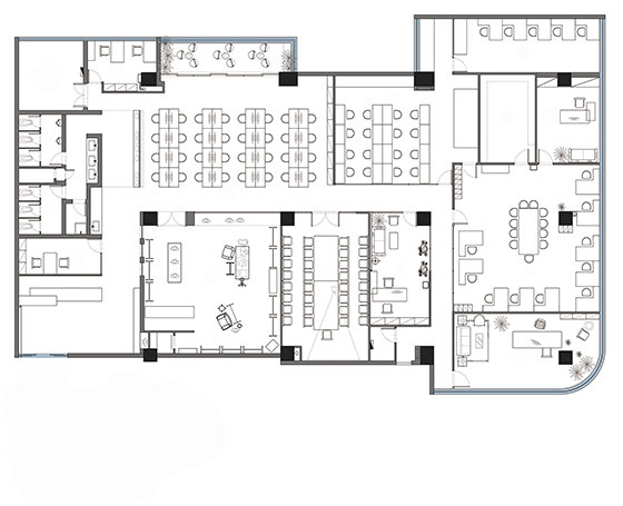
Traditional expressions of eastern Zen are diversified. However, what we want to express is not the language deliberately posted with such labels but a kind of quiet expression that attaches importance to meaning instead of form. The project covers a showroom of 100 square meters and an office space of 700 square meters. Gene core of the major brand QUALLIN in the showroom is also created by us - trace to its source, and return to simplicity.
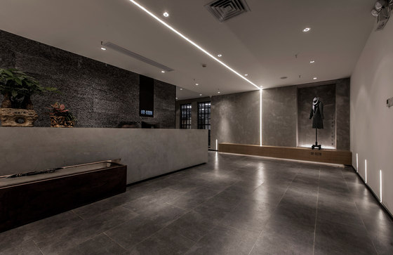
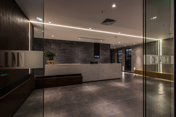
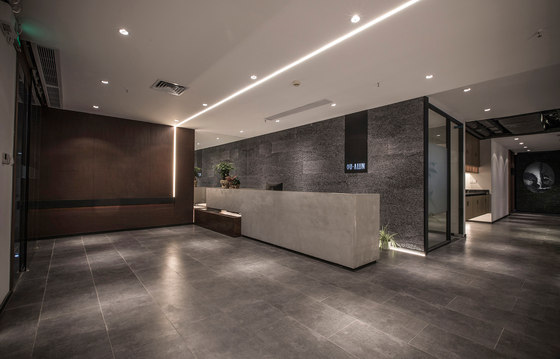
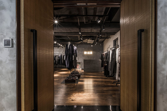
We intended to break the part that is too formal in eastern Zen. Both our client and us agree to the idea that the design should gives a eastern feeling yet not deliberate, and a feeling of zen style yet not indifferent. The whole design conveys a feeling of simple fashion-a space with style and quality. The entrance design does not present any superfluous element but brings the modern feeling with its own logic of shape and the quality of materials and light.
We have integrated the light bands into the whole space as a kind of geometric design language to create another kind of texture. In temporary reception area of the front office, space-integrated wooden table is used instead of traditional seats. For regular change of theme models, a movable brand model is placed in the sunken part. As space in front office is not large, an entire mirror is designed at the left side of the entry to stretch the space levels.
The embedded light strips on the ceiling and the light strips on the ground echo with each other, creating a powerful space design language. The reception area in the entrance adopts separate structure. The self-cycling pool made of rusty iron plate on the left has breathed new life into the space; while the cement reception desk is rough and powerful.
The rusty iron plate, cement and striped stone sheds its own gloss under the shadow.
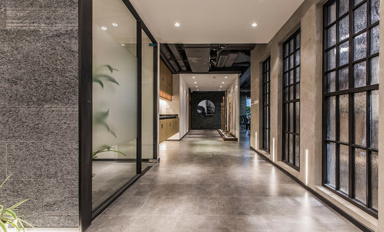
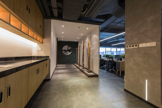
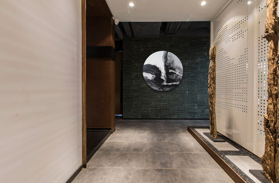
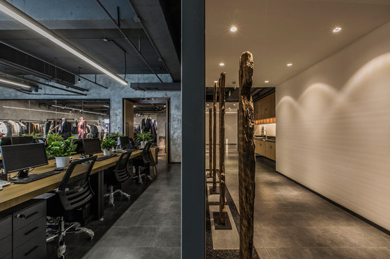
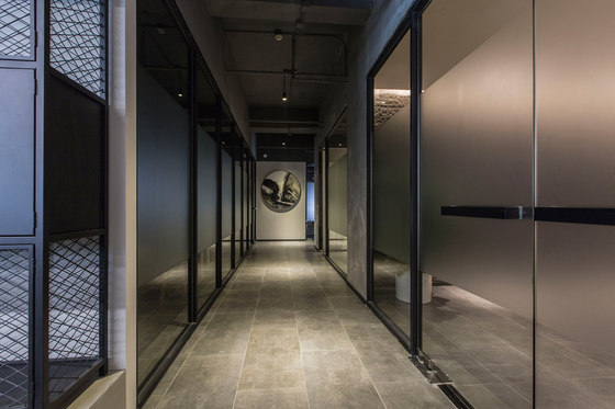
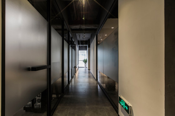
Spatial gradient and balance is very important, yet the virtual-real depth of corridors requires much more attention. It’s necessary to consider both the logical relationship in the overall space and the virtual and real space. The abstract ink landscape painting at the end presents a visual focus for the corridor. When presenting the Zen style, we must be cautious in the selection of shapes and designs to avoid exaggeration.
The right side of the corridor is decorated with four rotten wood through years, corresponding to the screens punched with landscape paintings on the back--forming the main scene of mountain, water, wood and stone. The purpose is to best presenting the Zen style yet burying it deep. The large area of clean blank space makes the level more distinct and also leaves space for association.
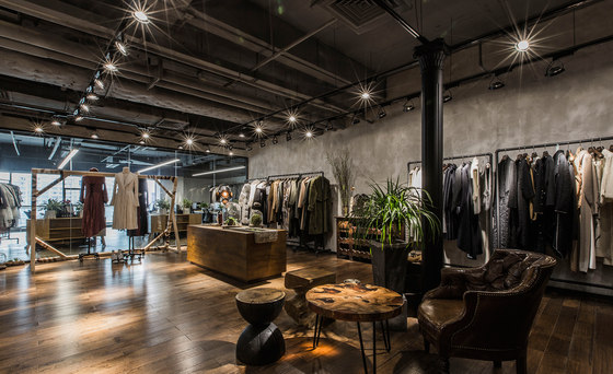
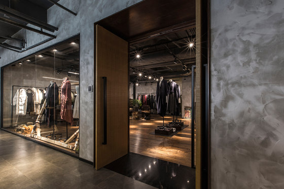
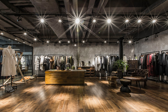
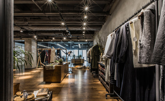
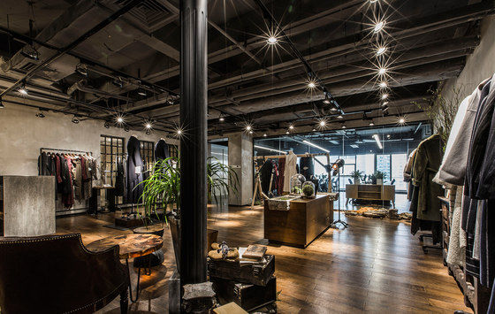
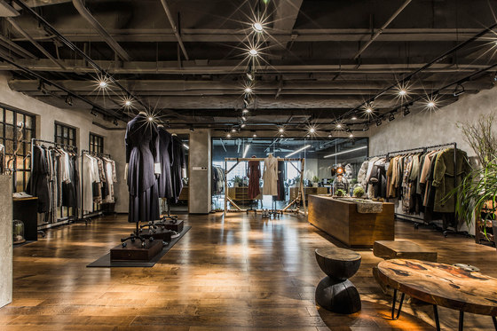
We did not make too much shaping and segmentation in the design of showroom space but made efforts to highlight the texture of clothing by the plain technique of wood, cement, iron plate and decoration. The whole style displays the subject of nature, simplicity and depth, and gets rid of fixed style and pattern of thinking. You could feel the simplicity of Europe and America and also the Zen style of the East in this space.
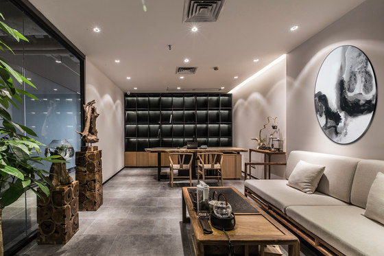
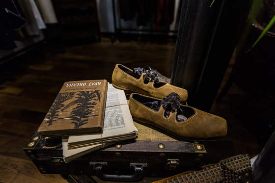
With heavy post-modern imprinting, the sofa in the rest area was hunted from the flea market of France. The small round table was processed with the integration of old brown wood resin. These unrelated items, while placing together, present a different fashion style. Beside the decoration column is a group of storage boxes hunted from the flea market and several foreign language books of 19th century. A pair of chic dance shoes displayed among them gives a sense of elegance and style.
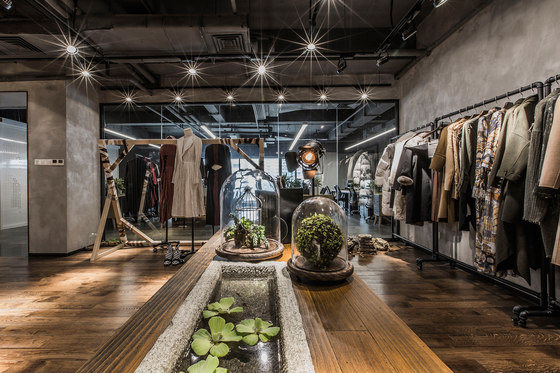
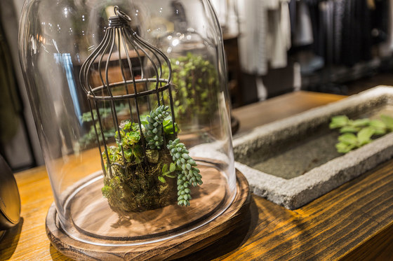
Considering on the relationship between various materials and creation of simple fashion style, we have adopted customized LED spot lights so as to highlight the texture of materials and overall atmosphere through the scatter of lighting in the whole space. The table in the center of showroom is restructured with wood and natural stone tank. The green floating plant is cultivated in the stone tank filled with water, presenting a feeling of freshness and nature.
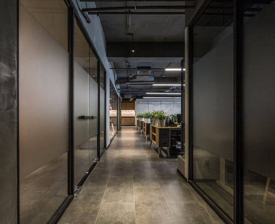
The design of the fitting room should be comfortable and natural, as a result, the harmonious and warm lighting atmosphere is the key point for this area. We do not deliberately design the main corridor in the middle of the office but take the effects of corridor into consideration when designing the functional facade. The corner of the corridor is customized with a painting of ink landscape, which gives the narrow and long corridor a focus in visual sense.
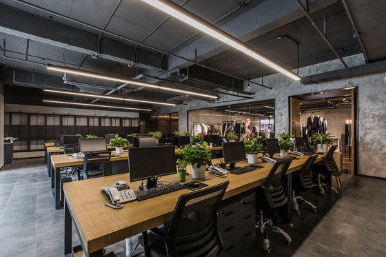
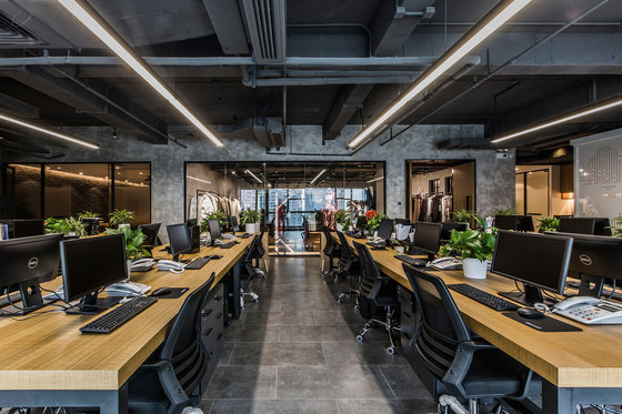
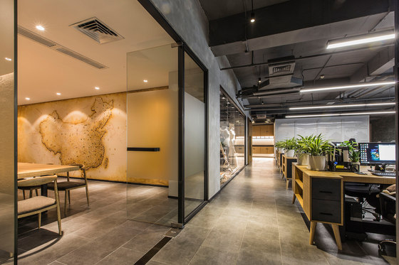
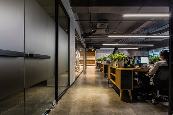
The layout of design department is more open. With the consideration that each designer should have their own tools such as shelves for sample clothing, we leave the corridor wide so as to made it convenient for moving the shelves. The bare ceiling is unified by the orderly distributed lamps in the shape of Chinese character “米”. The office of sales director is very concise. Space style is highlighted through the display of furniture.
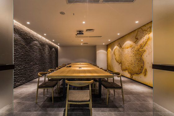
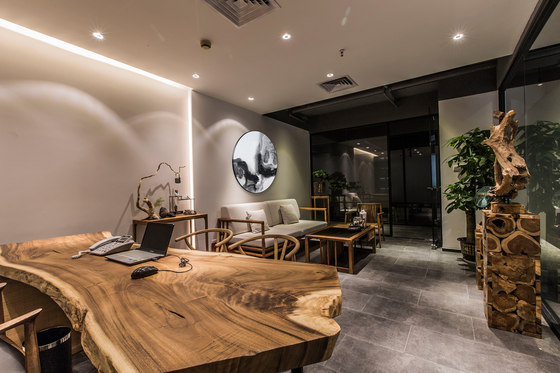
The entire wooden office desk echoes with the new Chinese furniture, while the customized black iron plate bookcase is extremely modern. The whole space presents an atmosphere of eastern modern Zen style. The hand-painted retro-style map of China hangs on the right wall of the meeting room provides an intuitive physical reference for future brand development .
Bernard Space Design: Zhu Liangwen, Yang Weiyu and Sheng Pingfeng
