Fotógrafo: Paul Winch Furness

Fotógrafo: Paul Winch Furness

Fotógrafo: Paul Winch Furness
The rich heritage architecture of an 1870s warehouse was the backdrop for our eighth collaboration with Grind. The project occupies a prime location in London’s up-and-coming Clerkenwell neighbourhood, alongside some of the city’s next generation of dining venues.
For the Grind team, this project represented the next step in the growth of their business, marking their transition from successful coffee and cocktail venues to a full-scale restaurant and bar. From a design perspective, this meant redefining the visual language that we developed for their other locations and building a new flagship for the Grind brand that would set the direction for their future venues – a dynamic new take on the contemporary British dining experience.
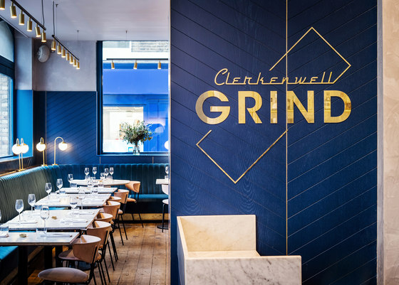
The building is a restored Grade II heritage-listed warehouse that once belonged to colour merchant Thomas Mabe. Behind its intricately patterned brick and terracotta facade, we sought to create a vividly coloured but elegant interior that would contrast with the architecture while respecting its heritage.
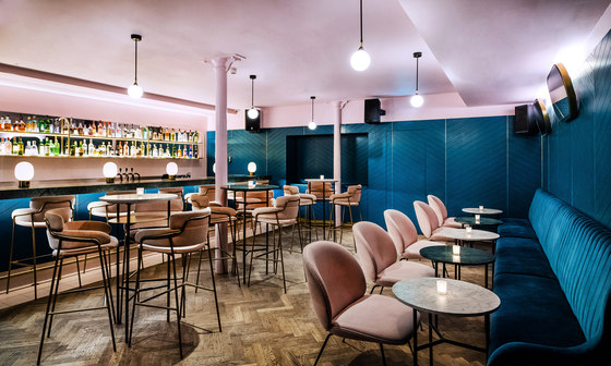
The venue spans 260 square metres across two floors, with four distinct zones – at ground level, the main dining room accommodates sixty diners, with a cocktail bar and private dining space, while the basement level houses a more intimate bar and night spot, alongside the open kitchen and amenities.
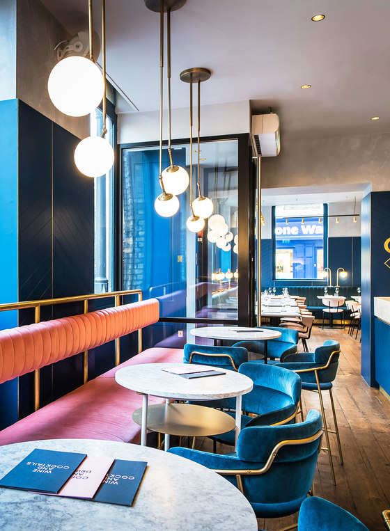
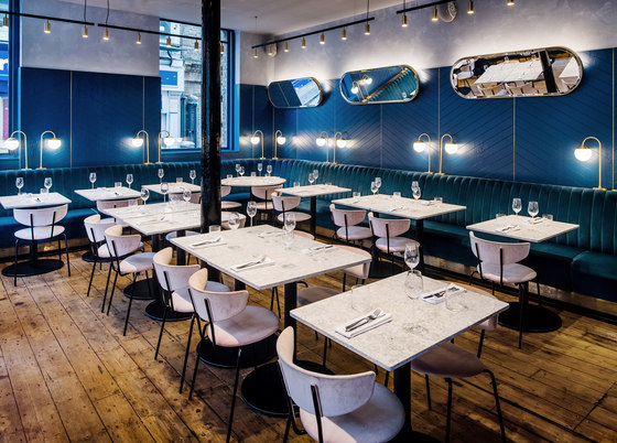
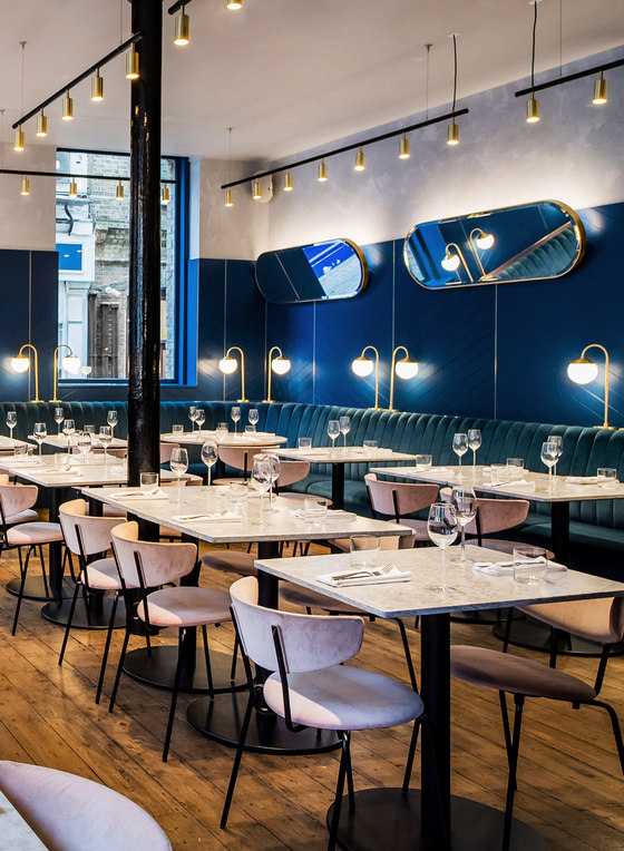
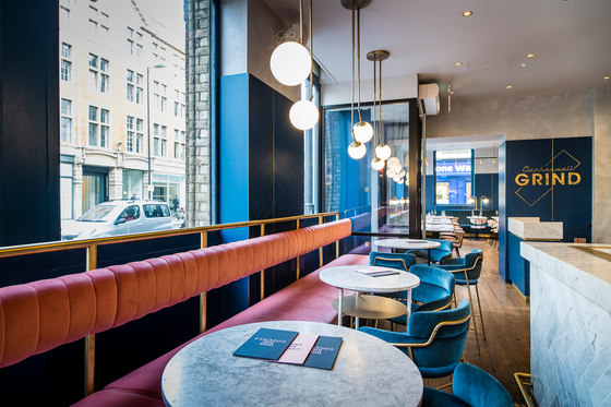
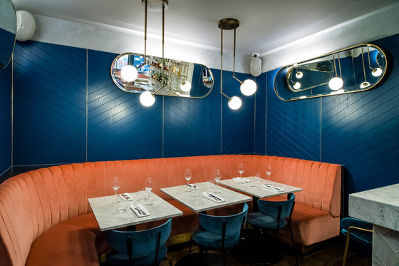
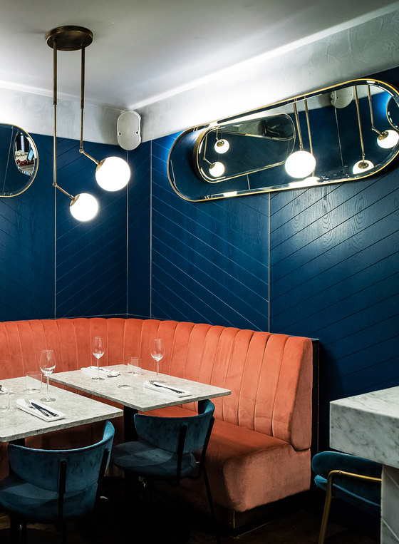
The project’s materials palette draws together custom design elements and products from places near and far – Denmark, India, the United States and Australia, to name a few. In the main dining room, a plush banquette in a navy blue velvet wraps around the walls, below navy timber panels with a chevron pattern. Slender brass lamps and beautifully worn timber floors nod to the building’s history while, overhead, angled oval mirrors create unexpected connections between groups of diners. The furniture is light and elegant – marble-topped tables in circle, square and rectangle configurations with slender Ferm Living chairs upholstered in dusky pink velvet.
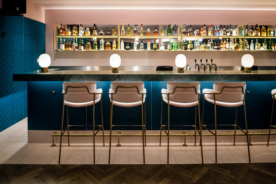
Alongside the entry, the casual dining zone features a second banquette – upholstered in a blush-hued velvet – which looks toward the main bar clad in herringbone-patterned Carrara marble tiles. Behind the bar, display shelving continues the brass theme. Opposite, a neon artwork by Toronto tattoo artist Curt Montgomery is a playful addition. A key challenge was to open up the interior, so we worked within the existing floorplan and strategically removed walls to make it function as two interconnected zones.
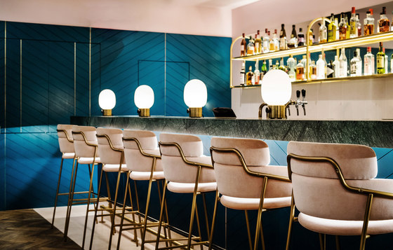
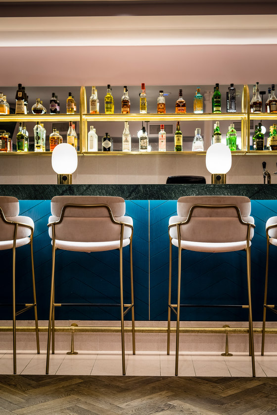
Downstairs, the materials palette continues in the intimate bar. We wanted to give the space a relaxed, feminine vibe, with delicate materials and a finely resolved colour palette. Structured around a bar topped with cool Verde Guatemala marble, the space is equipped with slimline furniture – high and low marble tables, and brass-legged stools and sculptural Gubi Beetle chairs wrapped in pale pink felt. Chevron timber panelling reappears, this time in a rich green above a teal velvet banquette. Along the bar, counter-top lamps with a bulbous, almost retro form create a moody lighting scheme, perfect for late nights and good times.
Across our eight collaborations with the Grind team, we’ve evolved the brand to give each project a distinctive identity. Here, those design elements come together to form a sleek new flagship that celebrates the brand’s character.
Biasol: Design Studio

Fotógrafo: Paul Winch Furness

Fotógrafo: Paul Winch Furness

Fotógrafo: Paul Winch Furness

Fotógrafo: Paul Winch Furness

Fotógrafo: Paul Winch Furness

Fotógrafo: Paul Winch Furness

Fotógrafo: Paul Winch Furness

Fotógrafo: Paul Winch Furness
