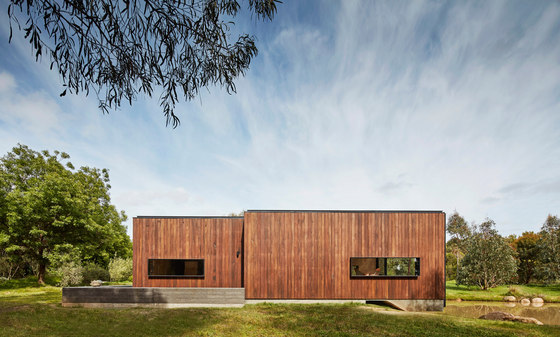
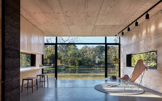
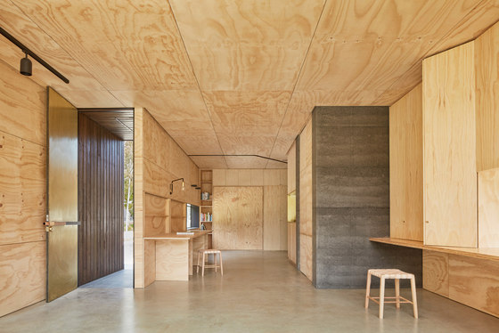
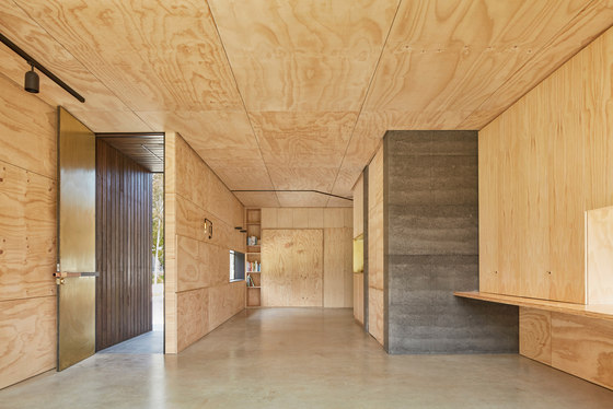
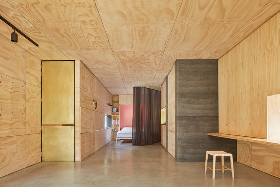
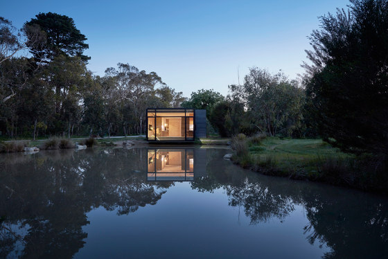
From the very first discussion with the client it became apparent that this building would need to be specifically non-specific in its apparent program, a space that could be nothing one minute and everything the next, required to regularly and effortlessly switch between an empty nondescript shell of limitless possibilities to a fully functioning private residence - a knitting studio, a reading room, weekend drinks with the neighbours, yoga, Christmas day lunch.
At the heart of it all was the idea of retreat, a slow moving space that would provide a haven from the hectic paces of modern life, a slow building for slow living.
The response to the open-ended brief for a non specific ‘studio and retreat space’ was to create flexibility through adaptability. the idea that the space can be divided or united depending on the requirements of that given moment. Purposefully lo-fi , The Retreat embraces a low-tech aesthetic towards the operation of the building itself, fully embodying
the idea of retreat and slowing down.
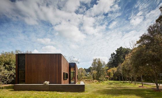
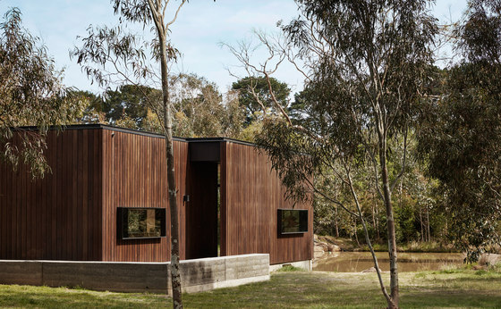
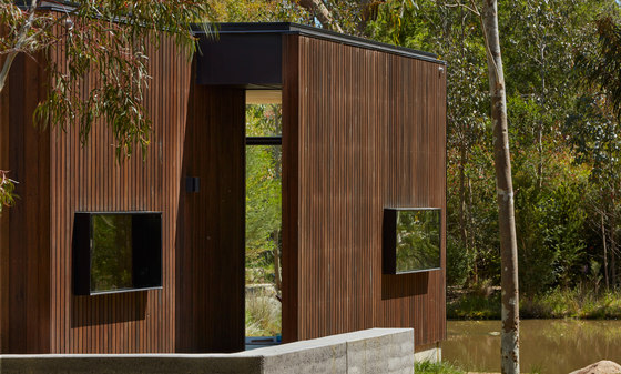
Celebrating craftsmanship and integrity of materiality instead of technology, every wall of the building has been designed to contain components that manually fold, open and close to manipulate the space and transform the program of the building. Rather than pressing a button on a remote control, the inhabitant must fold and unfold the various components by hand, mindfully manipulating the very space they inhabit and therefore becoming a part of the space, not the master of it.
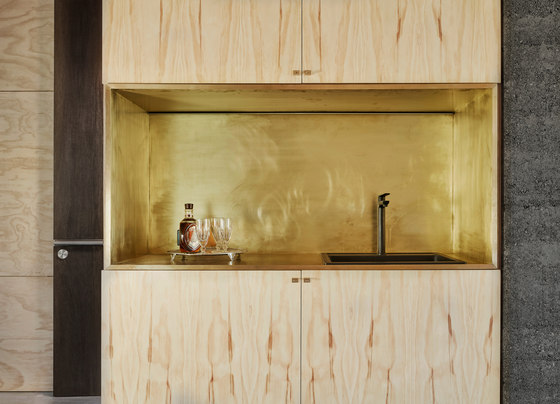
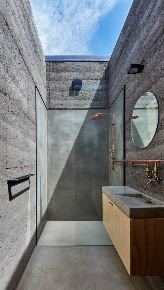
The south wall contains the fold away bed and houses a desk, book shelves, general storage and also conceals the air conditioner. The east wall has a series of flaps that unfold and work together to create a long table while also revealing the shallow storage between the stud wall framing behind. The west wall houses the kitchen, the main work space (consisting of a large desk area incorporating large concertina doors to conceal the ‘everyday mess’ of a study space, a flap that folds down to create a standing desk utilising the sunken floor area to the north) and a hidden door leading to the bathroom.
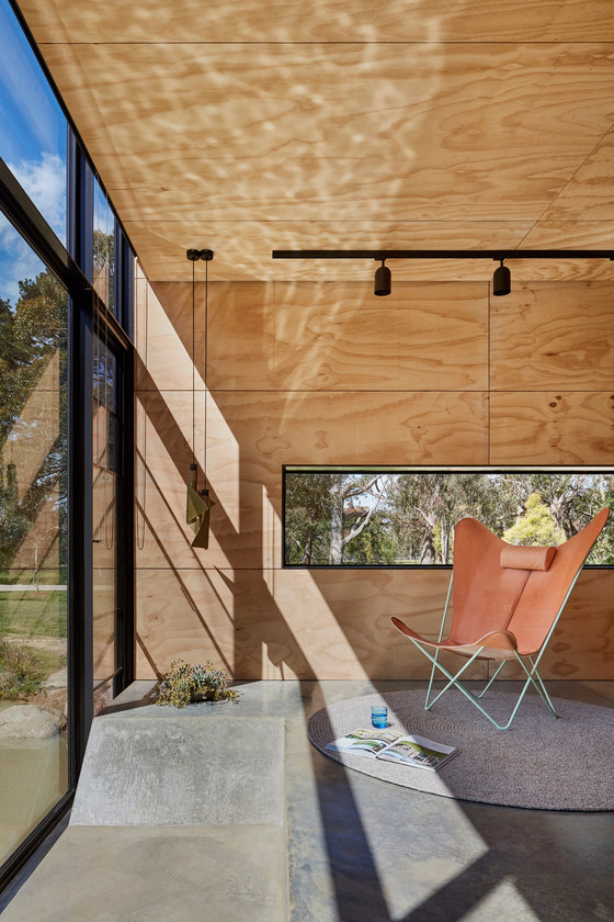
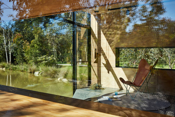
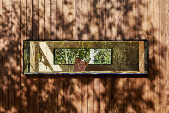
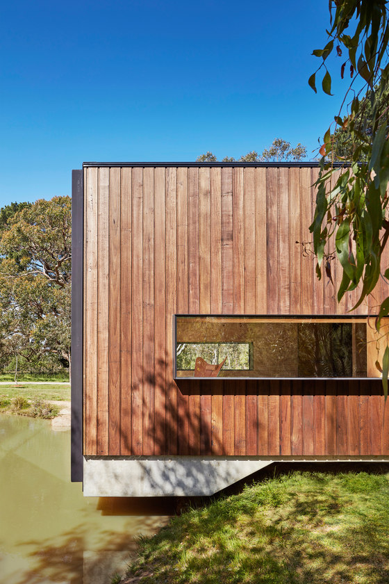
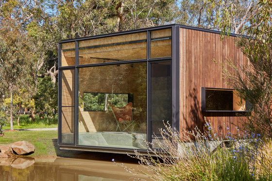
Immediately in front of the glazed north wall is the sunken ‘day bed’ providing multiple options for sitting and watching the ducks. A series of plywood boxes have been designed to ‘infill’ the sunken section, providing a larger usable area for parties and gatherings by creating a consistent floor level when in place, while also providing a versatile option for additional tables and seating when removed from the recess and placed throughout the space. The connection with place, in this case nature, is an important element... the relentless croak of the frogs, the mesmerising water reflections that dance on the ceiling, the ducks and other water birds paddling past and the dense greenery swaying in the breeze.
Branch Studio Architects
Nicholas Russo, Simon Dinh, Rowena Henry
Builder: LJ Roberts Constructions
Structural Engineer: WSP Consulting Engineers
Custom ‘Nose Dive’ Pendant: LTNK/Orchard Design
