Fotógrafo: Eugeni Pons

Fotógrafo: Eugeni Pons

Fotógrafo: Eugeni Pons
This project follows the exploration initiated with Casa AB on what it means to intervene in an apartment in Barcelona's Eixample. The proposal partially takes up the reflections initiated in the first project, purifying and developing some of the concepts and solutions for an equally domestic but slightly different program. Here's a breakdown while detailing some of the differences between the two.
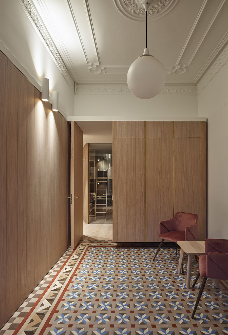
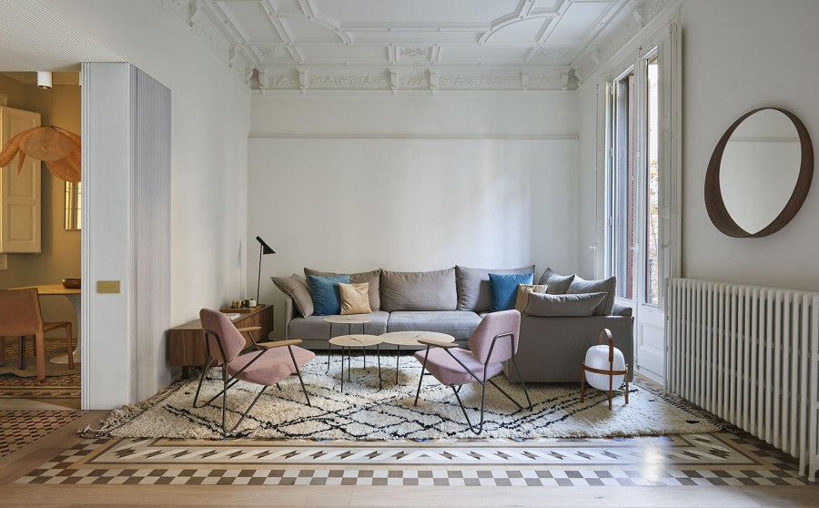
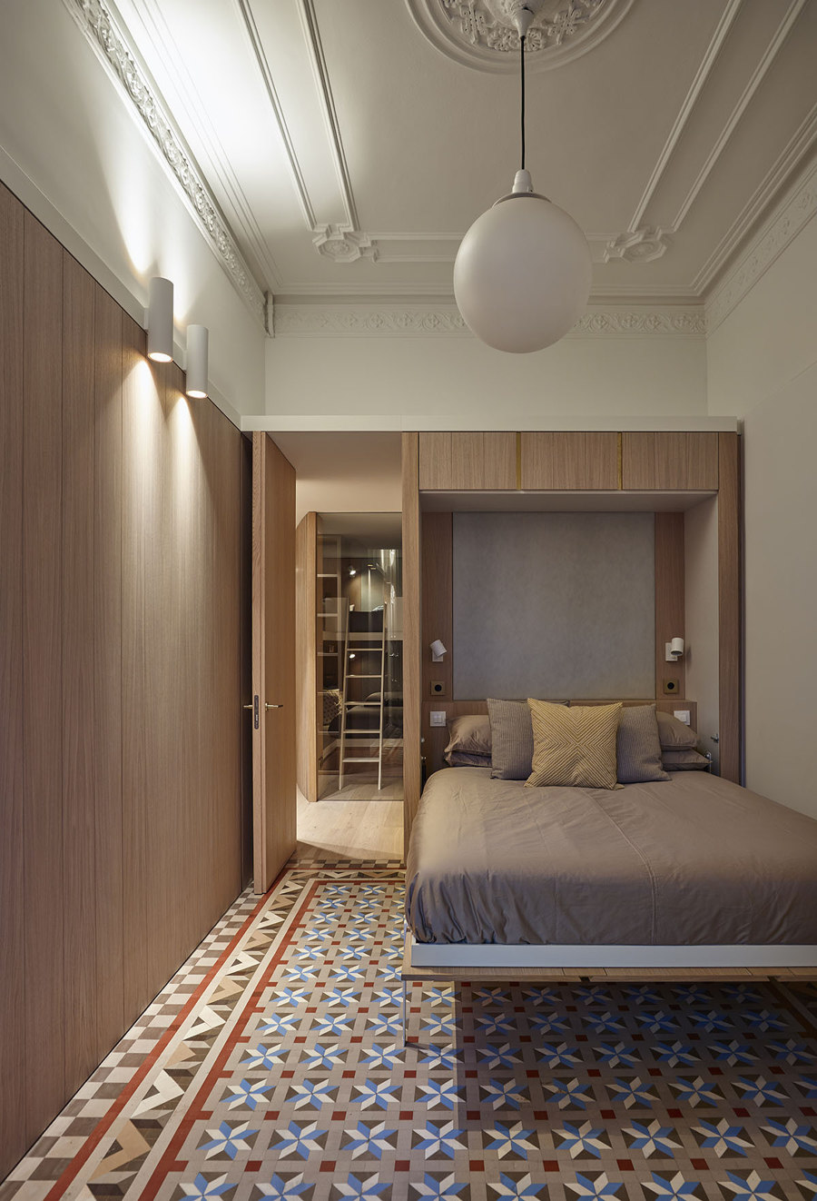
The Eixample district has become the true heart of the city, Barcelona’s urban and architectural heritage. It is so both for the artistic value intrinsic to its buildings and facades, as well as for the great polyvalence and versatility that it has demonstrated over time, adapting to how many realities the city has faced. Its urban growth pattern has spread throughout Barcelona’s plan, uniting the various historical neighborhoods that shape the city today. Built mostly by regal estates, the floors are usually organized into two units per floor, from side to side and facing both the outside street and the interior of the block. It is composed of highly compartmentalized cell dwellings sewn by long corridors, high ceilings, and profusely decorated with plaster moldings, Nolla mosaic floors, and exquisite work in the carpentry of windows, doors, and other modernist ornaments typical of the time. The project is just the last step in this relentless process of mutation and adaptation.
Although the first project enjoys greater natural lighting, benefiting from the uniqueness of facing the block’s chamfer and being located on the upper levels of the building, the second is slightly darker located on the first floor and embedded in the center of the street. Undoubtedly its longitudinal condition and between dividing walls make it more archetypal, but it induces us to a more conventional distribution divided into day area and night area, being completely different from the first.
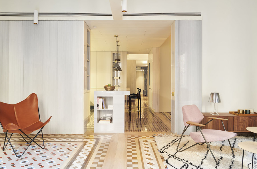
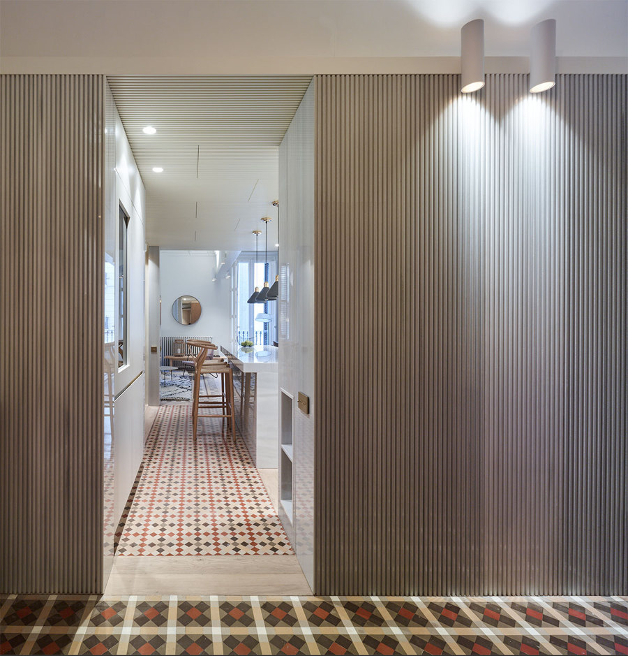
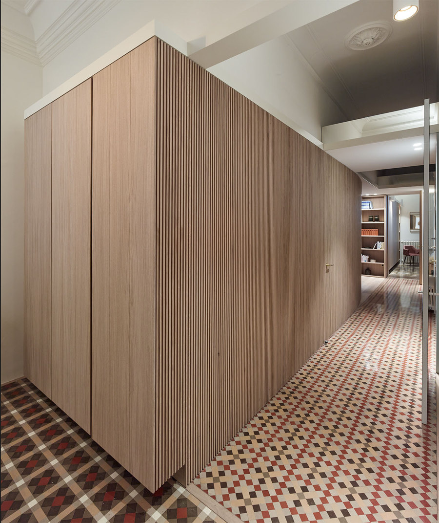
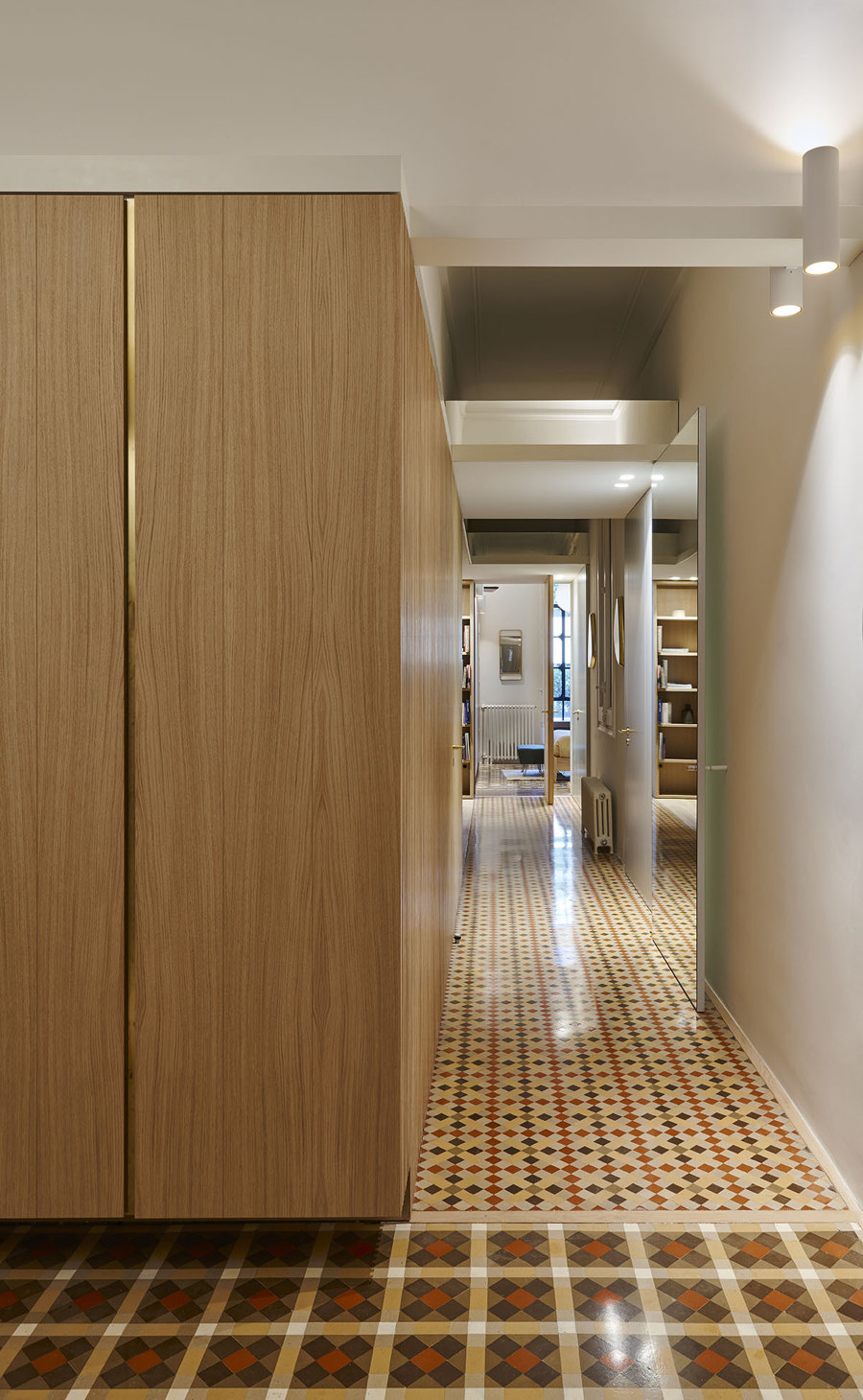
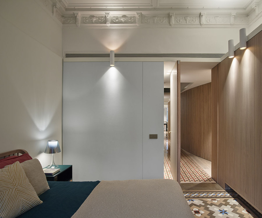
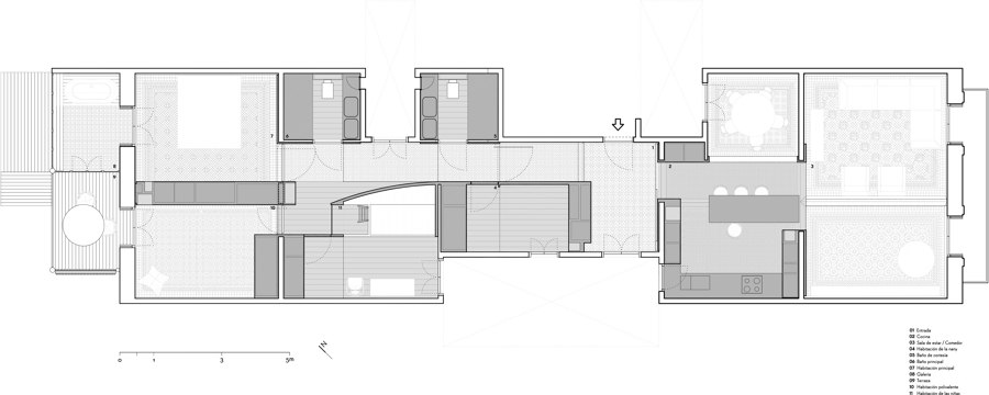
Entering from the center of the apartment we immediately discover the three elements that organize the new distribution: the new white cornice, the longitudinal oak furniture, and the three marble stones. Three ingredients that build a spatial sequence that is compressed and widened by interposing different thresholds that frame the day and night areas and the entrances to the bedrooms and bathrooms. The strategy of fixed furniture and coatings mask the structural walls and partitions of the original distribution, leading to a more open and continuous perception of the space.
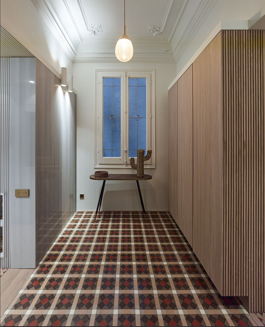
Thus, the project reconverts the original distribution of the apartment by interposing a new level 2.50m from the floor between ceilings and pavements of the time. This new ceiling is much thicker than its predecessor (which was only a 5mm black sheet metal) proposing a white lacquered wooden cornice exactly 8.4 centimeters thick, designed to receive the square base of a series of tubular wall lamps that illuminate up and down ceilings and floors alike.
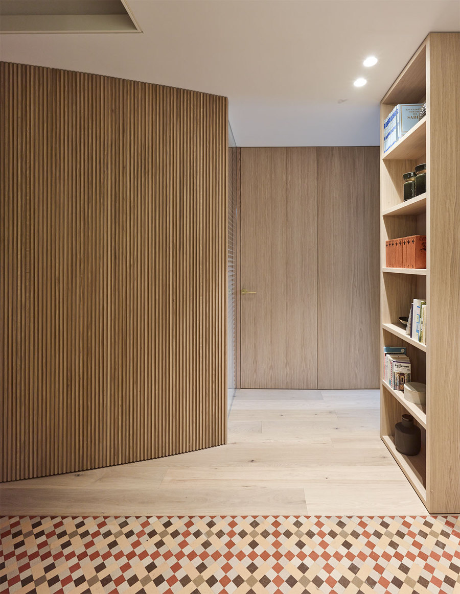
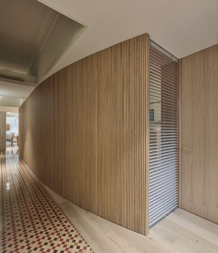
Under this new level, we first find the central oak wood furniture that extends in a curve along the floor hiding behind it the different rooms of the floor. Again, the central furniture consists of a divider between the public and the private and joins longitudinally the living room with the multipurpose room and the back balcony through the kitchen. Secondly, a sequence of three volumes understood as three carved marble stones, serve to accommodate the wet areas of the project: on one side the large open kitchen and on the other the two twin bathrooms. Between all the bodies is drawn a crack that crosses the floor linking the main facade with the gallery of the patio of the block. This achieves cross-visions and a greater entry of natural light while blurring the original central corridor to end up unifying the entire space.
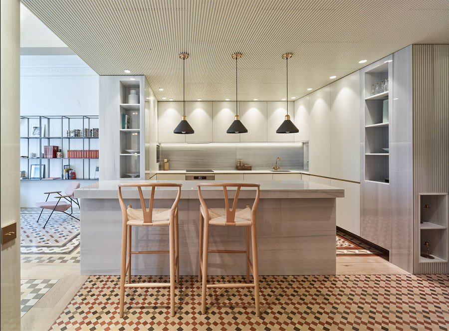
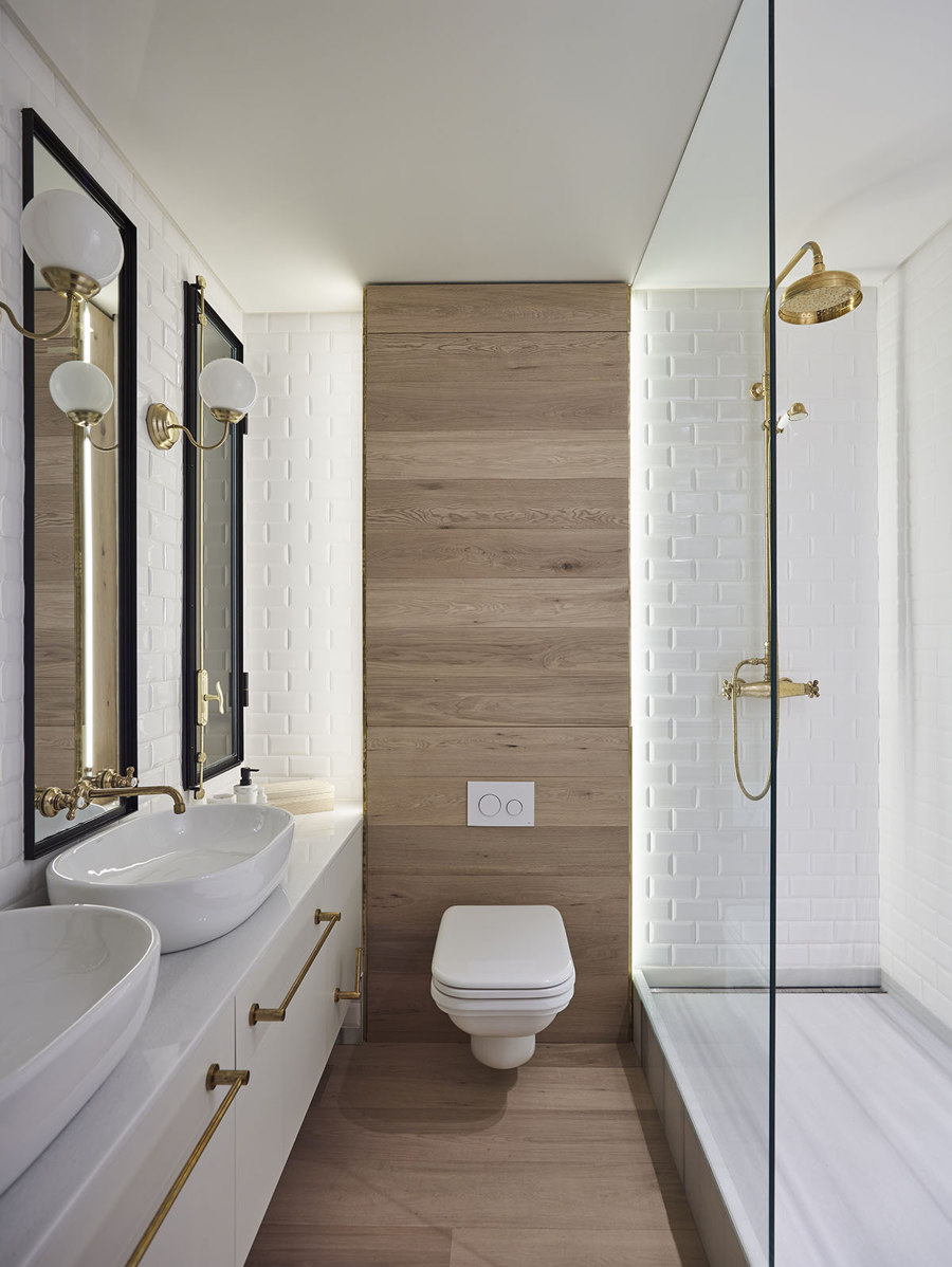
The selection of natural raw materials: oak, white marble, and brass, obeys the desire to remain neutral facing the lush and colorful modernist ornamentation of the floor. Vertical milling has been applied equally on marble and wood, which alternates smooth and shiny surfaces with rough and matte textures. This gives the whole a greater depth and shadow so that volumes are better appreciated to the detriment of the plane surfaces. In our view a subtle degree of technical sophistication in what has been an intervention that was usually desired sober and discreet so as not to rival with the modernist character of the house.
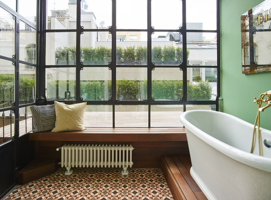
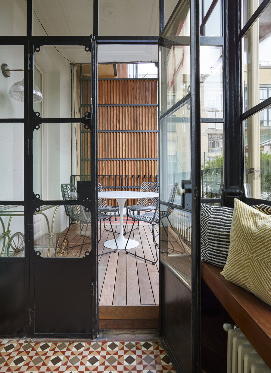
In the same way, both the central furniture and the marble boxes are lined up or fly over the mosaic pavements, avoiding at all times contact so as not to interrupt the borders, understanding once again the Nolla mosaics as carpets set on the perimeter wood pavement that surrounds them.
The center of gravity of the project is undoubtedly the kitchen. Located in the center of the floor literally inside a large marble stone, it has been delicately carved like a sculpture open to natural light from the facade. Under the milled roof, the volume rests only on the oak perimeter so as not to step on the mosaics at any time. It is a fully open space around a large marble island, which connects the most public areas of the living room, dining room, and office with the main entrance and the rest of the house without resorting to doors or walls.
A project for an apartment in Eixample must recover and emphasize its original values and virtues while being obliged to introduce new elements that dialogue with the past in such a unique, surprising, and innovative way as discreet, flexible, and respectful. An intervention always at the service of the people who will live on the floor, fostering the life that must occur inside.
Design team:
built architecture

Fotógrafo: Eugeni Pons

Fotógrafo: Eugeni Pons

Fotógrafo: Eugeni Pons

Fotógrafo: Eugeni Pons

Fotógrafo: Eugeni Pons

Fotógrafo: Eugeni Pons

Fotógrafo: Eugeni Pons

Fotógrafo: Eugeni Pons

Fotógrafo: Eugeni Pons

Fotógrafo: Eugeni Pons

Fotógrafo: Eugeni Pons

Fotógrafo: Eugeni Pons
