Fotógrafo: © Ines Leong/ L-INES Photo

Fotógrafo: © Ines Leong/ L-INES Photo

Fotógrafo: © Ines Leong/ L-INES Photo
Cafe area
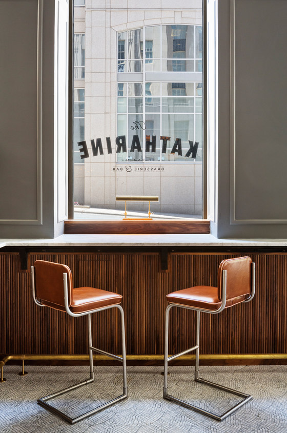
Here you can see a detail shot of the brasserie materials. Although classic in materiality, all have a modern edge that brings the space into the 21st century and makes it relatable to its current clientele. The brass foot rail becomes more simplistic and architectural, the bar die uses walnut dowels to create a unique texture to the classic idea of paneling, and the cantilevered barstools add an industrial touch..
Material and texture detail
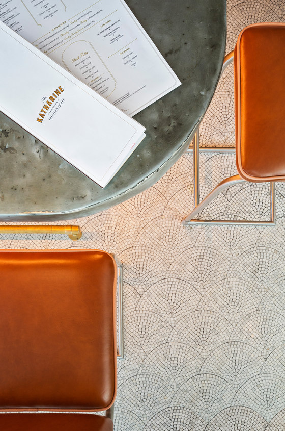
Merging the organic botanical components and the distinct materiality of the art deco area can be seen best in this image. The juxtaposition between the zinc bar top, scallop mosaic floor, and the rich colors of the leather stools plays on the warmth of classic deco furniture and the cool and ridged architectural elements found in the art deco aesthetic.
Bar area
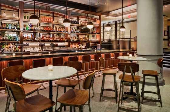
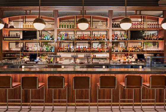
We again see a modern twist on the classic styling of the art deco brasserie at the bar. As the main entrance to the space, the client requested separation between the more casual dining atmosphere of the bar and the main dining room. We saw this as an opportunity to create a strong classical language with the back bar, while incorporating new materials that add a modern and industrial touch. Additionally, the custom pendants are directly inspired from the Empire State Building and it’s detailing (which is known as using the RJ Reynolds building as its design muse).
Bar counter
(See above)
Main dining area
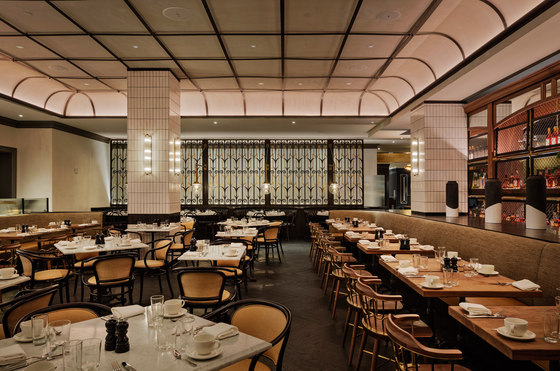
The main dining space moves from the deco brasserie inspiration of the bar into a warmer and more intimate setting. The curved pop-up ceiling defines the space while adding metal detailing to add an industrial flare. The central seating area showcases custom Thornet chairs, classic beveled marble table tops and bistro bases, while the flanking banquets opt for a more casual approach to the deco aesthetic and highlight the custom exchange chair backs that reference the organic movement found throughout the botanical influence in the deco era.
Private dining area
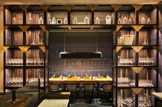
The PDR is a little gem within the hustle and bustle of the classic brasserie atmosphere. Surrounded by modern yet industrial crates that replicate deco details, the PDR has subtleties that really roots the space to the history of the building; the floor to ceiling custom wall covering reveals the architectural drawings of the original space itself. The pleated chandelier, custom Thornet’s with lush chevron upholstery, and the unique communal table, set a demure yet detailed base for the bold pattern of the blueprints.
Banquette seating area
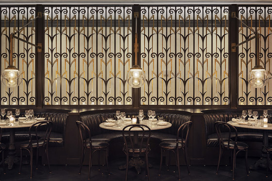
The aesthetic of the custom booths and café chairs nod to the era of the art deco brasserie, while the custom pendants utilize the classic globe styling with a modern twist. The screen behind makes reference to not only the styling of the architecture, but it also references the past resident of the building, RJ Reynolds Tobacco Company. The pattern was derived from vintage prints of tobacco plants and stylized in an art deco manner.
Exterior
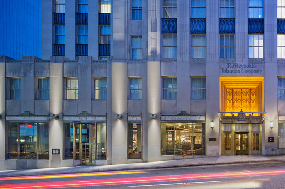
The architecture and prior use of the building were the inspiration for the interior. Here you can see the classic art deco details from the 20s and 30s as well as the botanical nod to the previous tobacco company tenant.
Studio Creme

Fotógrafo: © Ines Leong/ L-INES Photo

Fotógrafo: © Ines Leong/ L-INES Photo

Fotógrafo: © Ines Leong/ L-INES Photo

Fotógrafo: © Ines Leong/ L-INES Photo

Fotógrafo: © Ines Leong/ L-INES Photo
