Louis Kahn has said that if you fill your mind with something that does not belongs to you, they would never stay in your brain; you would forget them, and you would lose the awareness of defining your self-worth. His spirit in the architecture has been summarized by John Lobell in the book Between Silence and Light.
In my point of view, Louis Kahn has found a calm answer for each question he asked in architecture. He never went with the flow but thought more about design and himself. As a designer, the most important thing is to think beyond the box and create new possibility, not always stay stereotyped or even duplicate work from others.
Every time I met a space, for me, it always means a start of breaking boundaries, which appears more as a status of keeping self-breakthrough and the story created behind the status. The design method applied on this space, however, acts as the medium conveying mood and narrative. Then how do we break the rules? One of the architect Cui Shu’s best friends, Wu Wei, started a project with Cui to again achieve their breakthrough.
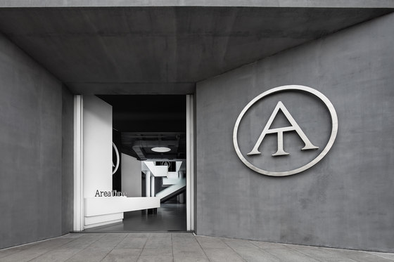
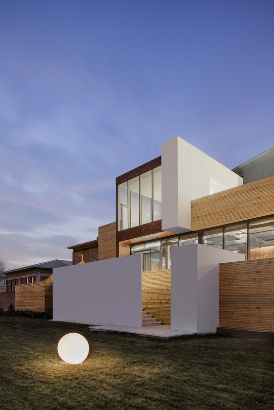
This project is located in a creative park in Beijing. When we stepped into this bright building, we understood that this area belongs to simple and clean. As a space used for meeting, conference and art exhibition, it should not just be a shining moment, but built up a memorable visual impression to audience in this space defined by our architects. This area does not belong to the interface space in ‘Area One’, or the spirit and language in ‘Area Two’, but the intersection of time, identity and narrative in ‘Area Three’ where we start our breakthrough.
No.1 Identity Breakthrough
Personality & Occupation & Interest
Our clients are three girls with diverse characters and personality. Almost all of them have multiple occupations: they are not only the ‘PE’ (Private Equity) of this era but also the leader in the fashion industry; and Area Three is an area they set up together for their friendship. However, it became our question to design this space with multiple personal tastes involved.
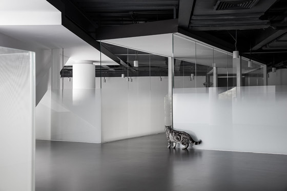
We came to the space and experienced the silence and purity brought by the existing building. It is the extreme silence that furnishes the space with multiple personality; and it has no boundaries, where there is no limitation to develop our design method. We believe that people need something beautiful, and beauty is something that people are all endlessly chasing.
Three girls’ lifestyle, aesthetic taste and social status determine their individual taste and interest for the space, while spatial design has built up a system to carry on a conversation according to the achievement of common language. Simplicity is always something ordinary, but also something most advanced. When we take off all the identity icons from girls, they are just people attending a party, talking with each other in such a clean and bright room.
NO.2 Designer’s breakthrough
Commercial & residential
Architect Cui Shu worked together with residential designer Wu Wei in this project. In China, designers in the industry are always labeled and bound with the category such as ‘Residential Designer’ and ‘Commercial Designer’. I thought residential designers can just do decoration work and some simple spatial layout for clients while commercial designers can do more. This stereotype has been kept in my mind for a long time until we process this project with Wu Wei. I found my idea totally wrong and the fact is about sense and sensibility.
What residential designers bring to the space is the service system for human. It is more about the relationship between human and space. They provide clients more with design service comfort and establish trust and confidence with clients; while commercial designers think more about space and architecture, which involve more logical thinking.
Designers are always dancing with shackles: They are always seeking a way to get rid of fetters but things could not be changed at all. However, an outstanding designer should not reject shackles. He should be willing to carry them on, facing the space as a professional, pushing the boundaries step by step, and then start to break the boundaries. This is the thing our designers should do.
NO.3 Function breakthrough
Club & Restaurant & Event & Art Museum
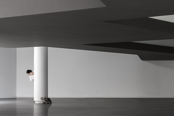
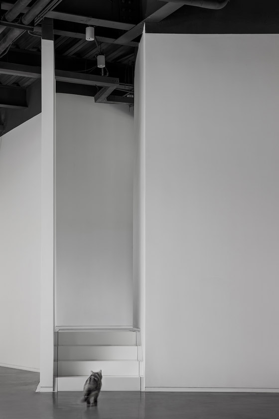
Each individual has multiple personalities, and each character is a different person, which has his own identity, memory, feature and behavior. Space also has its multiple characters. However, in Area Three, there is no constraint to define its function. It is just a room, which could be a club, a restaurant, or a space where people gather together; it could also be an art museum. It is a pure room where all the scenes could be endlessly conversed. Stories and narratives continue to happen, while Area Three is the origin.
In the entire space, black and white is also a kind of character. The relationship between each other is the same as the universe, which is conflict and unity where the universe is growing and creating a variety of beauty.
The unlimited extension and strong visual charisma of these two tones clearly and fully create an atmosphere for each person in the space. They leave a strong impression to people, and push people and things in the room to an aesthetic level that is more silent, which meets its commercial application value and thus attracts people to gather in such a simple and fashion space.
NO.4 Space Breakthrough
Architecture/Interior/Visual
The scope of how we interpret architecture space should not just be limited in length, height and width. It should be interpreted via things, human, order, feature and time. A space should not only has visual spatial forms of architecture/landscape/interior/graphic, but also spiritual meaning.
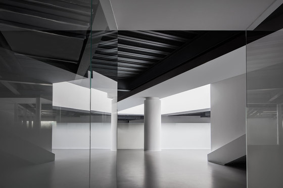
A project should have its unity, where boundary doesn’t exist. The boundary between vision should be ambiguous, and the geometric architectural pieces should be re-organized to engage audience into this space and allow them to have more scope for self- reinvention. Thus the audiences have more room to experience, imagine and relax.
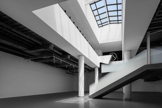
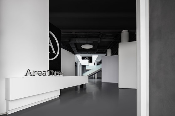
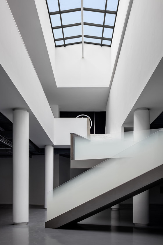
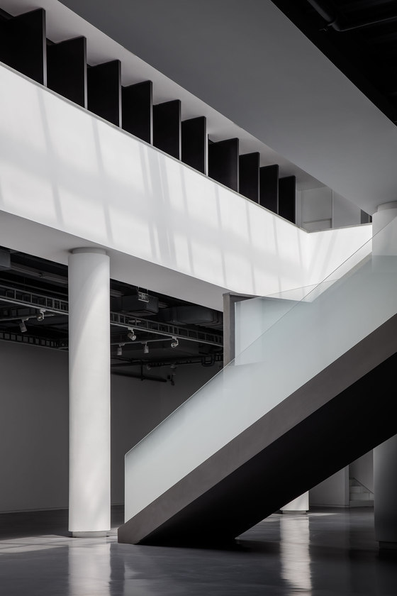
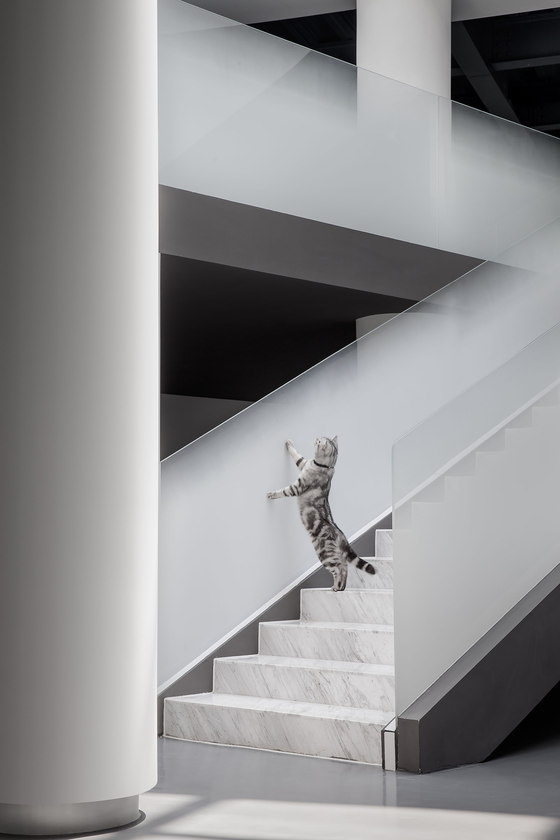
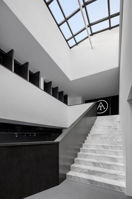
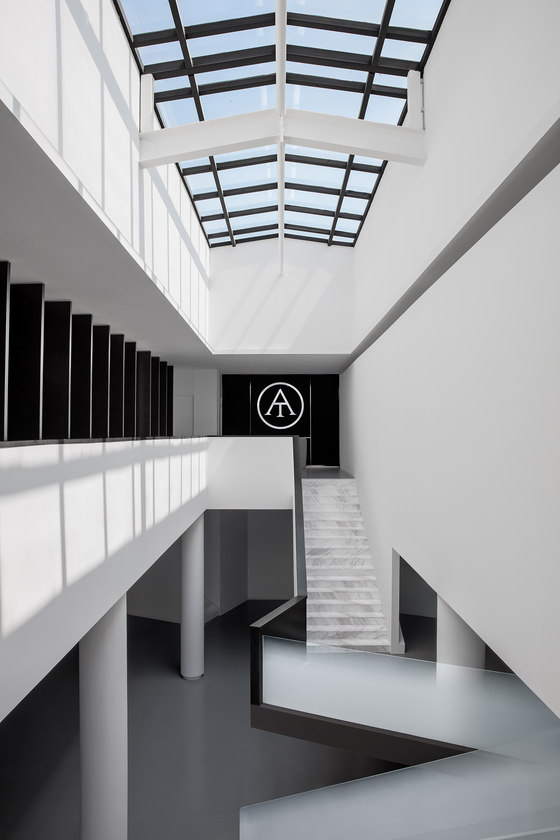
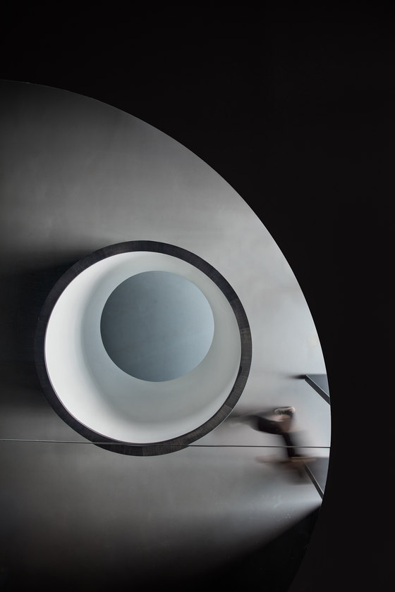
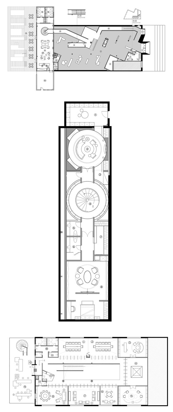
It is the white corridor that connects every entrance, exit, ramp and stair system. It sometimes enters a void atrium, sometimes goes through a narrow and semi-private space, and connects circulation conversion between storeys. The flowing system is not just a core of traffic, but creates a flowing order with great sense of body rhythm. The corridor weakened the sense of solid space, and forms different busy gathering space, thus guides people to communicate and interact with each other through these pathways.
CUN Design has set up two main entrances. They are the starting point of two circulations. The equipment, props and device need to access from one entrance on ground floor, which makes the bump-in and bump-out more sufficient during the event. Another entrance is the access to the glass corridor on the second floor. These two entrances can also interchange with each other. The atrium is the main area of Area Three, which creates dazzling displays of sunlight and a transparent environment.
The dining area serving the event is the connection to the exhibition area(atrium). The design method of different tones is applied according to functional area through the narrow pathway. In the whole project, this dining area acts more as a confluence of pivot, which keeps operation to provide food and beverage. It can serve the exhibition area, private room on the second floor and the courtyard in the back at the same time. Customers can also relax and chat with friends here in the dining area.
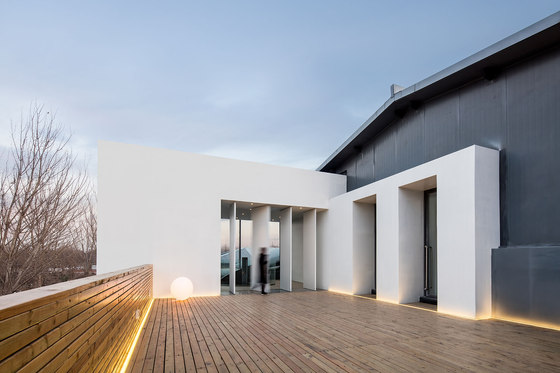
Although the transition space plays a minor role in function, it is the leading role in expressing emotion. It doesn’t isolate or separate the neighbor, but more transfer from close to open, certain to fuzzy, single to complex. It breaks the boundaries in some degree and allows the whole space to form a sense of unity. The courtyard on the back could be accessed via dining area and the indoor events could be extended to this space. Here people share lifestyle, great delicacy, sorrow and joy. The emotion gets communicated and pressure gets released in such an open space.
CUN Design no longer applied a huge amount of white in the restaurant as what they did in the main area, but darkens the walls around. When the door is closed, the walls around seems to be extended infinitely. It is kind of interesting to enjoy delicacy under candle light diffused by the metal ceiling and with sculptures in four corners "staring".
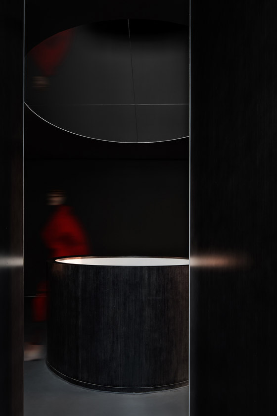
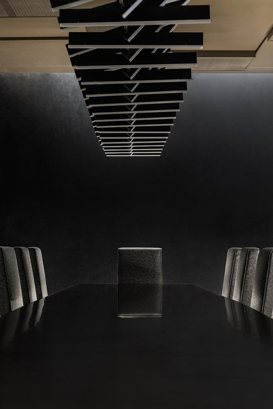
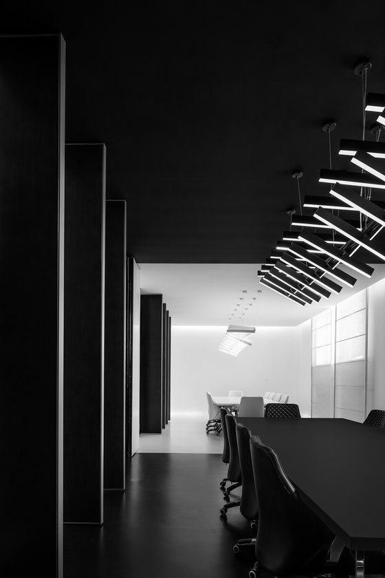
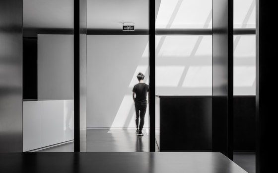
As our clients are three girls with distinctive characters, we divided the big meeting room into pure white and pure black to represent two different characters of them. Black ceiling to floor revolving wood doors are used in all entrances on the third floor, the sense of sequence of the space endows the architecture more emotion, makes it more artistic and transparent, so as to influence the visual perception experience of visitors. This is an approach to express time, a design concept, as well as a very important design method in space design.
Meanwhile, the third floor is the reception area equipped with dining area and meeting room. It is the core area of the whole space as a certain commercial value could be created here from visitors.
NO.5 Relationship Breakthrough
Service Provider & User
In modern life where internet communication has taken the place of real communication, though we had a great time in virtual world, we are more lonely and isolated then we were thirty or forty years ago. Area Three is a place where you could find a real fellow in the real scene. In a great party or event, when your laughter penetrates into this space, there will be a feeling in your heart which reminds you that: you are a human beings, you share the same emotions with your own kind. This is what we long for in modern society, a sense of identity.
Area Three presents the relationship between service provider and user as well. The process that a designer delivering a project is the process of getting on with the client; a good project needs good design as well as skillful handling. The consistency and difference of the identity generated by above "relationship" requires to be constantly communicated; and this kind of identity will lead to the unity of aesthetic in the process of designing. In every space, designer is the symbol of creativity and identity. Even after the completion of Area Three, we often get together with our clients in this space to have better perception of this space as a user.
"Get boxed in" is the fastest way to kill our creativity.
Breakthrough - wait silently for the beam of light that make ourselves more than what we were.
Design Company: CUN Design
Architects: Cui Shu & Wang Jizhou
Interior Architects: Cui Shu & Wu Wei
Project Designers: Liu Xiaoyu & Ma Shijia
