The project was immediately confronted with the organization of the existing spaces, arranged around a central pathway, with a clear division between living and sleeping areas. Internal circulation was interrupted by the presence of the corridor, made dark by the poor passage of natural light. The design path opens up to the possibilities of space and the needs of the two young owners. The intervention completely transforms and revises the existing building, trying to make the rooms as connected and bright as possible, taking advantage of the flat’s double exposure. The walls in the centre of the flat are eliminated to connect the rooms and make circulation fluid. The different functions maintain their location, being interconnected by continuous furnishings, which develop on the new design of the spaces. The design creates volumes and punctual furnishing devices to create new relationships and mark out the various uses. The customised furnishings not only characterise the various rooms, but also make the most of the available space by articulating into storage units, partitions, sliding panels with different colours and textures.
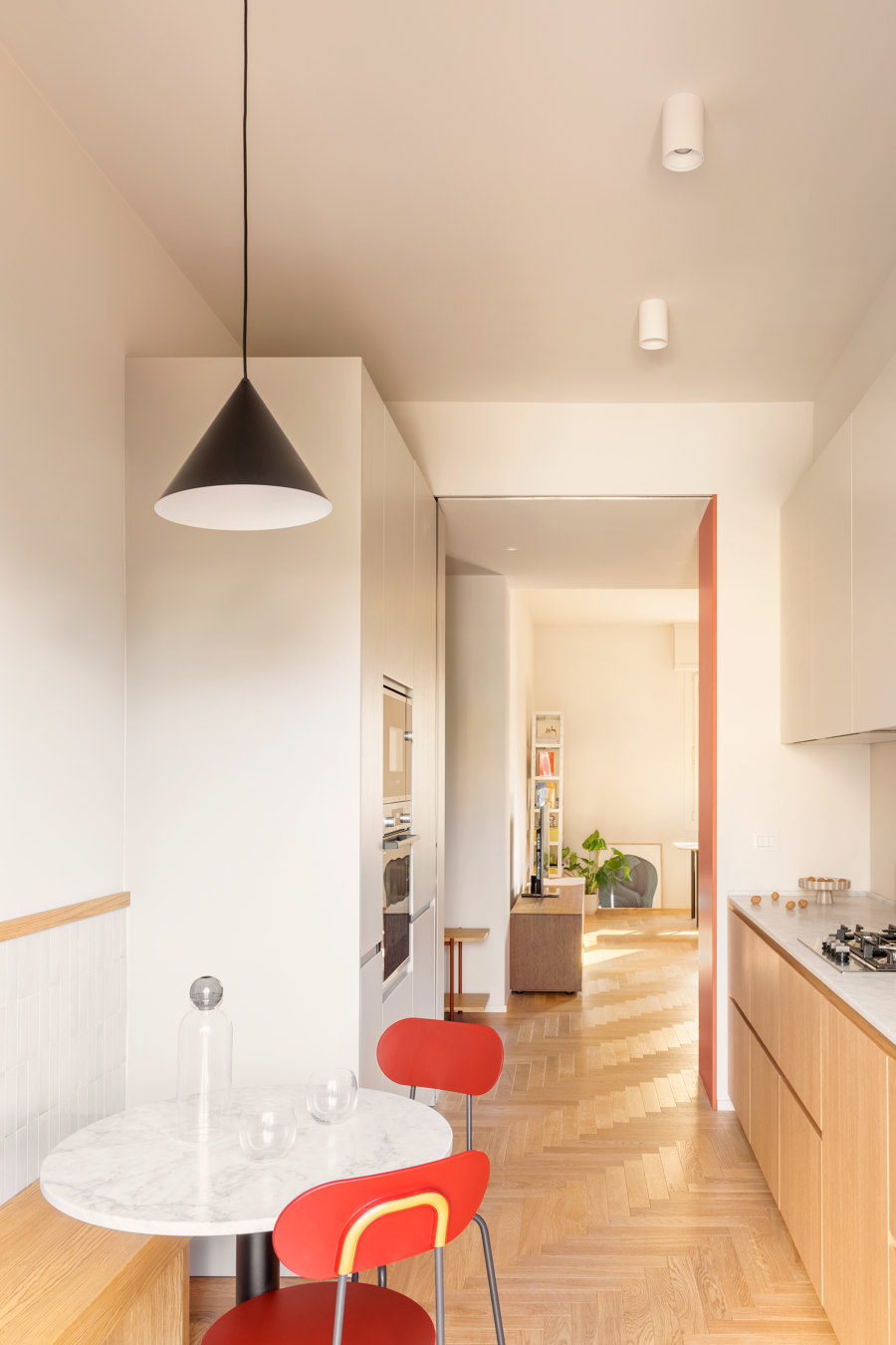
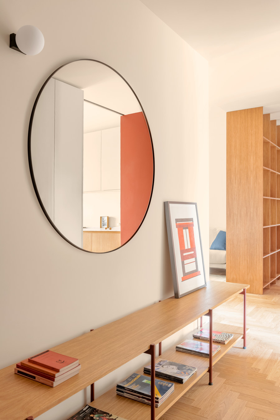
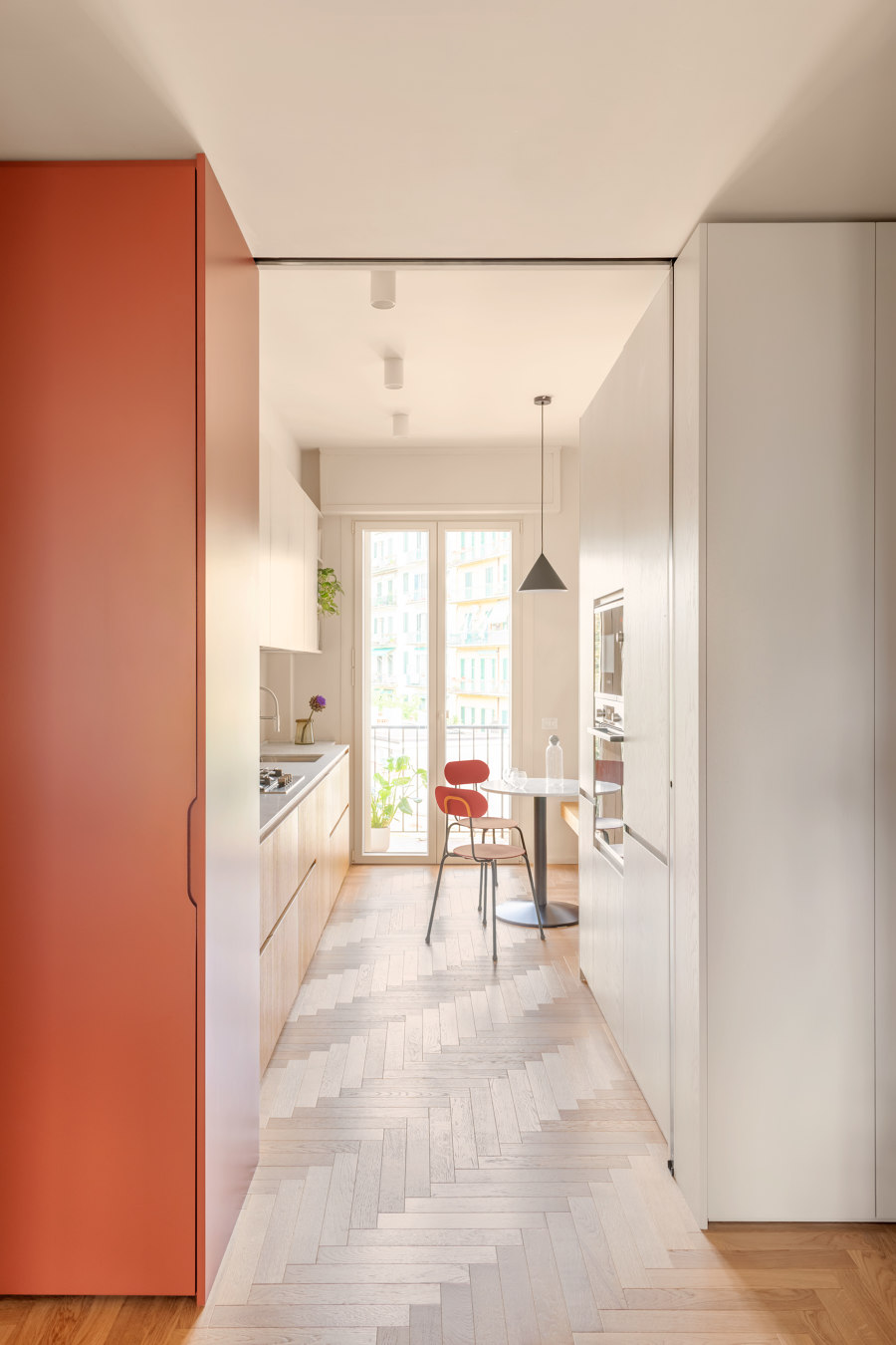
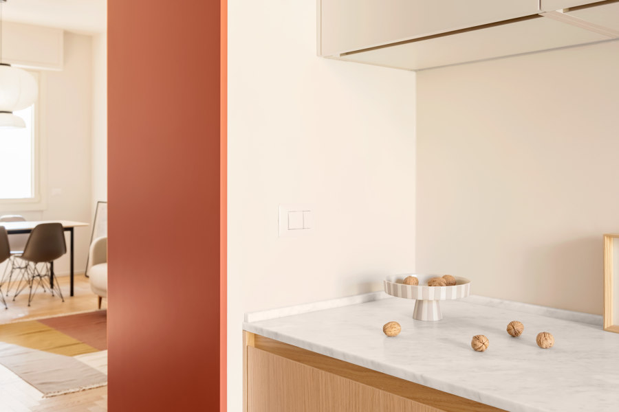
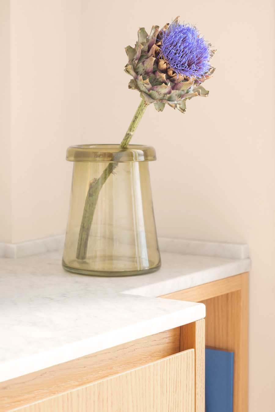
The house is entered through a large entrance hall, where various volumes and furnishing devices are placed. Among these, a long cabinet with double oak shelves and an enamelled metal frame is used both as a bench and as a place to store objects and clothing. Above the bench is a large circular mirror, while a full height lacquered oak wall unit occupies the opposite wall. It is a piece of furniture that runs along the corner between the entrance and the kitchen, placed at the transition between the two spaces. This wall unit has a dual function, at the entrance, that of wardrobe and storage for most of the utensils associated with the young couple’s passions, and in the kitchen, that of incorporating the tall units and pantry. The cabinet also contains a sliding glass door, which closes off the kitchen but still allows light to pass through. The project is the synthesis of a wide-ranging and articulated process developed with the clients, in a continuous dialogue that could bring out their needs, daily habits, special requirements and could therefore create a space tailored to their needs and to their expectations”. Lavinia Modesti The kitchen is completely renovated, distributing the furniture and organizing the activities on the two main sides of the space. The kitchen furniture designed by the studio is modeled on the characteristics of the space. The choice of materials makes it cosy and informal, the natural oak cabinetry and the Carrara marble top are balanced with the lacquered wall units.
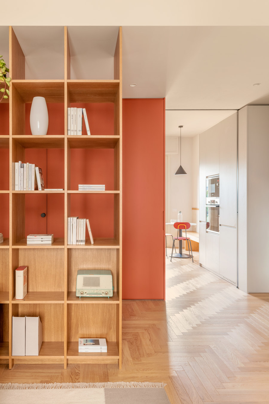
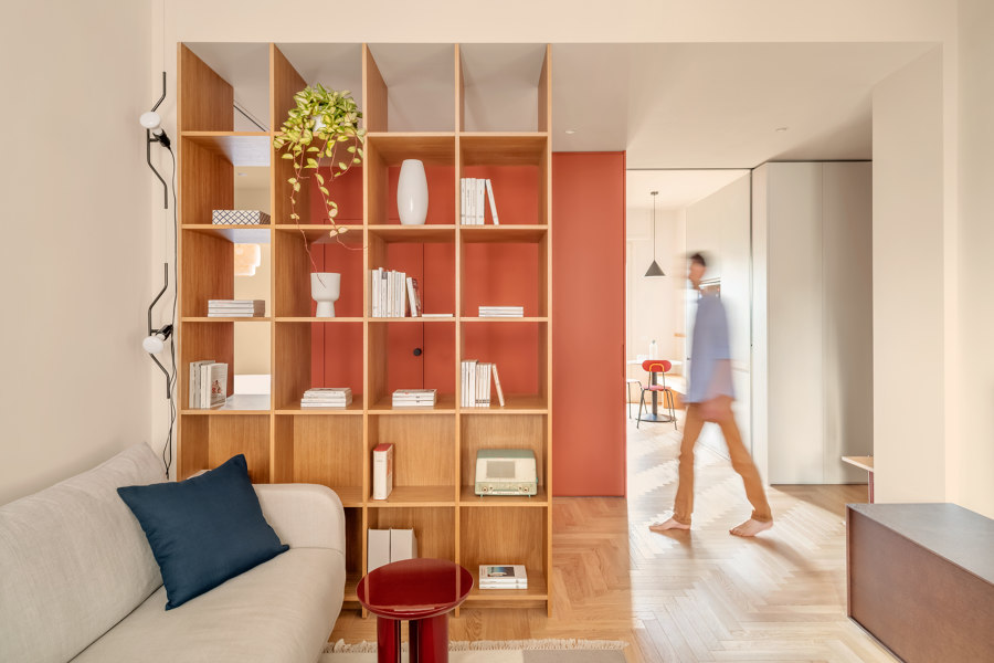
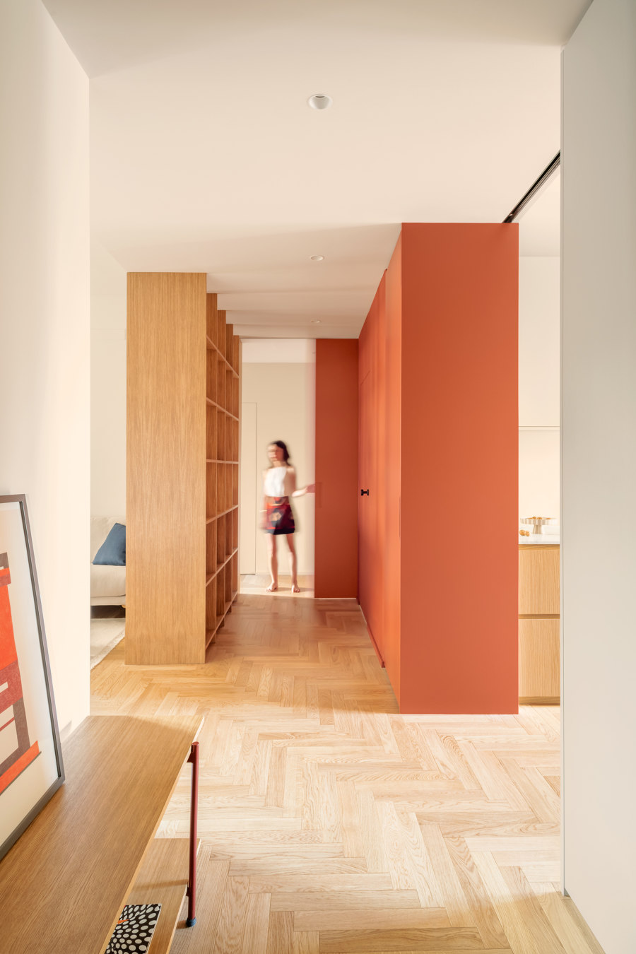
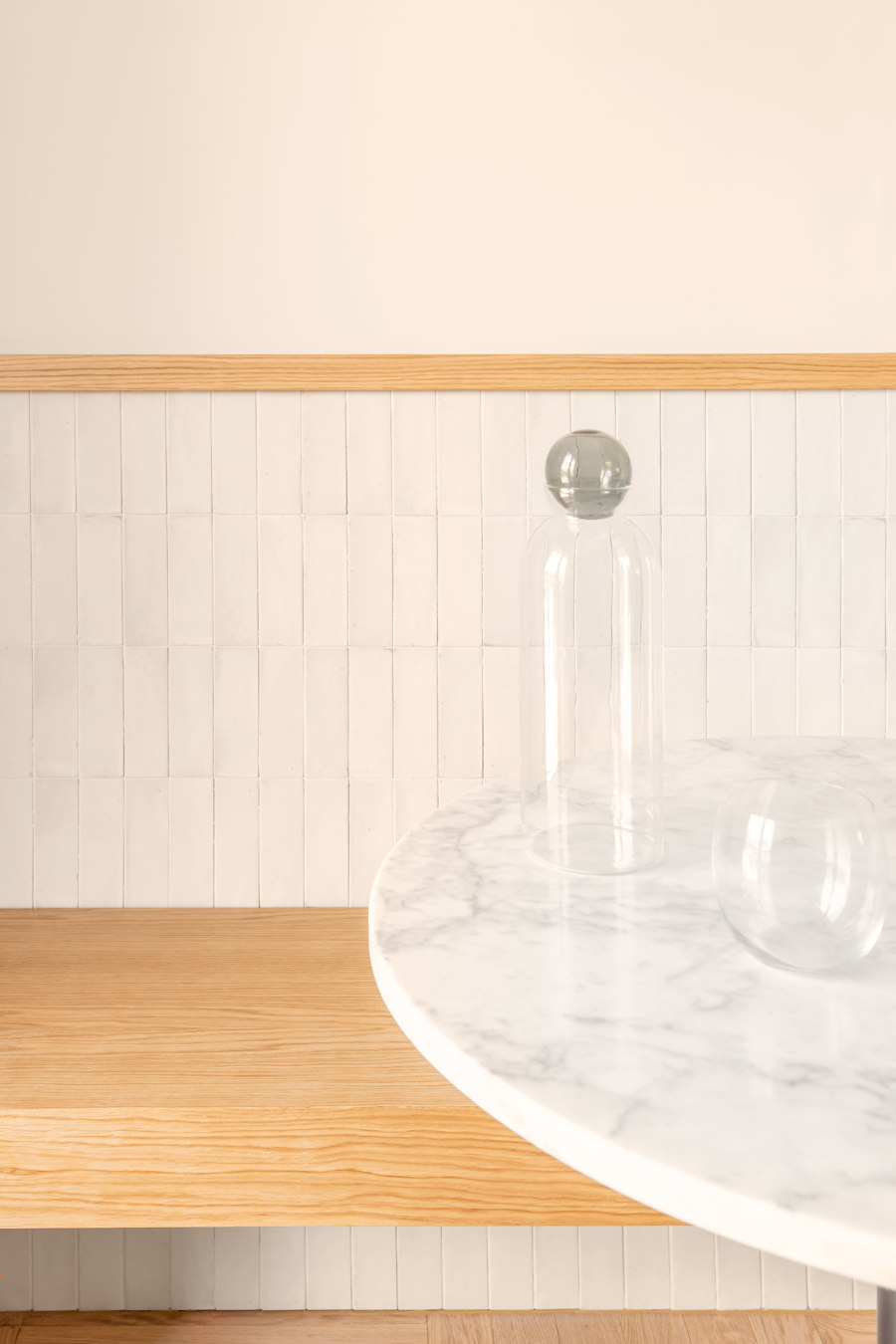
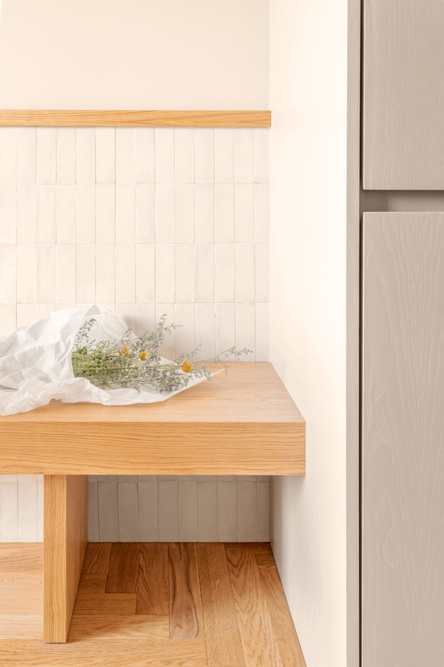
Along the opposite wall, there is the volume containing the columns and the pantry, which continues towards the door to the balcony with an oak bench with a rectangular white tile backrest. The bench is used as a seat for a small circular table, also made of Carrara marble, where one can eat in company or share food preparation. The central distribution space is now an open space, divided only by a full height sliding panel, which allows the division of the living and sleeping area. This space is overlooked by the various furnishing volumes, which dialogue with each other and relate the spaces. The volumes are designed by clear geometries, according to different tones and materials, and alternate with the two concealed sliding doors that open and close as required. In the central space there is a false ceiling with a lowered height compared to the other rooms in the house. On the threshold of the living room is an oak cabinet with a through-structure, used as a bookcase and objects container. The cabinet works like a filter in the space, dividing the rooms but allowing light to leak through. The living room is divided into two distinct areas: one dedicated to conversation, with a sofa, the other is occupied by a large table with an oak top for dinners with friends. On the wall is a low walnut console table and a metal shelving unit. “We have designed every element that makes up the interior of the house, from the design of all the spaces, to the choice of materials and finishes, through the selection of every single furnishing, to the design of the custom-made furniture with the sole objective of making the flat bright, welcoming and functional” Javier Deferrari.
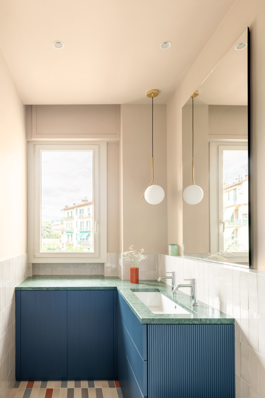
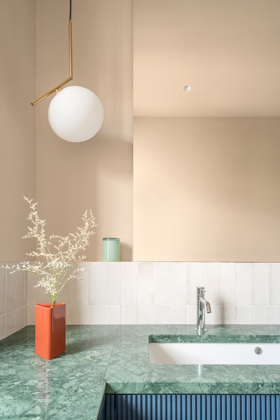
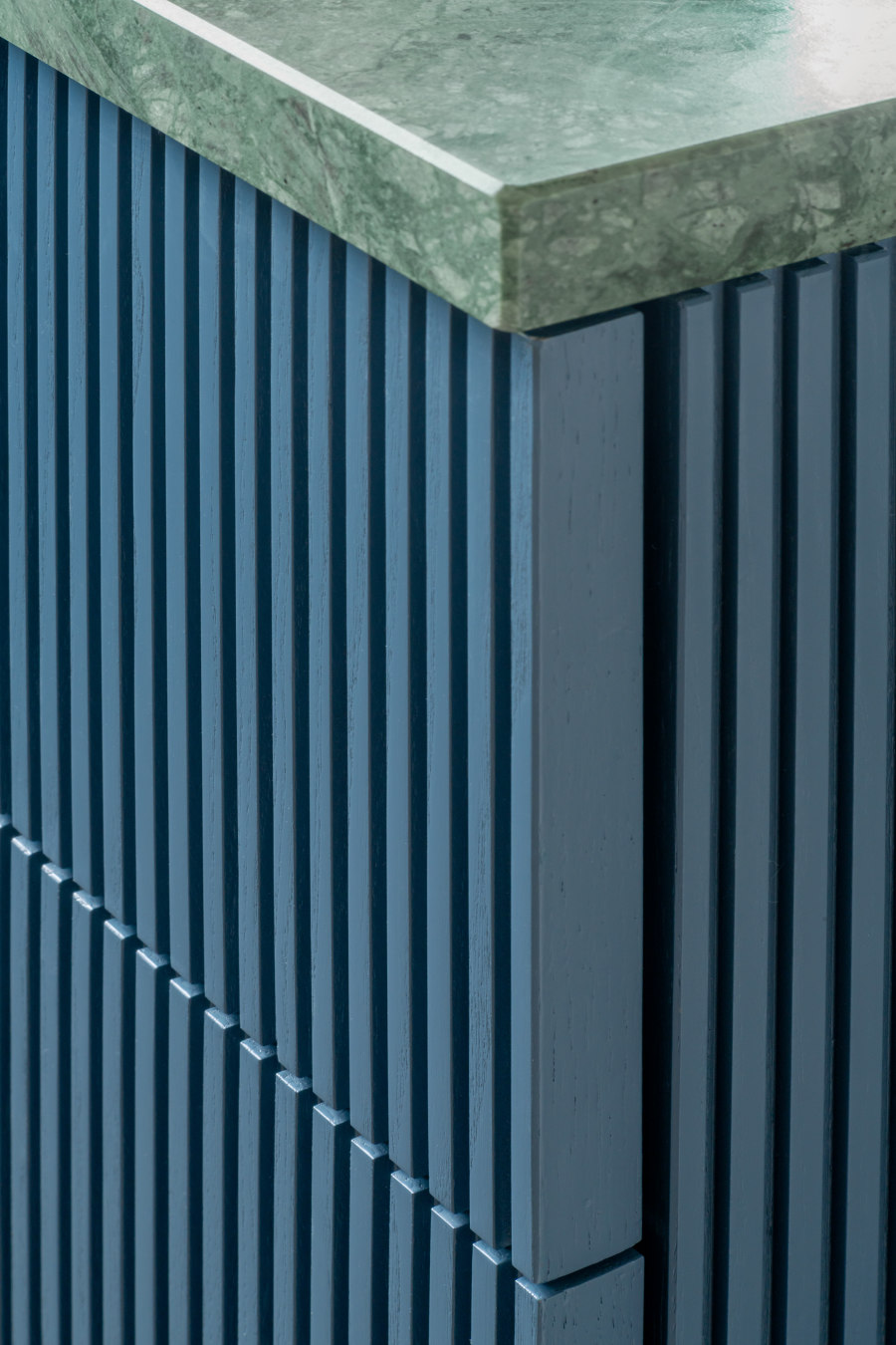
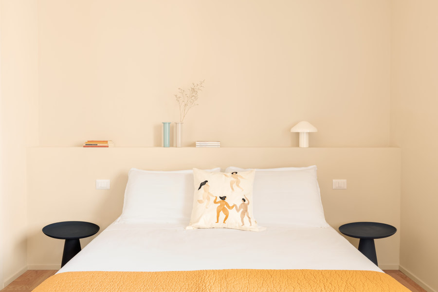
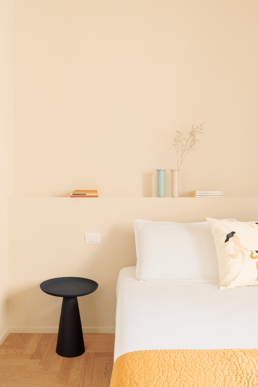
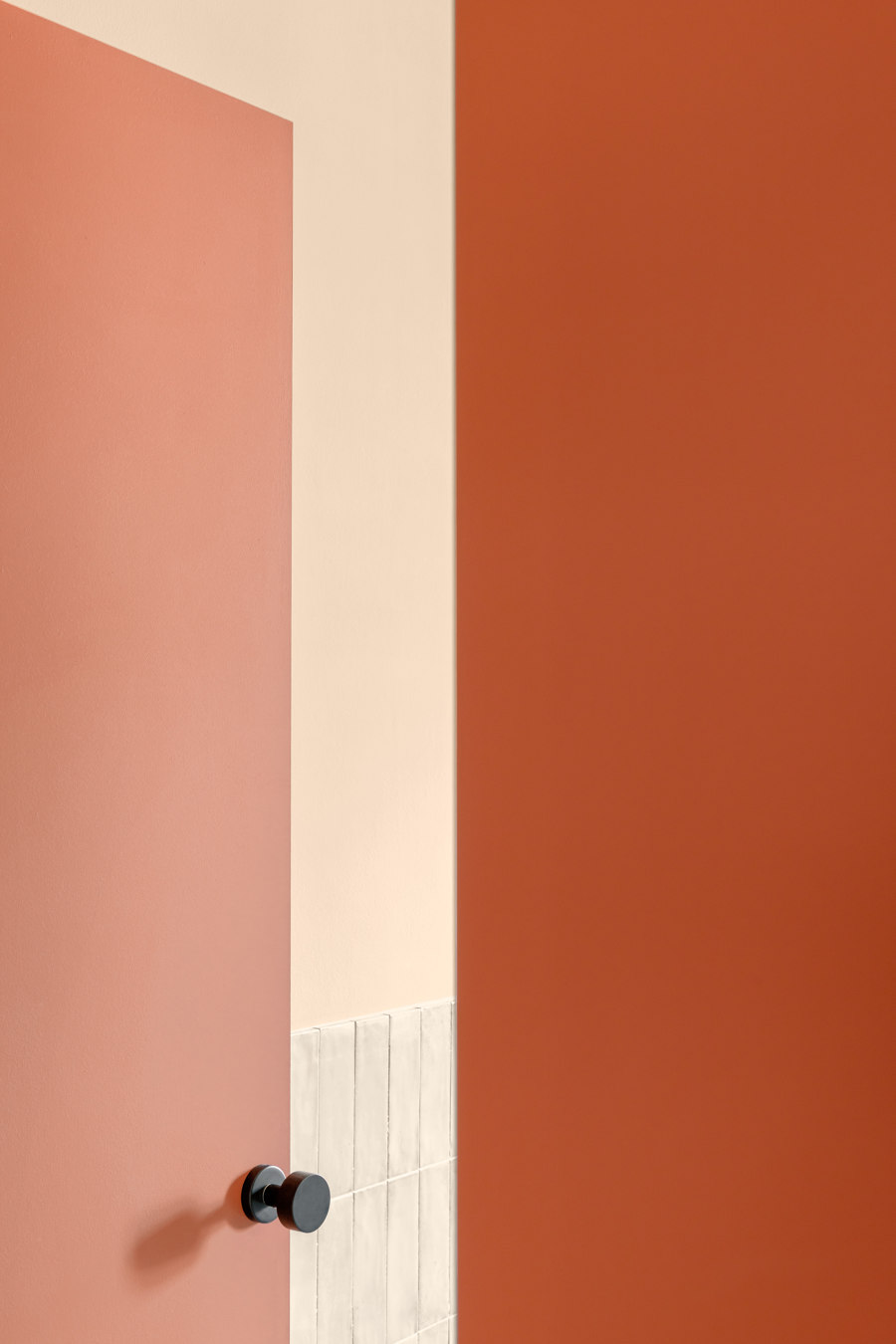
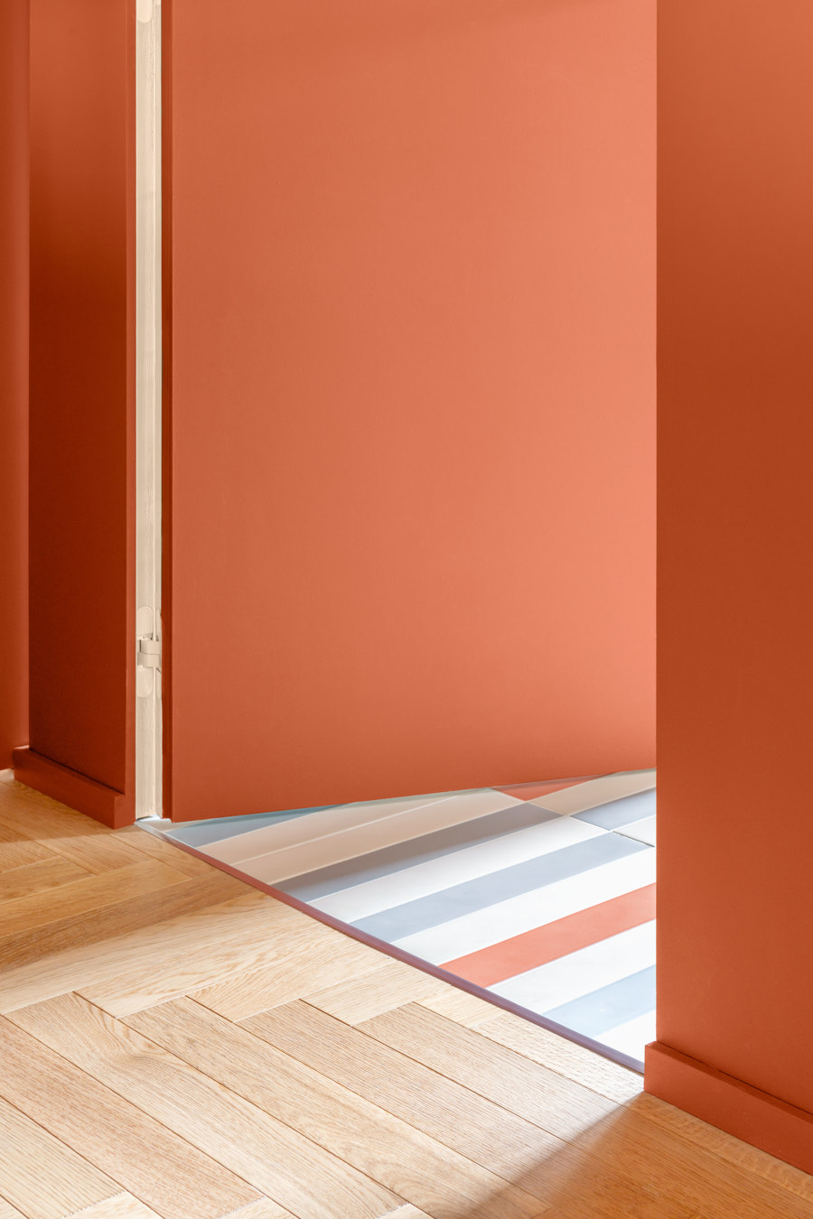
The entrance wall to the bathroom houses a storage unit that borders the kitchen and a full-height sliding panel that delimits the living area, all painted brick red to even out the surface and conceal the access door to the bathroom. These elements are configured as a unique volume, which faces directly onto the central space, alternating the colour of the surfaces with neutral or natural essences of the other volumes. The bathroom is organized with a masonry shower compartment next to the entrance, thus freeing up the only window on the wall opposite the entrance where a cabinet is set up that not only contains the washbasin but also houses the washing machine. Designed by the studio, the cabinet characterises the bathroom with its lacquered canned finish and large Guatemala Green marble top. We pass to the sleeping area, whose rooms are completely redistributed to include a walk-in wardrobe and a storage room between the bedrooms. In the main room, in addition to the bed with masonry headboard, there is a reading corner and access to the walk-in wardrobe. The passage is lined with a lacquered wooden boarding, fitted with an ochre-coloured fabric curtain. Here the project has made maximum use of the available space to create a spacious and well-equipped walk-in wardrobe. The design opens up to the use of colour and different materials, in neutral colours varying in intensity between the living area and the sleeping area, creating a cosy, enveloping ambience. Throughout the house, an Italian herringbone parquet floor is installed, uniting the spaces and expanding their proportions. In the bathroom, the parquet is replaced by a floor with porcelain tiles in alternating colours, with a three dimensional, sculptural effect. Ceramic wall tiles are also used as boiserie in the bathroom and shower compartment panelling, both in neutral tones.
The project involves the interior spaces of a residential flat at the foot of the Fiesole hills, in the Le Cure district of Florence, inhabited by families and young people who choose to move here because of the ample presence of services and greenery, which blends in with the surrounding hilly landscape. Here, the DEFERRARI+MODESTI studio of Javier Deferrari and Lavinia Modesti has created a bright and cosy domestic environment set in a late 1970s complex, which develops around a large inner courtyard. The owners are a young couple: Alice is passionate about fashion and clothes and devotes herself to numerous pastimes that have manual skills as their common denominator and that lead her to need storage furniture where she can store all the materials she needs. Diego, on the other hand, is involved in urban regeneration and needed a place where he could work and study. The studio was involved with the request to design an informal and hospitable space where he could welcome friends and cherish his lifelong passions.
Design Team:
Project Designers: Javier Deferrari, Lavinia Modesti
Collaborators: Oliviero Martini, Sara Panchetti
