Overview
MetLife Vision 2020 strategy was created with the objective to unify 7 various offices into 2 locations defined by a single corporate culture and work environment. The 2 locations, Tokyo Garden Terrace and Olinas Tower, are connected by a single subway line with an overall commute of 30 minutes. A complete workplace reset and global approach to the design was implemented and the projects mantra became “Bringing Our People Together”.
Information
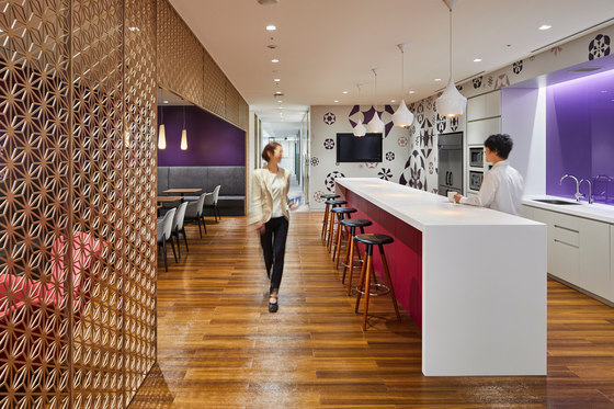
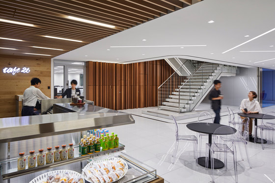
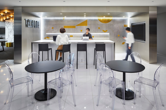
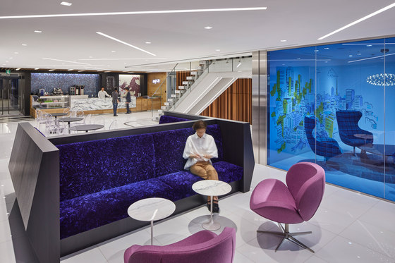
The Tokyo Garden Terrace location features 6 uniquely designed collaboration Clubs, a café space, a reception and client conference area, a TechLife bar and game room, and various wellness spaces. Each Neighborhood is comprised of one or more teams that share a variety of work settings and services for printing, filing, meeting and storage.
Concept: MetLife set forth three principals of the global workplace strategy
The Square is the space where all users of the building meet one another; staff, visitors(MetLife and MetLife partners) and perhaps even family. The Squares provide the strongest brand message which celebrates the MetLife culture, putting the work on display and highlighting the most important assets of the organization: its people.
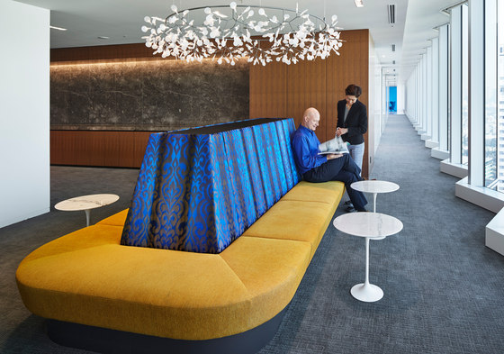
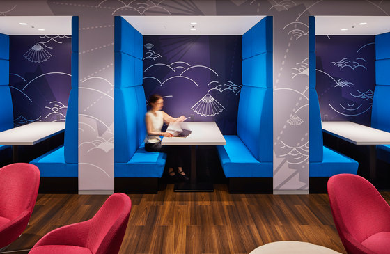
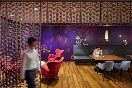
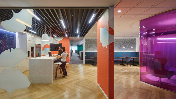
The Club is the second environment where occupants or visitors on the specific floor meet. Clubs are located at the immediate entrances from the elevator hall. The Clubs are specifically designed to promote group activities, impromptu socializing, and act as a landmark to orient the associates. Each Club is an alternative work setting that enables associates to easily change their environment and feel inspired. Graphic branding at the Clubs activate the cultural themes that drive the design of these communal spaces.
The Neighborhood is comprised of one or more teams that share a basic set of tools that support them in their daily work. The open office is divided into Neighborhoods at a more humanistic scale that promotes inter-personal relationships. Department boundaries are blurred reinforcing a single company concept.
This strategy ensures that amenities, daily sustenance, alternative work settings, support, and wellness spaces are accessible to all associates at 3 different scale levels: the office-wide level, each floor level, and at each open office level. Ubiquitous WiFi, built-in power, writable walls, easy access monitors, and new initiatives for a paperless environment, all contribute to a more mobile way of working that offers workstyle flexibility to all associates. The client also set the goal of achieving LEED Gold certification which requires the careful selection of materials, optimal lighting, access to natural light, energy efficiency, and air quality as a commitment to environmental responsibility. The office space design is a reflection of MetLife’s global presence mixed with local flavor derived from the rich Japanese culture to create a dynamic, collaborative, transparent, efficient, and human work environment that promotes wellbeing and communication.
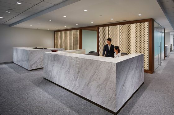
27F Reception Lobby
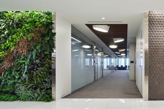
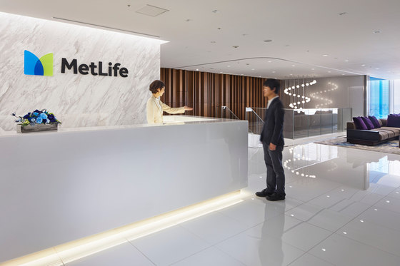
Biophillia design is the key feature for greeting visitors and signifying the company’s commitment to sustainability.
Media technology is embedded in the green wall and is balanced by a spiraling light fixture suspended over an open stairwell.
26F International Stair and Café
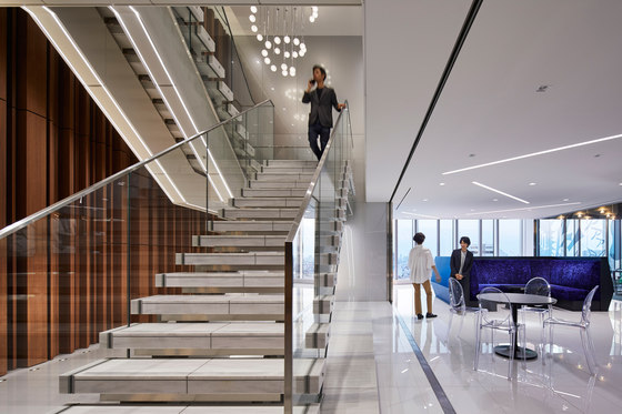
A marble stone and glass stair connects the 27F Reception and Conference Center with the 26F Café, TechLife Bar, and Game Room.
The floating marble treads are set against a vertical wood wall and the stringer is highlighted with LED lighting.
21F Irori Club
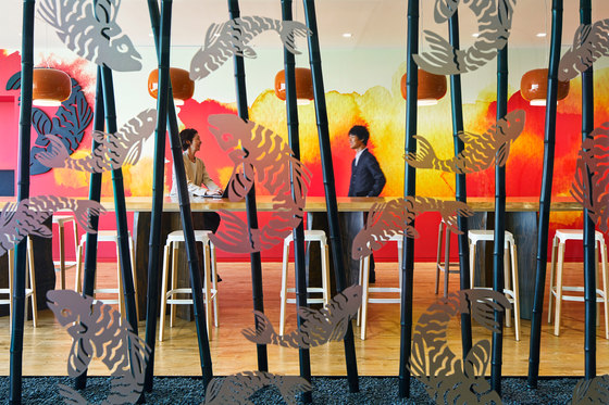
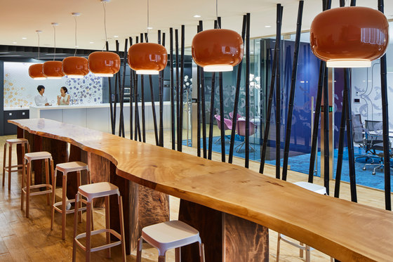
This collaboration/pantry space is based on the Japanese concept of the sunken hearth which symbolizes a place for community and conviviality.
The space features a large spliced Tochi trunk wood table surrounded by images of bamboo, koi fish, and the warmth of fire.
26F Café
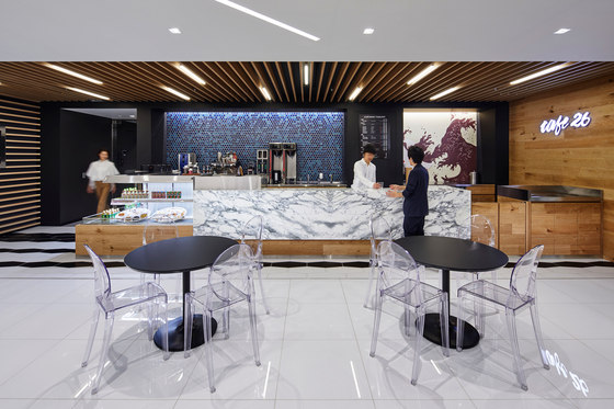
The Café 26 features a white marble counter, blue mosaic tile, and a graphic interpretation of coffee in the spirit of a ukiyo-e painting. The above materials are balanced by warm wood plank wall and wood louver ceiling.
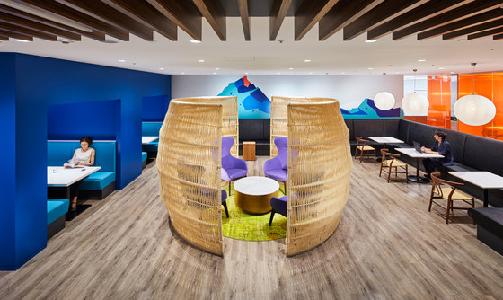
26F Mt. Tateyama Club
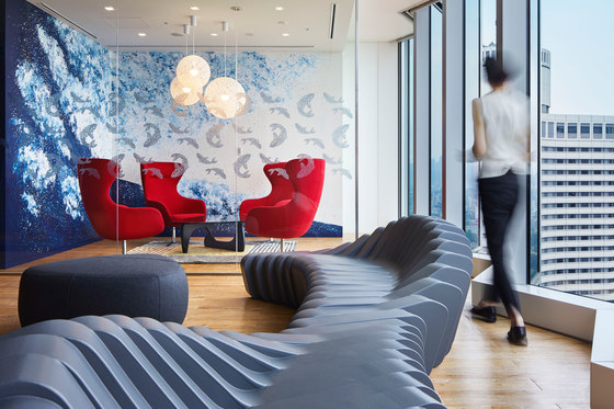
This collaboration/pantry space features the image of the peak of Mt. Tateyama(one of the 3 holy mountains in Japan) as the place of heavenly peace to the resting soul.
The blue and green graphics serve as the background to the central meeting pod made of roughly woven rope.
26F Open Office
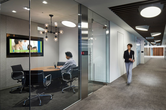
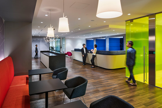
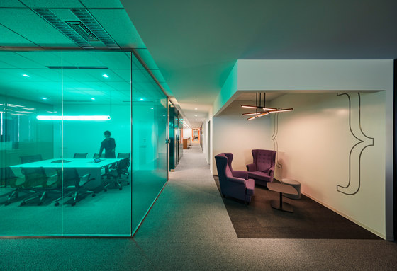
Colored glass meeting rooms are used for wayfinding and orientation in the open office area.
Small corner breakout areas allow for adhoc conversation and can function as a creative space with a writable wall.
36F Game Room
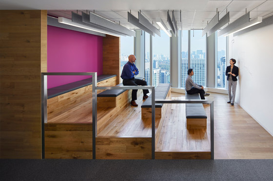
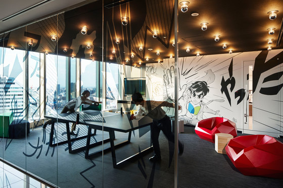
Theater steps are used for informal huddles and internal seminars but can also function as a general hangout area.
Wood steps and writable wall are complimented by a vibrant acoustic back wall and suspended felt baffles.
26F Theater Huddle
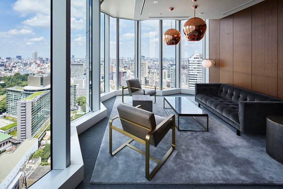
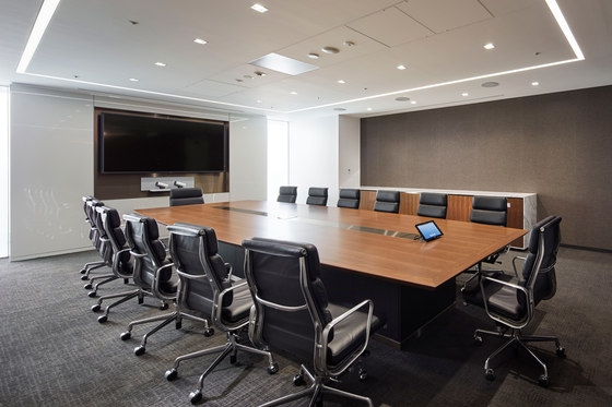
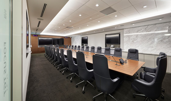
The boardrooms are equipped with advanced AV technology(featuring laser guided microphones embedded in the ceiling and side monitors) and a sound isolated translator’s booth.
The centerpiece is a walnut wood table with custom brushed brass inlay and high quality leather executive chairs.
MetLife
Design Company: Garde Co., Ltd.
Designer: Hidekazu Tsutsui, Christopher Brooks, Shinyin Lee, Naoto Sudo, Seiko Inoue, Miho Okubo, Jiyeon Kang
