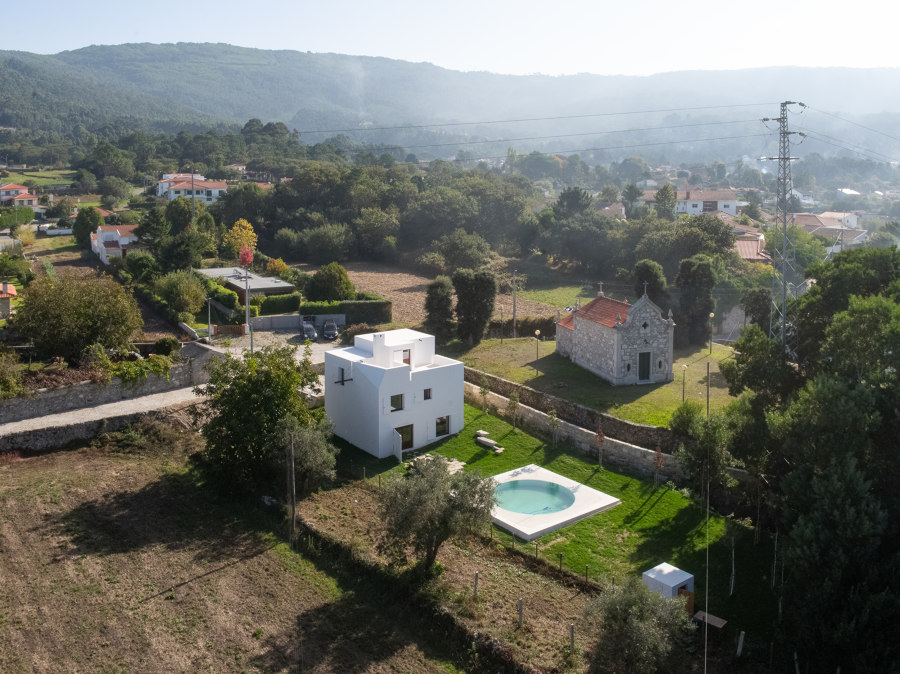
The house is built in the north of Portugal, in a rural settlement that was established at the foot of the hill and expanded towards the plain, which is used as arable land, and extends to the sea.
The land is separated from a chapel by a walkway, and it is located at a lower level. It is long (about 60 x 18m), and there is a gentle slope. The chapel stands on a base of granite walls with its entrance facing west, and it imposes itself in that area. Its presence had an influence on the project, particularly as regards the design of the volume, its implementation in the space, and the definition of the constructive details. The house sought not to disturb the harmony of this religious space. At the same time it did not want to be submissive to its presence.
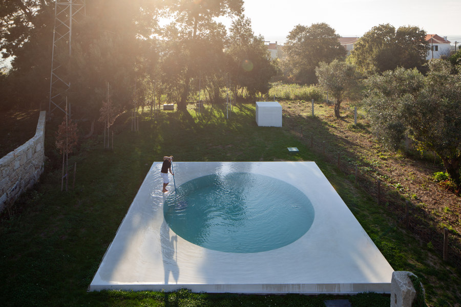
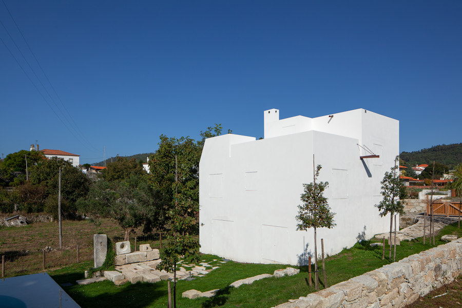
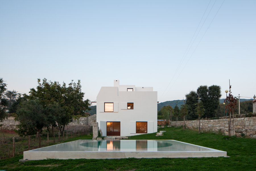
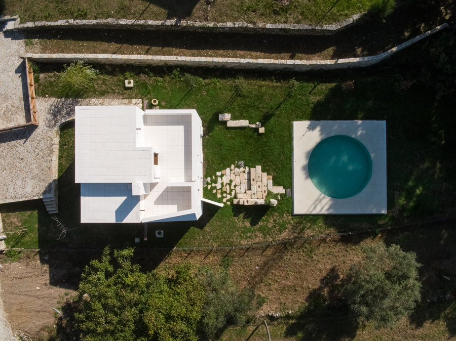
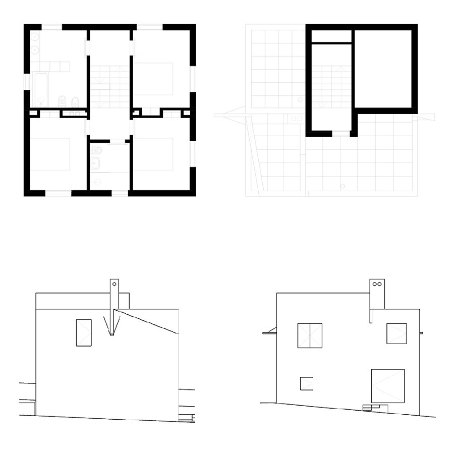
The volume was established away from the street so as to create an outside area of arrival and to keep the building in the background towards the chapel and its relation with the public thoroughfare. The width of the house (8.6m) was defined by the deviations that the width of the land determined. A square implantation was defined and repeated in the swimming pool and in the space between both. The regular volume, compact and vertical, evokes the essence of a traditional type of construction in the region of Minho.
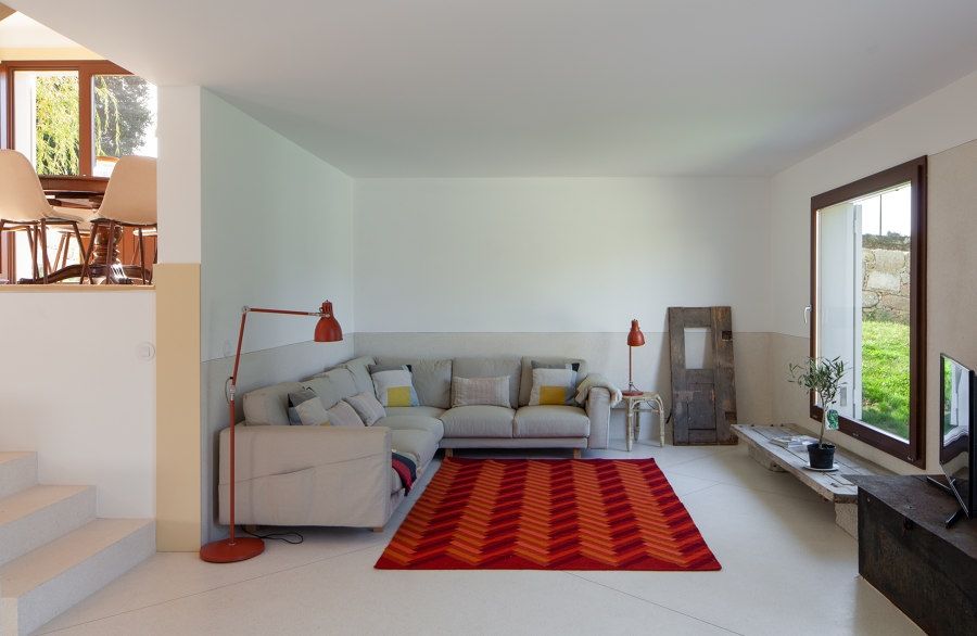
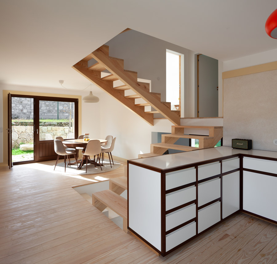
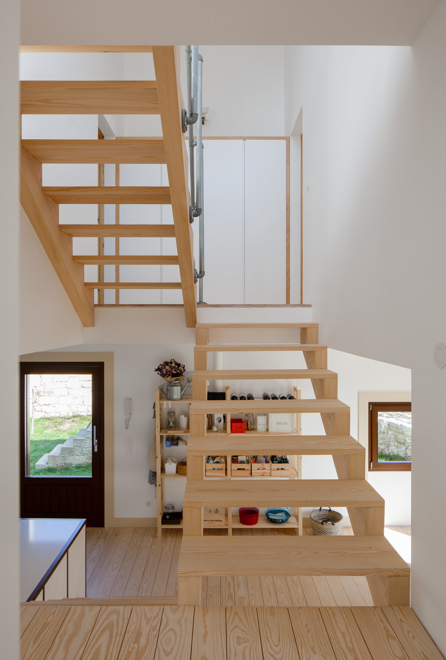
Another of the intentions of the project was to respect the natural topography of the land. In order to comply with it, the building was adapted to the existing elevations through half floors, which allowed a direct relationship with the exterior on the South and West side of the house. The useful space was capitalised on by the installation of the ladder in the centre so as to minimise the circulation areas, and promote the path that culminates in the roof terrace – the fifth elevation – where the discrepancy between the levels is clear through the volumetric organisation. Analysing it a posteriori, this association of spatial elements carries with it some 'Loosian' reminiscences.
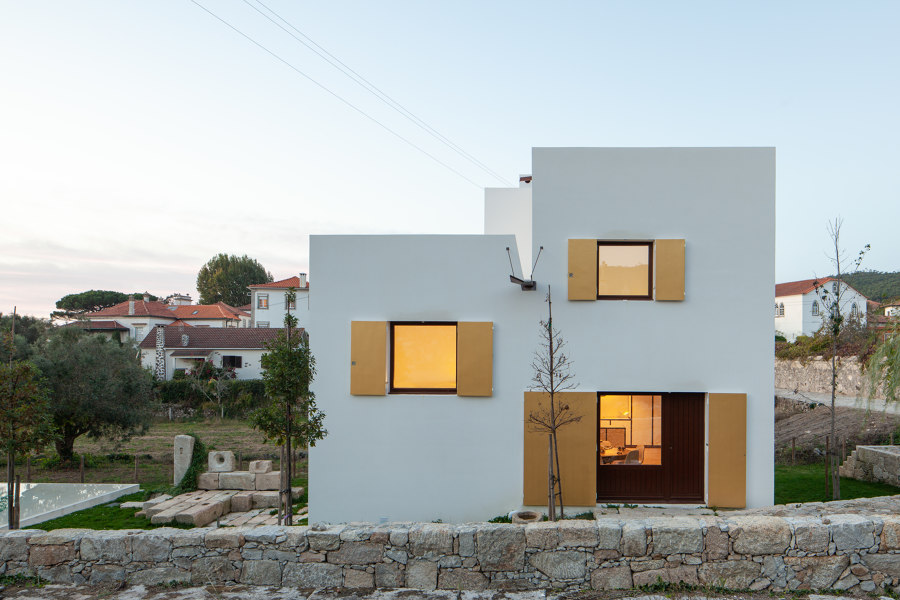
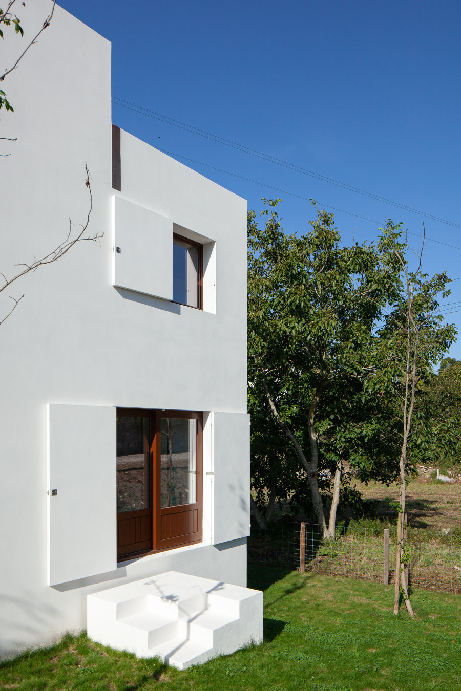
There is a strong contrast between the exterior and the interior. The façade functions as a shell that occasionally allows, through openings, the contact between the house and the world.
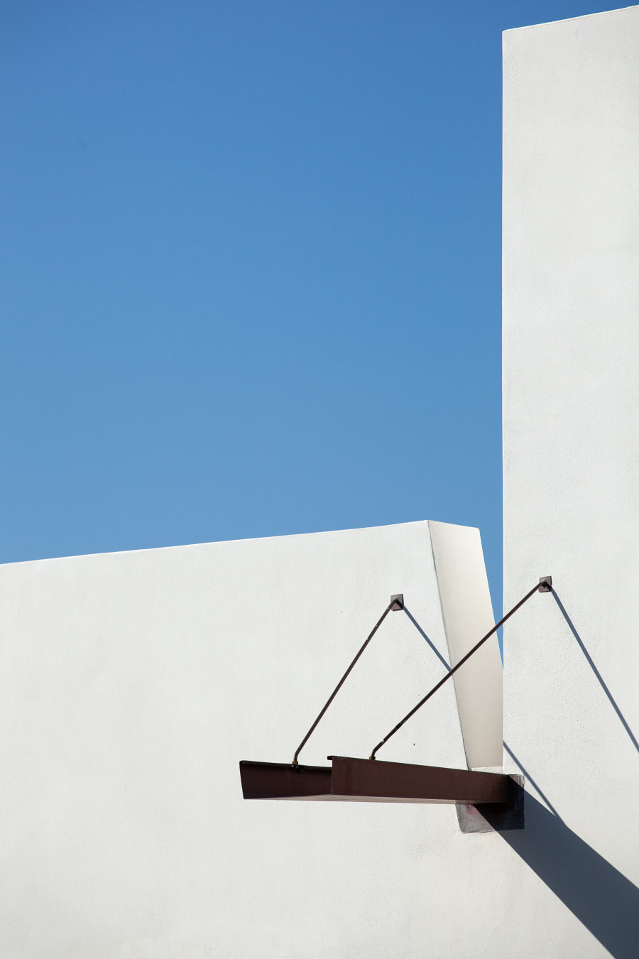
When the shutters are closed, the façade is its own denial, it is an anti-facade. It cancels an interior, suggesting only matter. It would become an abstract sculpture if the two copper gargoyles did not denounce a functional concern. The ornamental exaggeration of those gargoyles contrasts with the dryness of the facade.
When they are opened, the portals reveal an interior with different materialities that takes its inspiration from vernacular architecture. The portals of the South elevation (facing the chapel) invoke the gilded carving, and also recall, in an abstract way, the medieval religious paintings created in triptych.
The window frames are made of wood, just like the skirting of the entrance floor, and both are painted with colors used in times gone by. The skirting has a freedom that allows it to wander through the area, assuming a character which is both plastic and functional. The floors of the ground level are made of terazzo with brass joints, and the remaining levels have wood floors with open joints. The interior doors do not interrupt the plane of the wall – they choose one side, and lean back. The house is old rather than modern. The swimming pool is what it is.
Design Team:
Guilherme Machado Vaz
