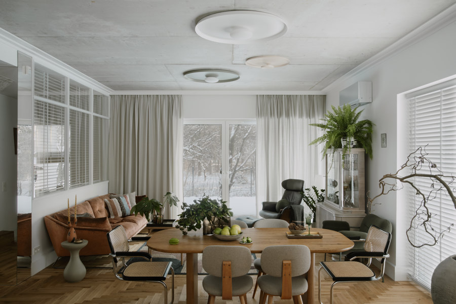
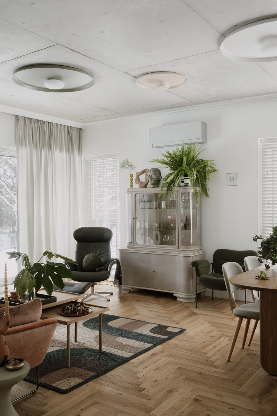
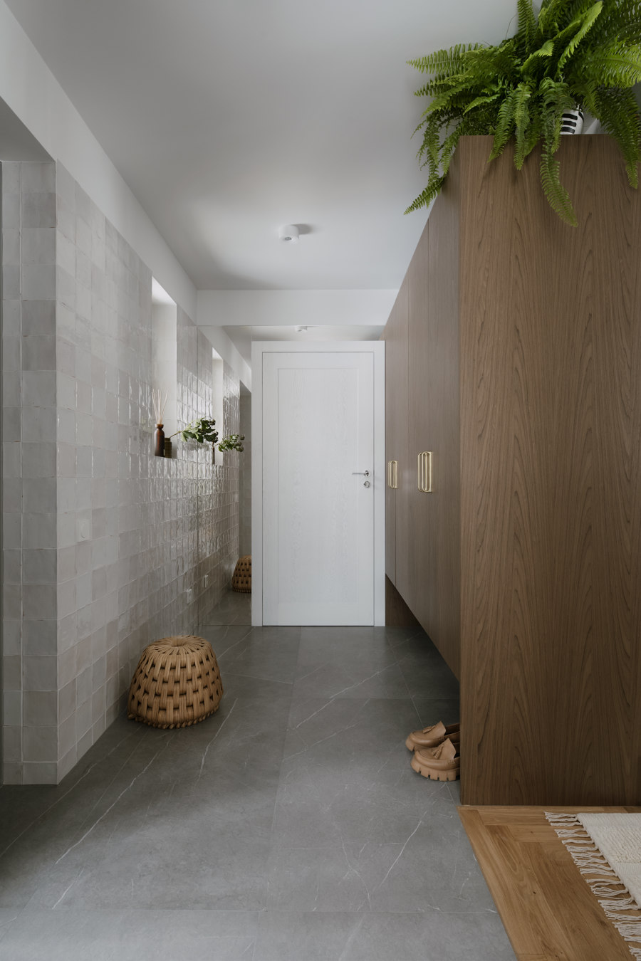
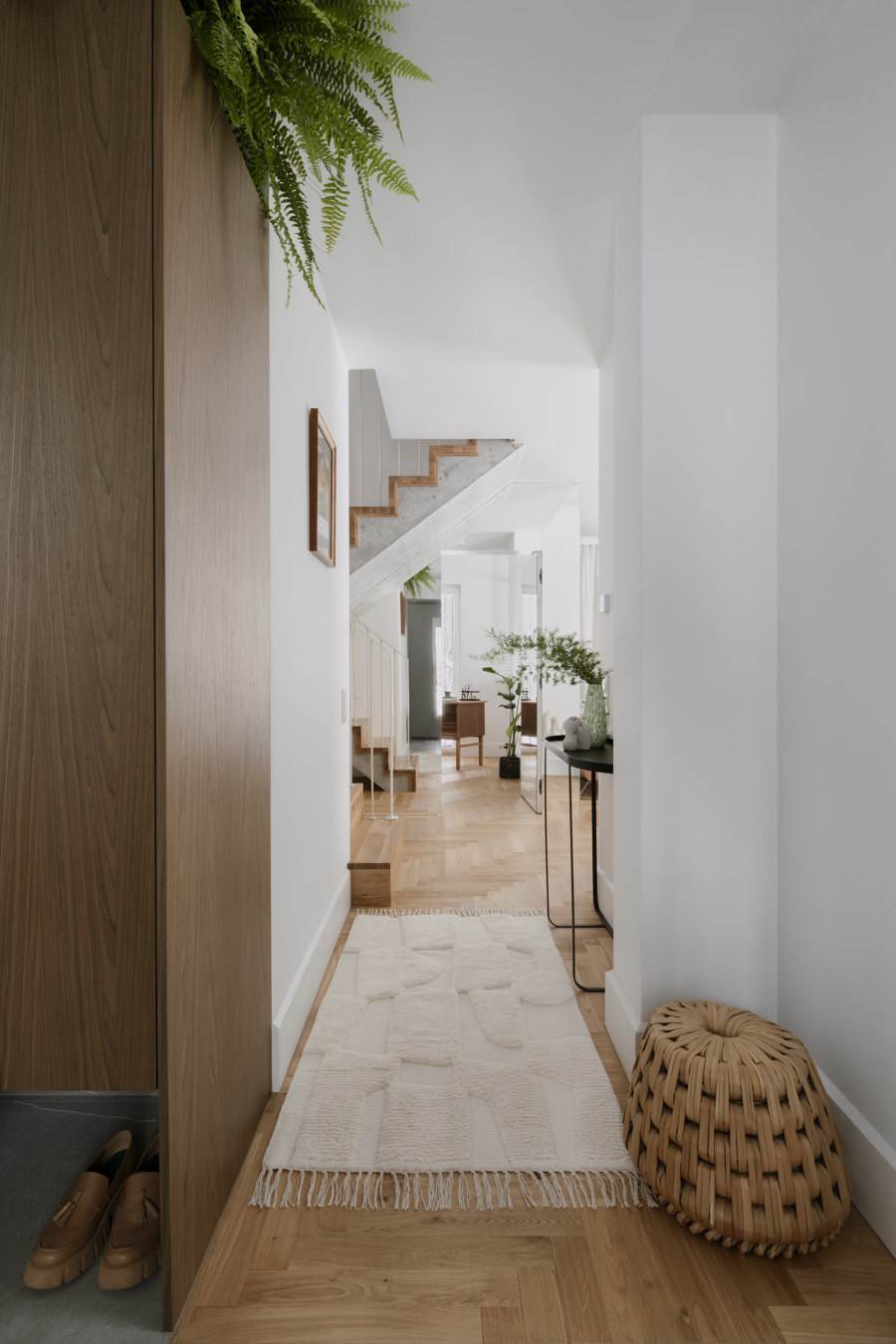
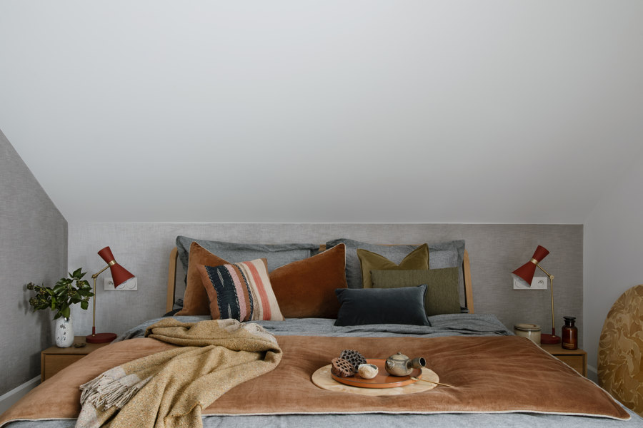
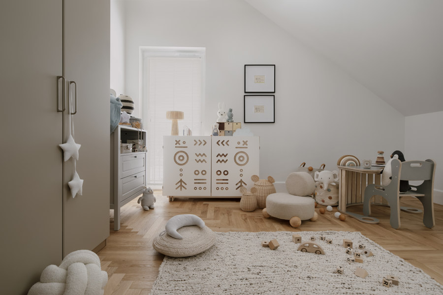
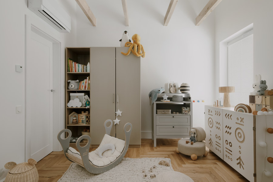
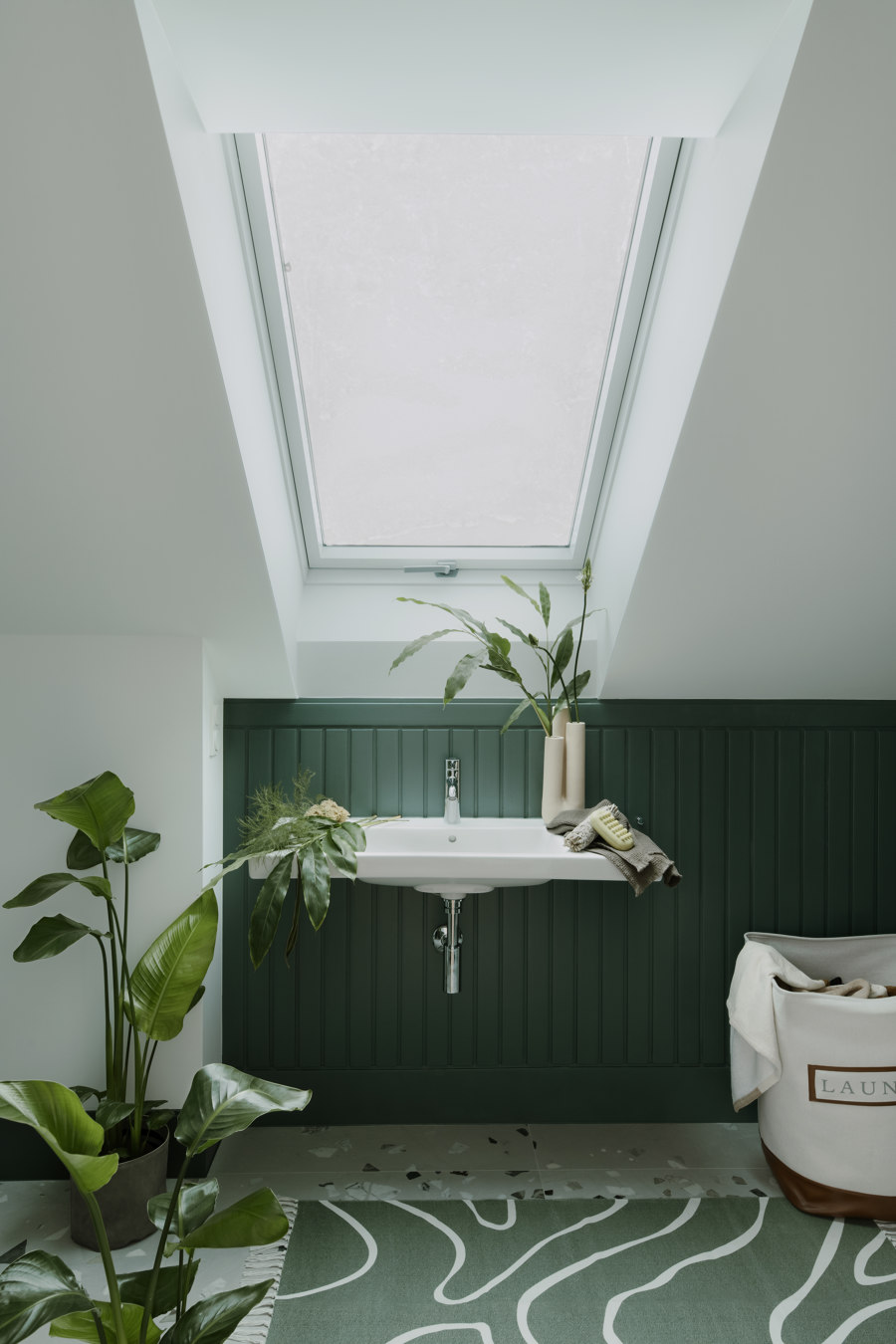
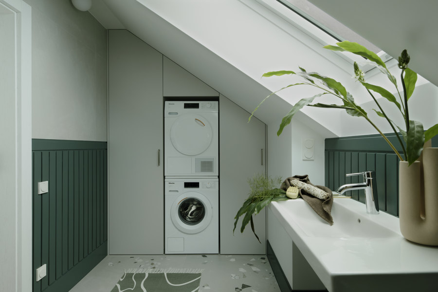
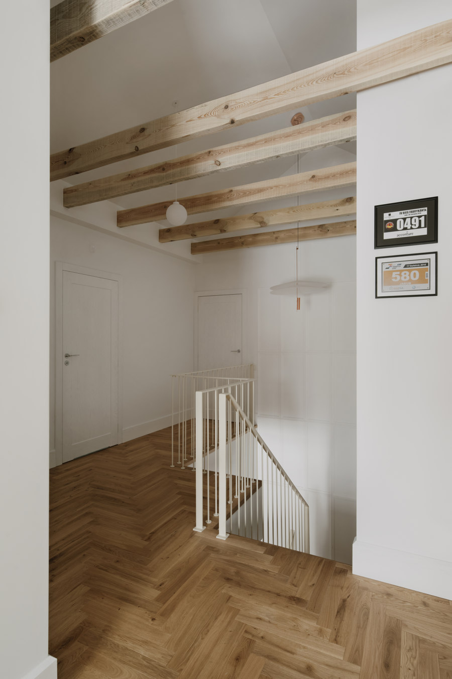
Natural materials, a mix of structures and at the same time colors create the interior of the house of architect Hanna Pietras. Its forest surroundings were not without influence on how the individual rooms were decorated. You can see the inspiration of nature here also in the patterns, but also in many wooden accents.
Hanna Pietras loves eclectic interiors and knew from the beginning that this is also what her living space must be. She likes to follow trends, but does not succumb to them. Instead, she consciously mixes together elements that seemingly do not match at all. She looks for balance where others fail to see it.
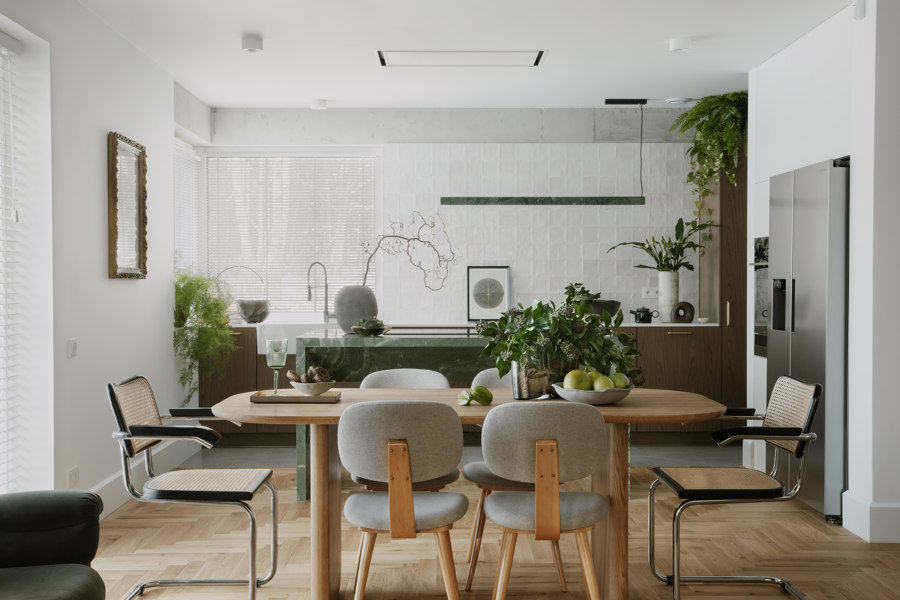
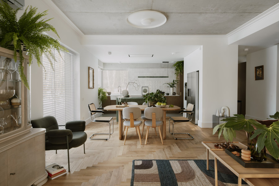
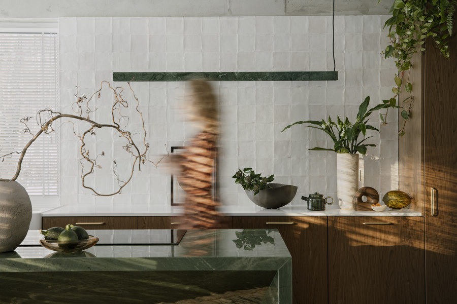
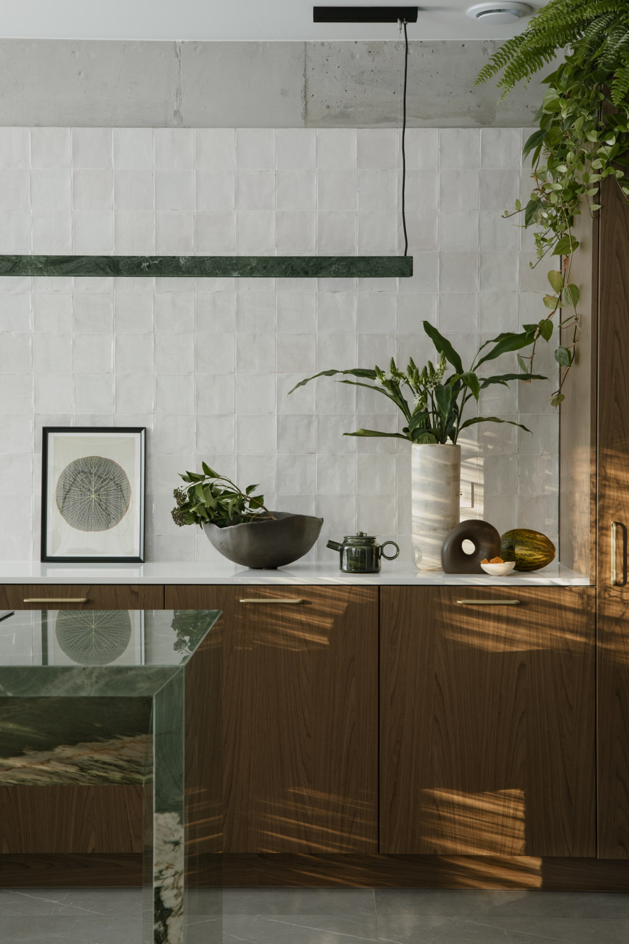
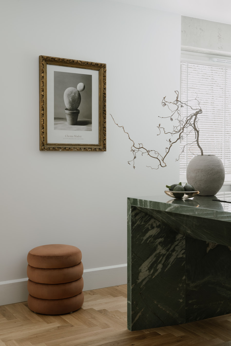
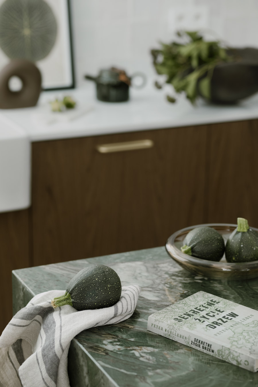
The living area, which consists of a kitchen with a dining room and a living room, is a balance between warm and cold colors, but also materials. There is wood on the floor and raw concrete on the ceiling. There is also no lack of natural stone. And this is due to the original kitchen island.
"I love natural materials and dreamed of such an island. From the beginning I wanted an island to stand in this open space, which in its form is light, but at the same time is a strong accent in the interior, including color," says Hanna Pietras. "An interesting feature is the lighting on the other side of the island, above the countertop, which looks as if it is also made of the same stone. On the other hand, it is just a happy coincidence," she adds.
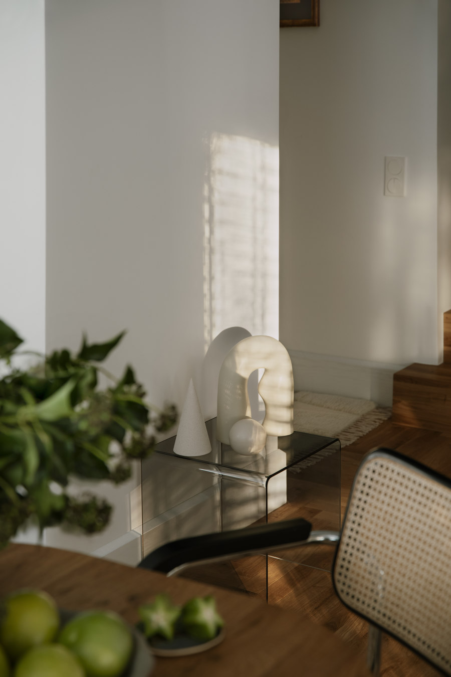
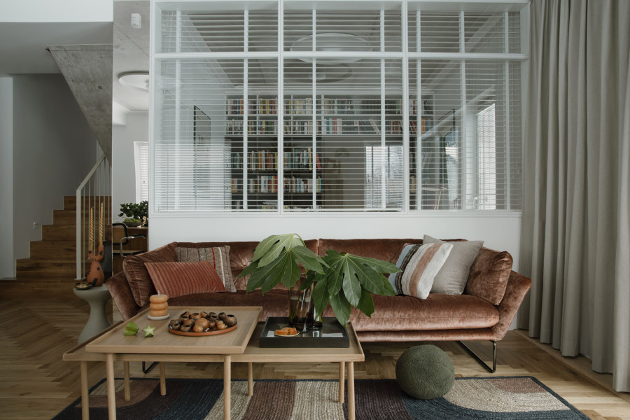
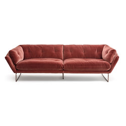
The use of concrete in the living area, on the ceiling, was an architect's dream, and so the decision to leave it and not cover it up was a very quick one. This doesn't mean that the whole interior is cold and austere. Just look at the sofa, in a beautiful copper shade, topped with a rug that perfectly complements this space with warm colors, while giving a touch of modernity. However, when we look the other way - we see a vintage whey, as well as chairs designed by Marcel Breuer. This is eclecticism in the making by Hanna Pietras.
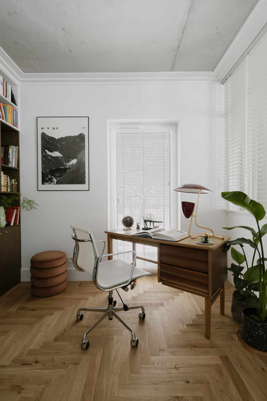
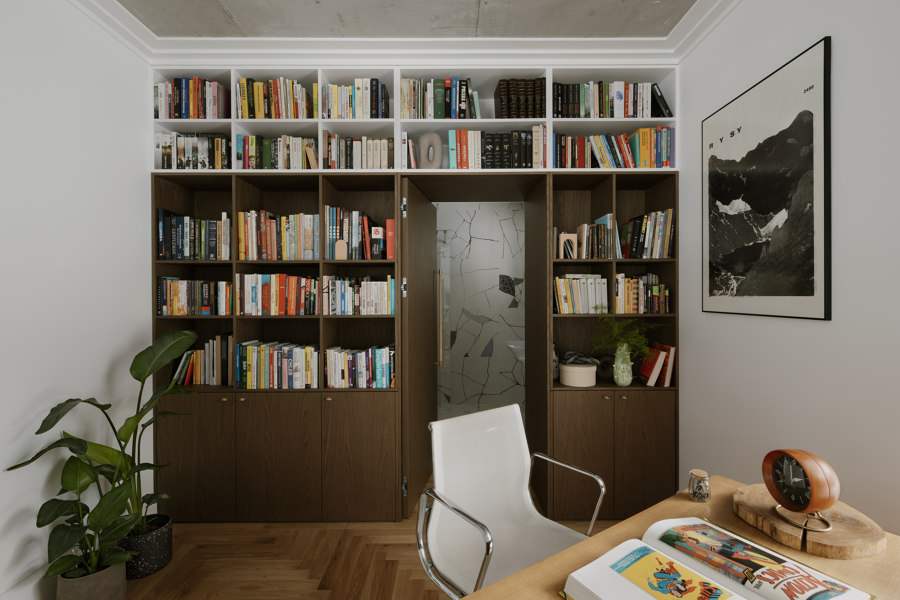
The living zone is also a glassed-in office with a vintage desk, which comes from the private collection of the architect's mother and is more than 70 years old.
For the architect and her husband it was important to create a space for relaxation, not overloaded with, for example, furniture or other objects.
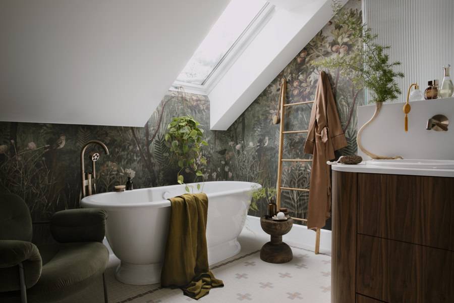
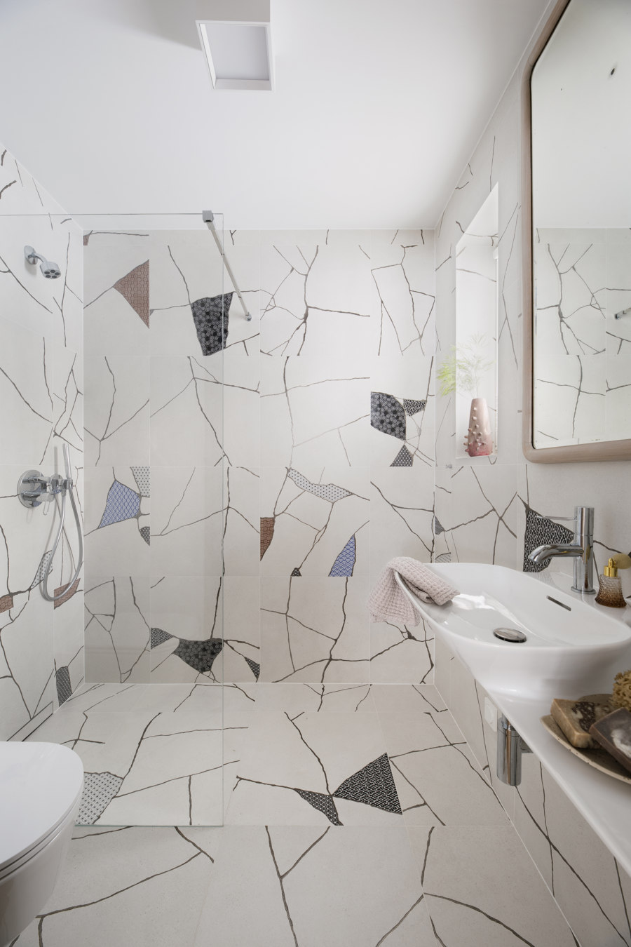
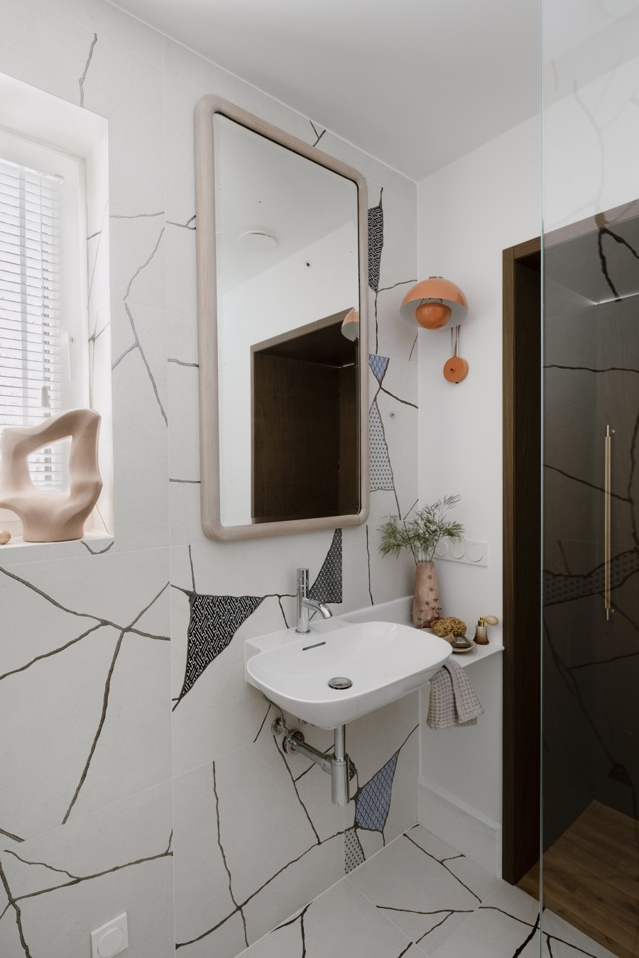
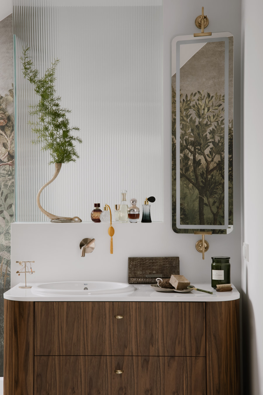
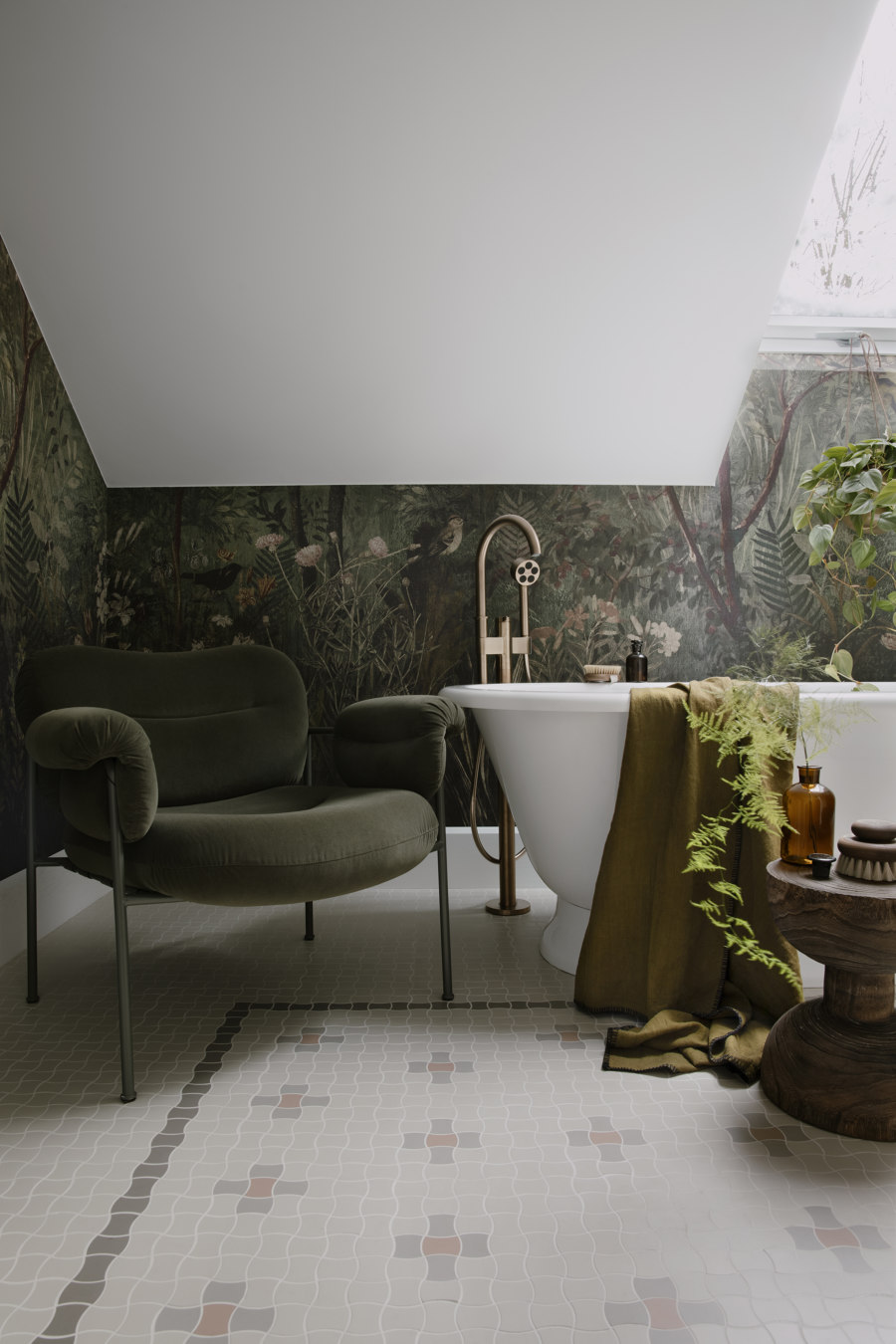
You certainly can't pass by the bathroom, which is like a home spa. Spacious and decorated like a bath salon. This is exactly the effect the architect wanted. She wanted this space to be treated like a room. And here the attention is drawn to the wallpaper imitating plants, as well as the free-standing bathtub or at least the shower hidden behind fluted glass. On the floor, meanwhile, an element that alludes to the owners' beloved vintage is a mosaic called gorse tiles.
Design Team:
Lead Architect: Hanna Pietras
Team: Anna Petrova
