This ten-storey office building opened at the beginning of the 1990s as the ‘Lahmeyer-Haus’. Like many buildings from that time, the increasingly sophisticated demands of tenants and Frankfurt’s oversaturated business real estate market quickly rendered the building no longer competitive. It stood empty for many years until project developer Phoenix Real Estate recognised its attractive position in Frankfurt’s Westend and decided to completely gut and revitalise the building. Since Phoenix itself rents office space in the building for its Frankfurt branch, the brief was simple: “to build the best house in the respective market segment”. Our studio was commissioned to design the entrance lobby and the access and supply cores for all storeys, as well as interior architecture for two rented offices.
Lobby
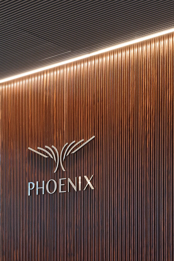
The impressive lobby serves as a shared business card for all the different tenants. It stands out in a striking way from the lobby architecture that dominates much of Frankfurt. The height of the compact, two-storey room is exaggerated by means of a wall design composed of vertical lamellae. The lamellae are staggered at irregular intervals, giving the walls a dynamic progression. Moreover, concealed interstitial absorption fields ensure unexpectedly warm acoustics.
The ceiling is formed by a suspended, polygonal, folded element of glossy, polished stainless steel, which further elevates the room. Spots set in the gap between the ceiling and the lamellae illuminate the wall elements from above. The light source remains invisible, so the walls appear to magically glow. Light points are formed at the top edges of the lamellae, an effect that appears even larger and brighter in reflection on the ceiling. Moreover, the folded ceiling creates new and surprising effects depending on the perspective of the beholder. Three sculptural objects in the entrance area pick up on the shape of the ceiling element: a letterbox located in front of the building, an upholstered seating element and a reception desk of black and white solid surface.
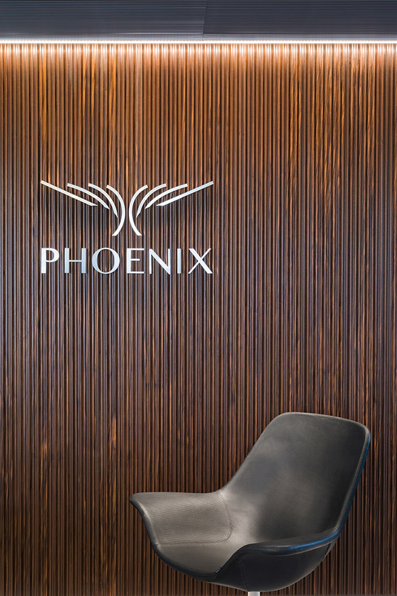
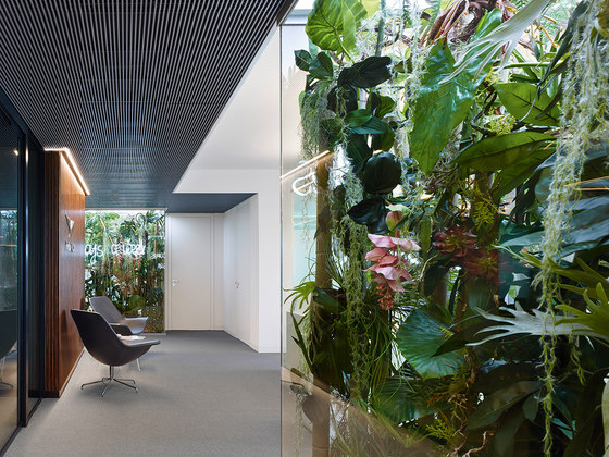
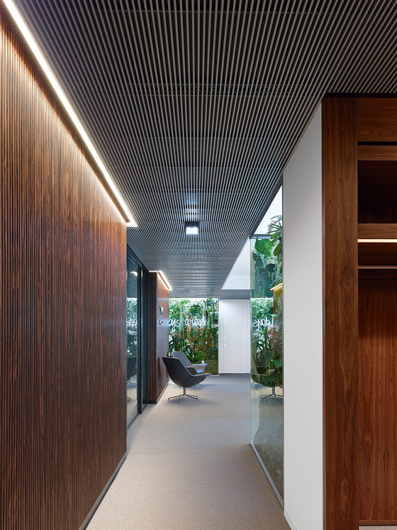
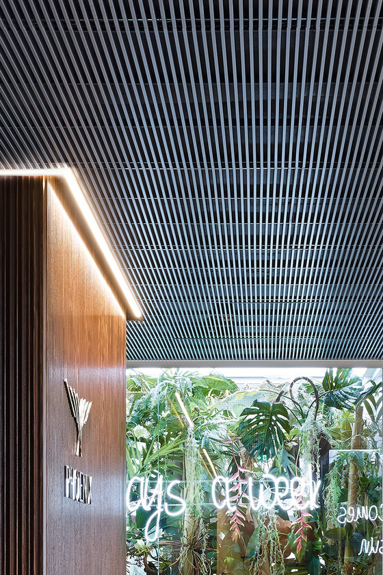
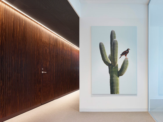
The lobby provides an unrestricted view of the lifts. The access and supply core located around the lift shaft is identical on all floors. Viewed from the outside, this area is completely panelled with walnut veneer lamellae, thus offering a warmer variation on the sophisticated theme from the lobby. The overlap of the individual lamellae renders the doors to adjacent areas invisible, thus creating the impression of a homogenous, wooden corpus. A circumferential light strip further emphasises its monolithic form. Access to the lifts is incised into this corpus, and the area within is panelled in floor-to-ceiling tiles. Here wooden pilaster strips run down the walls like veins, making the walls appear as cross-sections cut through the room. Acoustically functioning, fully accessible metal lamella ceilings of anodised aluminium are installed in the corridors and in the atrium to the lifts.
Office Phoenix Real Estate
Project developer Phoenix was greatly impressed by the concept, location and success of SOLOWEST, so chose to move its Frankfurt office into the building. The interior design of its office was to be closely tied to the company’s history and self-image.
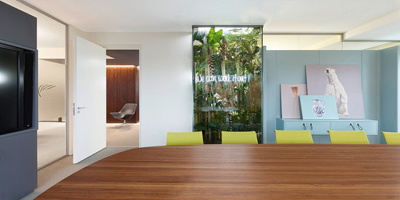
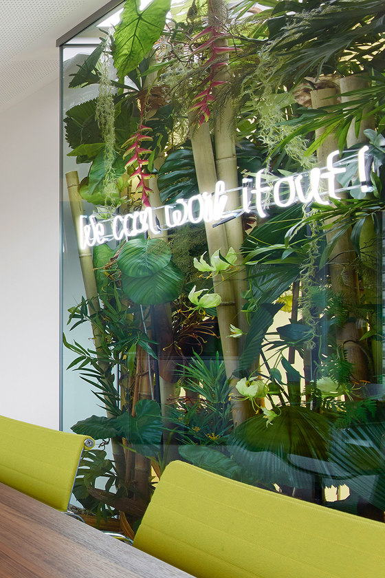
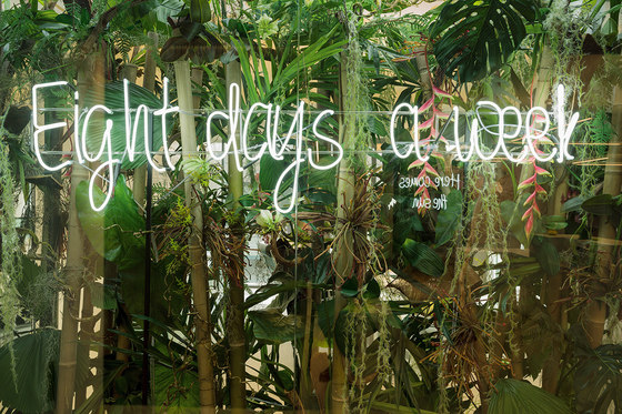
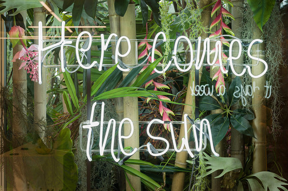
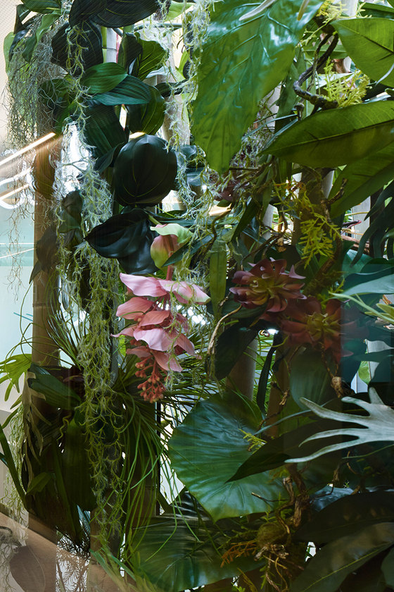
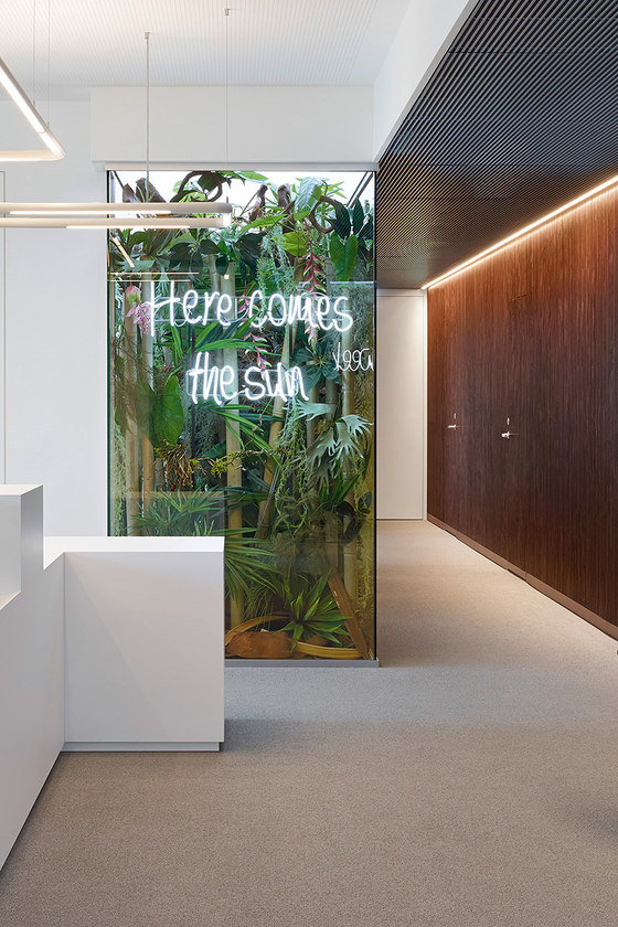
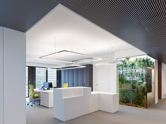
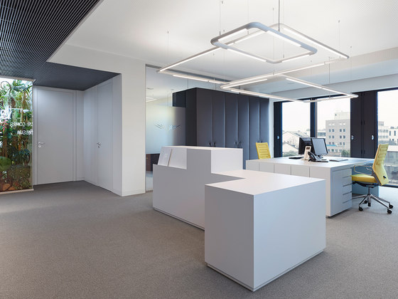
The office is presented as a high-quality, open space. Clear office architecture on a white background offer a tantalising contrast to the warm wooden panelling of the building’s access core. This effect is heightened by three display cases, opulently filled with tropical, jungle-like vegetation. In addition to making a surprising and decorative impression, they also make humorous reference to the processes in the industry itself, as well as to the project developer’s and its customers’ hopes and desires inherent in the projects under development.
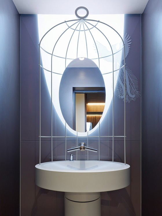
Neon lettering fronts each perfectly arranged artificial flower backdrop, with a line from a Beatles song to suit each room: “Eight days a week” in the director’s office, “We can work it out” in the conference rooms and “Here comes the sun” in front of the secretary’s office. The Beatles theme comes from an anecdote from the founding days of the company when, as a joke, the four managing directors worked out which of the four band members they each most resembled. A further tongue-in-cheek reference can be found in the WCs, where a phoenix ascends from a stylised cage into a cone of light projected on the rear wall.
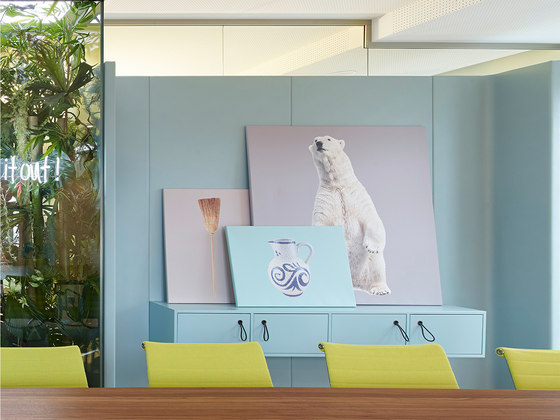
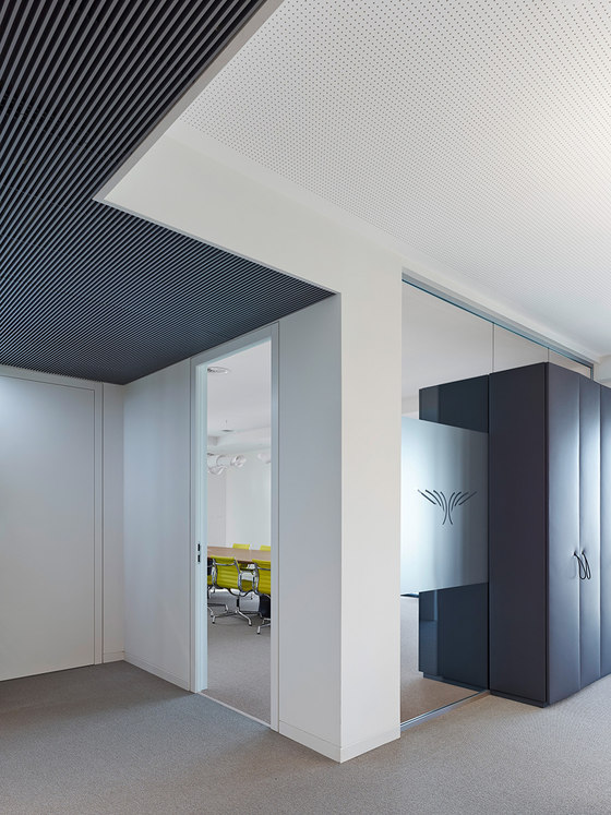
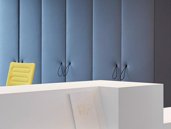
The rooms that lead from the reception area are not hermetically sealed, but remain visible thanks to the display cases and floor-to-ceiling glass façades. A further layer is created in front of the glass walls by cupboards fronted in acoustically absorbent, micro-perforated artificial leather. A series of large-format photos was compiled to decorate the office walls. The highly associative images refer to the self-image of the company (a small bird that tackles tough challenges like a cactus), its origins (the broom as a synonym for Stuttgart’s famous ‘sweeping week’) and its business (Chuck Norris, the polar bear). Most of the photos are not permanently installed and can be freely recombined to make new backdrops in the individual rooms.
The overall result is a spatial ambience in dialogue between the rationality of a clear, precise and transparent architecture and the emotionality of warm materials and surprising, humorous elements such as the display cases and images. The office is transformed into an open narrative, an invitation to discuss topics, desires and the working practices of the project developer. It thus becomes a mirror of the personality of the company and its stakeholders, and its narrative can be reinterpreted and reinvented time and time again by each of its four managing directors.
Egon Zehnder International
Egon Zehnder is a globally operating personnel consultancy, specialised in placing high-level executives in top positions. Its Frankfurt branch moved into three and a half floors in SOLOWEST. In addition to developing a new office layout and overall renovation, we were also commissioned to design a reception area on the ninth floor. The customers are received at a long reception counter: A wooden structure is mounted on an offset natural stone plinth, leaving an unrestricted view of Frankfurt’s skyline through the expanse of window behind. The free structure of the counter formulates an inviting gesture, signalling openness and transparency to its customers. As Egon Zehnder regularly invites top managers to recruitment discussions, discretion is always key. To enable discussions to be held in parallel, two waiting areas were created without any visual interaction between them. An employee ‘living room’ was also created on this floor, with a library, dining table and lounge area.
With the revitalisation of this rather outmoded Frankfurt office block, the investor Phoenix is aiming to appeal to a new target group with more prestigious aspirations. For the realignment of SOLOWEST we have created spaces with high-quality materials and an elegant accentuation in the design of all public areas. This high standard also explains the fact that the entire redevelopment was given a LEED gold certification for sustainable construction.
PHOENIX Real Estate Development GmbH
Ippolito Fleitz Group
