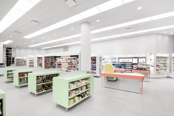
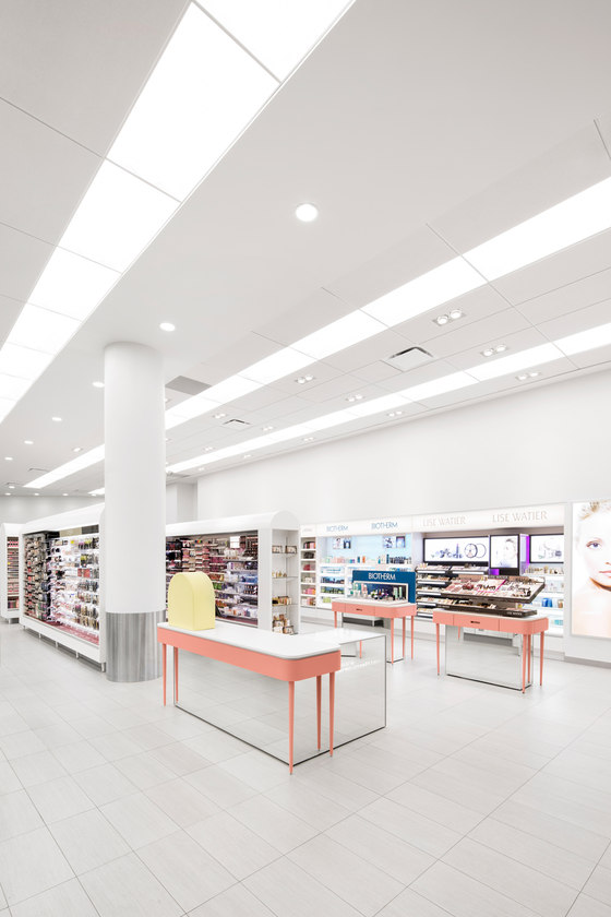
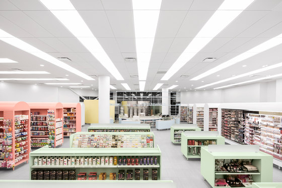
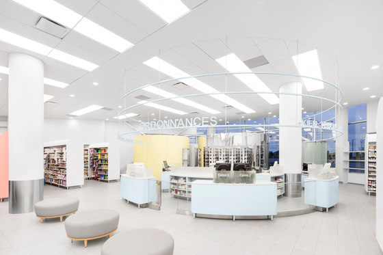
Advertising campaigns are enhancing the image of closeness of the family pharmacist. Still, insists Jean de Lessard, who is known for his radical experimentations, it must be demonstrated: “We wanted the space to reflect the human side of the profession, that it becomes an empathetic place, simple and collective, unpretentious, allowing the pharmacists to be more accessible and be seen by their patients.” To heighten the social dimension of the act, the designer thus chose to make of the laboratory the focal point, and consequently, a place for socializing amongst neighbours.
Harmony in roundness
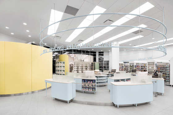
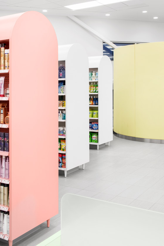
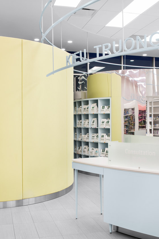
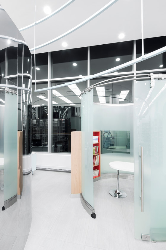
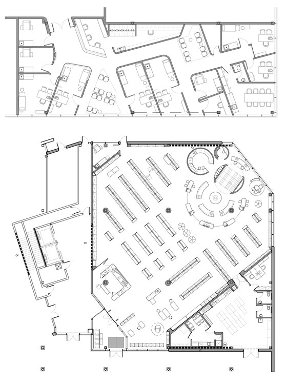
The design was modulated by some feng shui principles, such as organizing the space to promote a smooth circulation of the energy flow (Ch’i). The laboratory consists of a grouping of circles around which one can walk, including a magistral medicine side room and the pharmacist’s favorite, an ergonomic pillbox, which she finds has a retro look; there is also a storage room and a circular glass air-lock looking office with a sliding door, for private consultations.
For Ch’i activation, light is key according to feng shui. The laboratory is positioned in the north part where soft natural light comes in from large windows. The use at this spot of the colour blue and steel is auspicious too, the north being associated in feng shui to the water and metal elements. In addition, the reflection of light on the polished steel of the pillbox softens the visual impact of a volume with such an impressive mass. The yellow-colored fabric that covers the wall of the magistral medicine side room brings balance to the laboratory area colder in appearance. Placement of the furniture is far from accidental: high furniture positioned at the periphery and low-profile units offer an unobstructed line of view of the laboratory and the pharmacists.
Circularity of the yin and the yang
Simplifying the reading of the space and the products plus optimizing the merchandising factor took months of research, volumetric studies and discussions. These aspects stem from the pharmacist and the designer’s wish for a colorful and refined place, in a simple fashion. Kieu Truong believes that it is possible for banners to humanize their store as she did to improve the customer experience.
Since construction, the interest for the space in the industry is truly palpable. “I’ve found a few [competitors] covertly trying to take pictures! I have them visit the place”, adds an amused, not without pride, Kieu Truong. Several important events of the Group have already been held in her pharmacy and traffic is a bit higher than expected.
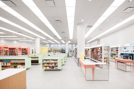
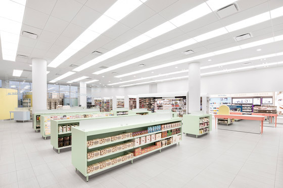
Such as "objects carefully arranged in space," in Jean de Lessard’s words, the custom display furniture brings a lively note. Behind their apparent simplicity of form, the shelves and counters built by cabinet-maker Héritage did present many technical challenges themselves subject to intensive research. Further, colouring preparation called for a rigorous sampling process, until the proper shade for each colour was achieved. "Those pastel colours are a perfect balance to Kieu Truong’s personality, a true ball of energy! The colour acts as a gentle counterpoint to her vivacious personality, interplaying with the yin and the yang," comments the designer.
That there are no products around the laboratory area may surprise at first, but clutter is to be avoided. “The reason is that we consciously wanted to dissociate the mercantile aspect of the professional act of the pharmacist. Listening, professionalism and human warmth prevail over product”, says Jean de Lessard, as he concludes. Conveying fluidity and openness to preserve the natural brightness, the immaculate walls are, moreover, devoid of any advertising materials, leaving the space to harmony.
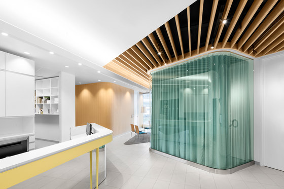
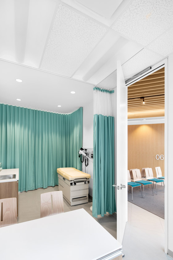
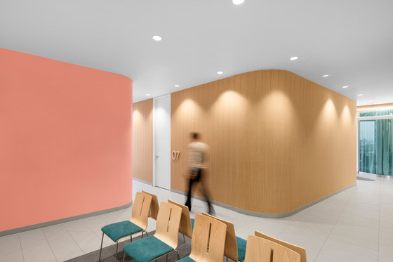
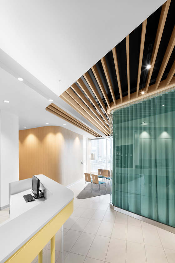
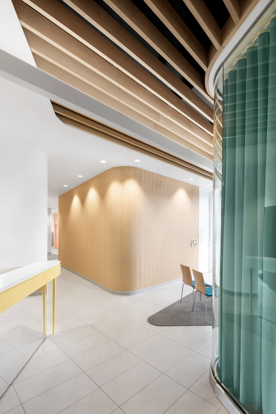
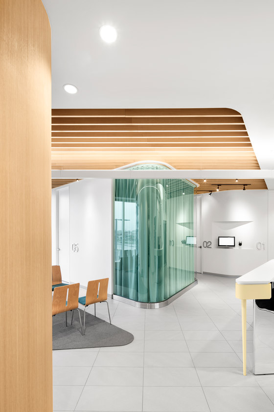
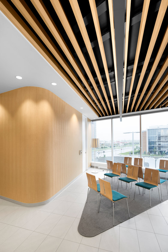
Jean de Lessard also designed the Centre Médical Alexandre, owned too by the pharmacist. He sought to animate this clinic located on the first floor with the same spirit of clarity and simplicity, selecting similar volumes and materials for continuity. A sense of movement and the rounded walls energize the place in a non-aggressive manner. The round scheme is used for furniture, just as it was used in the pharmacy. The wooden slats ceiling of the waiting room in the south part is another auspicious architectural detail. Wood brings structure, warmth and brightness without oppressing the Ch’i. In feng shui, the south part benefits from the strong presence of the wood element and is, by extension, beneficial to all of those present in the space.
Kieu Truong, pharmacist owner, Uniprix
Jean de Lessard
Project manager: Alexa Adam
General contractor: Construction Mikado
Project manager: Teresa Botello
Cabinetwork Pharmacy: Héritage Ébénisterie Architecturale
Cabinetwork Centre Médical: Regency Ébénisterie
Shelf Pharmacy: Équipement Boni
Lighting: Au Courant Lighting
Glass: Renaissance Glassworks
Stainless steel: Gagnon Spécialités
