Special effect paint comes from the combination of water and paint and shows various textures via unique artistic expression. As approaching the project, the designers hoped to convey the subtle relationship between water and soil based on the natural laws of interdependence and Yin-Yang. Meanwhile, they intended to create various spatial scenes by utilizing paint of different textures, and construct a series of artistic spaces with smooth circulations to attract visitors to explore, reflect, and encounter with surprises.
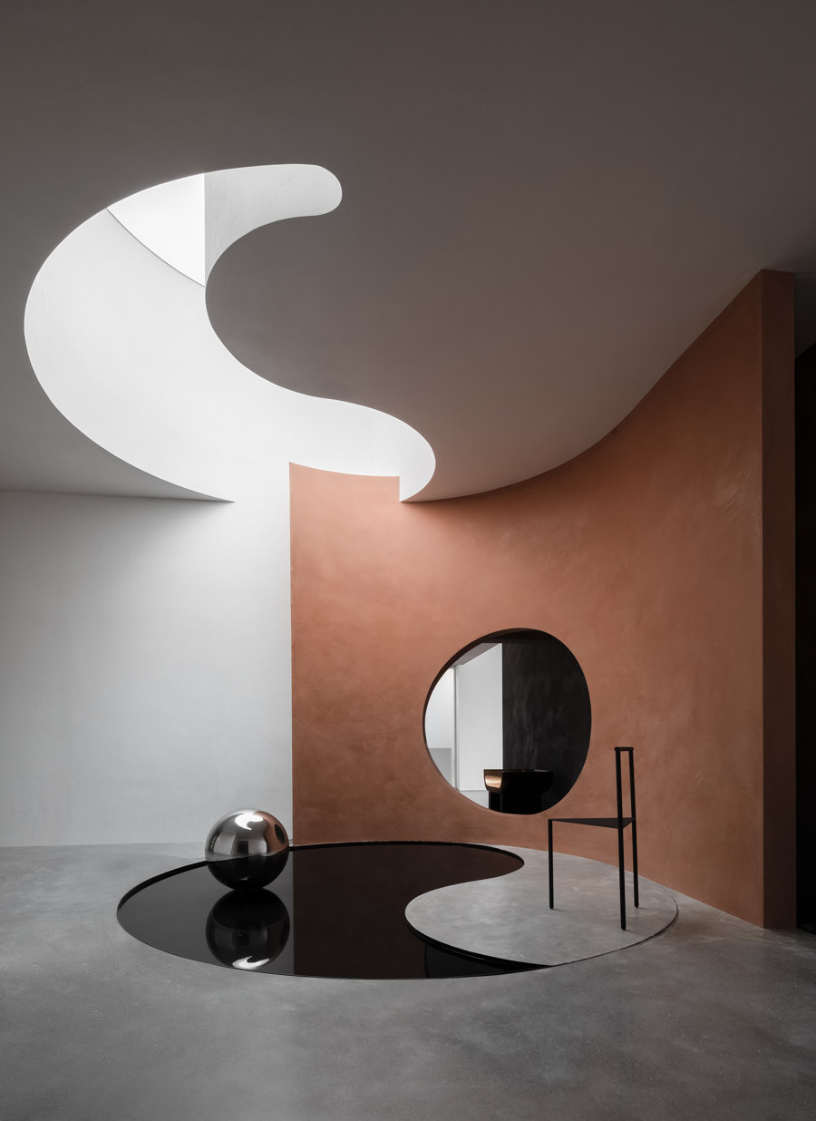
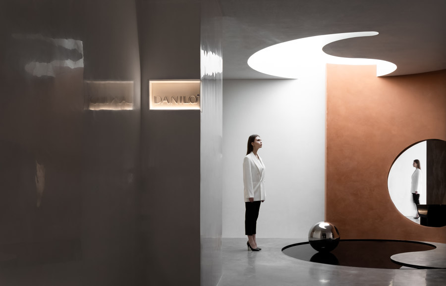
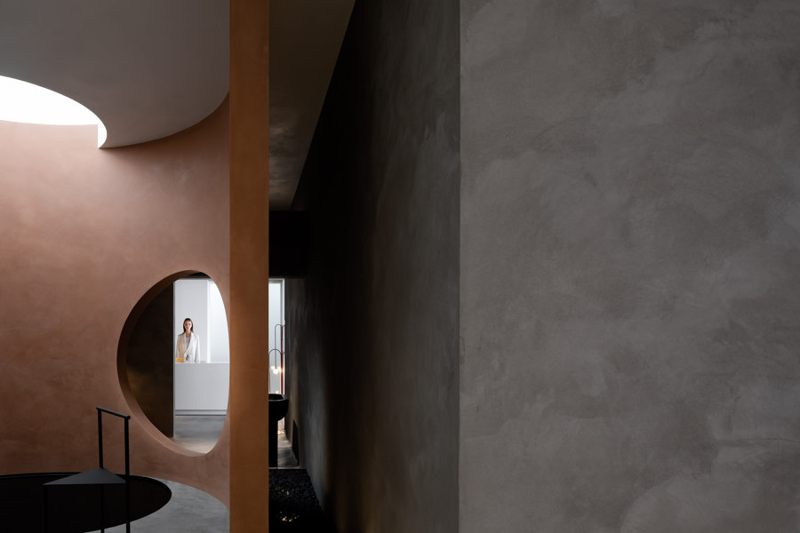
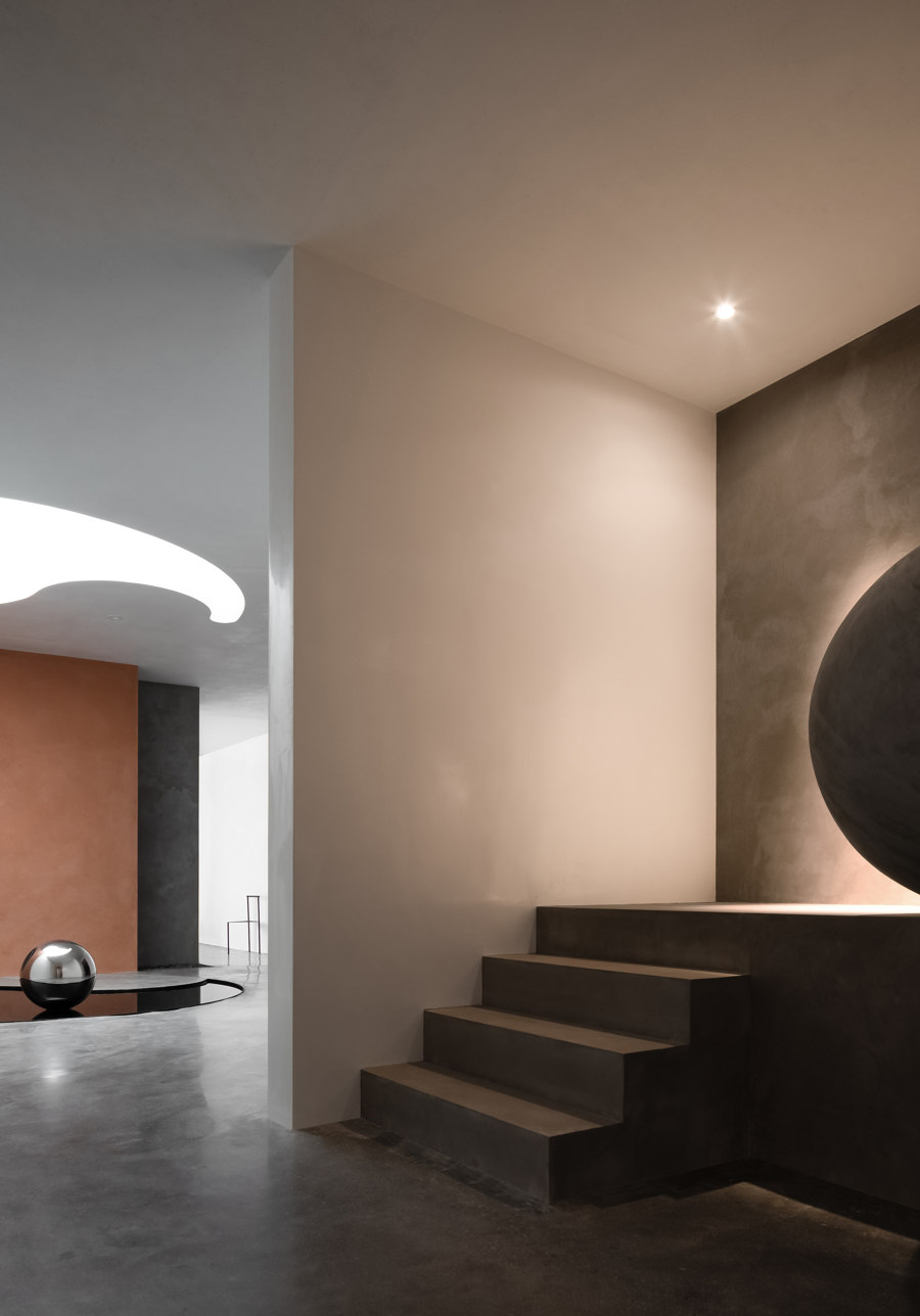
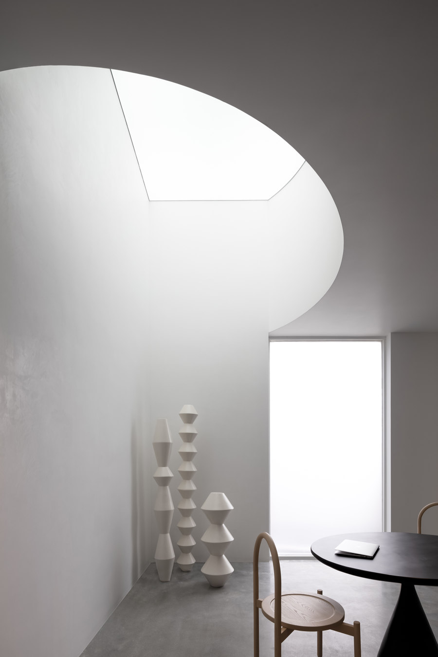
A harmonious integration of water and soil. Entering the space along a long slope, visitors will first see the wall surface clad in Danilo's white polished paint, which brightens up the whole passage and creates a modern serene atmosphere. It takes people away from the outside world for a while and leads to a journey of art. In the artistic hall, the floor shows the patterns of Yin and Yang. The part of Yin is embodied by a pool in a concave shape. Beside it, the curved wall with an opening and the thick white stone wall are interconnected. The stone wall is unified with the ceiling, on which an irregularly shaped skylight echoes the pool on the floor. The design of this bright hall conveys the idea that rainwater is absorbed from the sky to nourish the soil and everything.
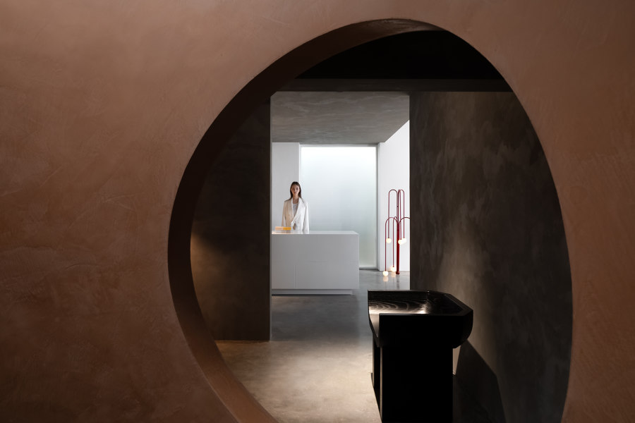
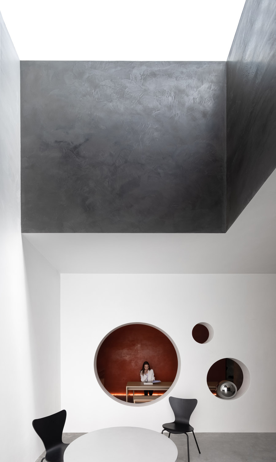
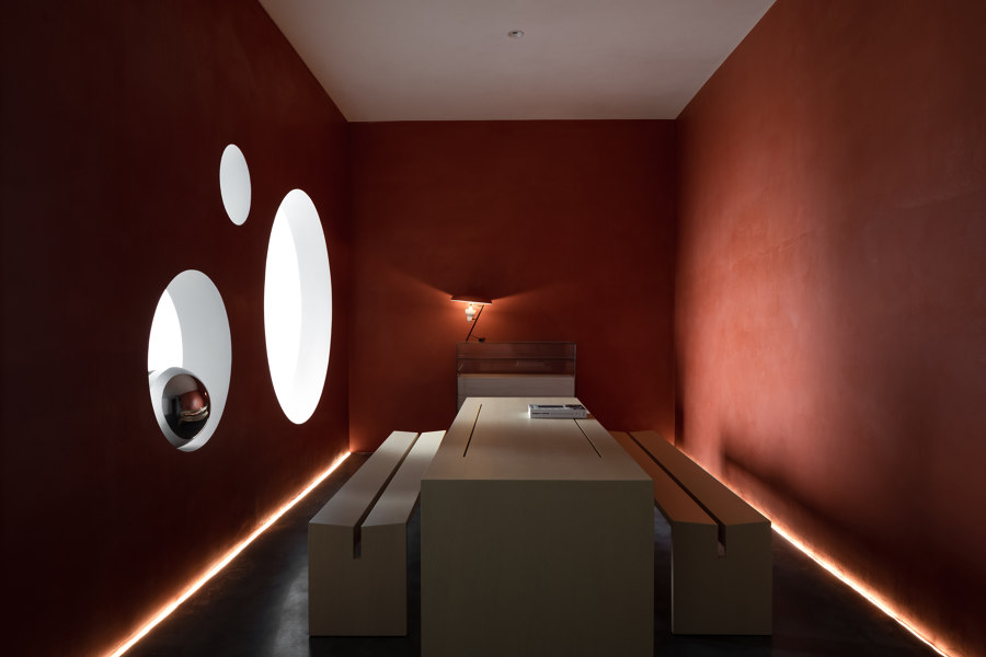
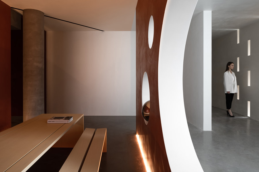
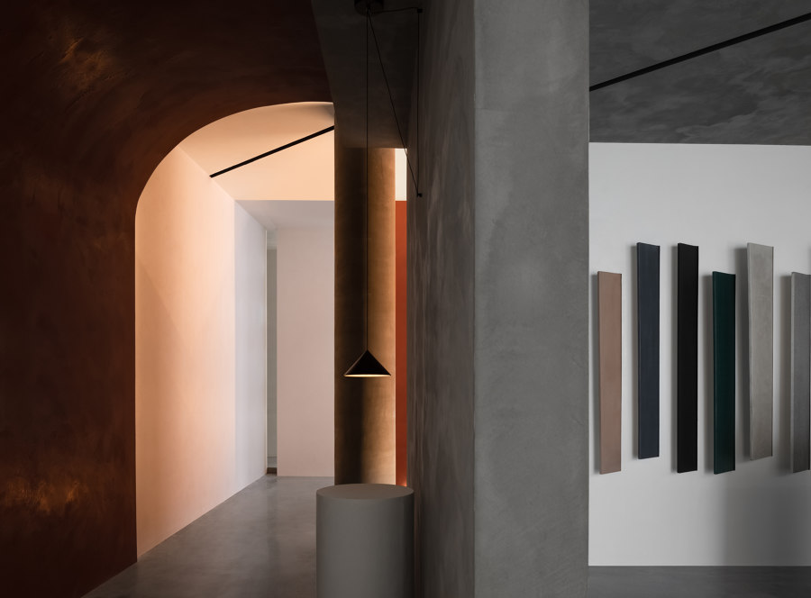
Smooth circulation. The circular opening on the vermillion-painted curved wall is visually connected to the spatial structures inside, which allows visitors’ imagination to roam freely. In the art hall, two circulations spread out and then return to the starting point, which is full of fluidity. There is no boundary between the beginning and end of time, and visitors will be immersed at the moment where time pauses here.
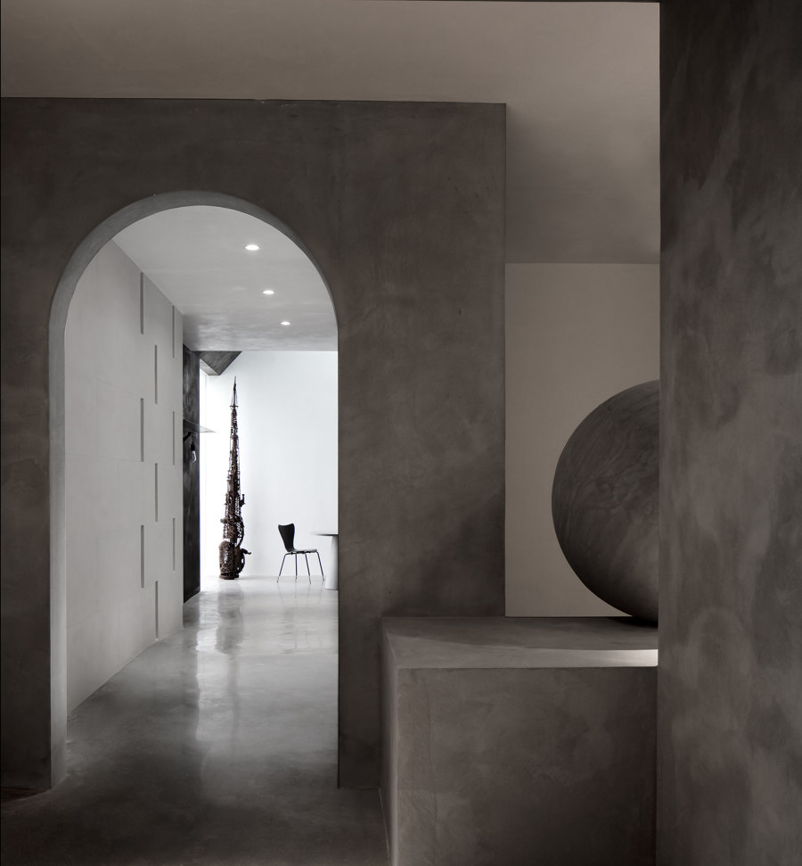
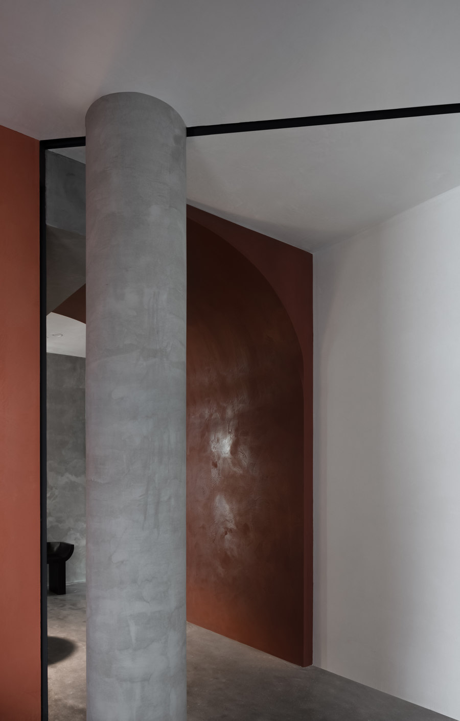
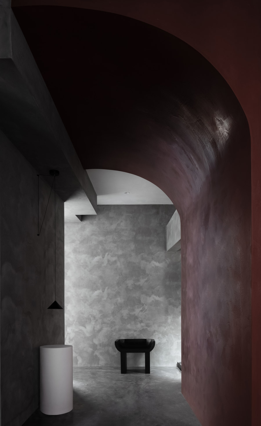
In the fair-faced concrete area, the arched door opening structure is interpenetrated with the step block, on which a sphere stands silently. Such a design aims to spiritually inspire vision and imagination. The wall of the passage adopts H-shaped patterns and is finished with light beige sandstone-textured paint. Light beams can be diffused through the gaps, hence allowing the integration of nature and the structure.
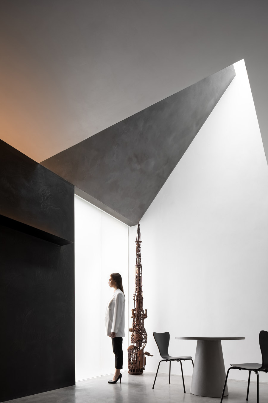
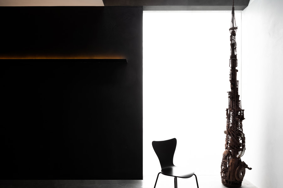
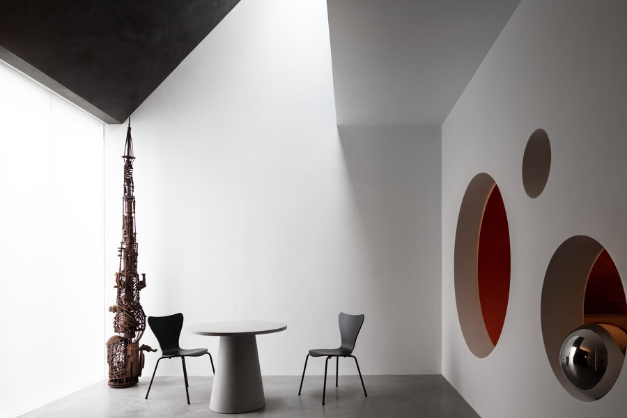
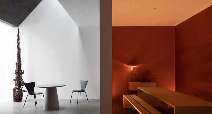
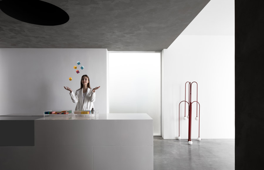
Geometric structures and varying light and shadows. The geometric structure of the negotiation area is extended through the plain and simple color scheme of black, white, and gray as well as the slanting block of the ceiling. The linear frosted glass skylight brings daylight in and enhances the transparency of the space. The futuristic tower-shaped art installation is made of mechanical parts, which symbolizes the rebirth of the future and infinite vitality. The overall spatial structure of this area is seemingly segmented, which is like truncated time. Whether it's the present and future, the criteria of beauty seem to be always common. The carved-out round opening on the wall echoes with the stainless steel sphere, which reflects the interior architectural structure and the art installation on its clear surface. The sphere enables visitors to have a glimpse into another dimension of the interior, where the boundary is blurred.
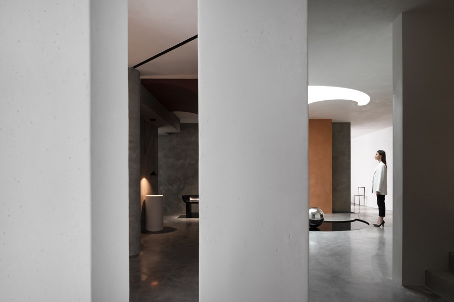
With orange walls, long wooden tables and benches, the resting area brings people into an elegant and calming world. The designers adopted orange hue to contrast with the cool palette of the room next to it, aiming to create dramatic tension in the space and eliminate the boundary of the viewing angle. Making use of the pre-existing round column in the passageway, the designers outlined a deep linear black slit on the ceiling, which extends to the sample display area and merge with the dark concave of the ceiling. The relationship is clear yet implicit, intimate yet estranged, interdependent yet contradictory, seeming to narrate a future living situation where things are interconnected while the space is independent.
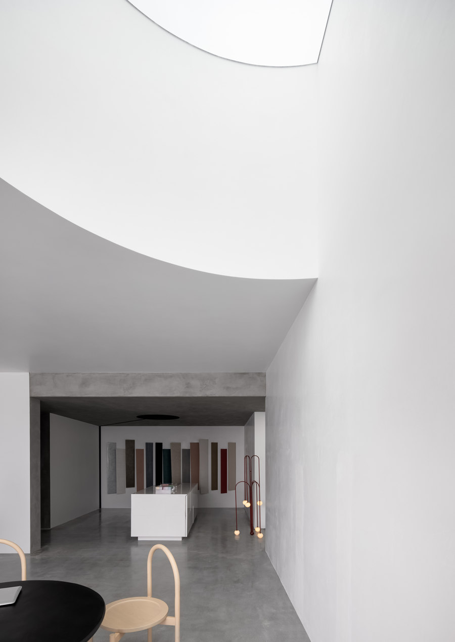
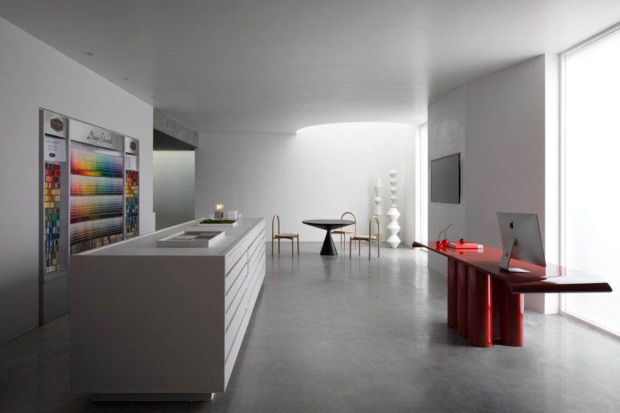
Rhythm of lines and Volume. In the sample display area, the samples are deliberately displayed in an obliquely embedded manner and show a staggered yet unique arrangement, which is futuristic. The counter features segmentation and juxtaposition of parts, echoing with the diversified sample modules. The color change is playful and full of rhythm, which activates the displayed products.
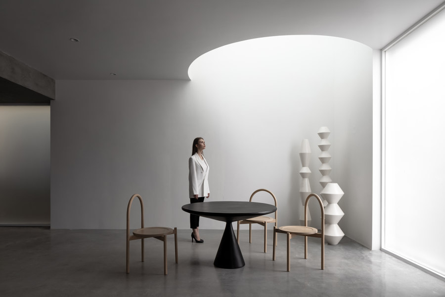
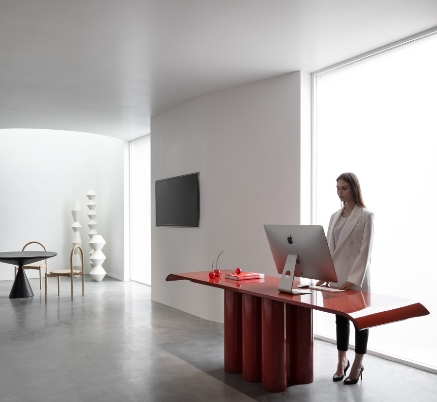
The skylight and the switchable floor-to-ceiling glass blur the spatial boundaries and introduce natural light and shadows in, which attract visitors to stop for a moment and reflect. Different kinds of white paint that are respectively characterized by fine sand-like, semi-polished, and brushed textures are utilized, showing a pleasing disharmony while at the same time harmoniously expressing various subtle emotions. Just as Salvatore Quasimodo wrote, beauty is reflected not only in harmony but also in disharmony, because the latter sometimes can also reach the peak of aesthetic.
Design Team:
Jingu Phoenix Space Planning Organization
