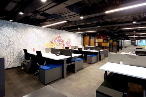
Drawing on Nike’s heritage and foundational stories, we created a collection of installations for the sports company’s new office in Beijing. Nike commissioned us to design art pieces that communicate their strong brand history. The pieces were designed under the concept 'Changing Perspectives’. The project consisted of eleven brand installations spread over the two floors of Nike’s office space.
The project involved translating core Nike stories, materials and techniques into new scales and contexts. Focus was placed on finding interpretative ways to represent the universe of Nike innovation. Another approach we adopted was the use of materials and craftsmanship typical for Nike’s products.
The challenge was to create pieces that not only tell stories, but also have an impact on the audience and working environment. “The brand installations were designed as engaging touch points for occupants of the space. It was important to us that the pieces would continuously intrigue and surprise those who interact with the workspace on a daily basis. We therefore created transformative pieces that aim to deliver new experiences each time they are viewed,” says Rachel Mackay, Project Leader.
The nature of the art pieces varies from framed photo prints and interpretations of the iconic Nike logo to a ten meter long lamella wall creating a magical illusionary effect. Find a detailed description of five selected pieces below.
Bill Bowerman’s magical lamella tribute
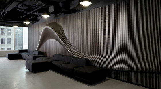
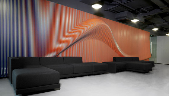
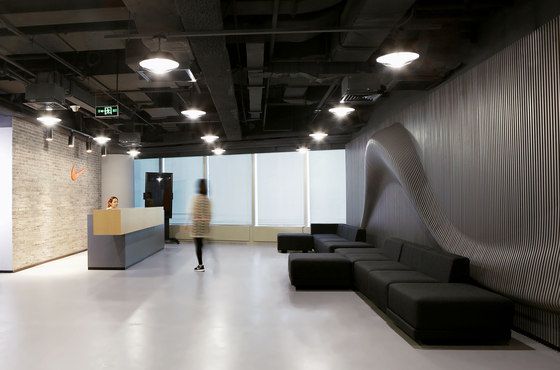
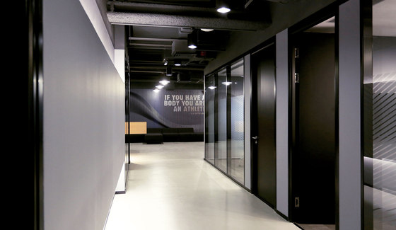
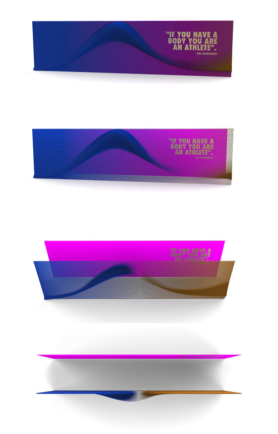
In the reception area, the Magical Lamella Wall surprises employees and guests with its optical illusion of movement evoked by a three-dimensional wave inspired by the Nike swoosh. The colours change from grey to orange to blue depending on the observer’s position. The front view reveals a print of Nike co-founder Bill Bowerman’s quote “If you have a body you are an athlete” which is mounted in the background. To create the illusionary effect, lamellas were individually cut out of wood panels according to the protruding organic shape of the wave, and then painted in three different colours on each side.
A wall inspired by one of the world’s most iconic sneakers
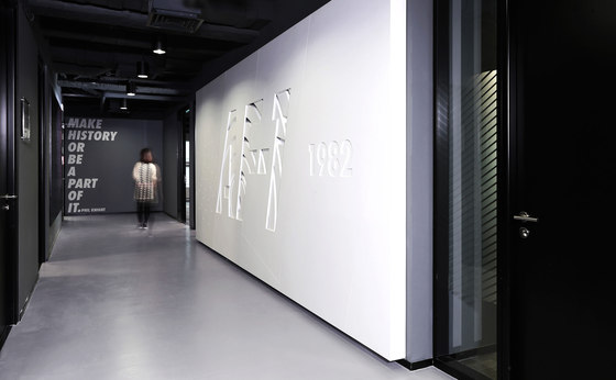
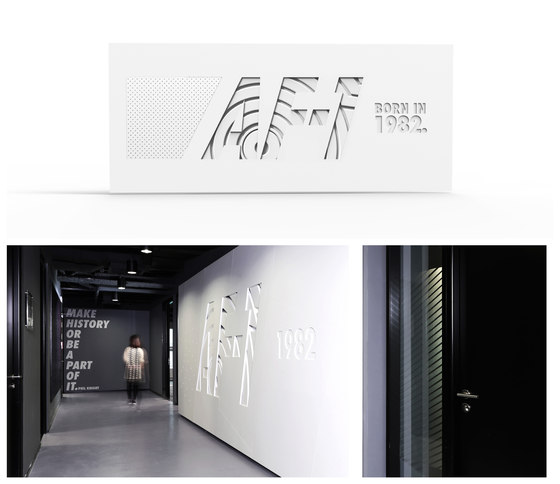
Paying tribute to the best-selling shoe in Nike’s history, the Airforce 1, we have translated the distinctive design features of the iconic athletic shoe into a large branding element. The design includes inspirations taken from different parts of the shoe, such as the texture of the upper and the traditional white colour. The logo AF - 1 is milled into a white-painted wooden box with the year of the shoe’s first production added next to it. Behind the cut-out of the logo we placed wooden panels representing the texture of the sneaker’s sole.
Nike Flyknit meets Beijing’s bird’s nest
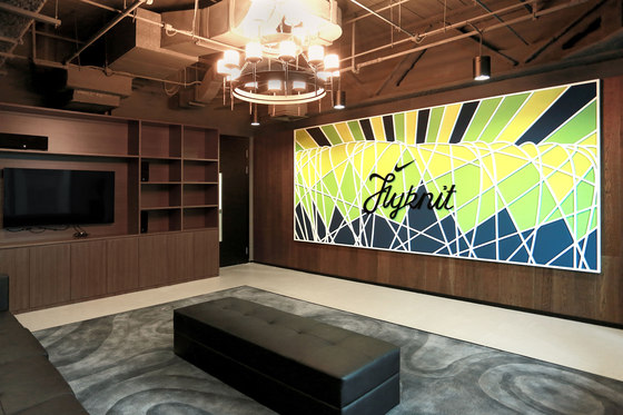
The concept of this element is based upon the idea of flight, connecting the so-called Bird’s Nest—a stadium and local landmark of Beijing—with the intricate pattern of Nike’s Flyknit technology. We interweaved the architectural patterns of the stadium with the fabric of Flyknit sneakers using actual Nike fabric. Mounted on foamed pieces, the installation provides acoustic insulation. The bright colours are representative of the well-known colourful athletic shoes.
A sole with soul - tribute to the Cortez shoe
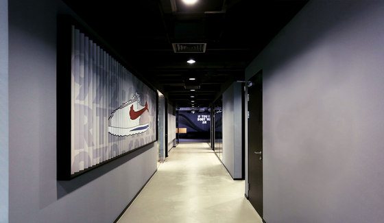
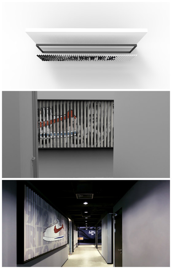
In this art piece, we honour another iconic Nike sneaker, the Cortez shoe, designed by Bill Bowerman in 1972. We interpreted the Cortez shoe’s herringbone sole pattern on a larger scale and turned it into a panelled wall piece made out of bent sheet metal, which displays graphic folio prints as the viewer walks by. The installation contains two stories in one: a graphic of the Cortez shoe depicted on one side, and an image of Bowerman on the other.
Motivational typography
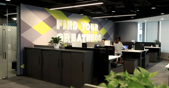
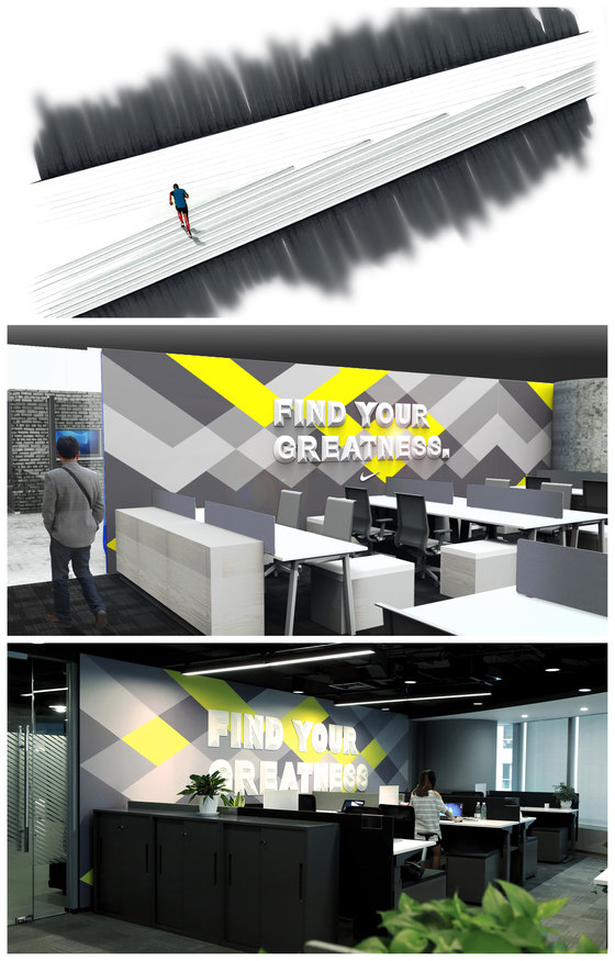
“Greatness is not in one special place, and it’s not in one special person. Greatness is wherever somebody is trying to find it. Find your greatness”. Based on this motivational Nike campaign, the studio turned the central message into a typographic art installation. A three-dimensional effect was created by mounting four layers of CNC-cut boards on the wall that are reminiscent of stairs in an exercise context. In the background, a Nike pattern printed as a graphic folio is displayed. The piece is designed to inspire Nike employees to be passionate about everything they do.
Johannes Torpe Studios
Bjarke Vind, Sara Vinther Martinsen, Etienne Coutable
Creative Direction: Johannes Torpe
Project Leader: Rachel Mackay
