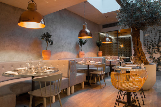
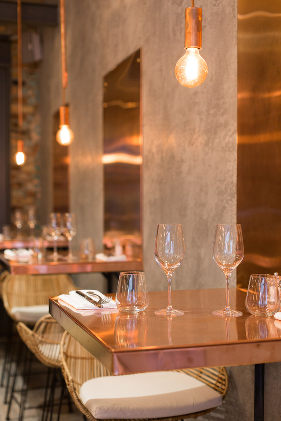
Bandol, a new restaurant on Chelsea’s Hollywood Road, delivers the cuisine of rustic southern France from within a stunningly warm and contemporary environment - featuring copper, distressed oak, steel, concrete, brick, smoked glass and artful lighting, as well as a large central olive tree - designed by one of London’s most prestigious and innovative design studios, Kinnersley Kent Design.
The team behind Bandol, married partners Sylvia Kontek and Vittorio Monge, came to the project fresh from the success of their Margaux wine bar/restaurant in South Kensington. Whilst Margaux’s main point of reference centres on the wines of the Bordeaux area, Bandol takes its inspiration from the food and wines of the Provence and Riviera regions of southern France, in the form of a sophisticated and modern menu - and the perfect wine to accompany each course. The intimate, 70-cover restaurant – measuring 200 sq m over two storeys - is made up of a ground floor bar and dining area, with a kitchen, customer toilets and back of house space on the lower-ground floor.
‘The long and fairly narrow spatial arrangement presented us with a number of design challenges’, commented KKD Associate Director Jenny Andersson, ‘including how to make the best of the available natural light. We additionally had to be as clever as possible in achieving a feeling of luxury on a relatively tight budget, which also had to cover an entirely new kitchen.’
The main architectural intervention was the creation of an enlarged wall opening between the bar and the restaurant to ensure sightlines from the entrance right through the space from the moment customers enter. A secondary intervention involved the re-arrangement of the air-conditioning in the first half of the restaurant, which allowed for a half-metre gain in ceiling height. A virtue was made of the restaurant’s slim footprint by the design of a series of intriguingly zoned spaces and continued visual interest, so that there is something new to catch the eye at every stage. Cleverly-positioned, 3m x 1m mirrors on the rear right-side wall also enhance the feeling of space.
Natural light from a 2.5 x 4m skylight in the roof of the existing ground floor rear extension was supplemented via a new, large rear-side window and a glazed door. Added greenery, in the form of a climbing ivy living wall on a delicate metal trellis, plus an external bamboo plant framed by the rear door, add to the outdoor feel.
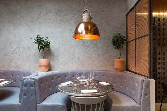
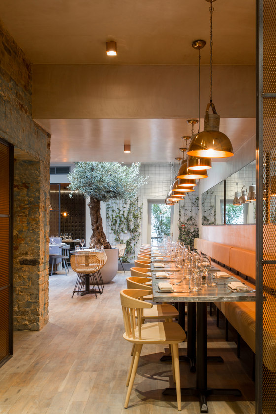
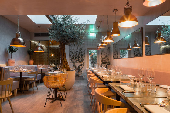
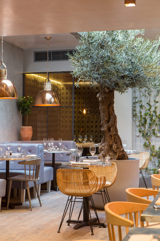
‘Our design DNA for the space was the use of copper throughout as a signifier of the warmth of the Provence and Riviera regions’, Jenny Andersson commented, ‘together with a light materials palette of pale brick, concrete render, oak flooring, blond timbers, white, grey and wicker chairs, smoked glass and a colour palette of greys, blues and the palest salmon pink. A sense of the outside is given by the indoor planting of lemon trees in pots, ivy at the rear and the half-ton, up-lit olive tree at the restaurant’s heart. Industrial design notes maintain a sense of contemporaneity, with an overall feel of al fresco dining in a warm clime.’
The London Evening Standard newspaper, which reviewed the restaurant on opening, summarised the space as ‘so beautiful, you’ll want to steal the entire look for your home.’
Design walk-through:
The restaurant’s exterior fascia is a re-working of an existing Victorian timber shopfront, protected by Conservation Area status and now re-painted in a mid-grey tone with a hint of blue. There is an entrance door to the right and large central glazing. Signage takes the form of ‘bandol’ lettering in 3D copper at the top of the fascia, with the name/logo also printed onto the extending canopy in a similar bronze tone.
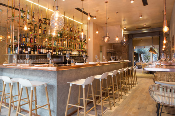
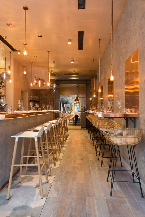
As customers enter the space, they are greeted by two stunning feature areas – the bar to the left, lit by a long display of 24 glass pendants spaced out in different sizes, lengths and colours and a series of four tables to the right, made of cantilevered, L-shaped copper panels which continue as far as one metre up the wall and are lit by bespoke bare-bulb, copper pipe pendant lights. The wall surround around the copper panels is in a concrete render, with a rough finish to add textural interest. Two further small tables in zinc with white J77 chairs from Hay also sit directly behind the glazed section of the fascia.
The bar features a bespoke 400mm wide/50mm deep copper top, which extends via a bull-nosed edge beyond the rough-rendered concrete bar front, which uses the same finish as the right-side wall. The bar back area is made up of a copper piping framework with glazed shelving. White-seated and timber-framed bar stools are by Normann Copenhagen, whilst the bar-surround flooring is in a series of dark and light grey hexagonal concrete tiles with bold red grouting.
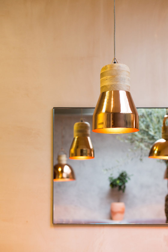
The chairs which accompany the four, right-side copper tables are in wicker, with black metal legs. Flooring in this area and throughout the remaining restaurant space is a sanded, aged and stained oak, giving the impression of being weathered and already in situ for some time. The dramatic feature lighting display over the bar includes glass pendants from Royal Copenhagen, whilst the two-sizes of alternating copper-and-wood alternating pendant lighting to the rear of the restaurant are from Libra. The lighting in the semi-screened wine-store/dining areas is in the form of hand-blown, smoked glass pendants from Curiousa & Curiousa.
Tables in the main restaurant space are in bespoke, patinated zinc, with natural wood and pale grey chairs from Hay, from the J104 series. There are also lower wicker chairs in the centre, as well as two bespoke sets of banquettes. The first of these runs down the whole length of the rear right space of the restaurant, below the pale salmon plaster wall and is made of a mild steel frame with light tan leather upholstery, whilst directly opposite on the left side is a series of three booth areas, where the banquette seating is finished in buttoned light blue leather. All the banquettes were manufactured by Penwith to KKD’s design.
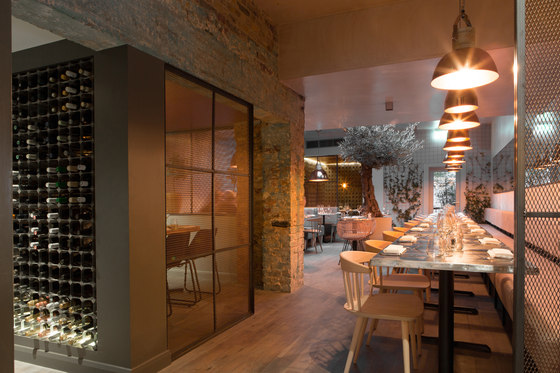
The ledge behind the booths is punctuated by small lemon trees in terracotta plants, further underlining the ‘outside-in’ feel. Two semi-private dining areas on the left of the restaurant are enclosed by floor-to-ceiling screens with mild steel frames and copper mesh and can each seat up to 6 people. Smaller versions of the screens also feature in other parts of the restaurant, above the left-side banquette seating, for example and to shield a waiter station to the right of the restaurant, helping add a subtly industrial and contemporary edge to the space. Empty, reclaimed riddling racks, sourced from France and traditionally used to house champagne, are used in these dining areas as a form of wall-panelling.
The furniture treatment is also slightly different in these two rooms and includes bespoke bamboo table tops and black leather, steel-framed dining chairs from Rockett St George. The first of the areas, encased in an aged brick surround, also wraps neatly around the restaurant’s central service core, where the food hoist is located, along with a wine storage system built into its outside wall, featuring LED up-lighting and allowing full access from the bar area.
Unisex toilets on the lower-ground floor continue the industrial feel, via Belfast basins and bespoke, surface-mounted taps and toilet roll holders made from copper piping. The space is tiled in white to the half-way point with very pale sea blue paintwork used from there to the ceiling. Flooring is the same hexagonal concrete tiling as used for the bar surround, but on this occasion minus the red grout.
Client and owner Sylvia Kontek commented on the design: ‘The aim with Bandol was to continue with the urban design of our sister restaurant Margaux, while making it lighter, airier and bringing in some natural elements to reflect the outdoors feel of Provence. The challenge was how to combine the urban and the rural and still keep it authentic and harmonious. KKD have achieved an incredible transformation of the place and managed not only to create much bigger, brighter and inviting premises, but, with their choice of materials, textures, colours and selection of living plants, they managed the impossible – marrying the industrial with the rustic countryside in a warm, welcoming space that is both chic and cozy.’
Sylvia Kontek
Kinnersley Kent Design
