London, 23 November 2017: House of Fraser (HoF) and leading British design studio Kinnersley Kent Design have launched the retailer’s first-ever green department store at Rushden Lakes, a unique shopping experience in Northamptonshire that blends fashion, leisure and nature. The much-anticipated department store marks several firsts for House of Fraser – it is the British retailer’s first out-of-town format, first ever sustainable store, and its first full UK store opening since 2008.
The project has been shortlisted for Best New Store at the Retail Week Awards 2018, announced on the 20th of November 2017. The stunning new store is BREEAM compliant, with a 50% reduced Carbon Footprint compared to existing HoF stores of a similar size, thanks to its energy efficient design and operations. The interior marks a lighter, brighter feel for the retailer. The concept, created by Kinnersley Kent Design in collaboration with HoF’s team, connects with the beautiful natural setting while embracing the industrial elements of the ‘big box’ out-of-town shopping format.
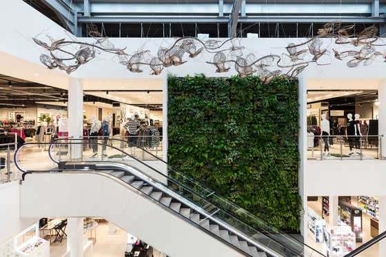
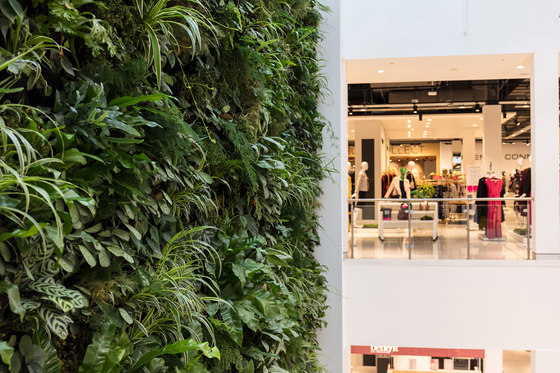
Boasting a champagne bar and restaurant, coffee shop, and over 50 premium and high street brands over two storeys, the new HoF has true destination appeal. Highlights include a striking 160-square foot Living Wall at the heart of the store that consists of nearly 2,000 plants, and bespoke artworks created by local artists. To help raise awareness and support protection of the local Nene Wetlands nature reserve, HoF has partnered with The Wildlife Trust BCN to help customers feel more connected to nature. The Trust is providing HoF customers with experiences and activities such as guided walks around the lakes, wildlife gardening and children’s craft activities.
David Blakeney, Director of Store Development at HoF, said: “House of Fraser at Rushden Lakes is green, local and relevant to how customers shop today. Working with our long-standing design partner Kinnersley Kent Design, we have created something more than an ordinary department store. The team has done a great job collaboratively – we’re delighted with our new green flagship and the store is trading well above expectations.”
Project vision and scope:
The brief was to create a store that is not only beautiful, but sustainable too, with strong environmental standards. The department store had to be fashion-forward, social, energetic and flexible and have a sense of place. In short, it had to give customers a reason to make HoF part of their day out at Rushden Lakes.
As Rushden Lakes is HoF’s first out-of-town department store, Kinnersley Kent Design was asked to create a new aesthetic for the retailer to suit the format. The design consultancy’s scope of work included masterplanning and circulation, façade design, interior architecture and lighting principles, plus defining the architectural design principles and material palette for each department.
A new look & feel:
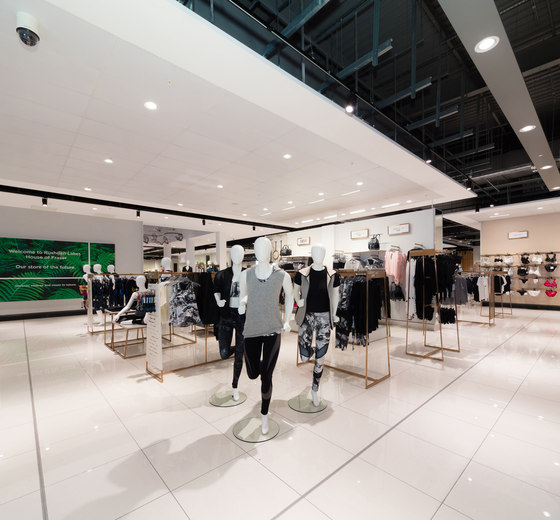
Kinnersley Kent Design worked closely with HoF’s team to move the retailer’s identity forward. Rather than disguise the innate warehouse-like aspects of the building, Kinnersley Kent Design made it central to the design scheme, whilst balancing the ‘industrial’ elements with a lighter, brighter aesthetic. Pops of greenery appear throughout the store to add to the fresh feel.
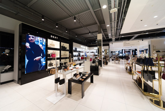
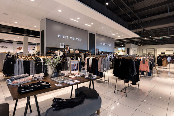
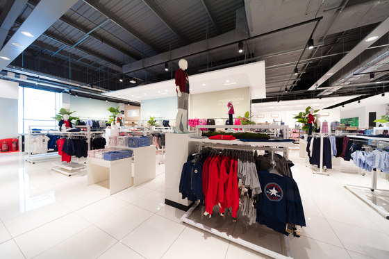
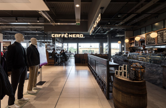
For the first time in a new HoF store, there is an exposed, open ceiling. The retailer’s signature black brand language appears in a new, lighter manner through black track lighting. This creates a keyline effect that helps to visually divide departments, adding to the contemporary feel in a refined way. LED lighting is used throughout the store, drastically reducing energy consumption.
HoF at Rushden Lakes uses eco-friendly ‘comfort cooling’ throughout in place of standard air conditioning. Kinnersley Kent Design made the perforated air displacement walls a key part of the store’s main architectural palette and used them to add texture to the scheme, demonstrating that functional can also mean beautiful. Another benefit of the air displacement walls is that no ceiling ducting is required, so the designers were able to create a more spacious and open feel in-store.
Describing the overall design approach to the project, Mick Kent, Partner at Kinnersley Kent Design, said: “The store concept introduces a new lightness of touch for House of Fraser, which felt especially appropriate given the natural location at Rushden Lakes. Having assessed and evolved the brand ahead of its launch in China last year, it was exciting to work with HoF’s team to develop this thinking further for the UK market, making the in-store identity feel brighter and more joyous.”
Design walk-through:
Façade and entrance
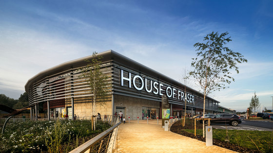
Working with the developers, Kinnersley Kent Design created a stylish ‘British’ herringbone-pattern architectural cladding for the façade, which helps to subtly differentiate HoF’s architecture from other stores at Rushden Lakes. Bold store signage is layered over sunshade louvres which create a sheltered promenade walkway for customers. When masterplanning the concept, Kinnersley Kent Design opened up the windows on the façade to increase natural light in-store, and moved the entrance to the centre in order to maximise the customer’s view of the space when they enter.
Ground floor and atrium
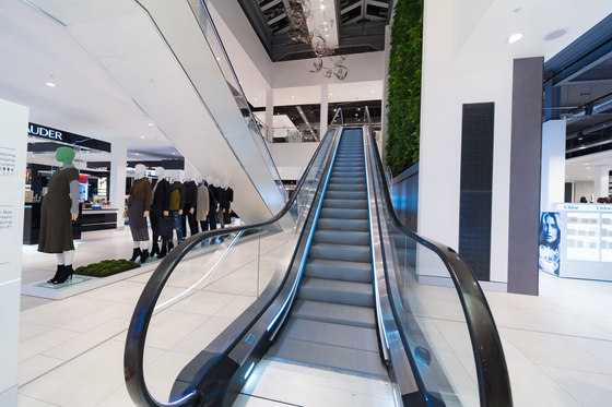
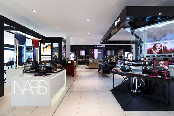
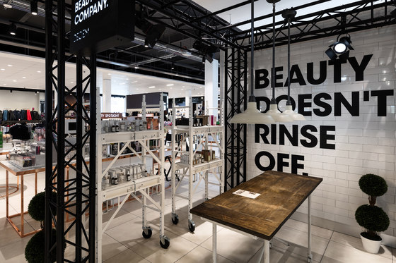
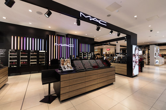
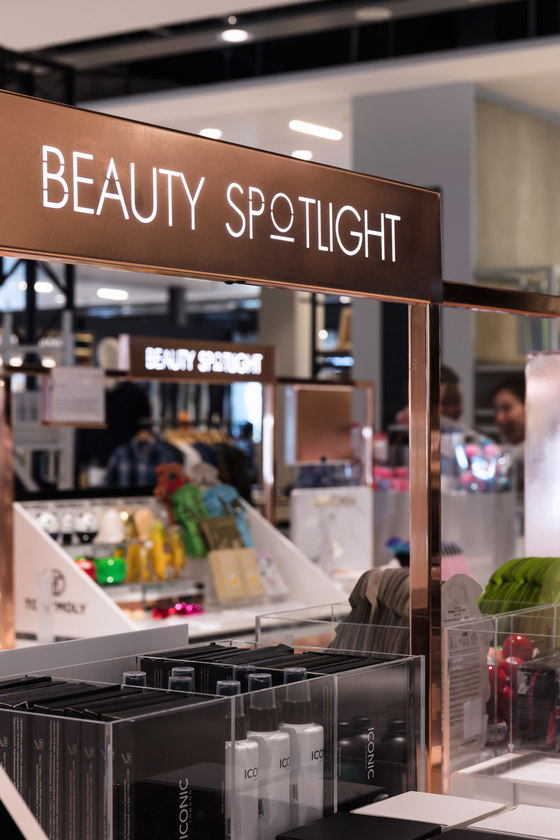
Customers arrive in Beauty, which features luxury brands including MAC, Urban Decay, Nars, Dior and Bobbi Brown alongside niche brands such as Instagram favourite Deciem. Beauty Spotlight Brands, an alluring new HoF-owned area in rose gold, reinforces the retailer’s beauty leadership by introducing trending and innovative new beauty products. In the middle of the store and directly ahead of the entrance, the atrium houses the Living Wall, criss-crossed by escalators in front.
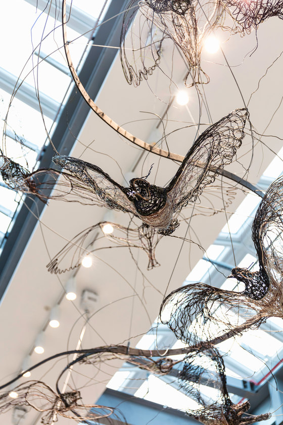
Comprising thousands of living plants and flooded with natural light from the glazed atrium above, the Wall not only brings the outside in but also helps improve air quality and customers’ sense of wellbeing. An ethereal sculptural installation of nearly 20 ‘birds’ glides overhead – all depictions of species found in the area, fashioned from recycled metal wire by award-winning artist Celia Smith. From the Beauty Hall, customers can either flow out to the right towards Fashion Accessories and Women’s Shoes, or towards the comprehensive Menswear offer and Caffè Nero coffee shop on the left-hand side of the store.
First floor
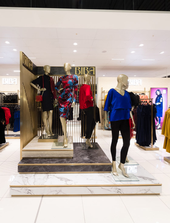
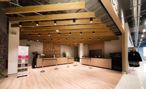
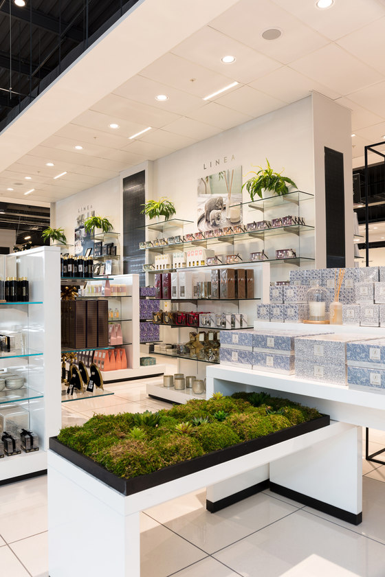
Travelling up the escalators past the Living Wall, customers arrive in Womenswear, which sits adjacent to Home and Kids. The Women’s Fashion department features fashion brands’ latest concession designs, helping to create the best experience for customers. HoF upgraded its own brands, Biba, Linea and ISSA, and introduced new athleisure and lingerie departments, fulfilling the customer trend towards holistic wellbeing. A dedicated Buy & Collect area is situated a short walk from the escalator and next to back of house, ensuring efficiency for customers.
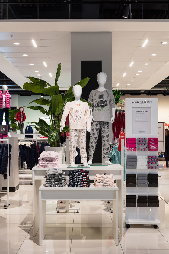
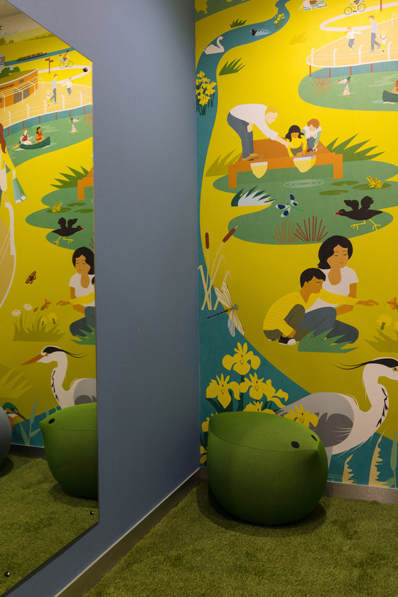
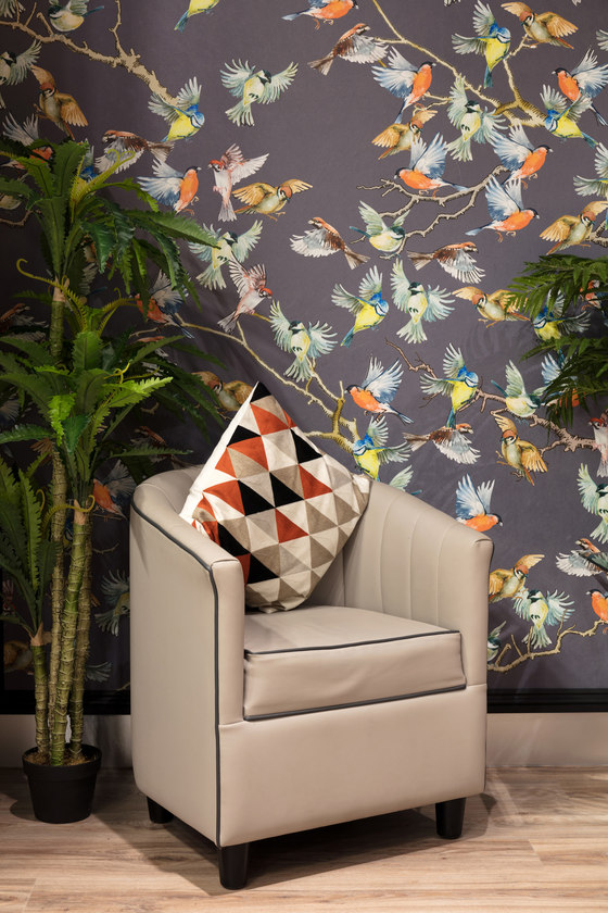
The Personal Shopping area and fitting rooms feature bespoke wallpapers by local artists, based on natural themes and commissioned by HoF specifically for the project. In the individual fitting rooms, changeable light features replicate different times of the day and night to help ensure that customers are happy with their purchases. Kidswear includes many new clothing brands and a new Hamley’s concession. Its quirky, fun changing rooms feature a mural by The Wildlife Trust BCN’s illustrator Rachel Hudson, picturing families enjoying the local wildlife at Rushden Lakes.
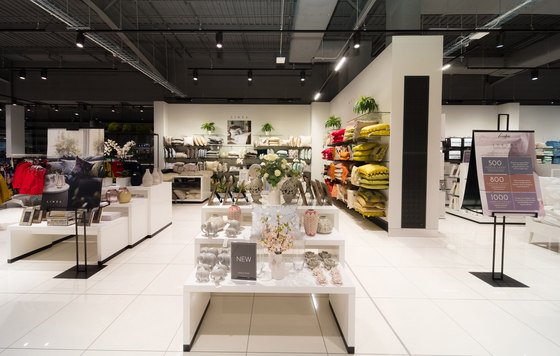
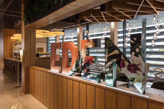
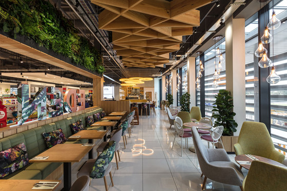
In the bright Home department, the store’s signature pops of greenery are especially present, with quality homeware merchandised alongside various living planters. Finally, Eden champagne bar and restaurant, located next to Home and Kidswear, offers customers a place to relax and socialise with friends while enjoying elevated views over the lakes. Its glamorous, botanical concept, designed in-house by the food service operator Compass Group, features high-level greenery which echoes the Living Wall in the atrium. The overall result is a beautiful new House of Fraser department store that’s social and sustainable, with a real sense of place.
Kinnersley Kent Design
