Kinzo has designed the office interiors for renowned Suhrkamp Verlag in the new building by Bundschuh Architects in Berlin‘s Scheunenviertel”) - a space for thousands of books on custom-made shelves, close to 5 linear kilometers; open space which creates a great atmosphere; „narrative staircase“ connects conference rooms and tea kitchens; unique color concept; tailor-made solutions; costs within budget.
It was a long journey for Suhrkamp’s new publishing house to be move-in ready by August of 2019. Nine years earlier, the publisher relocated from Frankfurt am Main to Berlin. The next chapters of a new success story were written, part of the story being an opportunity to move into a new building in Berlin‘s historic Scheunenviertel.
The building was to close the distinctive gap at the corner of Tor-, Linien- and Rosa-Luxemburg-Straße in the immediate vicinity of the Volksbühne. The modern new building, planned by Bundschuh Architekten, had not only the potential of becoming an important urban building block, but also to be in the best company of galleries, cafés, bars and an art association, thus completing an exciting cultural quarter.
”Kinzo has created a very appealing design, putting the house’s books in the foreground.“ — Dr. Jonathan Landgrebe, Vorstandsvorsitzender Suhrkamp AG.
Spotlight on Kinzo
Suhrkamp embarked on a search for a spatial concept that would reflect the publisher‘s identity. The project called for a tailor-made solution that would be simple and elegant while utilizing a small budget, and which, although smaller in size than the former office, would fit 135 employees.
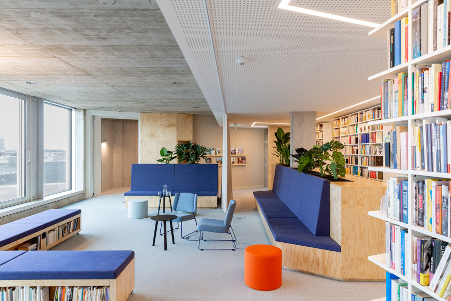
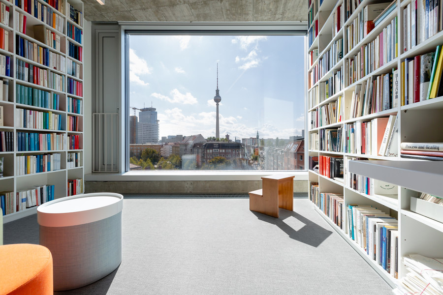
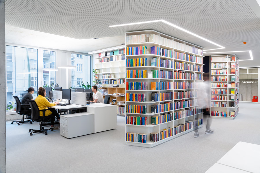
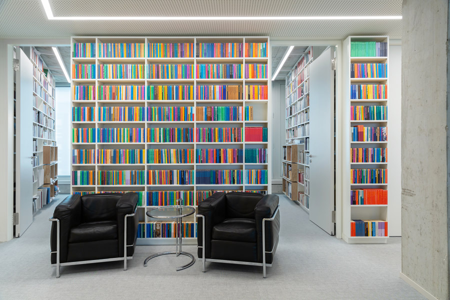
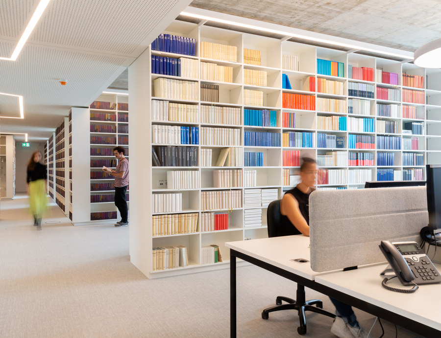
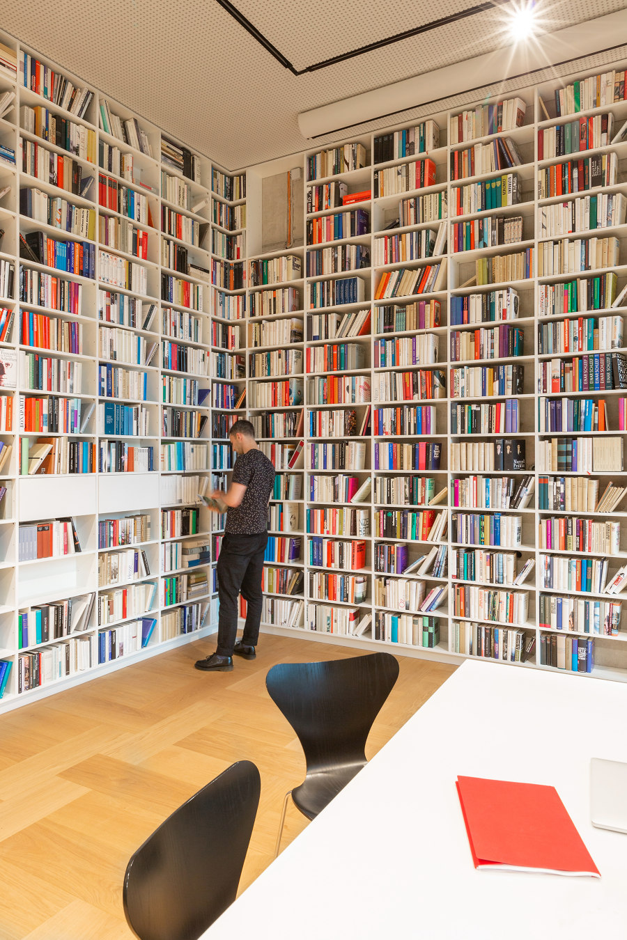
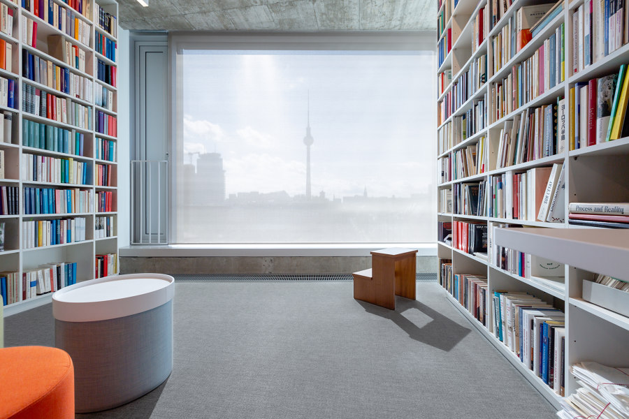
Of course, the main protagonist of the interior was clear to the design team at Kinzo: the book. Or rather the books. Or even more aptly: the thousands and thousands of books! Our vision was a house, which rests on multi-story high stacked volumes instead of walls and columns. As emotional and atmospheric building blocks, the books should form the supporting structure and at the same time be the daily working instrument. Accordingly, shelves had to be built, many shelves – these had to fill almost every free space on the walls while simultaneously replacing them.
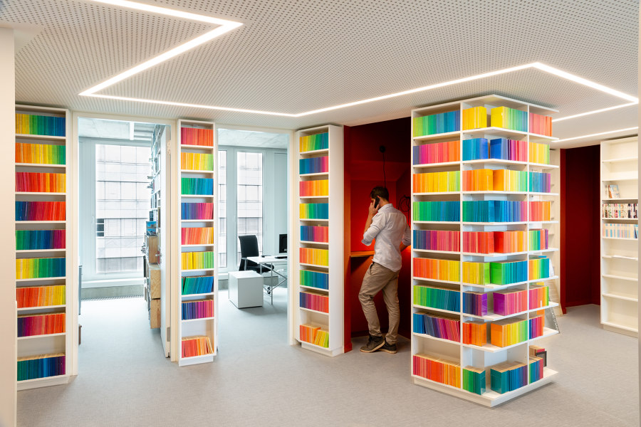
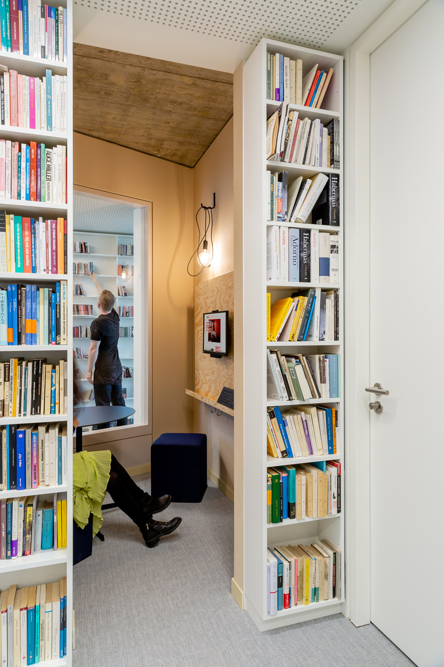
But how could Suhrkamp’s enormous book collection find enough space on the limited wall space? A new concept for the entire building plan provided the answer: Kinzo divided the floor plan and let the walls meander through the 6 floors of the building in the form of a zigzag, like an inner facade. This idea not only created more wall space and thus sufficient shelf space, but at the same time optimized the area of the rooms and created small niches - usable for all employees as retreat rooms for spontaneous meetings, communication islands, think tanks or telephone booths.
The stage undoubtedly also belongs to the employees of Suhrkamp, who play the second leading role alongside the books. Kinzo responded to all the spatial needs of the employees, including the editors, with a heterogeneous offer that is also reflected in the floor plan. Initially, it was a great challenge to accommodate all the desired editing rooms.
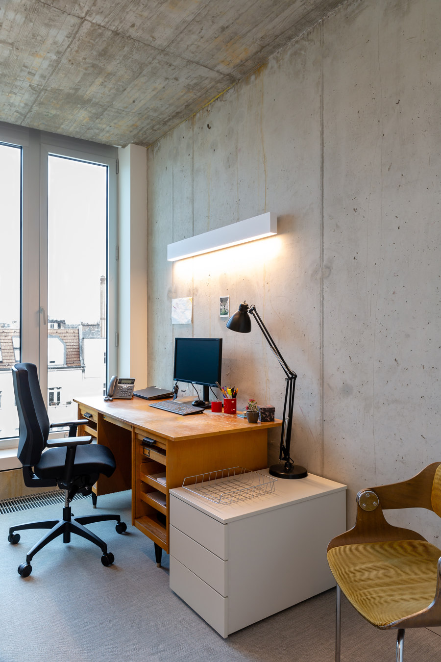
In addition to there being less space available than in the former office, the layout of the publishing house over six floors instead of the previous two led to a shortage of space, since room had to be provided for the access cores, corridors and toilets on each floor. The conical, tapered shape of the building did not make things any easier for Kinzo‘s team. It was clear early on that the rooms for the editors had to be as small and efficient as possible. The result are rooms with an average of 9 m2; they are characterized by windows that are almost as deep as the floor and which allow plenty of daylight to flow in.
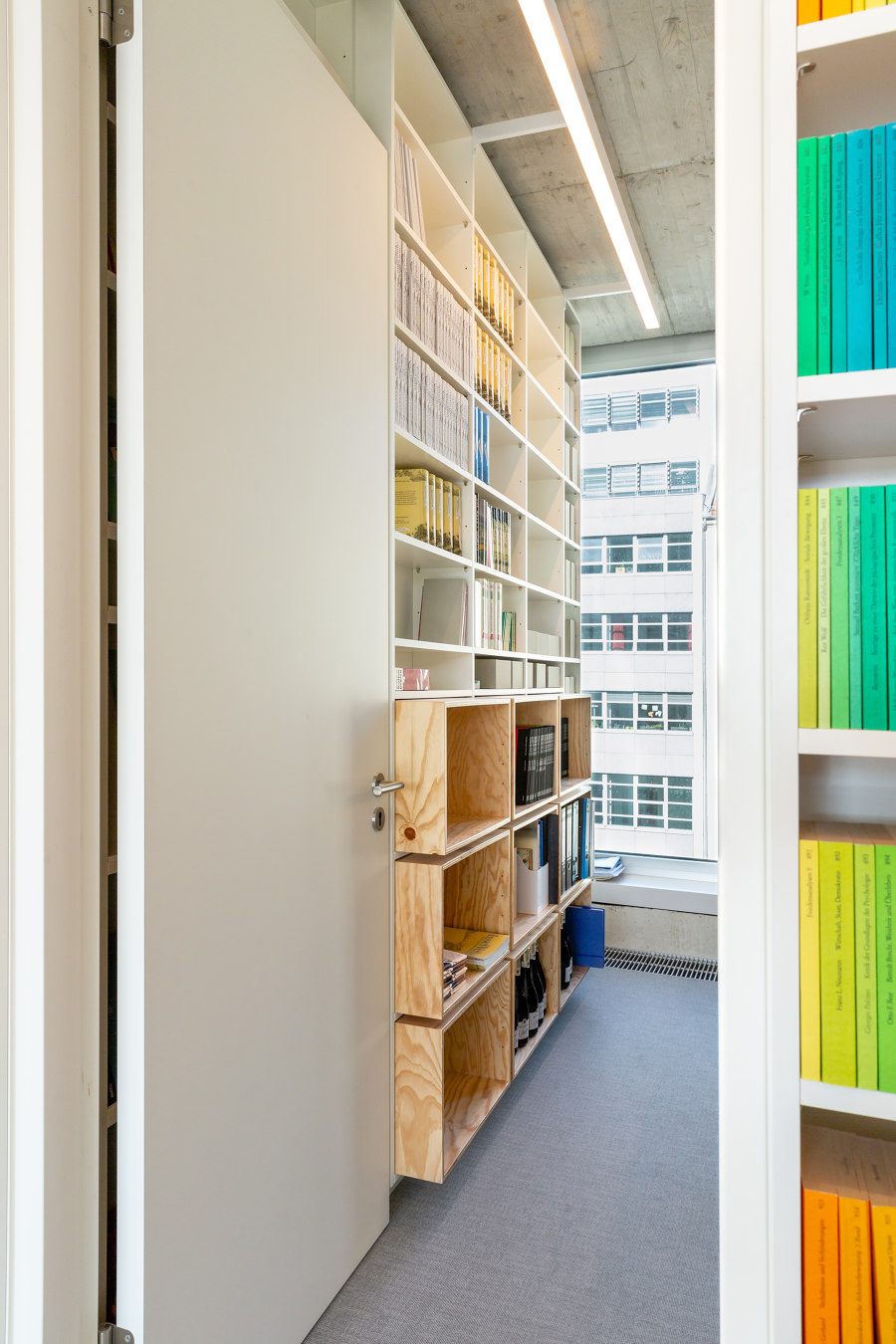
Instead of appearing confined, the rooms convey a sense of security and concentration. The door of every editing room is designed to be flush with the shelf when opened, and to almost seem to disappear into it. This enables the room to open up into the adjacent open space of the large office and, like a natural cove, becomes its extension. The large communal area of the office acts as a counterweight to the small rooms, as well as spatially allowing colleagues to work across rooms with natural communication at eye level when the doors are opened.
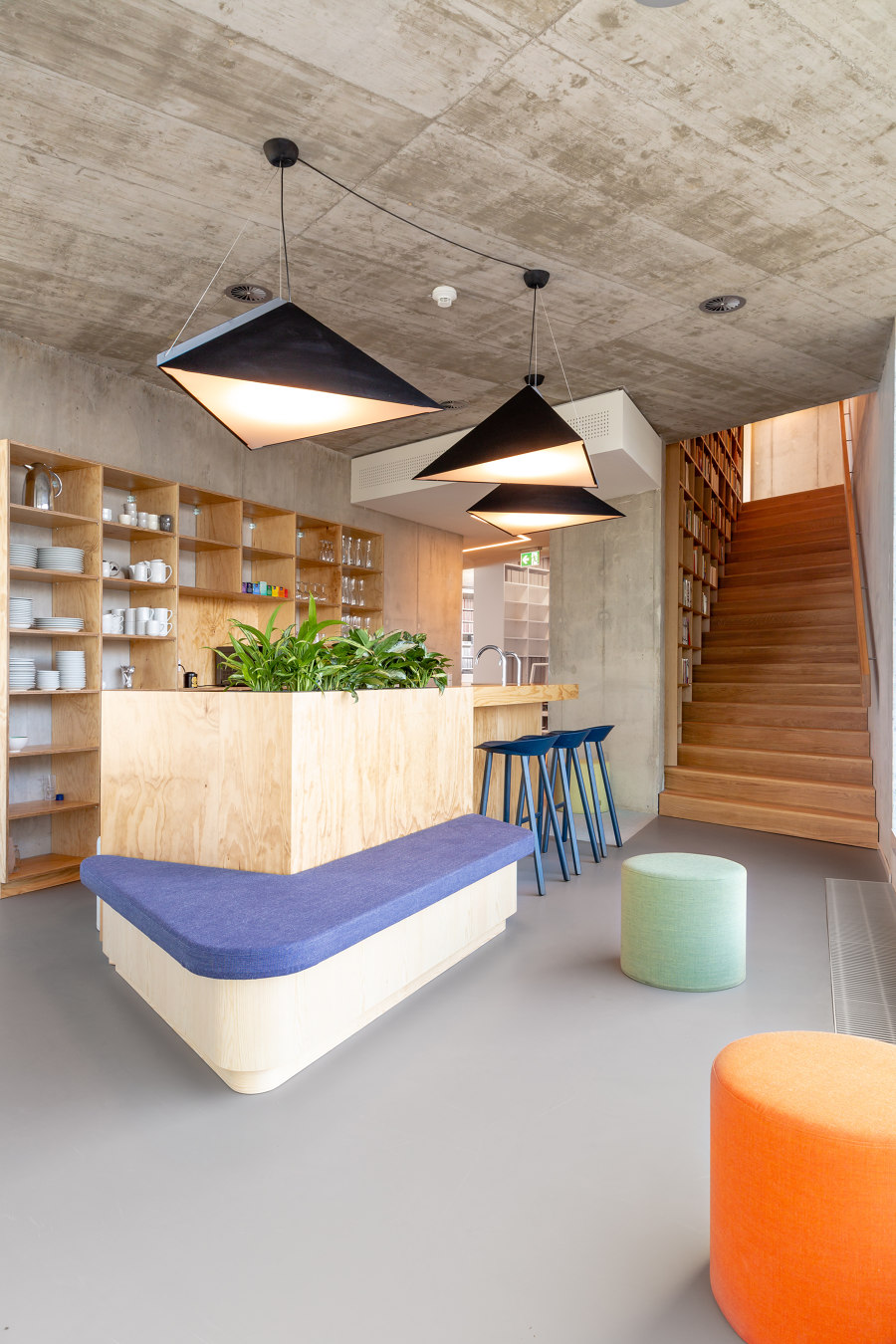
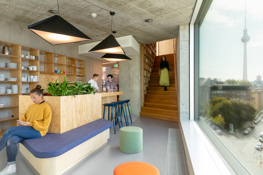
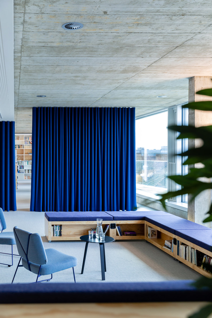
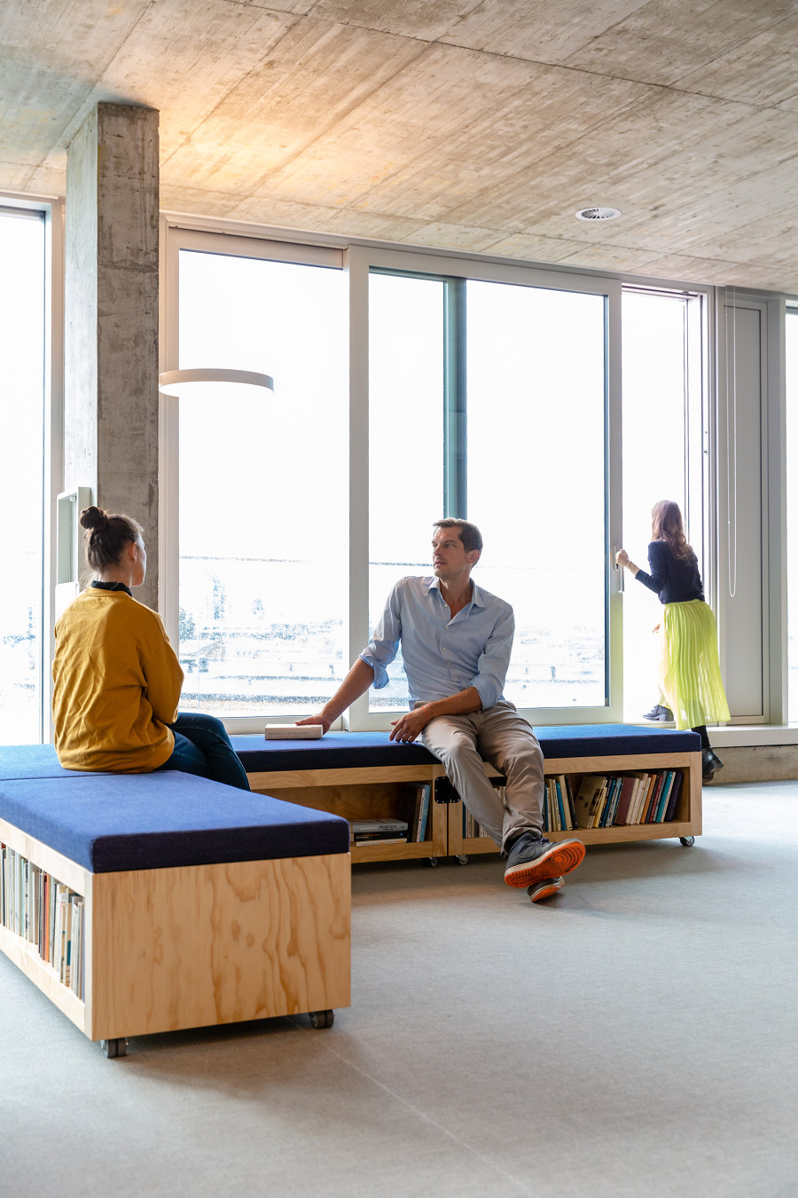
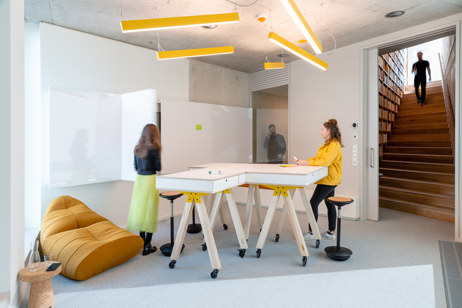
All other workstations unite in the open areas, which are lined with kitchenettes and conference rooms on the angular side of the building. These are characterized by a pleasant atmosphere, and the view through the large panoramic windows directed towards the bustling Linienstraße and onto Rosa-Luxemburg-Platz. One of the conference rooms features furniture on wheels, so the room can be repurposed as required.
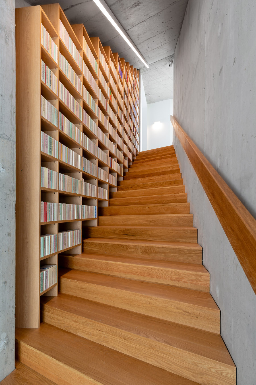
A custom-made whiteboard, which can be opened or closed as needed, conceals a large screen. The conference rooms and kitchenettes - and thus the floors - are connected internally via the so-called „narrative staircase“, which runs from the first floor at an oblique angle to the sixth floor. The staircase received its name because of its impressive shelf, which follows the steep course of the stairs like a dramatic narrative thread. The oak shelf mirrors the materiality of the staircase steps.
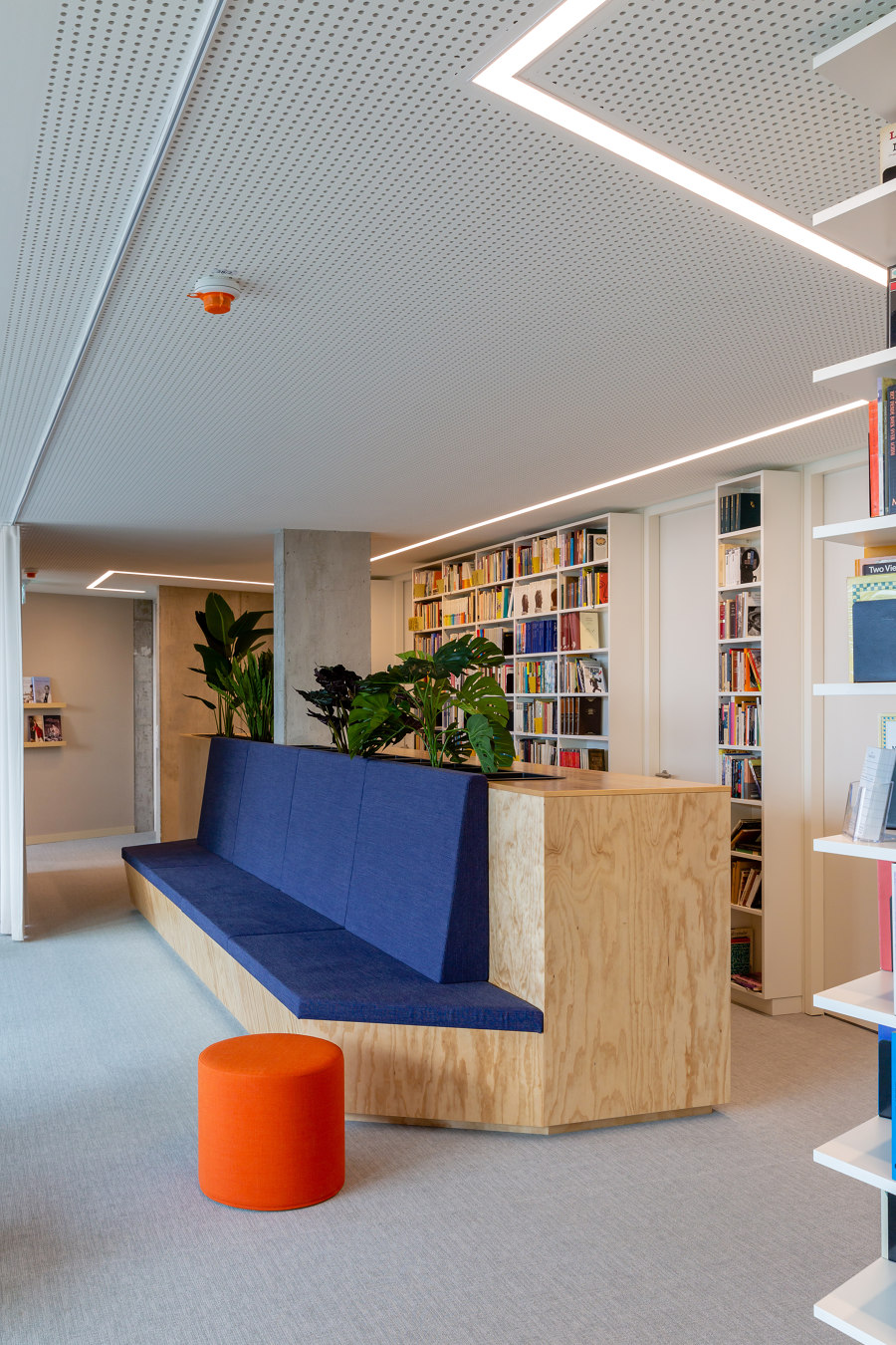
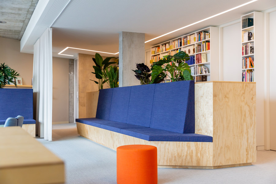
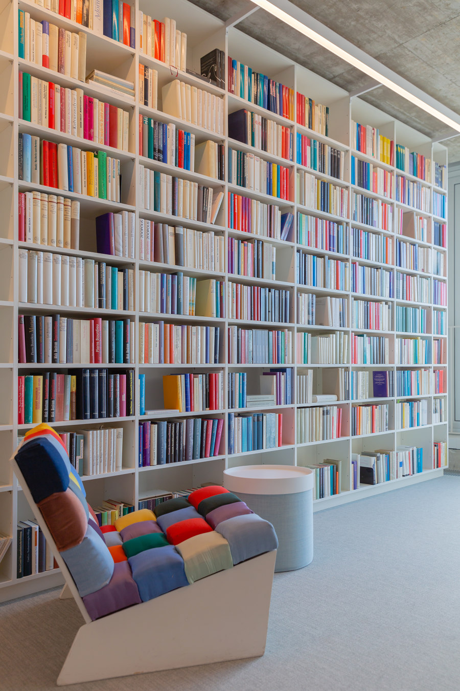
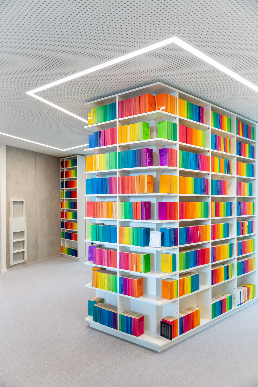
The color concept of the high-quality materials and furniture is well balanced. To balance the lively colorfulness of the thousands of book spines, the chosen colors evoke the greatest possible tranquility. All fabric-covered built-in furniture is dark blue, while the loose furniture picks up on primary colors, and here and there accentuates the grey and white mottled carpet of the offices. This in turn blends harmoniously into the color scheme of the rough grey from the exposed concrete ceilings with visible formwork, the elegant white of the shelves and the minimalist grey of the balustrades and soffits.
High-quality roller blinds, also in grey, round off the concept. The attentive guest (as well as the employees) will notice that the small retreats and meeting niches with their textile wallpapers pick up on the individual tile patterns of the toilets on each floor - a playful design which, however, ensures intimacy.
In the end result, Kinzo has optimized the relatively small space of the new Suhrkamp publishing house. Not only was it possible to integrate all the books and shelves into the space, but it was also possible to create a space that was both tailored to the different requirements of the users and flexible at the same time. Although high-quality materials and products were used and many fixtures had to be custom-made, the solutions remained cost-effective and within budget. Through their work, Kinzo has proven their expertise in office interior design, which has grown over the years, and at the same time opened new doors by meeting the requirements and needs of a traditional publishing house, an institution of high culture.
Express your shelf
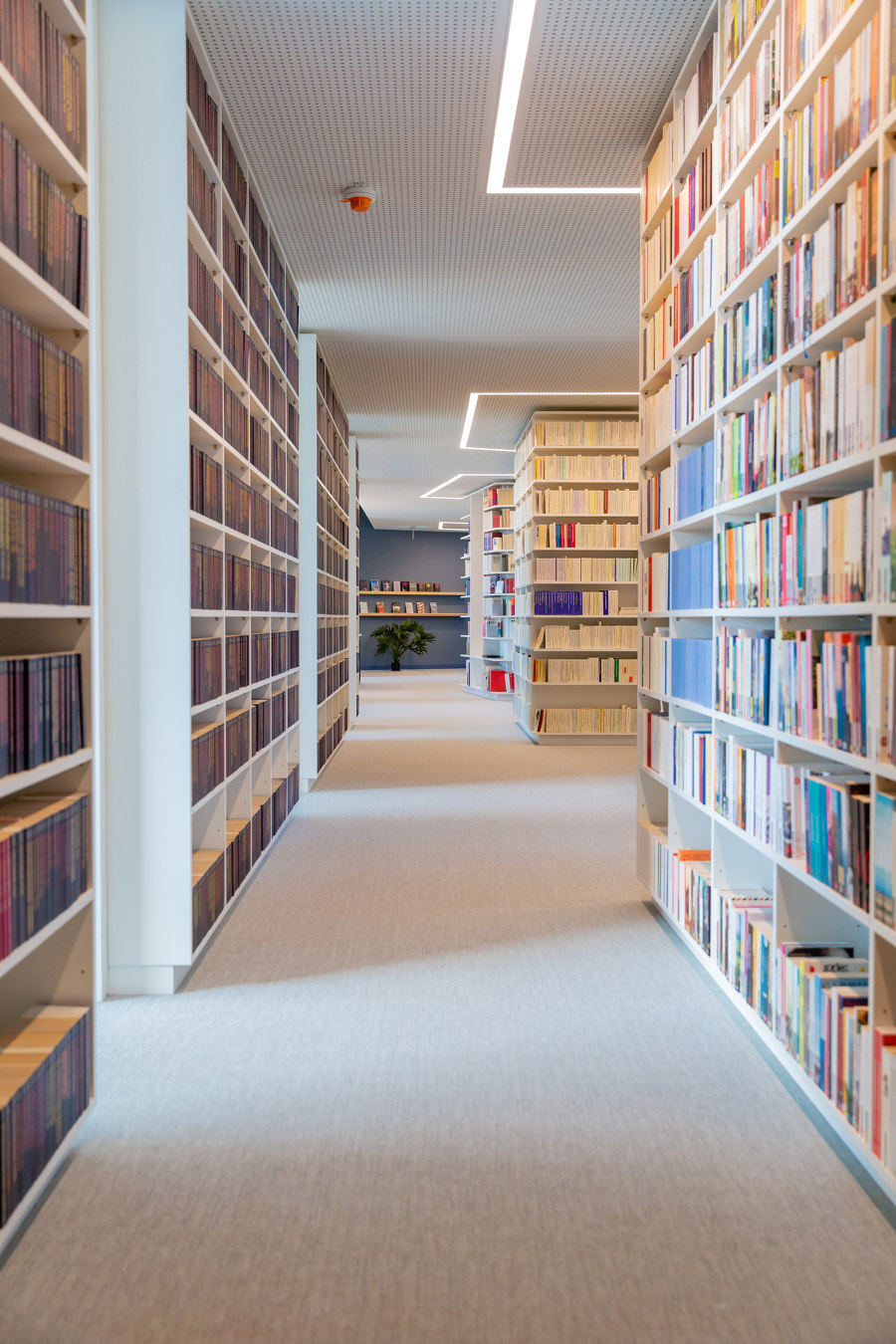
The Suhrkamp house does not seem to rest on walls, but on bookshelves, many bookshelves. The extensive inventory of the publishing company is housed within a total of 4,893 linear meters of shelving. This is about the distance from Alexanderplatz to the Berlin Victory Column (“Siegessäule”), or 13 times the height of the Television Tower (“Berliner Fernsehturm”).
By revising the floor plan, which almost doubled the shelf space, the central challenge of accommodating all the books was largely solved - and incidentally, the acoustics of the rooms were also significantly improved. Now the task was to optimize the layout of the shelves in such a way that maximum flexibility could be offered. At the same time, the entire shelf structure had to be as even, unobtrusive and neutral as possible so as not to steal the show from the books.
Kinzo developed its own shelf grid with flexibility in shelf positions - thus accomplishing two different options for using the shelves. An ideal height between the shelf units was determined which created a normal distance (for most books) and a dimension one and a half times as high (for large books and folders). Accordingly, the number of holes for shelf positions could be reduced considerably. In the open space area, the shelves have the ideal depth of 30 cm to accommodate folders that perfectly line up at the edge of the shelf. Space had to be saved in the small editor rooms and in the individual offices - here a shelf depth of 21.5 cm was sufficient.
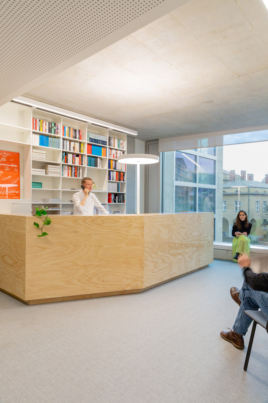
Simple wooden boxes made of pine wood were developed so that folders could still be placed on the slimmer shelves. The wooden boxes can be added into the high compartments stably and precisely if required. The varnished wooden surface protrudes from the shelf, radiating warmth with its honey color, creates an accent, and at the same time harmonizes ideally with the melaminecoated white edge of the shelf, the exposed concrete of the ceiling and the colorfulness of the books. Pine wood is also used as a material for the reception counter, kitchenettes and small meeting rooms - anywhere where community is created. The implementation took place in close and constructive cooperation with the interior fitting team at Raumeffekt.
The books are lit either by luminaires integrated into the perforated ceiling, or by lamps set into the shelves, which also supply the rooms with indirect light. The light rails are positioned precisely so that each row of books is illuminated, even the lowest. The particular placement of the shelves makes the parallel light tracks appear almost like the light source itself, giving the building an energetic feel as well as depth when viewed from the outside at dusk and at night.
Design Team:
Interior: Kinzo
Partner: Chris Middleton and Martin Jacobs
Project leaders: Grischa Leifheit and Siwan Dub-Russ
Team: Stefanie Pesel, Georgia Dimaridou, Jacqueline Haller, Luca Marinelli, Brian Chen, Nhu Huynh and Hannah Beisner
Architcture: Bundschuh Architekten
Client: Suhrkamp AG
