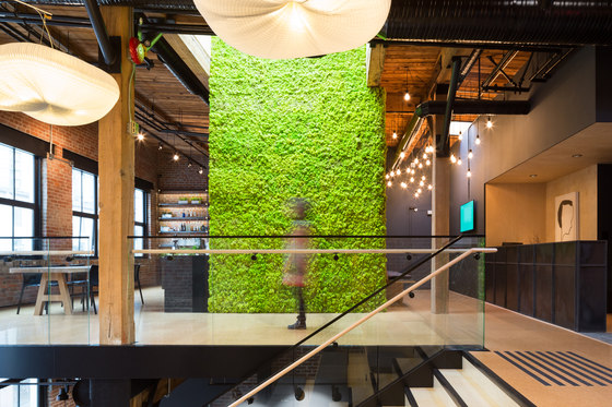
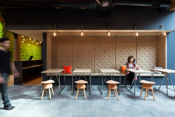
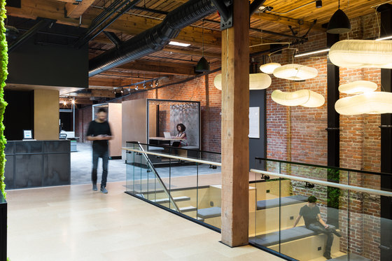
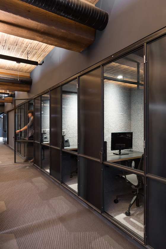
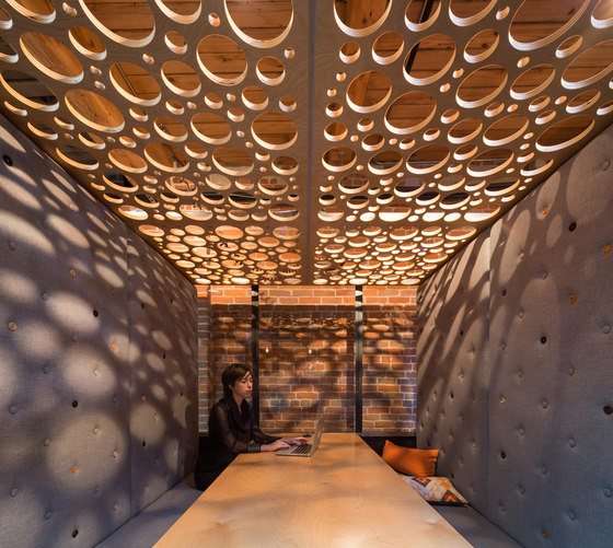
The Vancouver headquarters for an award-winning communications software company repurposes an industrial warehouse building in Vancouver’s historical Yaletown district. As a rapidly growing communications-software startup, the client’s technology aims to revolutionize the typical modes of corporate communications; humane thinking and empathy are core social values for the company. The design challenge for the headquarters was to materialize a physical laboratory which promotes the company’s attitude towards digital communications and to successfully integrate this layout into an existing building with a distinct industrial character. Functionally, this meant re-imagining the roles of social working spaces to make them nconventionally flexible and reconfigurable. There are no private offices in this project. Typical static meeting rooms are supplemented by mobile meeting boxes: custom cubic rooms on wheels intended for portable breakout or informal meeting space. Amidst the open floor plan, employees can find solitude for Skype meetings and private phone calls in the ‘Skype booths’, semi-private cubbies derived from a phone-booth typology.
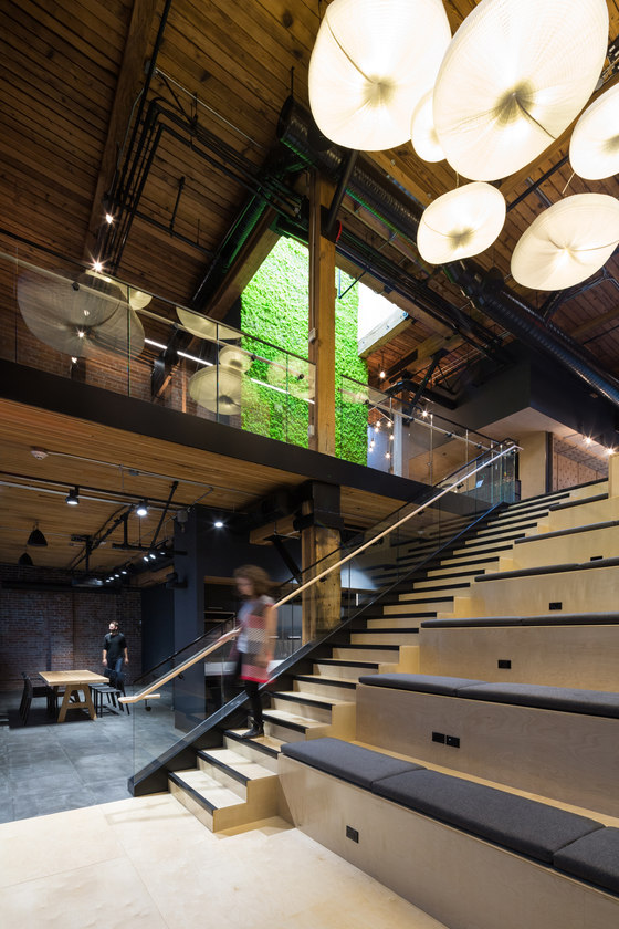
These unique spaces allow for a kind of play that is thought-provoking and inventive. The headquarters is organized across three levels, connected via an ambitious architectural implant that creates a linked series of typologically varied gathering spaces supporting a range of social activities, including:
• A double height space with convenience stairs and terraced seating to facilitate ‘allhands’ meetings and
• presentations, as well as informal gatherings (connecting all three floors)
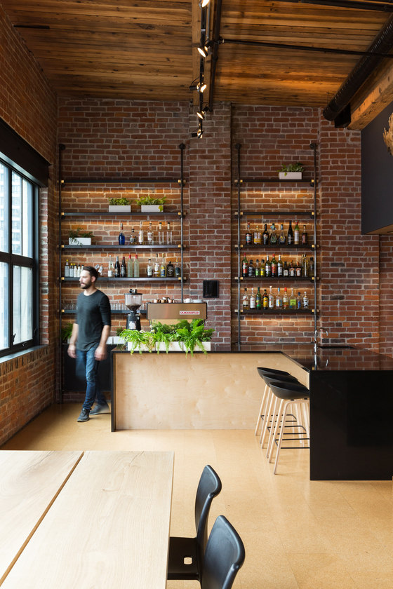
• A kitchen / espresso bar / cocktail bar area to accommodate team lunches and social
gatherings (third floor)
• Coffee stations (first and second floors)
• An open dining area (second floor)
• A lounge / media room (first floor)
• Meeting rooms – various sizes (all floors)
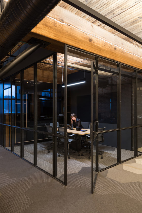
The architectural implant was extremely ambitious from a structural and building code perspective, requiring the implementation of multiple innovative alternative solutions to create continuous flowing space through several separate fire compartments across the three floors. The project seeks to integrate the existing еxposed structural brick, heavy timber beams, and mechanical infrastructure with contemporary details and everyday, utilitarian materials. The project was executed via a phased approach, with an ambitious delivery schedule for Phase 1 (the top floor) – 100 days for design / permitting / construction. Accordingly, creative problem solving played a large role in the delivery process – the architect partnered with a builder tocreate an integrated design-build team. In order to avoid long lead times for products and components we ended up using existing trade relationships to expedite custom installations – most noticeably the interior glazing partitions and door assemblies. These elements were fabricated from industrial hot-rolled steel components, which were also utilized for custom furnishing pieces like the reception desk and kitchen shelving.
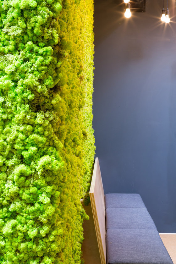
The intention here was to complement the base building’s industrial envelope details with industrial metal interior systems and furnishings that were locally fabricated to create a handmade aesthetic. From the custom sculptural lighting pendants that float like clouds connecting working and social spaces, to the massive moss wall that explores the concept of ‘interior nature,’ down to the smallest of details like the assortment of mismatched wood buttons on the upholstery, interventions are intended to bring quirky delight and playful stimulation to the company’s workforce.
Leckie Studio Architecture + Design
