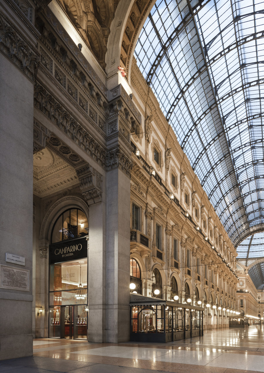
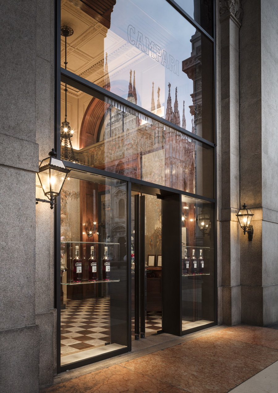
The restyling of Camparino in Galleria was carried with full regard for the history of the location in terms of its aesthetic and social significance. For Lissoni Casal Ribeiro, the renovation of an institution such as the Camparino has meant reviving certain tenets of Milanese interior design while seeking to maintain intact the concept of conviviality and sociality that forms such an intrinsic part of the city.
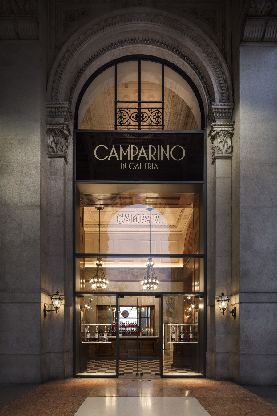
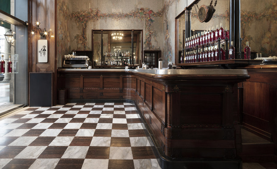
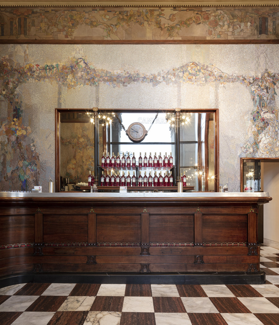
The Bar di Passo underwent a process of conservation and restoration with the aim of salvaging all the existing stylistic elements. The only interventions in this area involved the refurbishment of both the lighting for the coffered ceiling, so further enhancing its beauty, and the windows of the entrance in line with those already present in the Galleria.
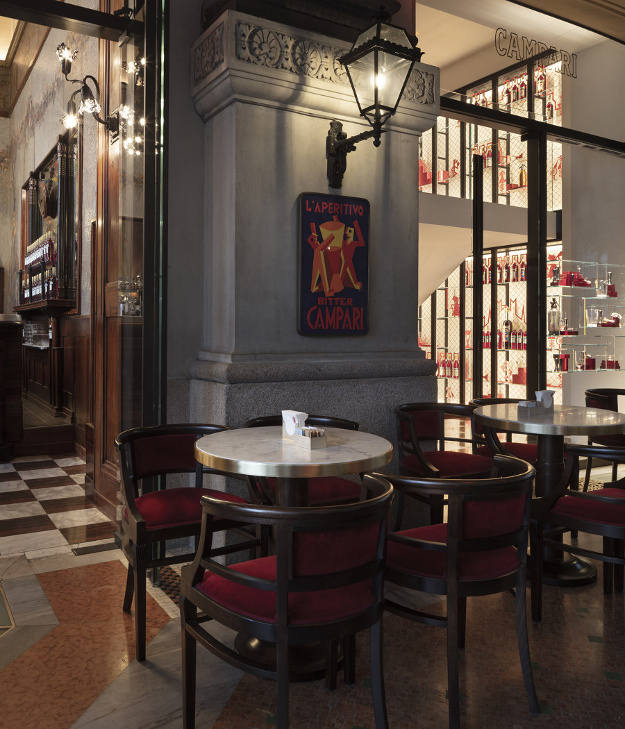
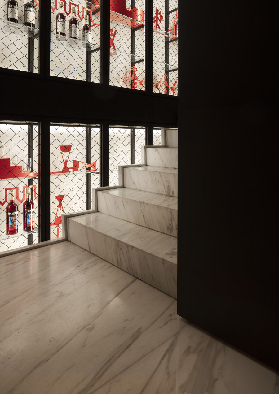
The style of the passage area that leads to the outside terrace has been renewed, giving a foretaste of that of the first floor without however losing the identity that links it to the Bar di Passo: the chequerboard tiling therefore uses the same materials – Carrara and Rosso Verona marble – in continuity with the surroundings, while an element of more contemporary design is introduced – a full-height, back-lit structure which accompanies the visitor to the upper floor. The tables and chairs of the outside terrace were renovated while leaving untouched their timeless elegance and refined simplicity.
Always with the aim of harmonizing and aligning the language, the staircase which connects the first floor and the new basement space is clad in walnut boiserie, recalling the stylistic code of the mezzanine floor, while the lift shaft is clad in burnished brass.
Whilst remaining closely connected to its history, the Sala Spiritello has at the same time been brought up to date in order to appeal to both the long-established frequenters of Milanese café society but also to younger people and to those whose taste is shaped by their experience of other metropolises the world over.
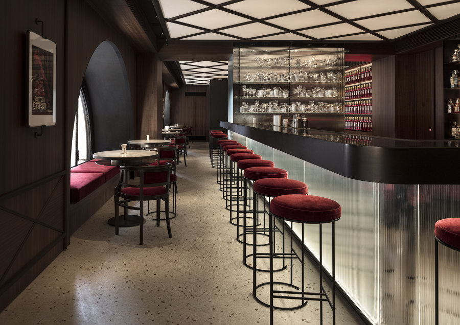
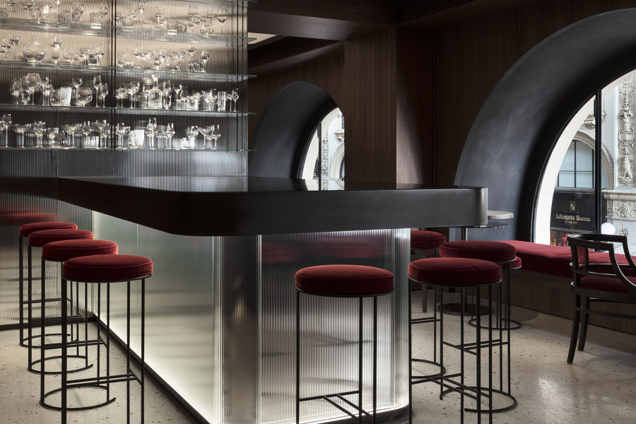
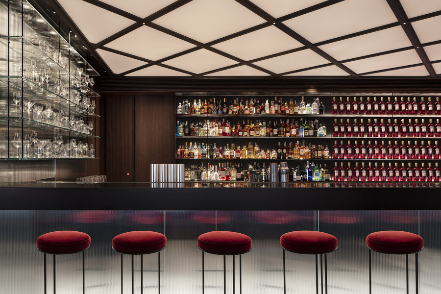
The space opens out from a large central fixture formed of a bar counter and a convivial peninsular table clad in backlit fluted mirror glass, both designed to enhance the preparation and the sampling of cocktails. The central wall dividing the two rooms is also clad in the same fluted mirror glass and has glass shelves to display cocktail glasses.
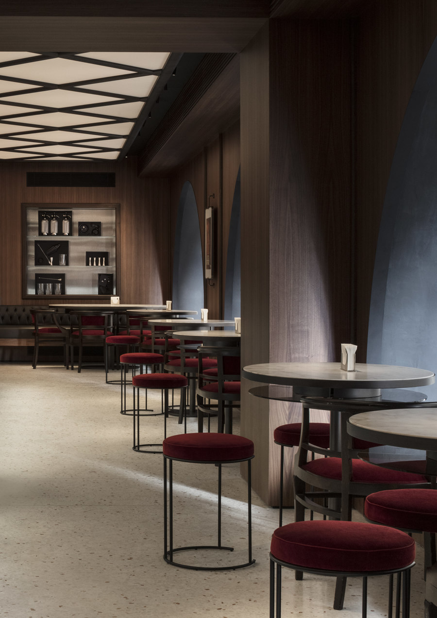
The architectural uniformity of the space is guaranteed by flooring in Venetian terrazzo and walnut boiserie. To evoke the memory of what Camparino once was, all the boiserie features floor to ceiling pilasters, the large arched windows on the Galleria side continue to accommodate the wood seating with velvet cushions and the end wall maintains the niches clad in mirrored glass.
The visual impact of the location is exalted by the backlit rhomboid-patterned ceiling that recalls the coffering of the Bar di Passo, in addition to providing diffused and uniform lighting in a space which due of its position does not receive much natural light.
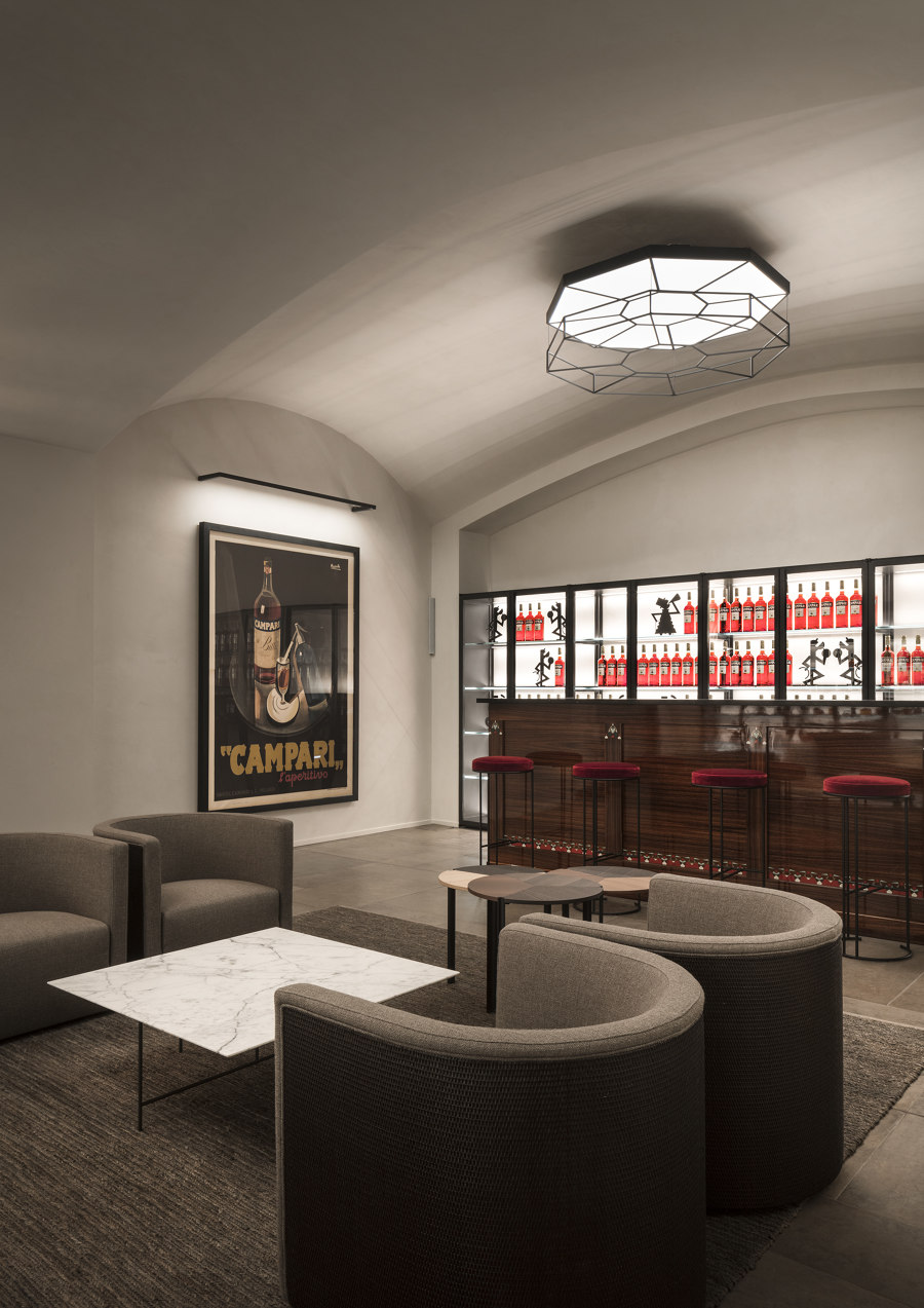
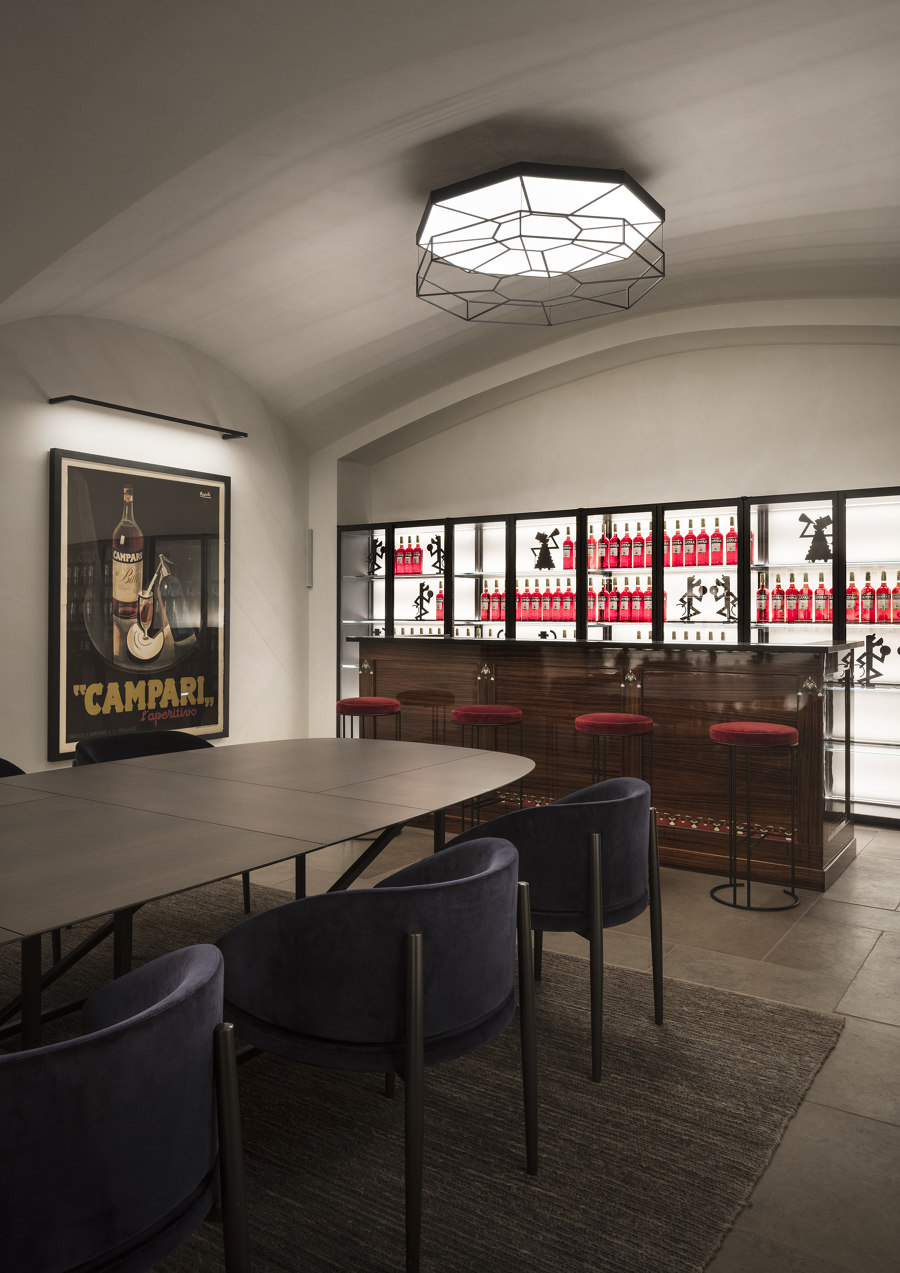
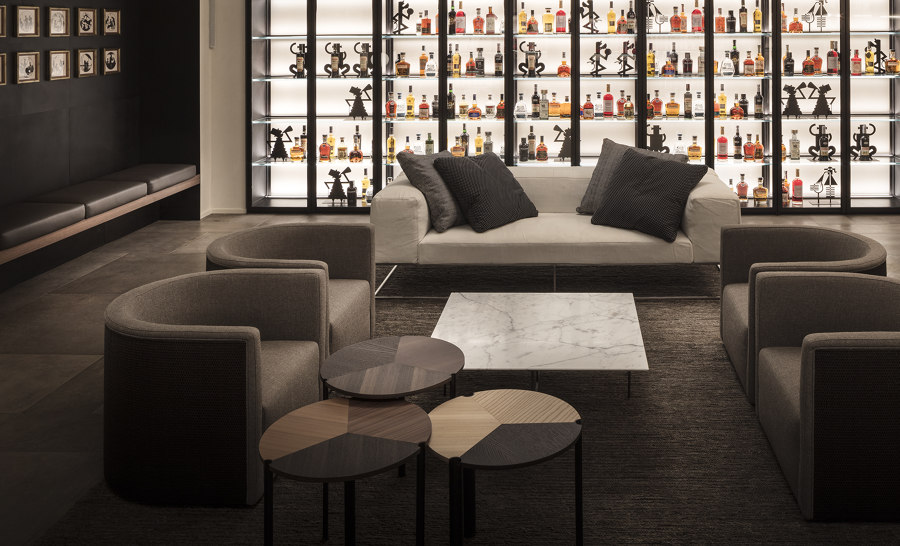
The Sala Gaspare Campari on the basement floor is totally new and was recuperated from the spaces that were originally given over to storage – a cozy and elegant space where the ceiling lights recall the design of the medallions on the floor of the Galleria and which features a wood counter that was originally on the first floor. The layout of the furniture in the room is flexible and can be configured to accommodate different types of events: host bartender courses, be transformed into a space for private dinners with a large convivial dining table, become another dining room for the restaurant to supplement the existing one or indeed turn into a comfortable and informal lounge space.
Lissoni Casal Ribeiro has also worked with Campari on choosing and positioning historical pictures and prints such as the original “Spiritello” (1921) from the painter and illustrator Leonetto Cappiello, after whom the room is named, the illustrations hanging in the niches by Ugo Mochi and the “Campari” picture by Marcello Nizzoli in the Sala Gaspare Campari.
The styling and art consultancy were developed around the desire to interpret in a modern key not just the identity, which is unequivocally defined by the Campari brand, but also its long and rich cultural heritage.
The main concept that forms the foundation of the intervention is storytelling: modern materials with strongly defining finishes narrate and interpret not only the brand’s products of yesteryear and today, but also the evolution of the brand’s relationship with the world of art.
In particular, the posters that the artist Depero realized for the company in the 1920s provided the inspiration for the creation of silhouettes of people and forms that animate and interact with the products in different areas of the bar.
Product, tradition and identity have been translated into modern elegance that does not shy away from offering a touch of the unexpected.
Design team:
Lissoni & Partners
Lissoni Casal Ribeiro: Piero Lissoni with Fabrizia Bazzana, Alessandro Bongiorni, Ilia D’Emilio, Sara Cerboneschi, Nathalie Sabbatucci
Styling: vandersandestudio
Renders: Alberto Massi Mauri

