Fotógrafo: Paul Karalius

Fotógrafo: Paul Karalius

Fotógrafo: Paul Karalius
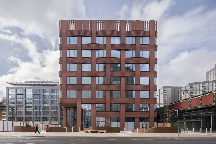
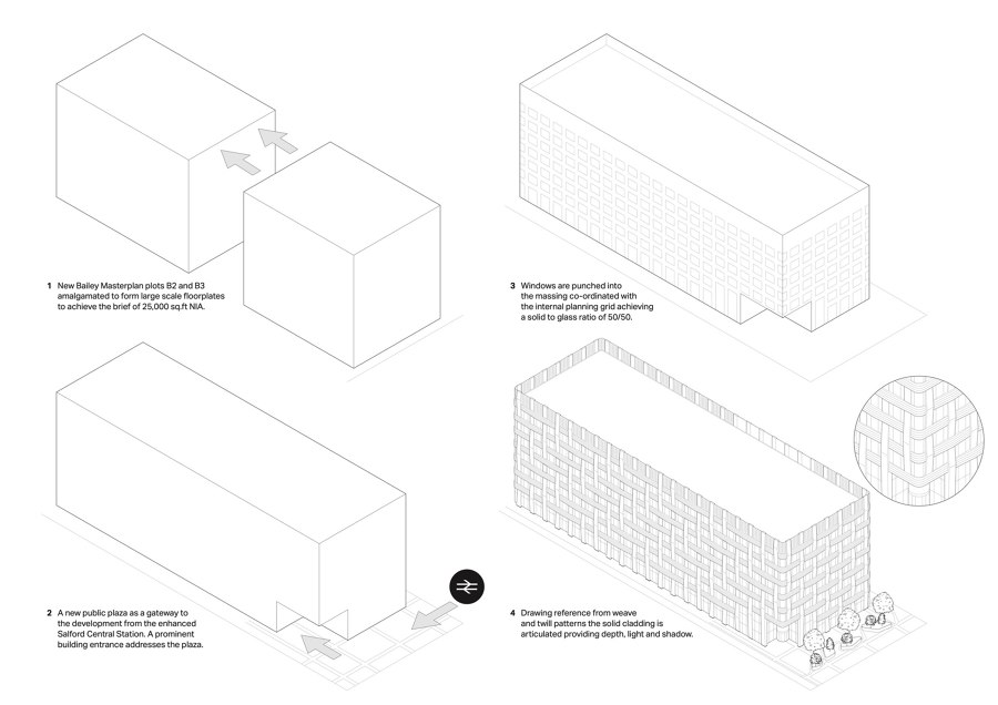
Salford’s cotton-weaving heritage was the inspiration behind the Make Architects’ designed, highly flexible commercial office building at Three New Bailey.
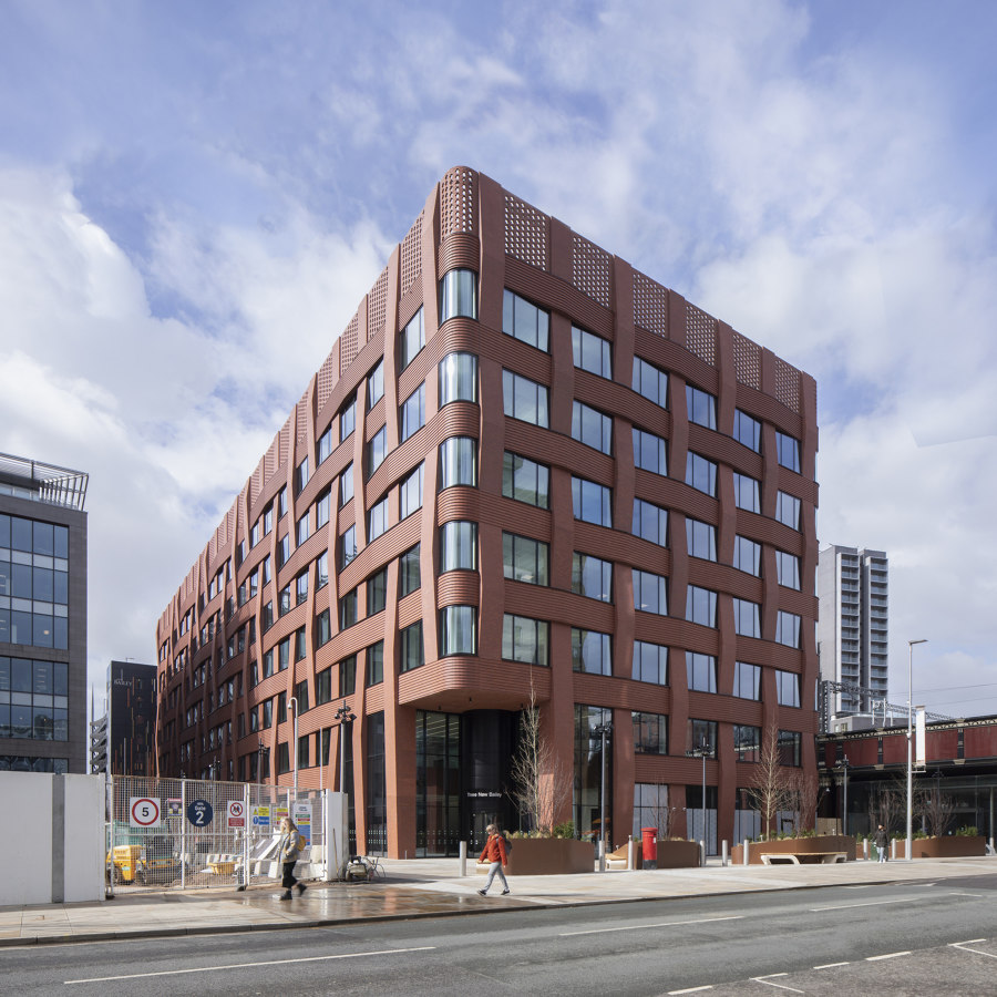
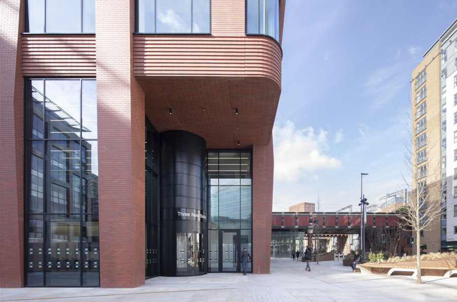
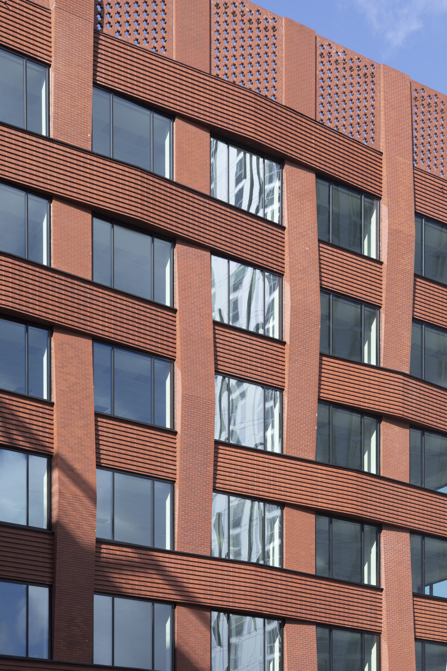
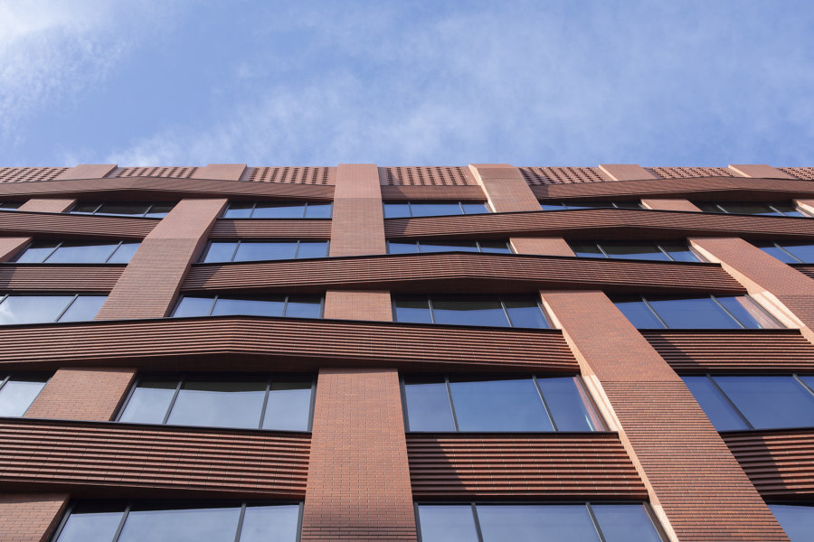
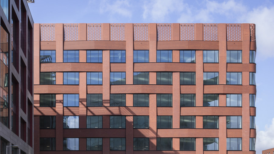
The scheme has reinterpreted the red brick of the local 19th-century warehouse architecture, with a range of distinctive red brick weave facade treatments that give the building its identity and celebrates it.
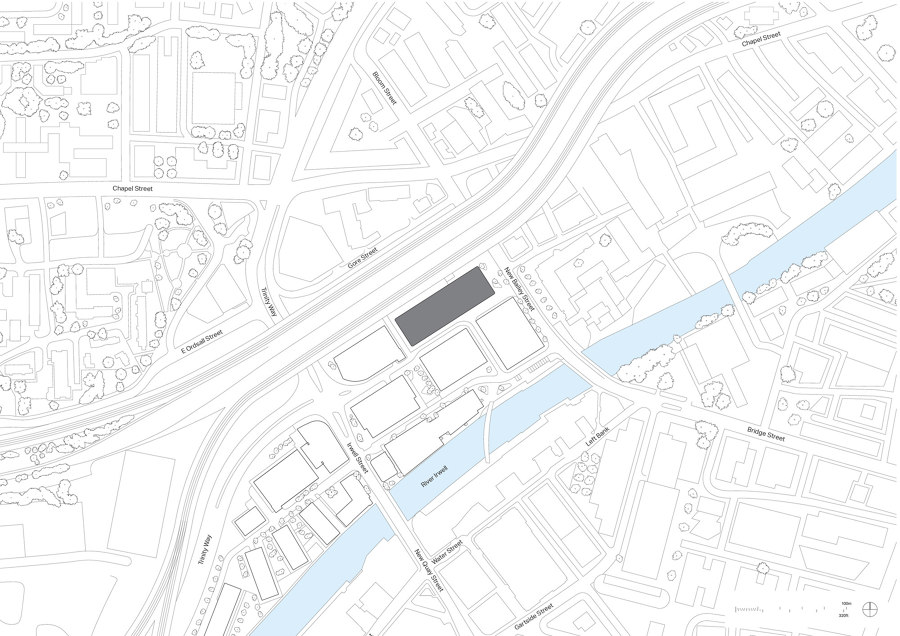
Three New Bailey is a gateway building on the Salford Central masterplan site. It has transformed a former surface car park and brownfield site into a thriving mixed-use destination, blending office and residential buildings around the River Irwell. As the first building to greet passengers exiting Salford Central train station, Three New Bailey establishes a strong but quiet presence fronting a new piazza. It was delivered for the Government Property Agency, specifically to become a new regional hub for Revenue and Customs.
The building’s simple and honest form was created in direct response to the HMRC brief and provides large, efficient, repeating floor spans with a side core to maximise flexibility in achieving their workplace needs for today and the future.
The highly-articulated facade helps to break up the orthogonal mass of the seven-storey, 14,733m2building, and creates depth, movement, and interest. Working closely with brick contractor Thorp on technical research and innovation into the application of woven elements to the facade resulted in the selection of two weave types: a basket weave to the short elevations and a twill weave to the long elevations which articulate a subtle variation across the proposal’s massing. Curved corner panels and glazing help the transition between elevations.
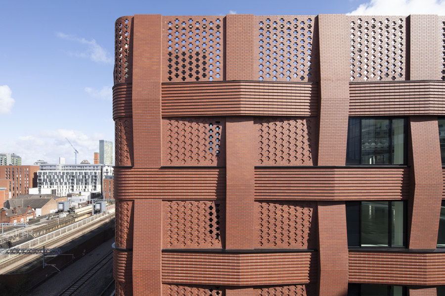
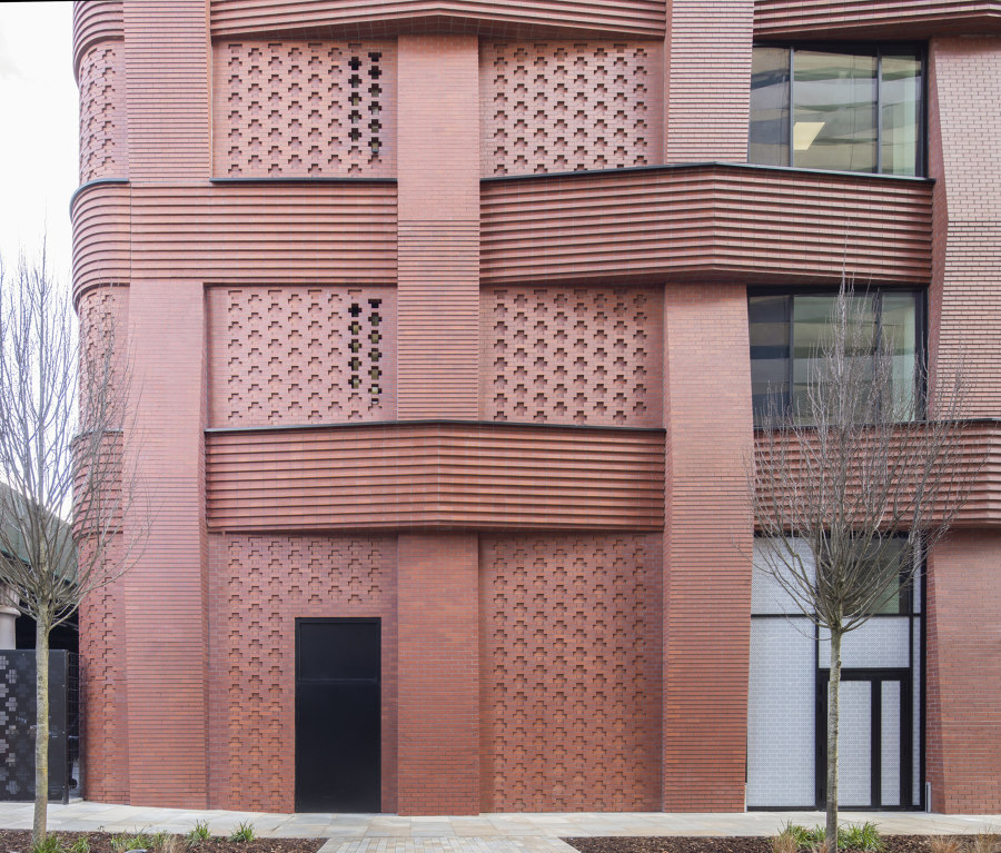
To emphasise the reading of the weave, vertical and horizontal facade elements are treated independently. Horizontal elements are formed with a ribbed and stacked red brick bond to emphasise the horizontal grain and maximise contrast with the vertical red brick elements laid in a stretcher bond.
Visual movement and interest are formed through the projection of facade elements away from the glazing line, in both the horizontal and vertical brick facade panels. The cladding is set out to project between a maximum of 400mm and a minimum of 100mm from the glazing line. This 300mm variation in depth seeks to capture and accentuate the passing of light across the facade, generating shadows that play across the surface of the building and, in turn, reveal the weave.
The roof level has a different treatment, with a distinctive perforated screen made of open Flemish bond, hit-and-miss brick panels to control views of the plant. Infilled Flemish hit-and-miss panels are also used on the core, providing a detailed brick pattern and texture to add grain to the facade.
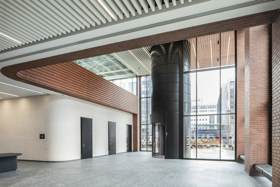
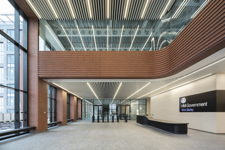
The scheme offers a generous journey through the building, from a double-height entrance that invites visitors into a spacious and active lobby, with well-chosen materials to indicate the subtle quality and the red brick soffit and the internal spandrel panels bringing the external architectural language into the building.
Design team:
Make Architects
Contractor: Bowmer + Kirkland
Structural Engineer: Cundall
Services Engineer: Hannan Associates, Thorp Precast
Project Manager: Chroma
Landscape Architect: HED

Fotógrafo: Paul Karalius

Fotógrafo: Paul Karalius

Fotógrafo: Paul Karalius

Fotógrafo: Paul Karalius

Fotógrafo: Paul Karalius

Fotógrafo: Paul Karalius

Fotógrafo: Paul Karalius
