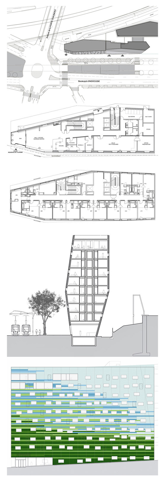
This project is part of a larger development known as VISALTO, which comprises three independent but adjoining buildings, with a total surface area of around 35,000m2:
- a 24,500m2 offi ce building, including parking (architect: 2/3/4),
- a 4,000m2 student residence (architect: Jacques Moussafi r),
- a 5,500m2 Hipark apartment hotel (architect: Manuelle Gautrand Architecture).
This development is in the 19th arrondissement on the northern edge of Paris, within an urban environment characterised by the brick buildings of low-cost housing units developed between the wars.
The triangular site, which measures around 10,000m2, is orientated north–south on its long axis. It is bordered:
- on the east by the Parisian périphérique ringroad,
- on the south by Rue des Marchais,
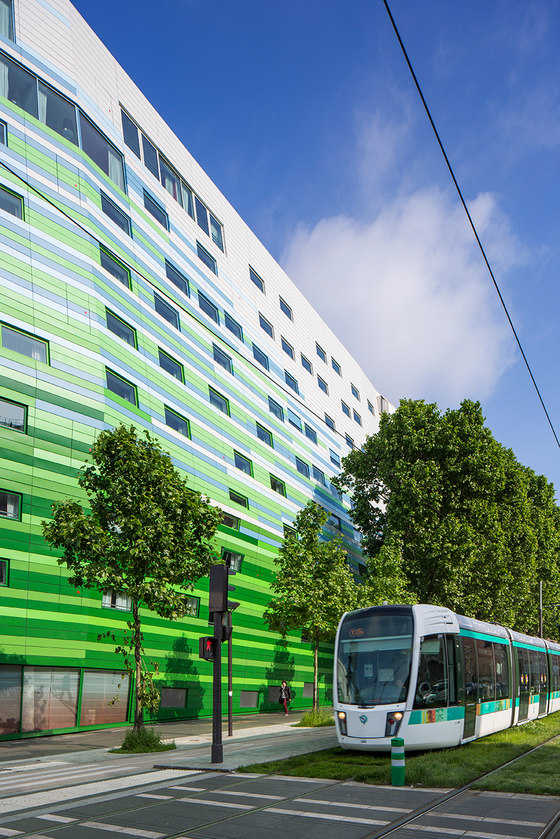
- on the west by Boulevard d’Indochine, along which runs line T3 of the Paris tramway,
- on the north by the city gate Porte Chaumont.
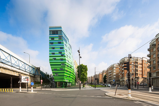
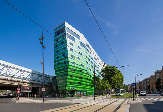
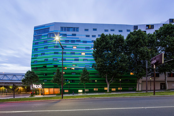
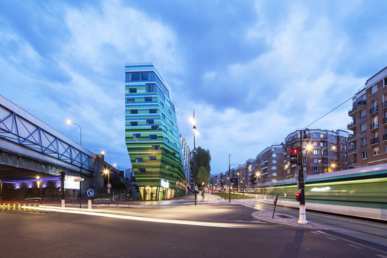
The site slopes steeply from its southern point at the Porte Brunet down to its northern point at the Porte Chaumont. Alongside the périphérique, a 6m-high acoustic barrier wall runs for some 280m, protecting the site from traffi c noise. Further pressure is put on the site by maintenance access for this barrier. Our apartment hotel project is on the northern tip of the plot, built as one continued line with Jacques Moussafi r’s student residence. The hotel forms a sort of «prow» to the overall development, pointing straight towards Jean Nouvel’s Philharmonie de Paris.
The building is in dialogue with two different environments:
- to the west, Boulevard d’Indochine, mostly comprised of the brick facades of the blocks of between-the-wars housing and the landscaping of the T3 tramway,
- to the east, the périphérique, a much less human environment, with streams of traffi c and all their associated pollutants.
The building, which fi lls every inch of the site right up to its edges, moulds itself around urban constraints, requirements in the programme, and land restrictions, notably the buttresses of the acoustic barrier on the périphérique side and the related access routes.
The various spatial and technical restrictions literally sculpted the forms of this project: the site is really very narrow, «squeezed» on its southern side by the student residence, and eaten into on the east by the access requirements for the maintenance of the acoustic barrier. The building had to fi nd suffi cient space for itself within these constraints to provide the required number of rooms for this apartment hotel.
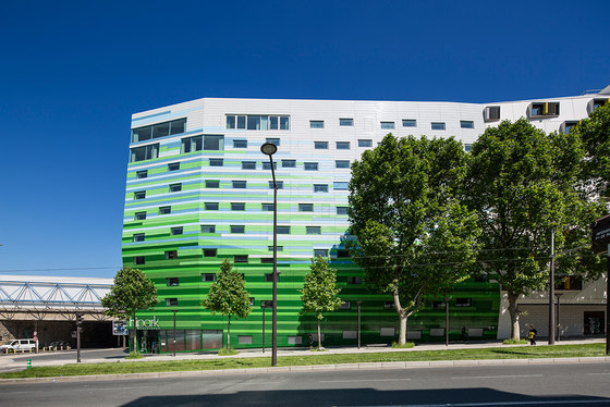
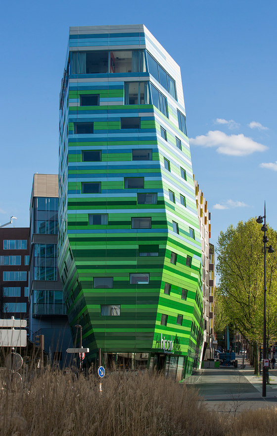
The resulting volume is tapered: different inclining planes allow for fi re access along the eastern facade, while lost space is clawed back on the Boulevard d’Indochine side. Further along, where the hotel meets the student residence, the same crisp angles carry through to this second building; the two projects, hotel and student residences, are powerfully related to one another.
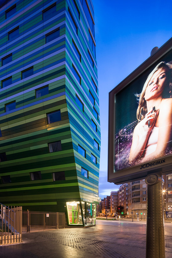
These different angled faces, of a volume that was virtually rectangular to begin with, provide very different perceptions of the building: according to the viewpoint, surfaces appear brighter or darker, more or less cambered, conferring a powerful dynamism to the entire building. The facade on the Porte de Chaumont side appears very high because of its narrow width, creating a pedestrian landmark for the Boulevard d’Indochine, and a beacon on the périphérique.
The main pedestrian entrance into the building is at the north-west corner. The proximity of the Porte Chaumont, a tram stop and a vélib city bike stand on the pavement outside, all facilitate access to the hotel. The hotel has a car park, located beneath the adjoining offi ce building. Access is via the southern corner of the site. In terms of logistics, a service access between the périphérique and hotel allows for deliveries and waste collection. Coaches can also use this route, which has a secondary, parallel entrance for dropping off guests.
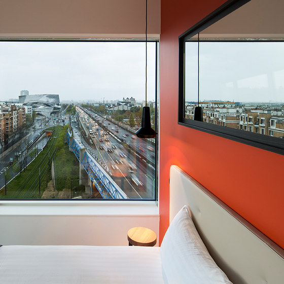
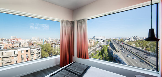
Within the asymmetry used to work around the site’s constraints, one element structures the project: vertical circulation forms a sort of spinal column, identical at each level. While this element is a constant, the size of the rooms and the studios varies from fl oor to floor. Suites on the hotel’s upper levels are a reminder that the landscape here is unique, with a panoramic view over Paris from the eastern facade. The lower level of the project contains all the shared functions: from the entrance at the northern extremity, come successively the lobby, reception areas and foyer, then points of access to the upper storeys and the rooms, and fi nally the breakfast room to the south.
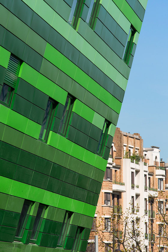
In this eclectic environment, powerfully marked by the périphérique, we wanted to design facades that were colourful and cheerful, using a palette of natural tones, inspired principally by sky and vegetation. We did not want to make the building too pale, bearing in mind the inevitable patina that would accumulate with its proximity to the périphérique. Rich and sometimes darker colours will make dirt less noticeable, as well as giving the project an air of liveliness, slightly shiny, and cheerful in its use of colour.
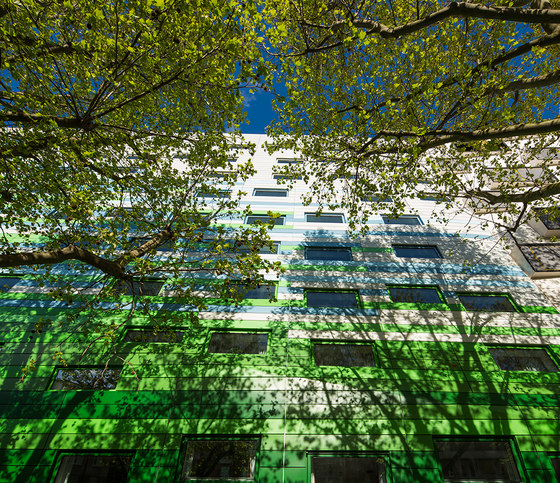
The tones play out from the bottom to the top, with paler colours as you go higher: The lower section in a variety of quite dark greens creates a base, the darker shades reducing the noticeable effects of dirt, giving a clean, shiny, lasting look. The green tones continue the great line of trees opposite the west facade of the project. Rising up the building, successions of paler blues, like those of certain skies, mix with different greens, and then white, taken straight from the facade of the student residence in order to harmonise the two projects.
The colours are fragmented into long strips, which give a kinetic feel to the overall volume: they capture the movement of the cars and an impression of speed. These strips are made of powder-coated metal panels. Long glazed openings slip in between the coloured lines in an irregular pattern, providing the bedrooms with views at different heights. Many rooms have two or even three of these windows.
The windows confer on each bedroom a unique relationship with the Parisian landscape, on one side all the splendour of historical Paris, and on the other the ‘Greater Paris’ of the future. The height of these glazed openings (170cm) gives the feeling of a belvedere, with panoramic views in which different sequences of the urban landscape succeed one another out to the horizon.
BNP PARIBAS IMMOBILIER
Manuelle Gautrand Architecture
Manuelle Gautrand, leading architect,
Cécile Ortolo, project manager.
Interior design: DIDIER GOMEZ INT.
Structure engineer: SYNA4
Facades engineer: VP & GREEN
Fluids engineer: GESYS
Economy: DAL
Acoustics: AVLS
Sustainability: ALTO ING.
Execution ACA and coordination: C2L
Technical controller: VERITAS
General contractor: LEON GROSSE
Metal cladding: ALU DESIGN
Exterior joinery: RAICO & SCHÜCO
Glazing: SAINT-GOBAIN
