Project development/spaces
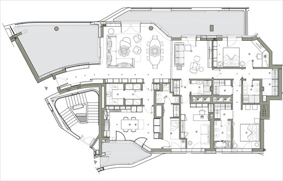
Marco Piva, along with his team, has revised the layout of the space according to the needs of the customer.
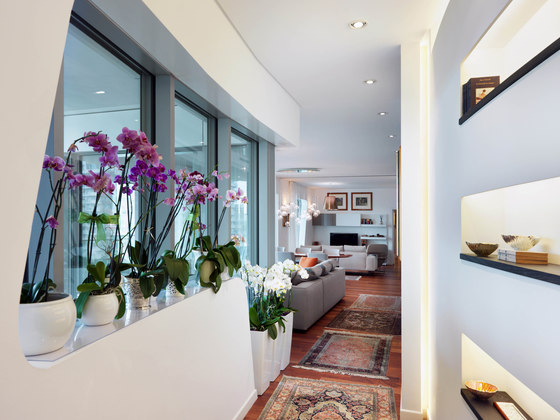
The entrance, featuring a custom-made backlit plasterboard wall, leads to the large living area.
Designed by Marco Piva, the plasterboard has been studied as opposed to the window, an artificial back-lit in contrast with a natural light source.
The contrast is also visible in the decision to give a horizontal cut at the wall, which gives more visual impact to the verticality of the fixtures and plants.
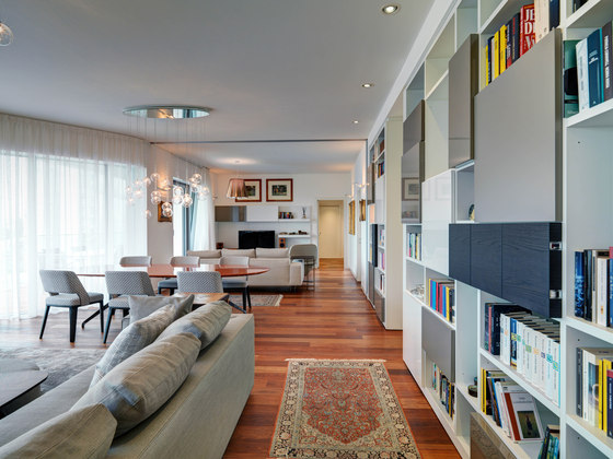
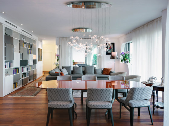
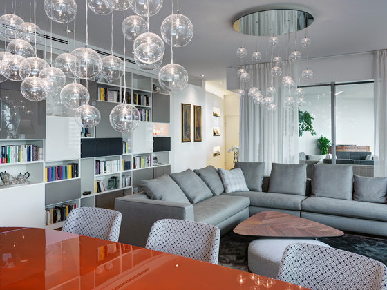
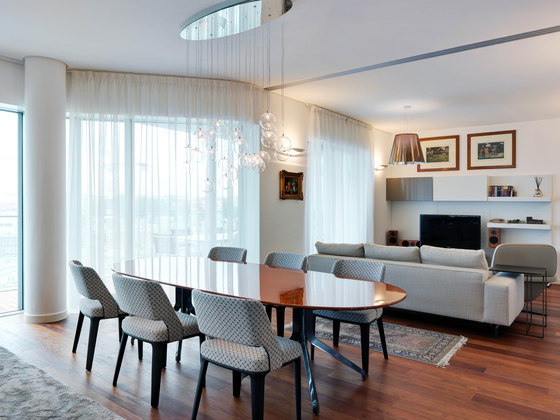
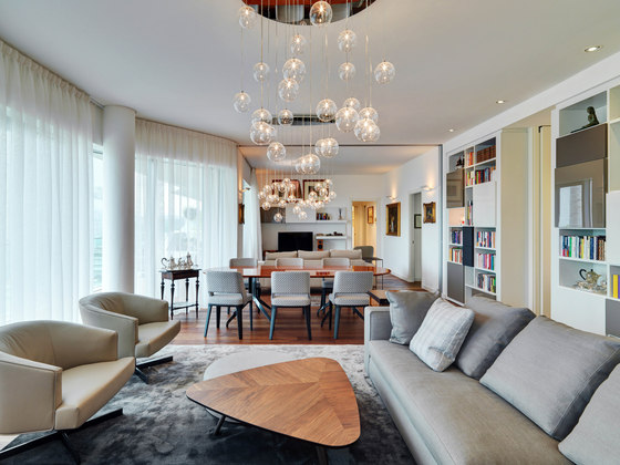
The living area, very spacious and with access to both terraces, is designed to receive guests or relaxing with the family.
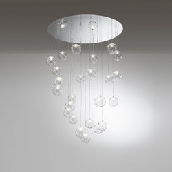
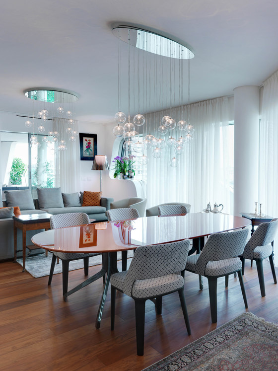
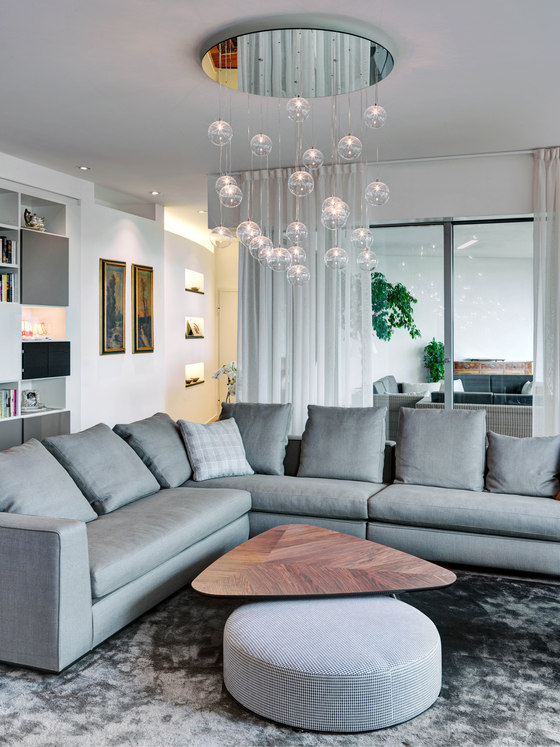
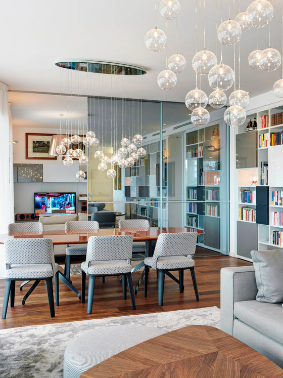
An important element are the two hanging lamps, characterized by a descent of blown glass spheres in which is positioned the light source.
The oval one incorporates the oval table in the dining room, and a circular one is instead placed upon the conversation area.
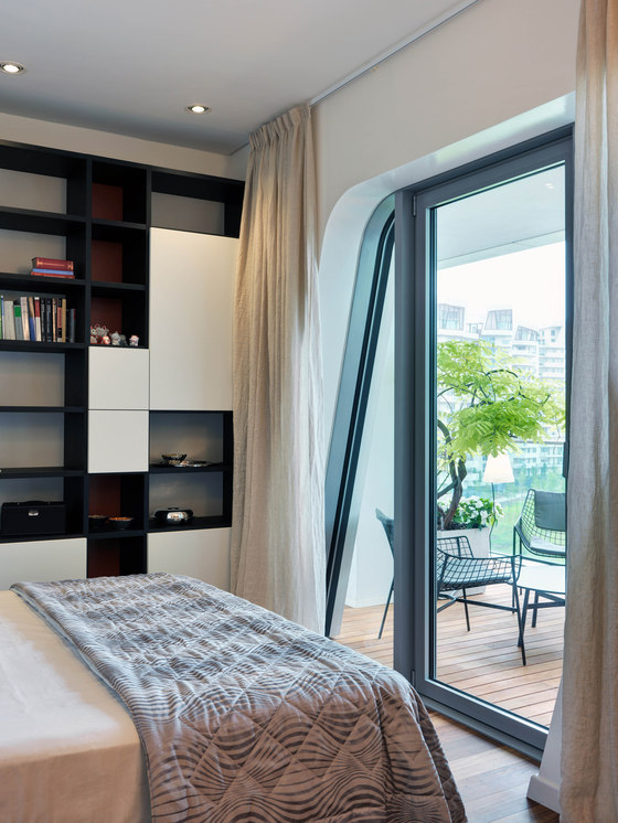
The library, very long, has a geometric pattern reminiscent of Mondrian, obtained with a set of closed and open parts that create harmonious contrast between empty and filled space.
Inside there were placed decorative lamps, in antithesis with the rigor of the library.
For the central table, it was decided a rust lacquered polyester color in contrast with chairs that have a light-tone decorated fabric.
Even the upholstery were played with neutral and contemporary colors, a comfortable seating that call in tissue textures and designs borrowed from the world of fashion.
For the curtains, it was necessary to have an element that soften the light and the very strong architecture that characterizes the entire complex. For this reason the choice was for a simple white veil that can be opened in all directions as needed.
In the living area there is also one of the main project’s design characteristic: at the junction of the second conversation area, just behind the second sofa, there is a sliding door, which you don’t see tracks or anything about it while it is open.
This door divides the space when necessary, creating the space reserved for listening to music or watching television.
The sliding partition, a reflex glass door, is partially transparent and partially reflective, creating a visual game while it is closed.
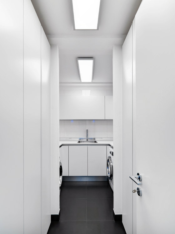
From the main living area there is the access to a large utility / laundry room, a space strongly desired linked to the need to have an extremely clean and functional, sterile and technologically advanced products and systems for cleaning the house and a wardrobe where to store clothes.
Here there isn’t a decoration lighting, just a technical deep-studied one, purely functional.
From the laundry area we access to the kitchen and to the maid’s bedroom and bathroom.
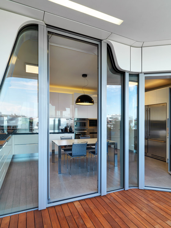
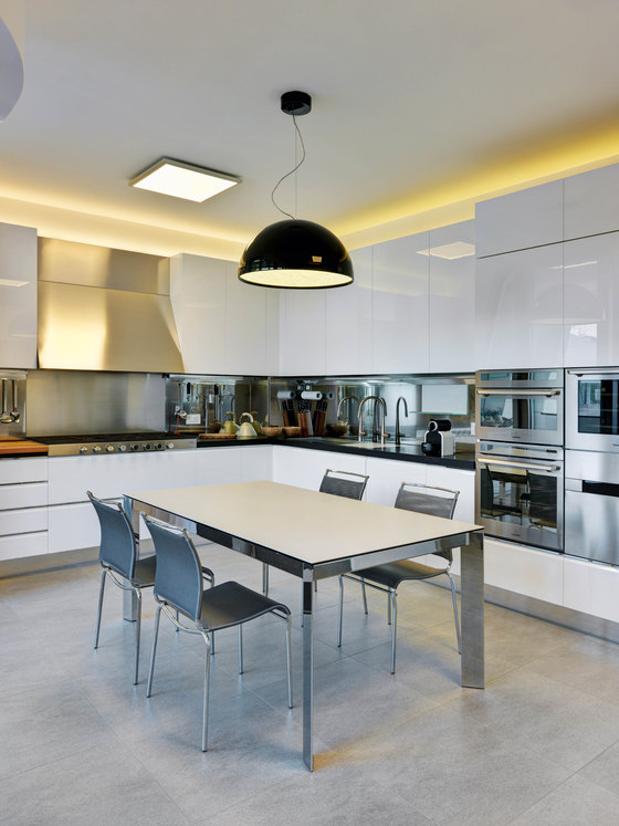
The kitchen had a key role in the design, both from a dimensional point of view that from the one of the devices that were chosen for the furniture, which come from the world of food and catering industry, bringing in the home the most sophisticated innovations.
For example, the presence of uncommon appliances, such as blast chillers, a steam oven in addition to the classic one and the microwave, a wine cellar, a fridge / freezer with a very large double door, a double sink, a very large stove. So many little touches that enhance the family's pleasure of good eating.
The kitchen floor is done with dark stone, while the back is made of steel, that is also the coating of all appliances.
All the project has been played around the duality between decorative and technical light.
On the one hand, the technical lighting provides a series of specific requirements for the use of space, while on the other, the decorating light gives a touch of personality and atmosphere.
Table and chairs, upon client’s request, has been chosen looking at functionality first, with an extensible table.
From the "secondary" living area we finally get to the study / guest room with its bathroom, and to the night area, with the two main bedrooms.
The bedrooms have been designed as if they are an hotel suite, with separate areas for the wardrobe and private bathroom.
Single bedroom: the door entrance acts as a divider between the study area, consisting of a large corner desk, and the sleeping one, with a bed and a bookcase.
Master bedroom: there are two walk in closets, one for man and the other one for the woman.
The woman wardrobe has been placed before the bathroom, because we liked to imagine that the woman could close it and have a space totally reserved for herself, a space dedicated both for the makeup and the dressing.
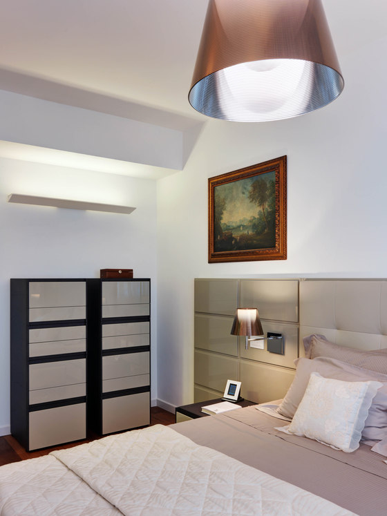
The headboard, designed by Marco Piva, provides a soft leather pad for the part that includes the bed, while is stiff and lacquered the one that incorporates the theme of the tables and brings the reading light.
For the two drawers, one for the woman and one for the man, we played on the contrast between the glossy lacquered opening and matt lacquered structure, which creates a pattern of memory of certain Japanese decorations, a culture loved by our customers.
Also in this room is visible the dualism between technical and decorative light.
The decorative lamps chosen distinct themselves for having a color that varies depending on whether they are on or off.
The lamp above the drawers, instead, has an architectural sign that seeks to emphasize the cut of the beam.
Bathrooms: four in all, of different sizes, have been studied individually ad hoc, with a deep study of technical and decorative lighting, for a great visual impact.
Bathroom single room
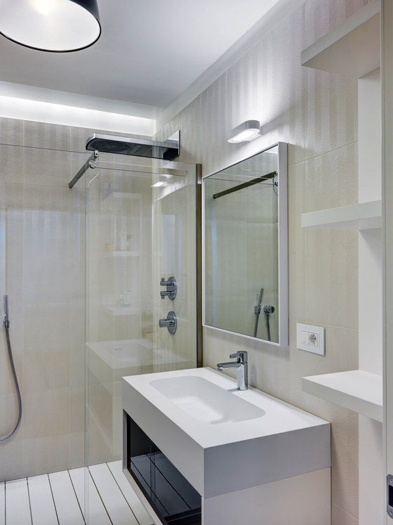
With no window, this bathroom is characterized by a large walk-in shower that goes from wall to wall with a groove in the bottom of the ceiling light, designed to give light to the same and greater depth to the bathroom. It has been given great importance to the taps for which there is a significant overhead for the various solutions of water use.
The wall cladding plays on a type of tile that creates a play tone-on-tone glossy / matte herringbone, with which the light creates a vibration with almost wavelike motion.
Bathroom Double Room
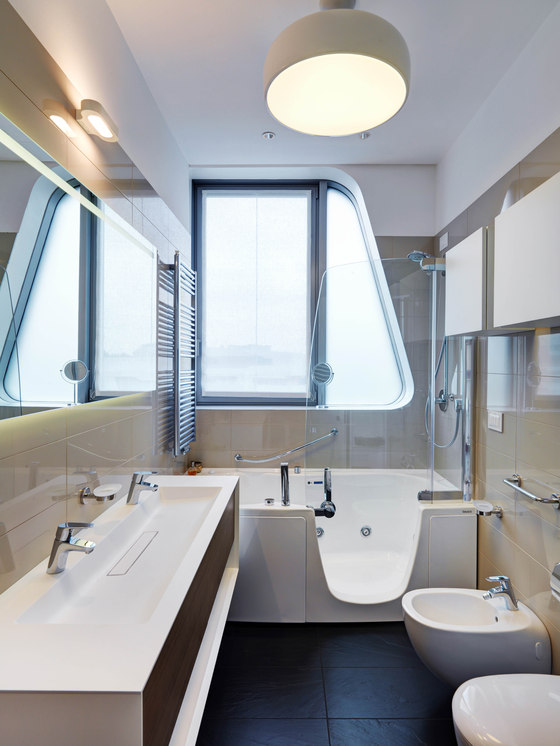
In this bathroom the request involved a solution that is both whirlpool tub than shower.
The choice was, having a very "invasive" architecture, to further emphasize the performance of the window, select a bath with a shape that makes even more evident the formal contrast.
A long sink, designed with a dynamic and original stretch, replaced two individuals one, making the space more efficiently, while maintaining the use of two taps.
For the entire length of the cabinet, there is a large back-lit mirror.
Bathroom Studio / guests / courtesy
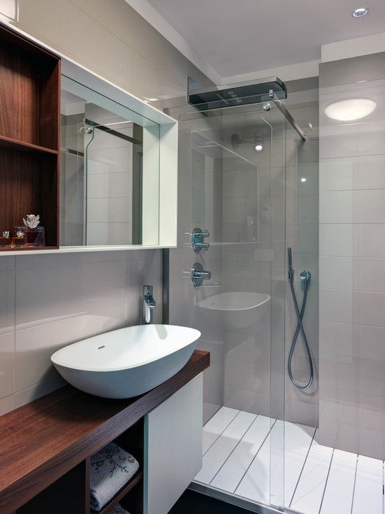
Even in this bathroom there is a shower that occupies the entire space wall to wall, with an important architectural element that actually makes it a double shower.
The architectural element (structural) has been revised and the internal pillar was coated, creating a unique environment.
For the furniture we have chosen to use wood material.
The terraces
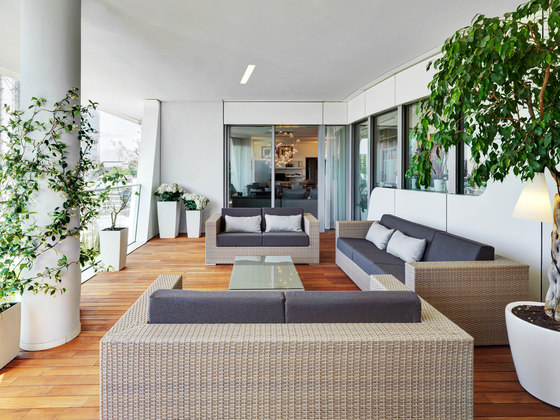
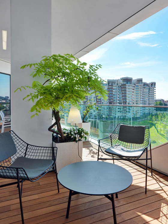
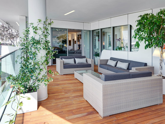
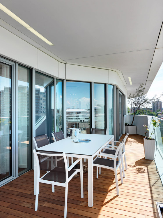
The terraces play a very important role in the project, as there is a big exterior space, divided into two large terraces plus a service’s veranda.
The terrace that overlooks the main living room has a square base, while the second, rectangular, starts from the living room and goes until the room.
For the main terrace, designed to be used as a conversation area, we have imagined that the column that interrupts the terrace (a structural one) will be completely green-covered, so we decided to put there a climbing jasmine. The idea is that it will become a vertical green.
Moreover, decorative lights were placed on the trees inside the vessels.
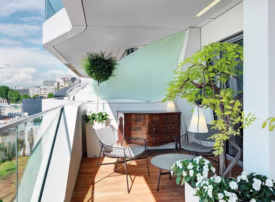
For the second terrace, it was decided to work on a dining area in the front of the living-room, while in the front-bedroom, we used a plant near the pillar so as to make the area a little more intimate and private.
Together with two lounge chairs and a coffee table, it was placed an old family’s dresser chamber, on which it was made a special treatment in order to stay outdoors.
Here, too, it was decided to decorate the green using decorative lamps to complement the architectural lighting of the ceiling.
Bill of Works
The floors and walls in the parts relating to ceramic (kitchen, bathrooms) are the ones that has been specify on the bill of works, as well as the sanitary, doors and window frames.
The floors and other elements of the bathrooms, showers, tubs, and some faucets have been identified instead out of the bill of works, with precise choices, oriented to the selection of the highest quality materials from the industry’s leaders.
Lighting
The technical and decorative aspect relating to the use of light was a key element in the whole design process, both for internal than external spaces.
The entire technical system was developed with IGuzzini, in large part led, with important stage effects.
In the showers and bathrooms there are areas where strip-LED were used to illuminate the walls and make visual games, while the kitchen has been designed with several illuminations depending on the area (kitchen / dining room) and the time of use (more technical for the cooking time, softer for eating).
The dualism between the technical and decorative lights runs through all the apartment, creating scenic contrasts and customizable effects.
All the lights can be customized, creating different scenarios for the same environment: the scenarios help to create the perfect atmosphere for any time of the day.
Moreover, there are also automatic switching of lights, and in the same way you can centralize power off or sleep mode when it is recognized that there is no people in the house.
Home automation technology and sound
From the technological point of view all the CityLife units are equipped with cutting-edge technologies and the most modern automation systems, with the important role of improving and simplifying the quality of life.
The main domestic functions can be controlled using an integrated system that governs the switching on and off and control even remotely the home.
In addition to that supplied, Studio Marco Piva has made an additional operation, developed in conjunction with B Ticino.
From the acoustic point of view, it was important to set up a Home Theatre system to offer in the TV area the feeling of being immersed in the middle of the event.
Moreover, it has also set up a wireless system to offer the possibility of following the favorite music/Tv program in every room, including bathrooms, with high sound quality.
All parts related to the sound system were perfectly hidden inside containers / walls, and are not visible.
Private
Interior design: Studio Marco Piva
