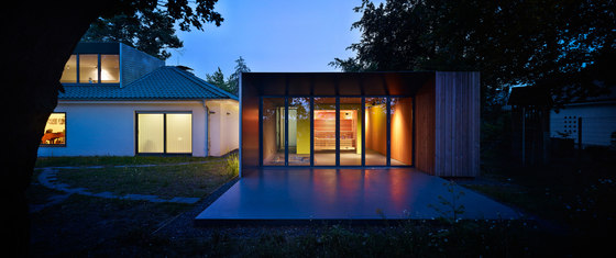
“Our concept was aiming towards the impossible: To add something new that will change the whole perception and experience of the site but to blend in at the same time.”
History
When the father of the client bought the plot of land besides an open gravel pit south of Moers, Germany in the late fifties, it was still unclear if the mine would be converted into a landfill of garbage or a lake. Luckily, the family ended up with a villa at an idyllic lake that is surrounded by a forest. Because of the possible landfill at the time of construction, the layout of the house was orientated away from this now beautiful nature reserve: The extensive paved driveway was situated between the house and the fantastic nature setting and an existing garage was spatially blocking the connection towards the lake. Inside the house only a view spaces provided a view of the lake.
Contextually
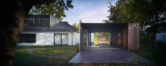
The new addition is set to solve these problems. The approach towards the site places three pavilions onto the park-like property. They are positioned in a way to achieve new spatial qualities in-between the old building and new additions, helping to connect the lake with the existing house. At the same time client and architect aimed for a fresh addition as the old house with its white plaster façade and its black double-pitched roof, had an appearance of strictness and sober functionality. The tree-covered site evoked a sense of dreamy melancholy that reflected the German fifties zeitgeist. Therefore, the extension is also supposed to add a friendlier and playful atmosphere.
Three pavilions
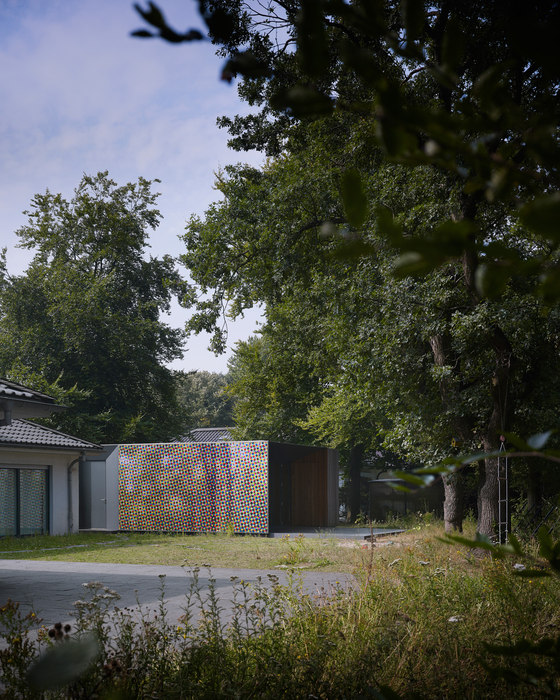
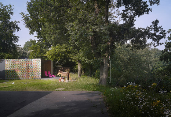
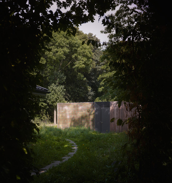
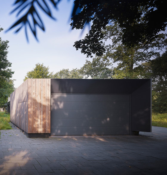
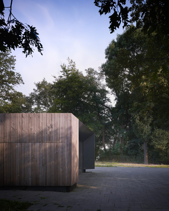
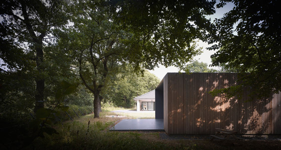
The workshop and garage is moved and situated as an autonomous pavilion towards the entrance of the site. A second pavilion accommodates a sauna and guesthouse, which is assigned to the existing house and directly orientated to the lake through an open terrace. A third pavilion is situated on top of the roof of the old house, extending the existing attic into a workspace and lounge with a beautiful lake-view.
Façade
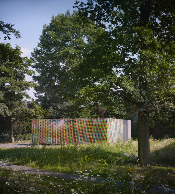
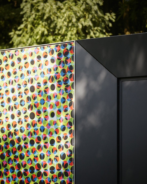
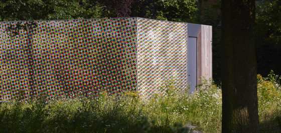
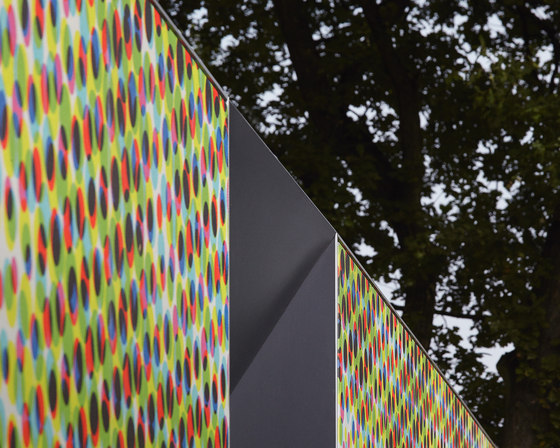
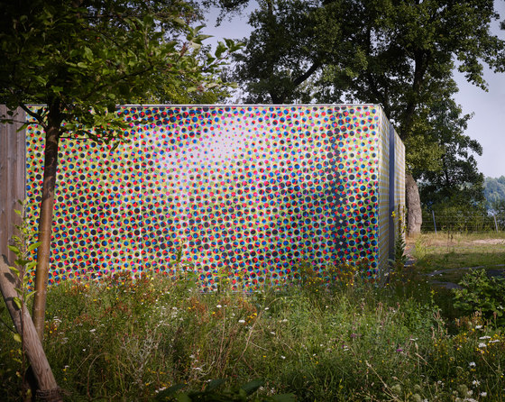
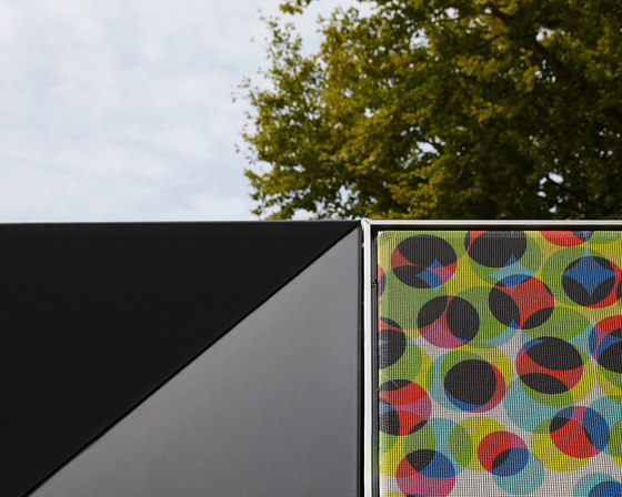
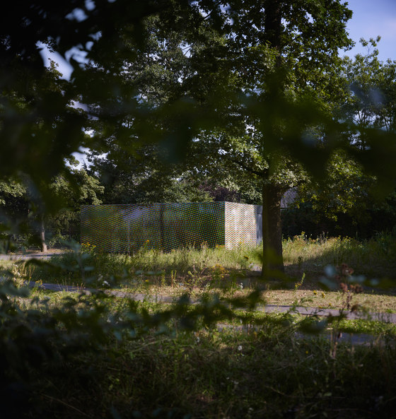
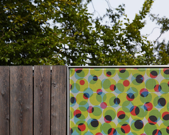
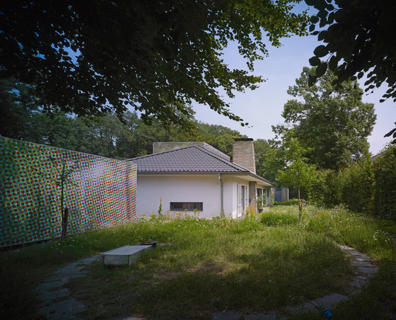
All new additions are clad with a special façade, made up from a building textile that features a colorful but also camouflaging print that was developed through a very close and intensive design process with the client. The print fulfils a number of tasks: It is an image that is very roughly pixilated by a halftone pattern, which is exaggerated in a way, that by close distance the façade only displays big dots in the Cyan, Magenta, Yellow and Kay color realm. These dots create a pattern, which is also a reminiscent to the petticoats of the fifties, adding a playful color-palette and graphic to the existing situation.
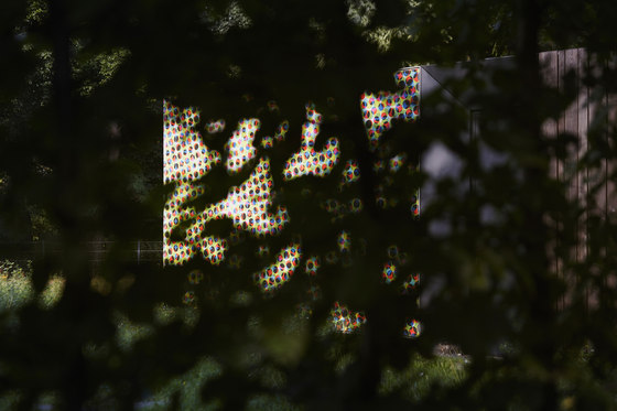
The color scheme of the pixilated image is intentionally reflected by the landscaping, consisting of wild flower meadows. From a middle distance, the human eye interpolates the colors: a shaded and textured surface of brown and green seems to appear, leading to a camouflage effect. The additions seem to blend within the color palette of the site. Only from far distance at the lake, the image will appear: A forest landscape with a deer, a classic and conservative German hunting motive giving a slight ironic touch to the existing building and a reference to its history, as the father of the client was a hunter and one special room of the old house was once occupied with hunting trophies at the time the son took it over.
Interiors
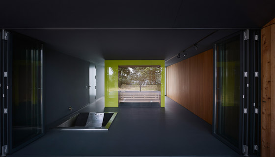
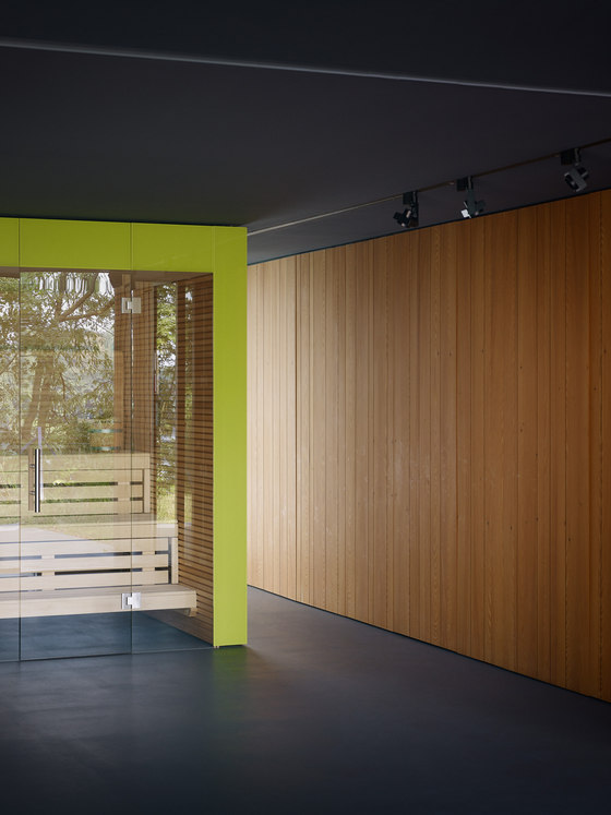
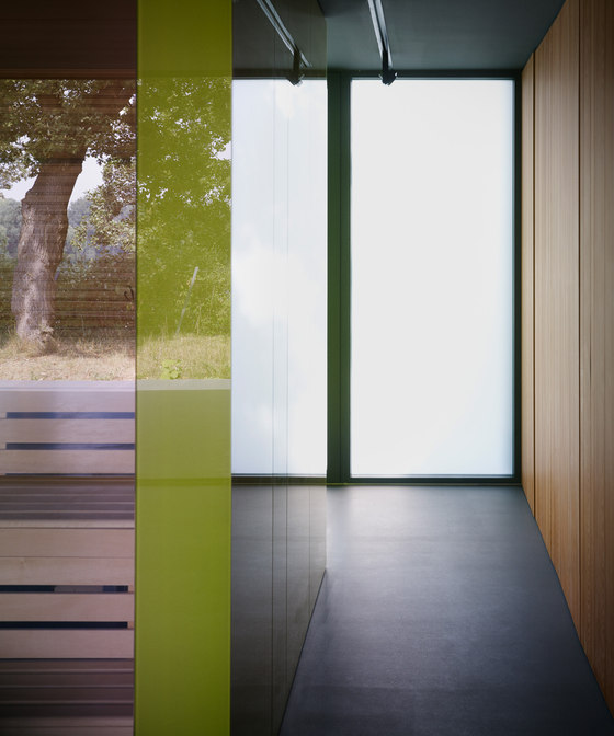
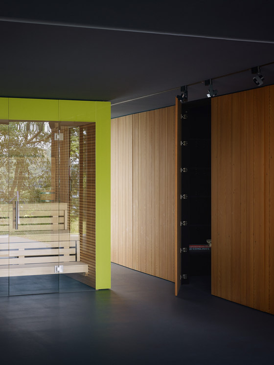
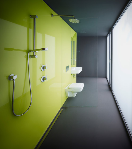
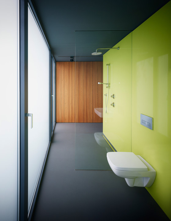
The interior spaces are highly flexible the pavilions feature a “multi-wall” that is designed as a ‘hollow’ 1,20m thick wall or woodblock, which functions as a storage that is accessible from both inside and outside. The sauna-pavilion has a “multi-cube” that houses the actual sauna and also a space for technical equipment, a wardrobe and bathroom fixtures on the outside. Through these interventions, the space becomes highly flexible and also open, the space is one continuum, there are no doors separating the bathroom from the Sauna.
Camouflage / Blending In
The concept of the building is creating a new experience on the site and adding something very playful and friendly. At the same time the building is blending into its natural environment. In this sense the addition mediates the genius loci of the existing building and the natural environment the architecture is not an alien anymore it becomes more natural.
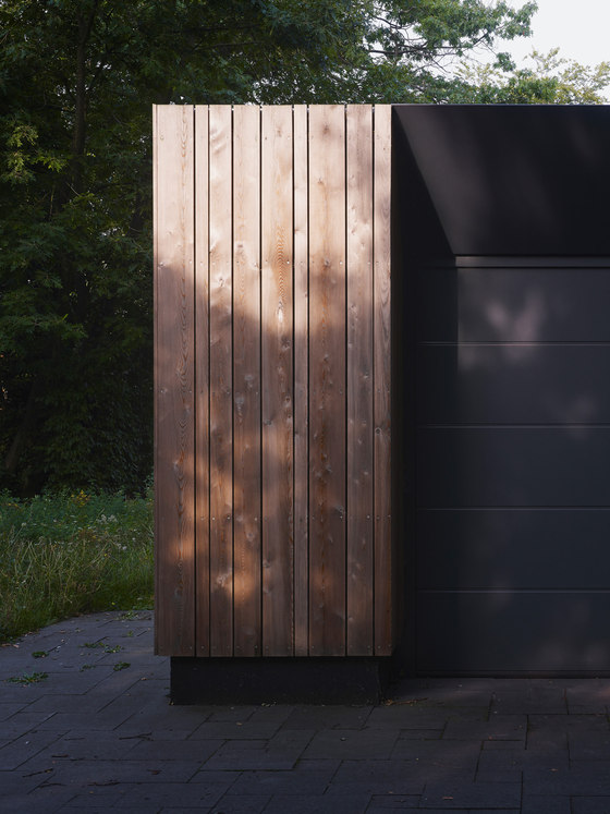
Some measures were taken to not only blend the house visually into its context but also to provide a tactile sense of dematerialisation that is reflected in the actual construction. All building details aim to hide the physical thickness of the construction and create a very light to paper thin appearance quality: The parapet flashing is set behind the façade, visible doors and windows are encased in a metal siding which peaks to a millimeter thick tip that hides the real wall thickness, the textile façade is wrapped around the corners and has a very minimal aluminum frame.
MCKNHM | Mueckenheim Architects
Mark Mueckenheim
Frank Zeising
Jasmin Bonn
Riesop Landschaftsarchitektur GmbH (Landscape)
