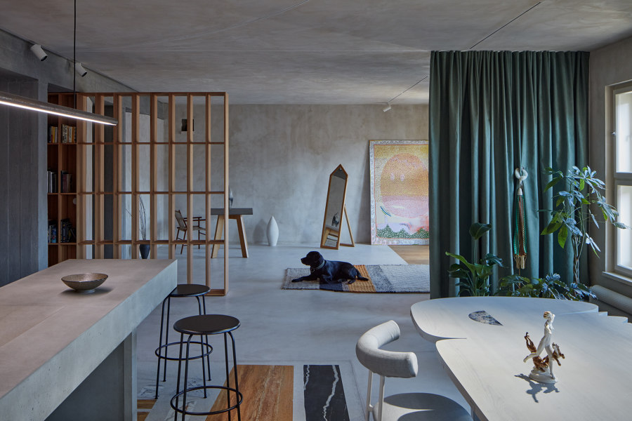
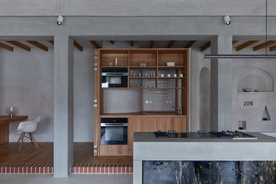
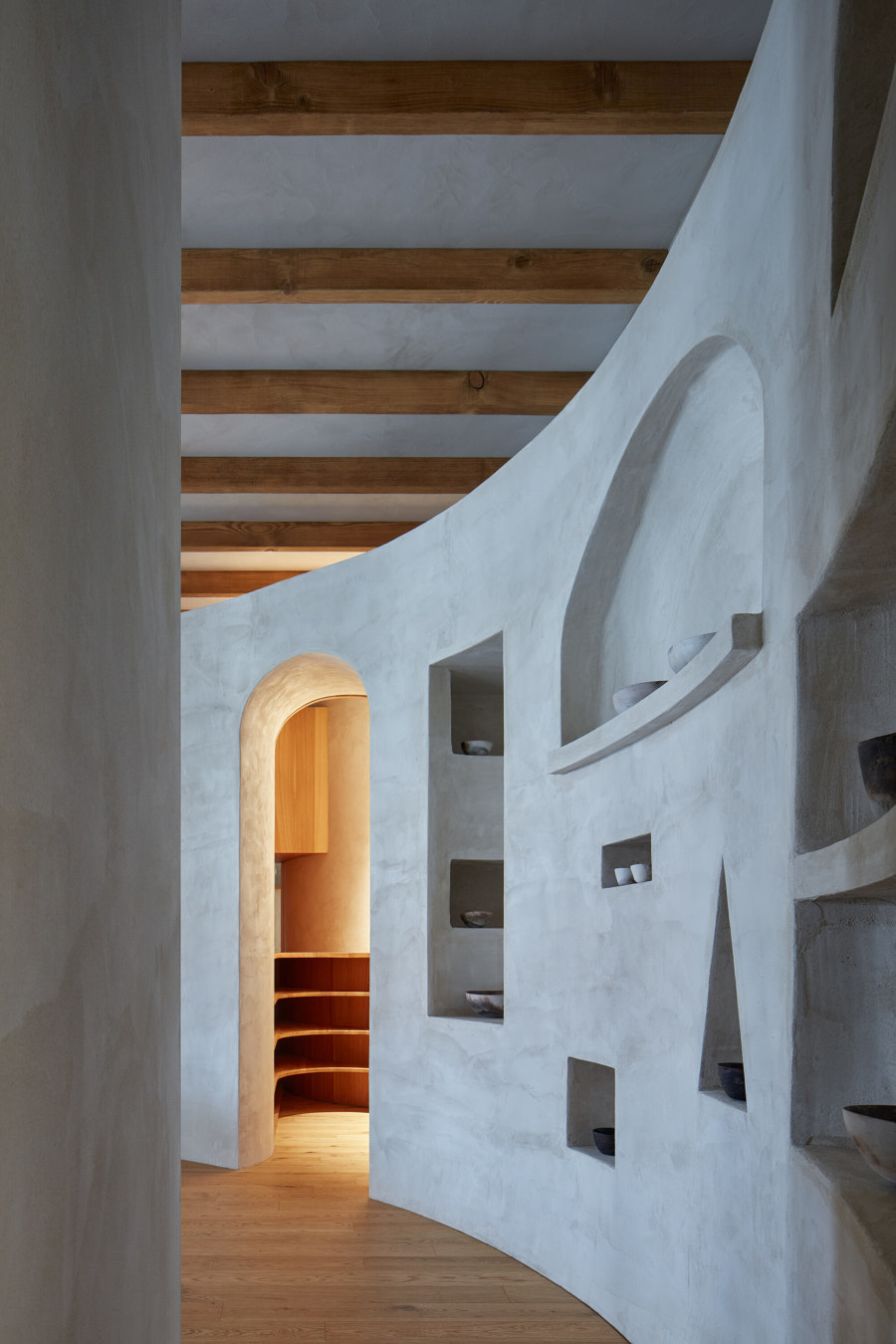
Creative Concept (Tereza Porybná) - All my life I have been interested in connecting people and exploring the permeability of different boundaries – whether interpersonal, cultural, genre, or species. I enjoy playing on the edges. Similarly, within the design of Ovenecká 33, we experimented with different stylistic elements and the boundaries between private and public space. I knew right away that I wanted to create a space that was shared, open, and permeable, while still containing hidden corners and secrets. A space where you never have to return along the same route. A space that is distinctive, yet always changing, like a gallery or theatre stage, or like me. I was lucky to find an architect who understood my ideas. At first, I referred to the work of Luis Barragán, Valentina Schlegel or Bijoy Jain for inspiration, but gradually the architectural design broke away from these great inspirations and the apartment found its own voice and identity. We incorporated various oddities and materialized childhood dreams into the minimalist base; for example, a home throne, a kitchen that looks like a cave, or a secret doorway in the library. I had the opportunity to involve various co-creators, designers, artists, and friends in our eclectic play and participate in their interventions. It was through these small experiences, such as sorting through pieces of stone that then became a painting on the terrazzo floor, dyeing yarn into jacquard, or assembling glass mosaics, that I was able to better understand different creative processes and crafts, as well as understand the objects that now surround me in my home. It is important for me to know the story of my apartment so that I can share it and invite creators to artist residencies through which the apartment continues to change.
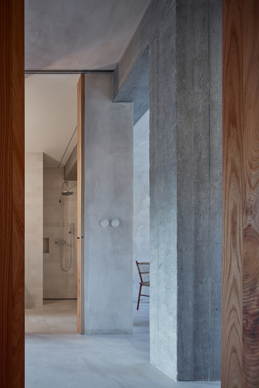
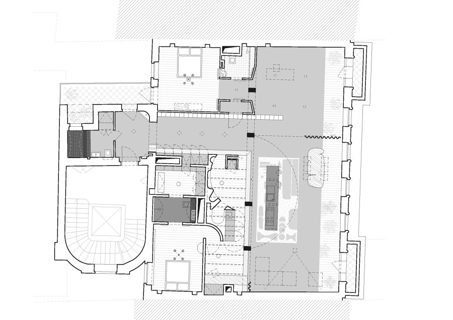
Architectural Design (Objektor architekti) - We enter an empty space with a floor area of about two hundred square meters. The first feeling of the apartment is purely horizontal. All that is left of the historic building are the exterior walls and of the modern reconstruction only the massive concrete skeleton. This is the support without which the space would literally collapse. The disappeared history of the house and the clear horizontality of the open space offer an unobstructed space for imagination.
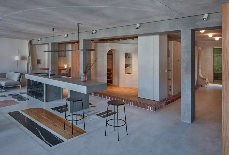
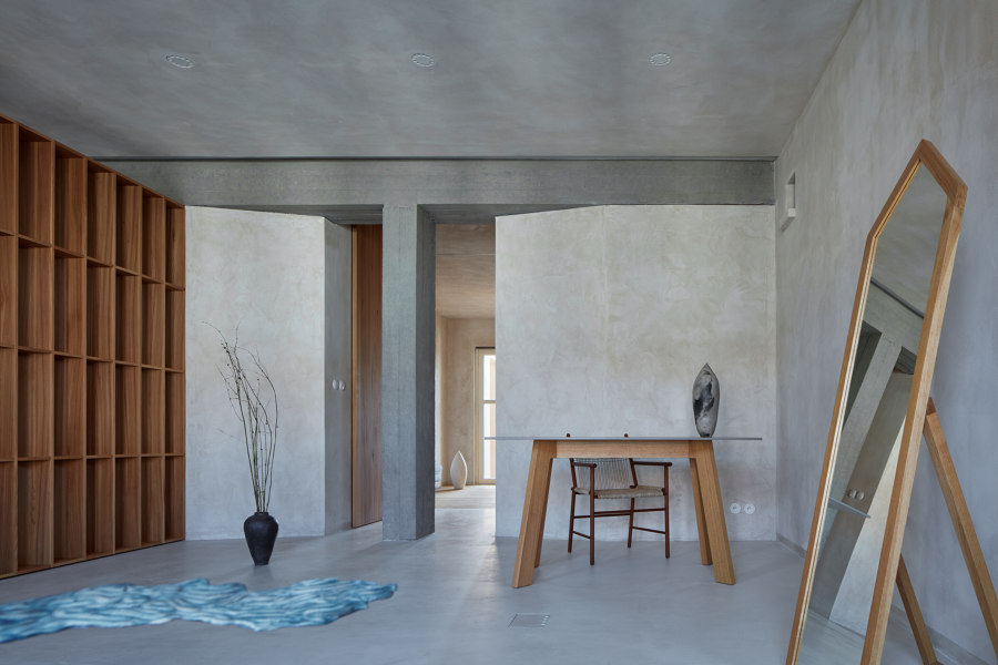
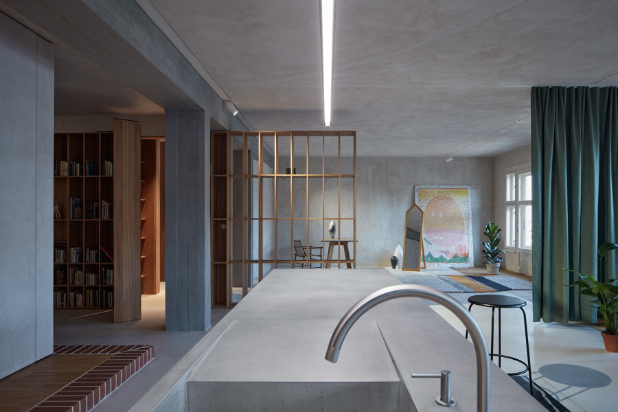
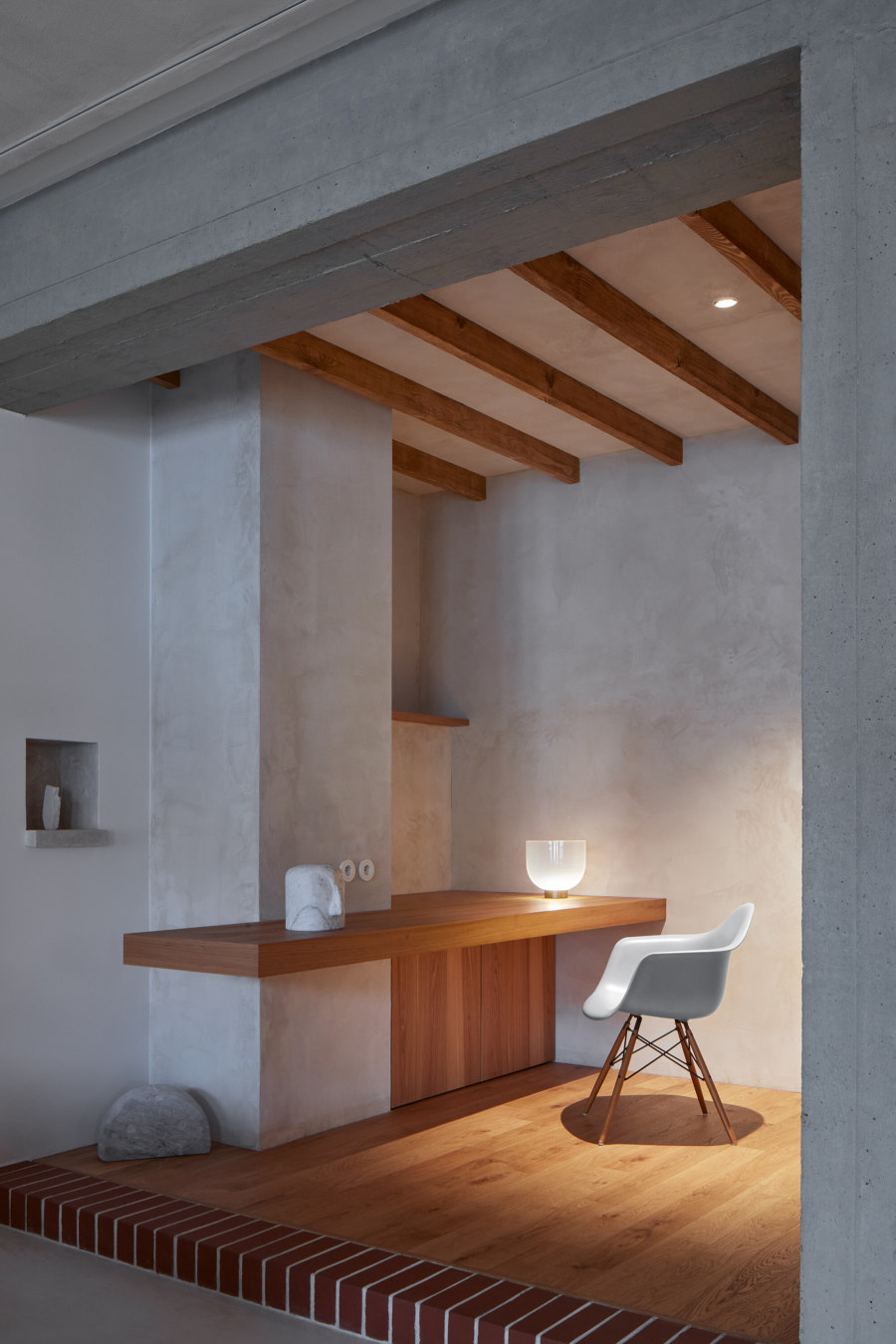
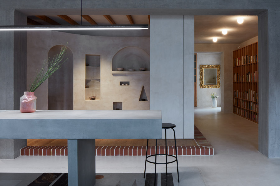
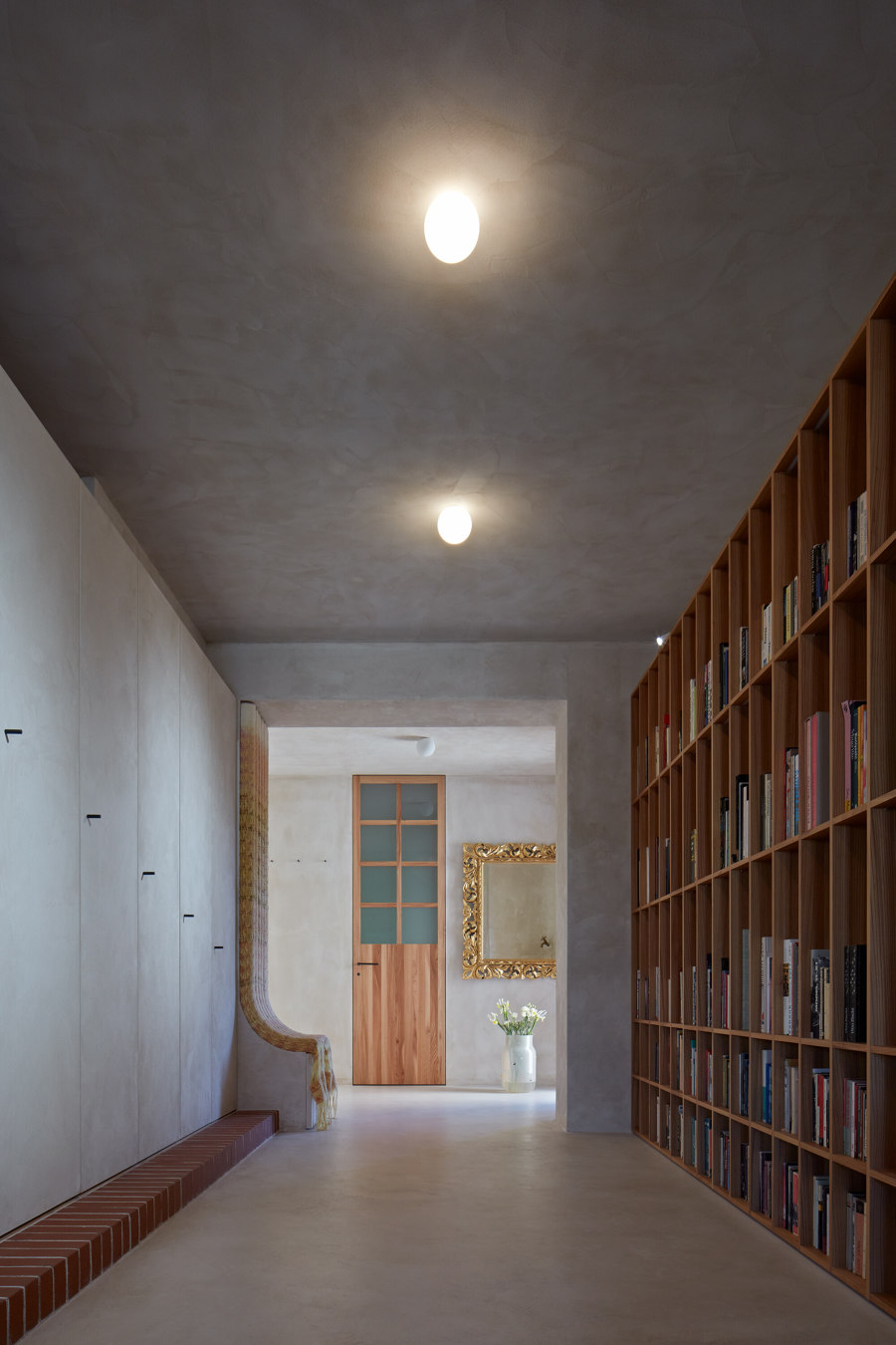
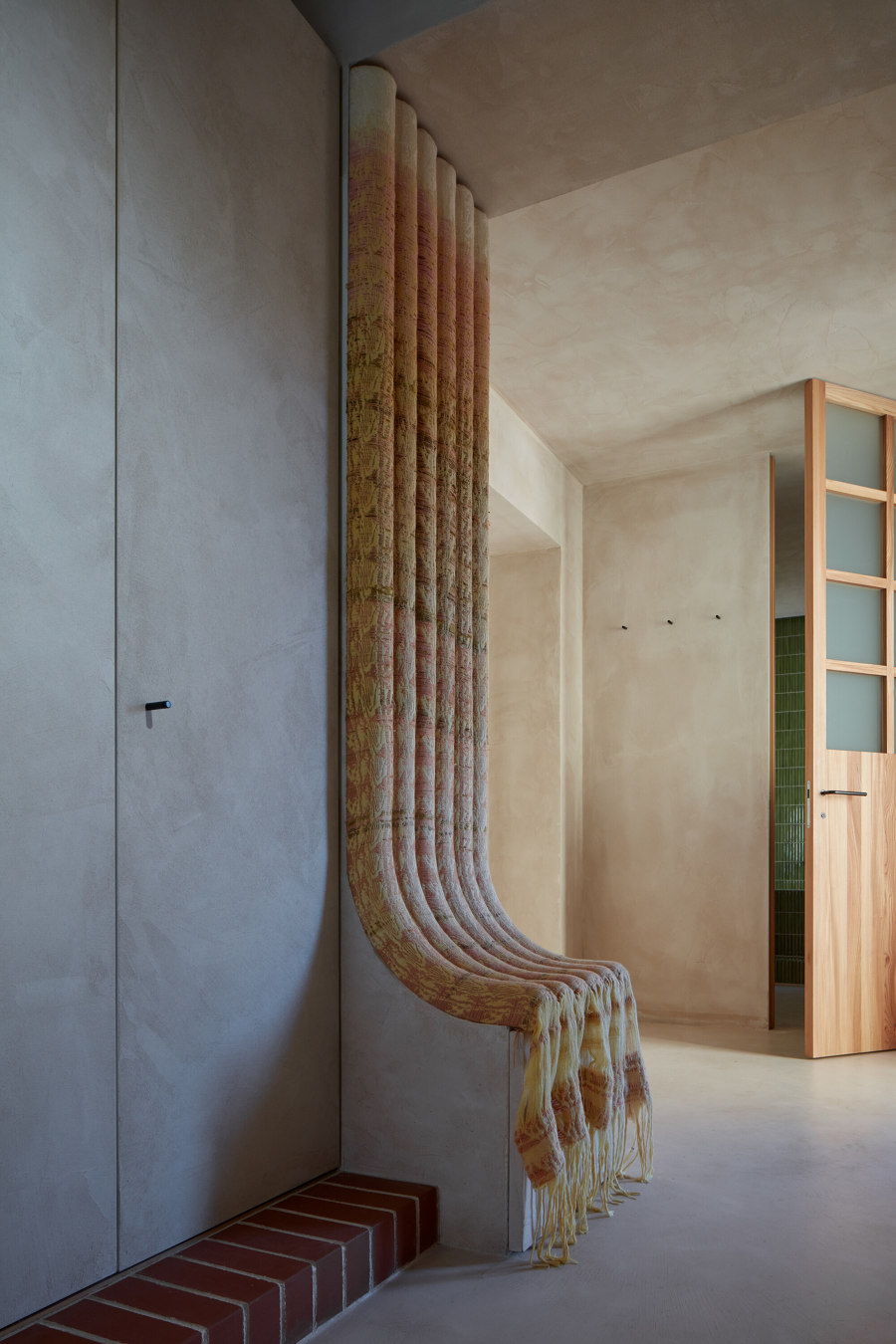
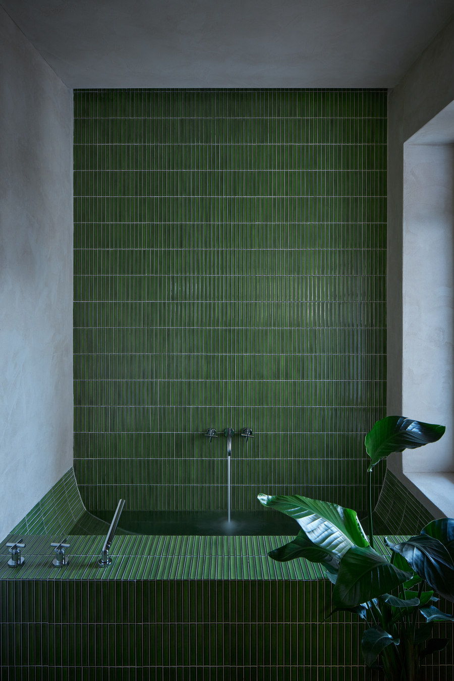
We conceived the reconstruction as a living scenography of changing and permanent backdrops. We are creating a framework that will be added to, updated, and used. We are working on the edge of exhibition support designs and adjustments of individual artefacts. With the static concrete skeleton, we rhythmize the built-in orbital layout with variable entrances and surprising viewpoints. The energy of the apartment changes with the time of day, the movement of the sun, and the stucco patterns of the walls. Some atmospheres are fleeting, disappearing in time, others are static, concretely experienceable and linked to the physical movement. Today, the apartment provides a base for the work of residential artists. It serves as a space for exhibitions and social events, but also as a retreat for the investor with this unconventional task - to approach the design of the apartment as an art installation, creating scenes and corners that the user chooses according to mood. The sunny entry space is dominated by the tectonically expressive figures of a corner stucco drinking fountain and a built-in woven throne. The neutral color scheme is enlivened by a rich green undertone from the adjacent bathroom.
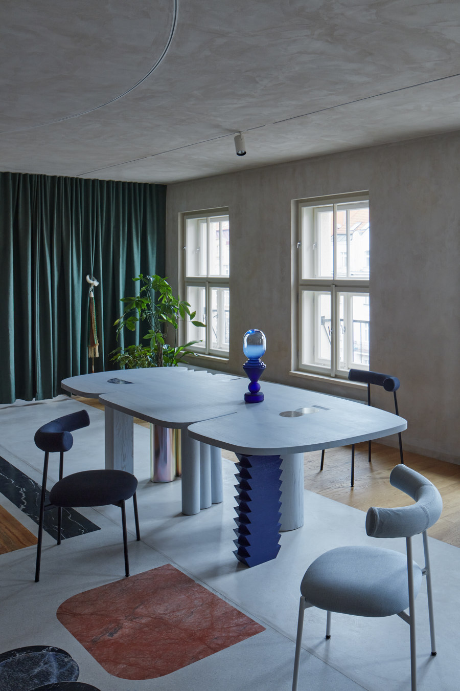
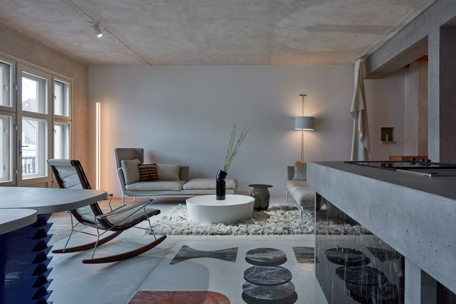
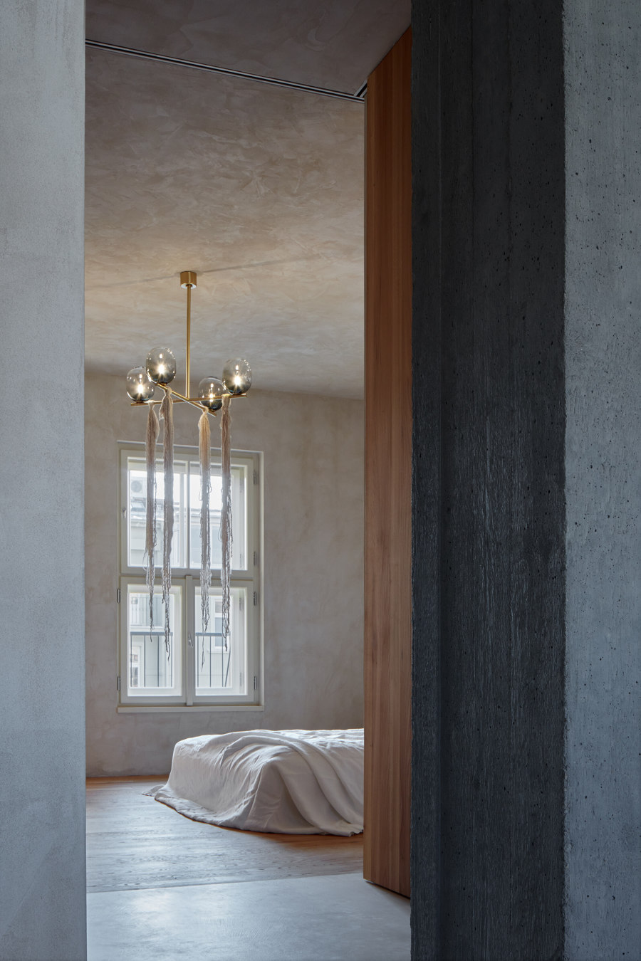
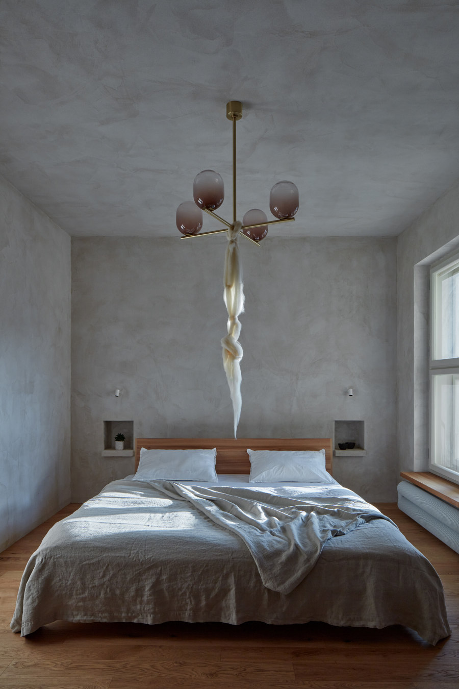
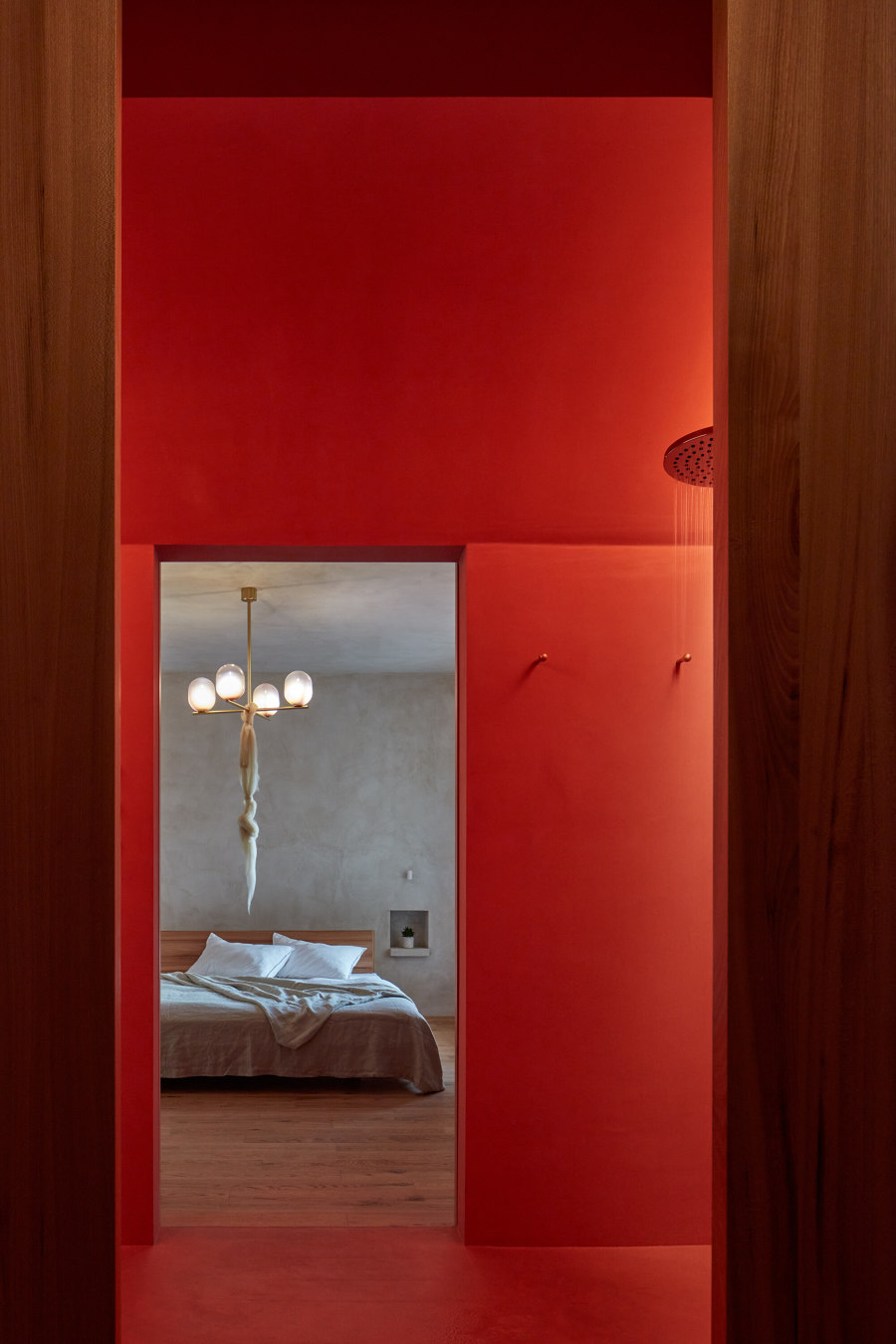
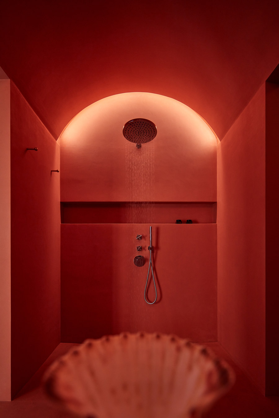
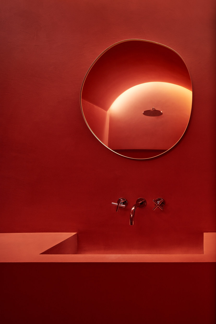
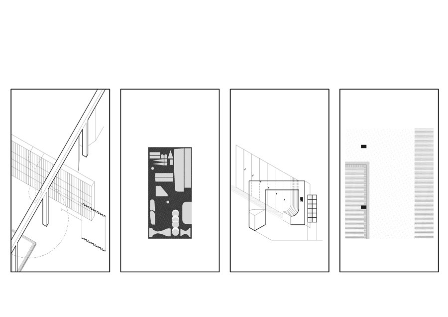
The austere geometry of the bookshelf progresses into a passageway through a beam into the living space. The materiality of the floors and ceiling patterns suggests a three-part layout - a communal space, a residential space with a studio, and the apartment owner’s bedroom. Privacy is ensured by strictly separating the bedroom from the lounge area and gradually mixes the three atmospheres. The stucco bedroom with storage niches flows through the vaulted bathroom to a vertically slatted walk-in closet with a secret passage to the entrance hall. The other zones of the apartment flow seamlessly into each other, with a loose boundary between them. Privacy can be regulated by vertical sliding elements. The studio bathroom is conceived in a strict square module. Its starkness is softened by a stained-glass window that lets in colored reflections of light. The neutral white color becomes a play of colorful shades. A terrazzo composition with a concrete bar dominates the center of gravity of the main communal space. This is complemented by freely movable elements. The materiality of the stucco, elm wood, floor screed, and concrete makes the embedded artefacts stand out. The best projects are created with great clients. Their most valuable characteristic is their broadmindedness, which allows them to break established rules. Everything is different and yet so the same. We thank you for the opportunity.
Design Team:
Architecture: Objektor architekti-Jakub Červenka, Václav Šuba, Vojtěch Šaroun
Creative concept: Tereza Porybná
Designers of built-in objects: Aleksandra Vajd, Daniela Danielis, Evy Jokhova, Dechem,Jiří Krejčiřík, Michal Ullrich,Simply Cotto, Olexton
