Steiner Flughafebeck Airport Center Zurich,
Zurich, 2019
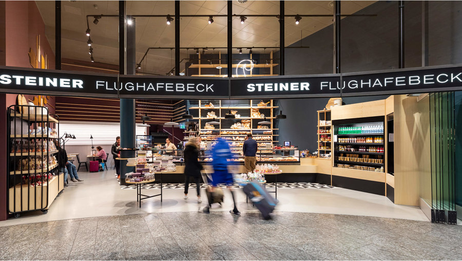
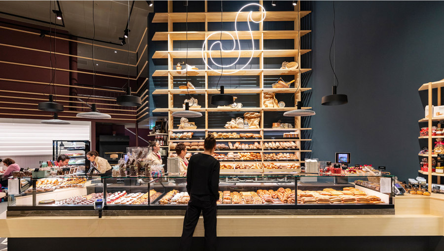
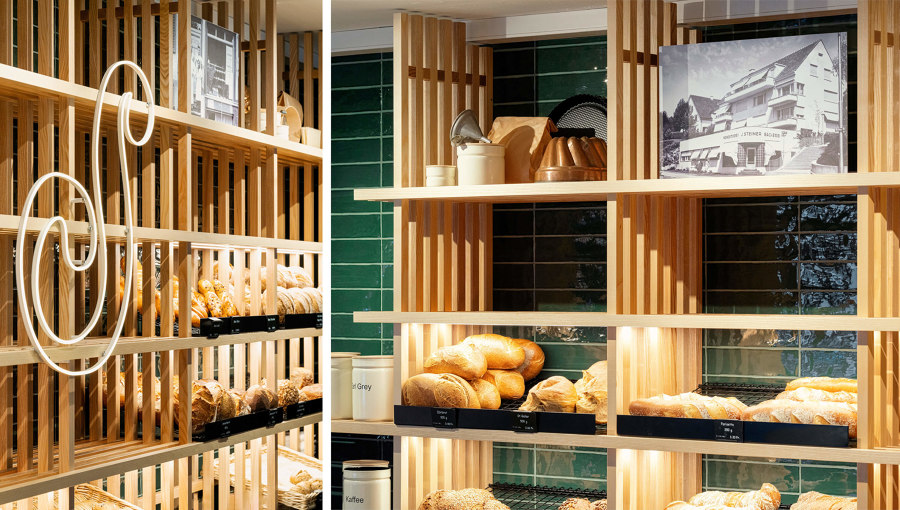
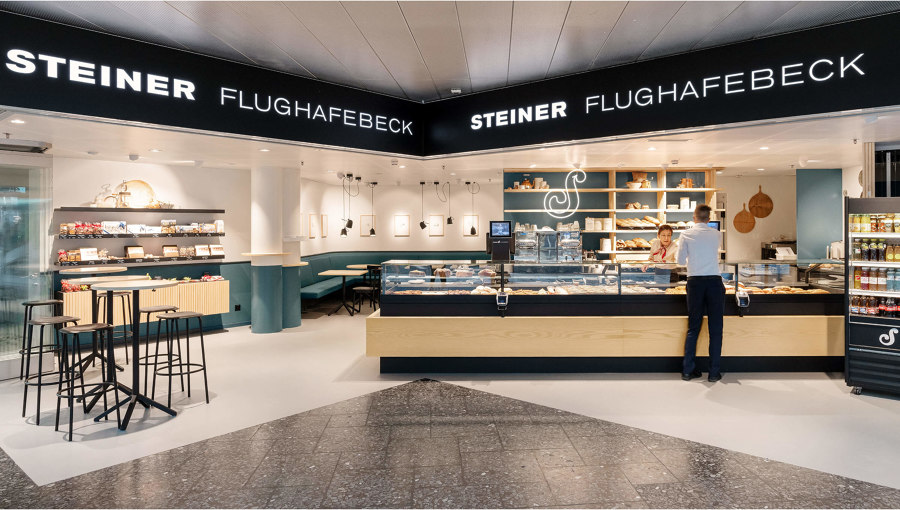
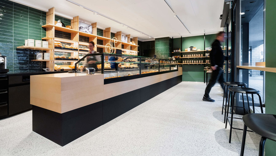
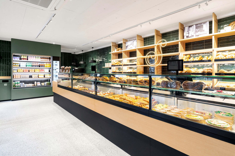
Steiner Flughafebeck is a traditional Swiss bakery that has successfully built up a large clientele in its eleven branches for over 90 years. At Zurich Airport, the company has been creating products since 1976 that continue to delight a broad public to this day. Pfeffermint challenged the task of developing a user experience and design concept in order to be able to stand up to the growing competition at the airport. The sales space was supplemented by a consumption zone to create a café ambience. The dark colour of the walls perfectly emphasises the naturalness of the baked goods. Together with the ash wood, which as a material runs through the entire space and, as a room-high shelf, acts as a powerful brand identity feature itself. This fresh, urban and at the same time authentic atmosphere allows to stage the baking craft in a superb way. Thanks to the installation of a pop-up during the extremely short construction period, sales were able to continue seamlessly without any major loss of turnover.
Steiner Flughafebeck Airport Zurich Check-in 1,
Zurich, 2020
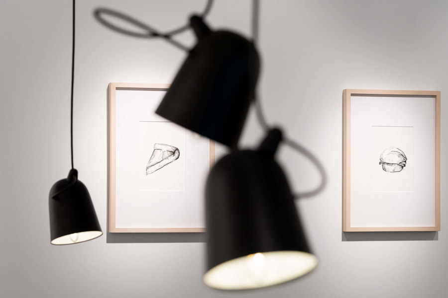
The branch at Zurich Airport was opened in 1980 and is located in a highly frequented place in the historical check-in 1 hall. Open daily from early in the morning until late in the evening, the bakery offers a last chance to grab food and beverages before the passenger cross security control. While the sales processes are standardised in all eleven locations of Steiner Flughafebeck, each location should undergo a unique retail concept that fits the given space. No two shops are alike and yet recognisable as one common brand. Pfeffermint started the project with a product range analysis and was able to generate space for seating in this rather small shop by refining the product assortment. The given low room height and the peculiar floor plan required an independent design solution. A light floor and ceiling brighten up the entire room considerably. A colour band in contemporary blue-green runs through all areas and skillfully connects the bench with the product presentations on the sideboard and the central bread shelf. The use of light ash wood and dark lava stone complements the material mix to create a lively and cosy bistro atmosphere. The subtle styling gives the interior the final touch and makes the craft tangible.
Steiner Flughafebeck Höngg Dorf,
Zurich, 2022
After successful renovations at Zurich Airport in 2019 and 2020, pfeffermit 2022 has expanded the first branch of the new design line on city territory. In a village setting in Höngg, the bakery is a popular place to go 365 days a year for residents. The last renovation was 11 years ago.
It quickly became clear that the main counter would be moved and find a new place symmetrically behind the entrance door. Attention was paid to hiding the new piping for refrigeration and sanitary facilities in the basement in order to keep the sales area free of visible technology. In addition, a separate delivery access was desired.
Pfeffermint was able to convince the client to remove the suspended ceiling and thus gain valuable room volume. At the same time, it was possible to expose the valuable concrete look. The choice of light floor and ceiling colors brightens the entire space considerably and provides a perfect framework for the design in between. The light-colored seamless floor is nicely aggregated by Swiss pebbles.
As the main design element here, pfeffermint chose lengthy, dark green wall tiles that run throughout the space and whose hue is repeated in a lighter shade on the walls. The work area feature a light gray color scheme. The bread rack in ash wood functions as a brand-strengthening design element across all locations. In this store, pfeffermint also used the ash wood in slats that hide the view from the outside into the spacious work area.
