When our clients for a previous loft project told us that they were getting a new place to keep up with their growing family, we were understandably excited. Aside from having become close friends with them, we found Joon and Arum to be fantastic design collaborators that we shared an aesthetic with.
Joon, the husband, is an amazingly talented design mind and partner at a prominent ad agency. Arum, his wife, is a total badass who does kendo, the ancient art of samurai swordmanship, very seriously.
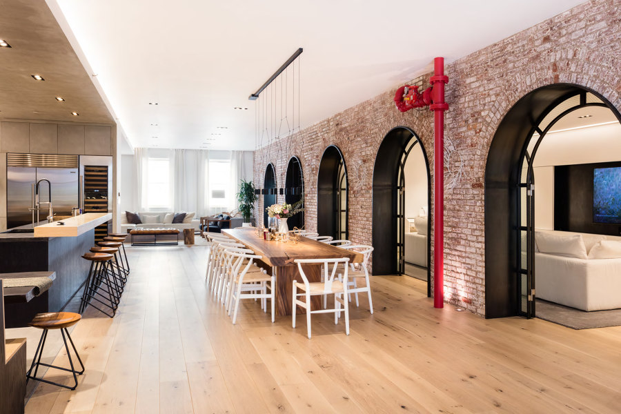
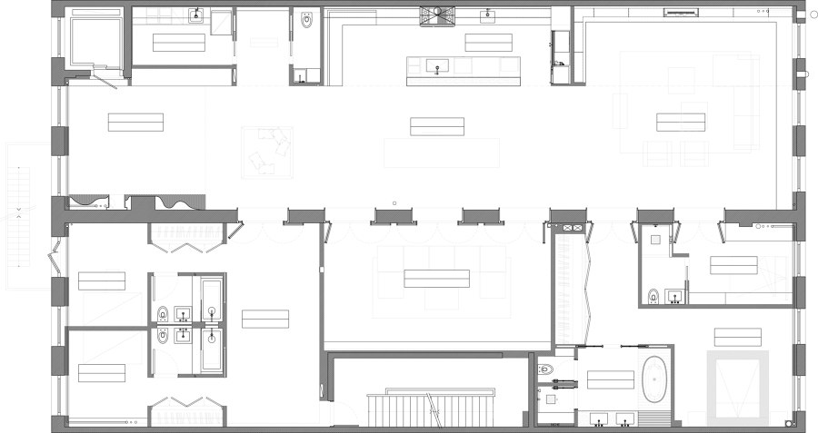
The apartment that they found was a floor of a building in Tribeca with two loft spaces, separated by a thick brick wall. We did some investigation, and we realized that the brick wall that divided the floor in half was in fact a series of brick arches. Immediately we realized that the old bones, and the arches in particular, were going to be what drove our design.
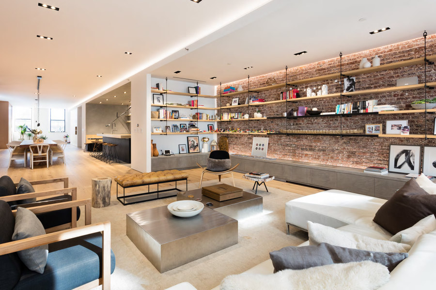
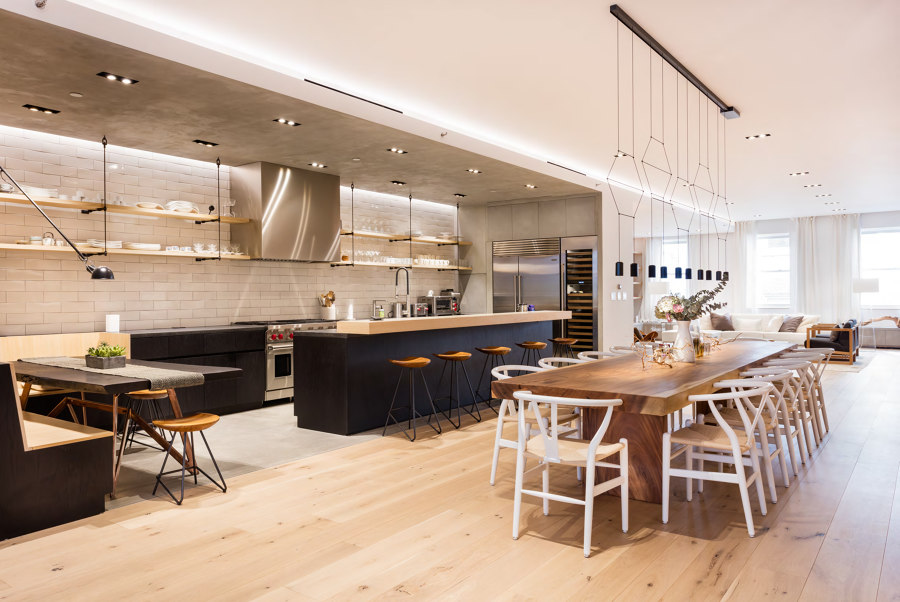
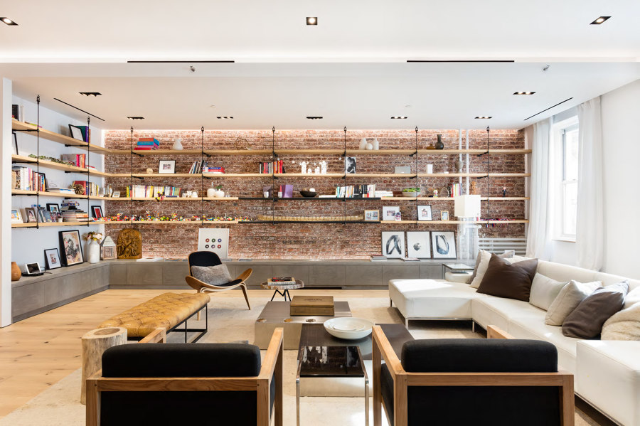
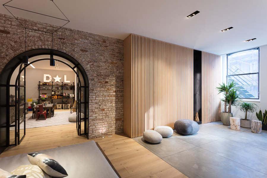
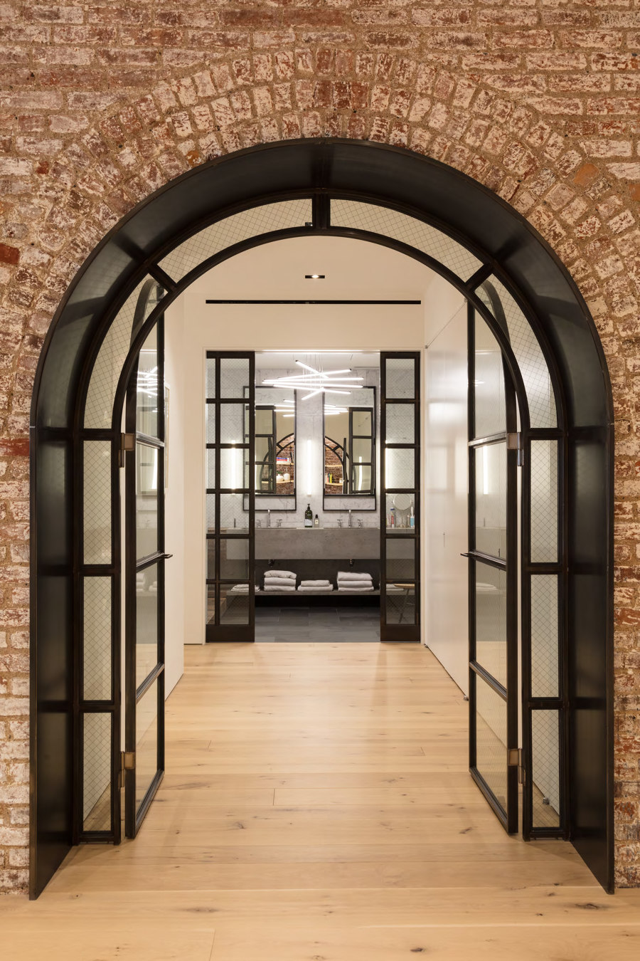
We stripped away as much as we could, generating a rhythmic arcade of brick arches, almost like something you'd see in the Cloisters. Those arches became the centerpiece of the main space, and creating all sorts of interesting spaces on the other side of the arches became a fun way to instill the design with a sense of curiosity and discovery. The huge main space holds the living area, dining, and a massive eat-in kitchen, while every arch leads to a different secondary function, like a media room, play room, bedrooms, and so forth. In this way we were able to heighten the sense of scale by juxtaposing small, cozy spaces with a huge main space.
Some highlights include:
- a custom sculptural entry area with a curved polished steel wall
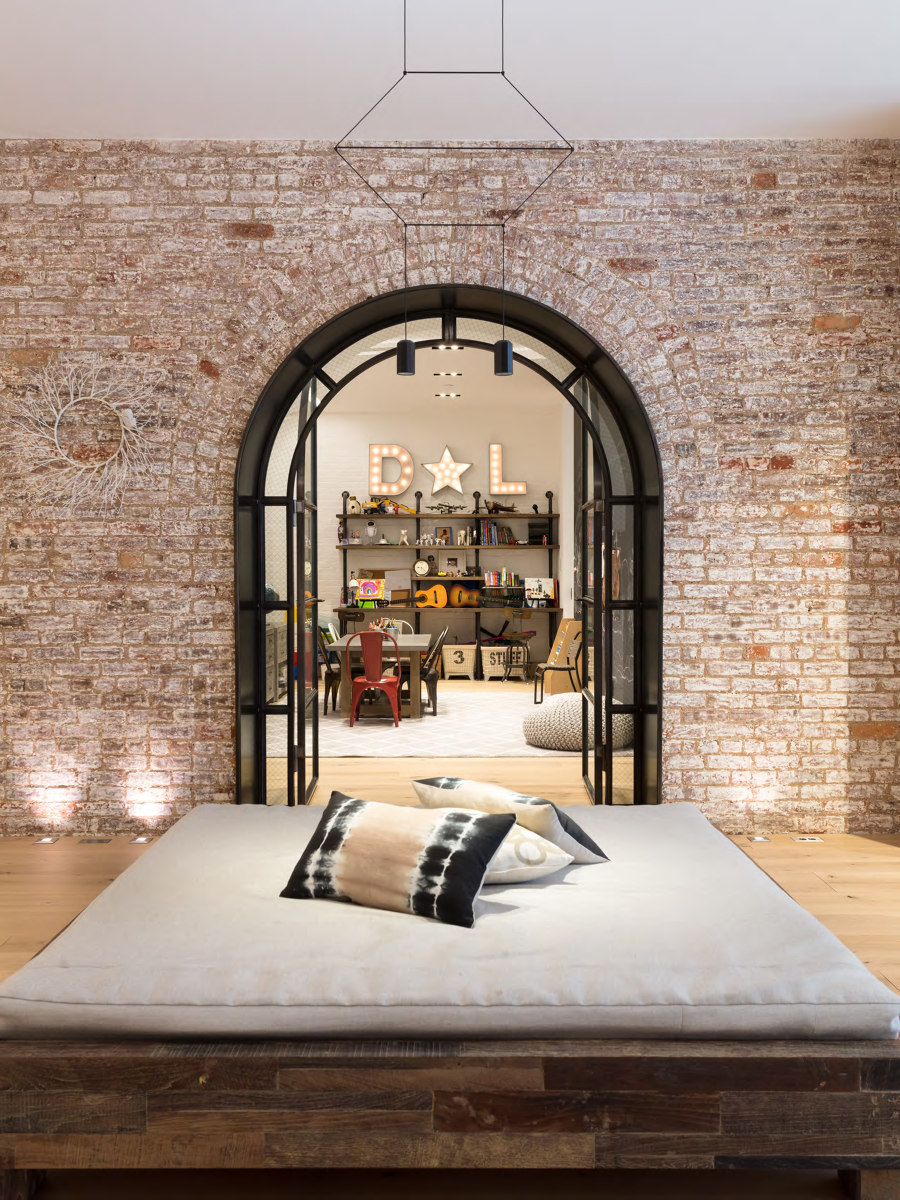
- a large daybed (inspired by the one in my loft) that floats in the middle of the space. Kids love it.
- an 18 foot wood slab dining table for their frequent entertaining
- a large functional kitchen with concrete floors, walls, and ceiling
- a marching series of arches, each fitted with custom black steel doors
- a kids' "suite", with a playroom that can be seen from other areas of the house where the parents might be via carefully considered peek-a-boo openings
- the powder room repurposes some of the ceiling tin tiles found on site as a cladding for walls and the door
Design Team:
RAAD Studio
