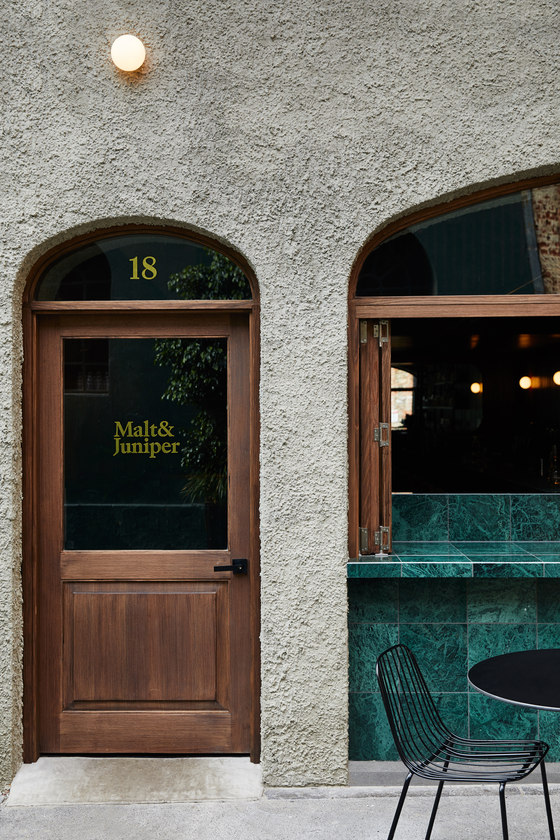
An intimate gin & whisky bar. Paying homage to classic cocktail bars of yesteryear, Malt & Juniper is moody, slightly modernist and a bit botanical.
What was the brief?
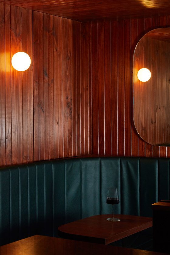
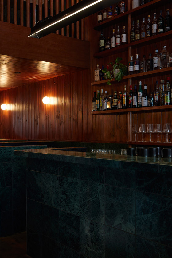
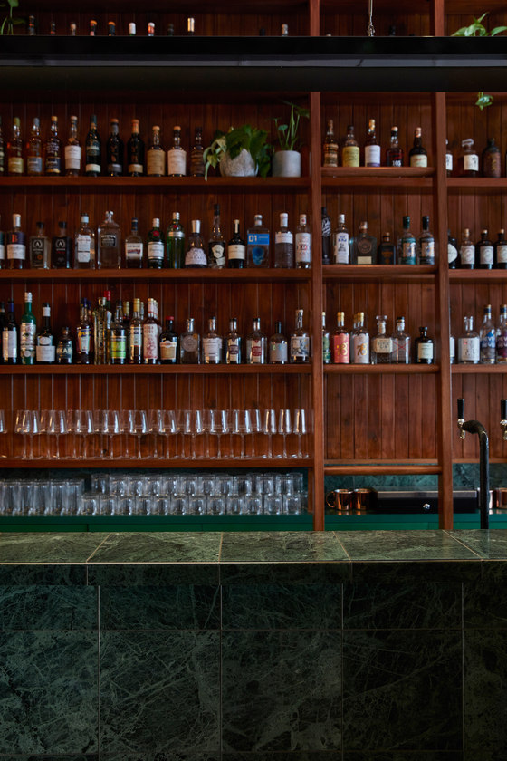
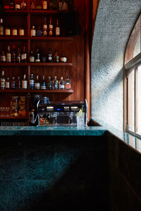
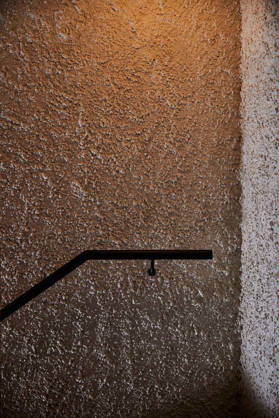
The brief was for a romantic, moody space, where patron comfort is key. A requirement was an over-sized back bar to house an elaborate liquor collection and a sliding ladder to access the upper reaches. We started with these two elements; the bar as a moment of theatre and grandeur, surrounded by booths where occupants can tuck in and hideaway in the darkness. M&J’s offering inspired a botanical twist to the space, the resultant design balances modernist influences in timber panelling and stucco render with green marble and indoor planting. The space itself is narrow, with a mezzanine to the rear. The bar dominates the space, with a suspended planter, mirrors and varied lighting creating depth, layering and a sense of openness in a small footprint. A limited budget went a long way, with the client as project manager and considerable time throughout the build liaising with consultants and trades.
How does the space work in response to the hospitality offering?
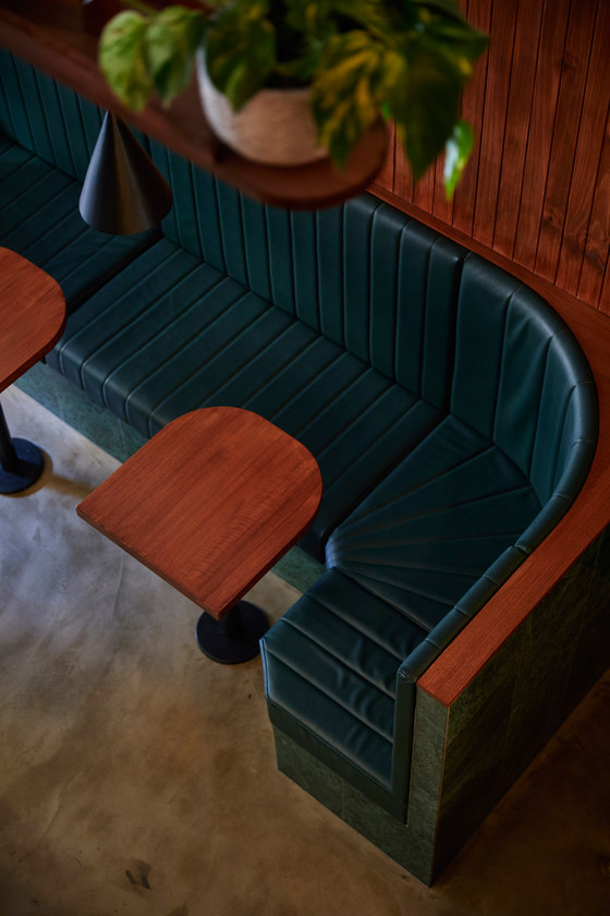
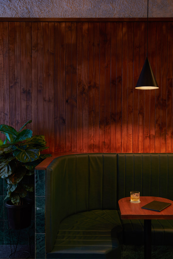
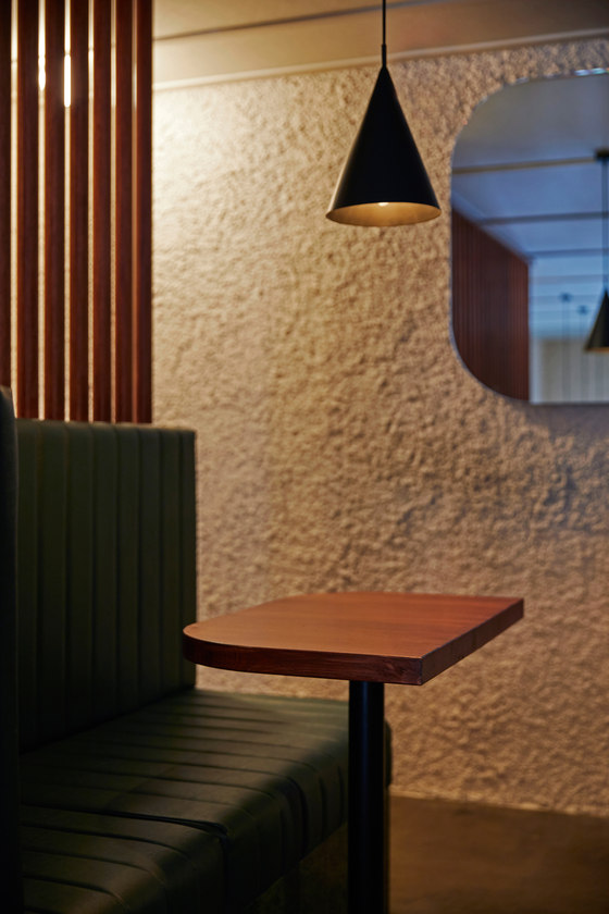
The menu is based around two spirits; whisky and gin, their base botanicals used to form the name of the venue; malt and juniper, and used to inspire a botanical, yet classic cocktail bar aesthetic. Within the space the mixing of drinks takes centre stage, the large back bar, stocked with liquor and plants creates a rich, visually dense backdrop for a simple, green marble bar, a stage of sorts. This idea of drink-making as theatre is expanded upon by 4-metre ladder that slides along the back bar, where bartenders run up and down the ladder all evening, accentuating the height and creating a vertical axis within the space. The bar is contrasted and surrounded by secluded booth seating. With a high back and deep seat, these are spaces you can sink into, where intimate conversations can take place and a quality, slow drink can be had.
What is innovative and unique about this project?
The compact footprint feels expansive and is filled with unique yet cohesive designed moments. A slightly unusual mix of materials - green marble, stucco, dark timber boards - reflect the botanical modernist aesthetic in a moody, dark manner that creates a considered back drop for the venue’s offering. The location of the bar, being away from the entrance, and the perimeter booth seating mean that customers are forced to gather in open spaces, or find a seat and tuck in, away from paths of travel, this makes a small space function well and easier to navigate even during the busiest of times. With a custom designed singular, long pendant light over the bar, subtle wall lighting and mirrors on the back wall, design has been used to create a sense of openness that can be hard to come by in venues of this size.
Sans-Arc Studio
