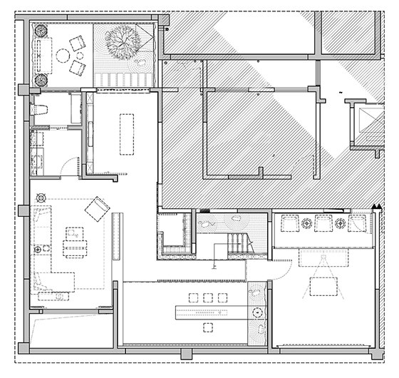
Life is a kind of experience. There are two kinds of people who have rich experiences. One prefers addition, this kind of people have childlike innocence and great attachment to objects. Each of their collection stands for a memory and a mood. The more the collection they have, the more fulfilling and productive life they live. The other one prefers subtraction, with the increase of experience, they become more gentle to people, but stricter to themselves. Knowledge, principles and tastes, all have established stable and clear boundaries through the years.
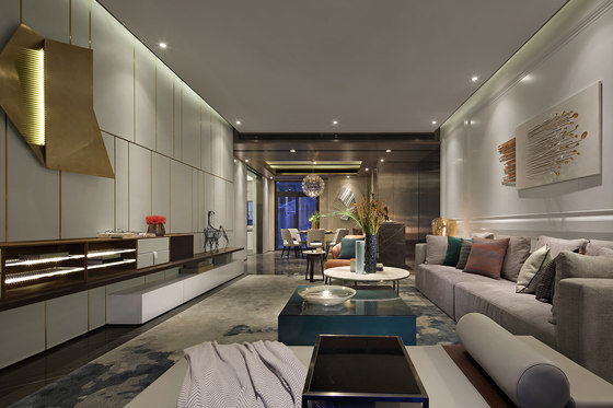
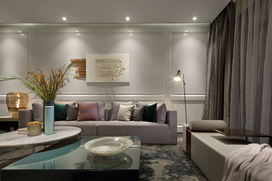
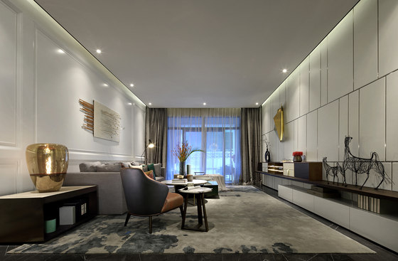
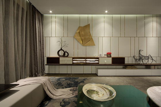
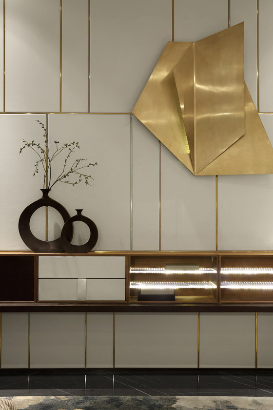
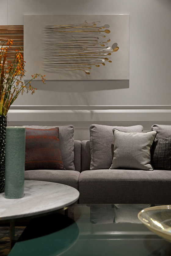
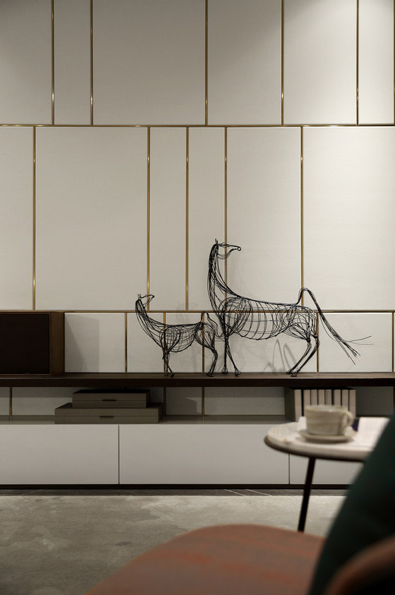
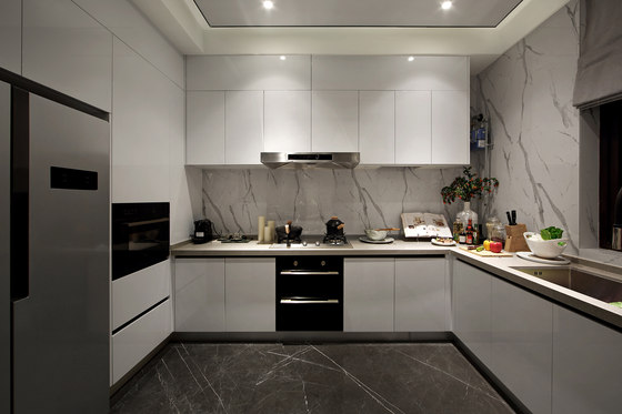
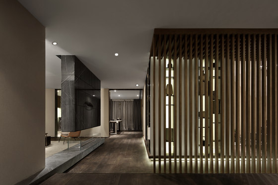
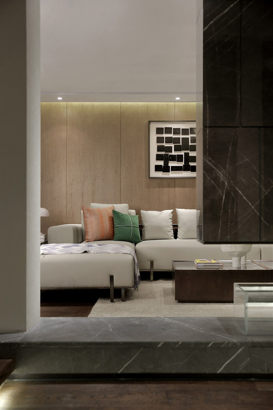
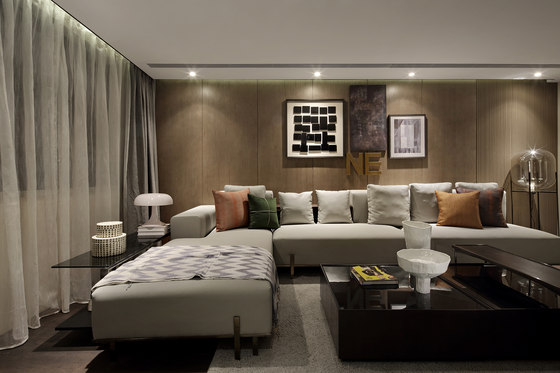
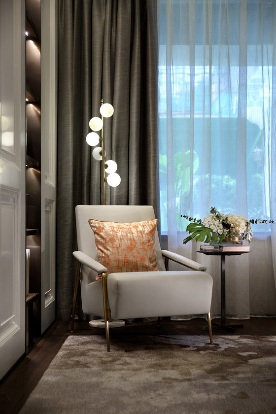
Zhengkai Olive City is designed for the latter. In this project, Qianxun gives unique characters to the space, boldness which is not gaudy, cold elegance , and low-key confidence . It is an ordinary project with extraordinary design. Simple style with gray and white tones, the space appears clean and neat. The unique carpet has fine stripes and personalized geometric patterns with a soft dark orange, creating an elegant charm. And the vivifying green ornaments make the space blending with coldness and warmth. In general, the entire space is not lack of temperature, nor grace.
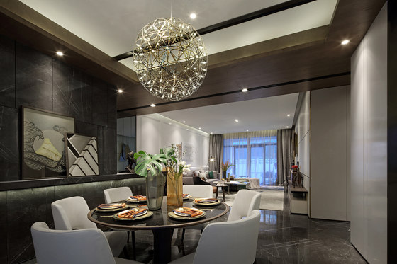
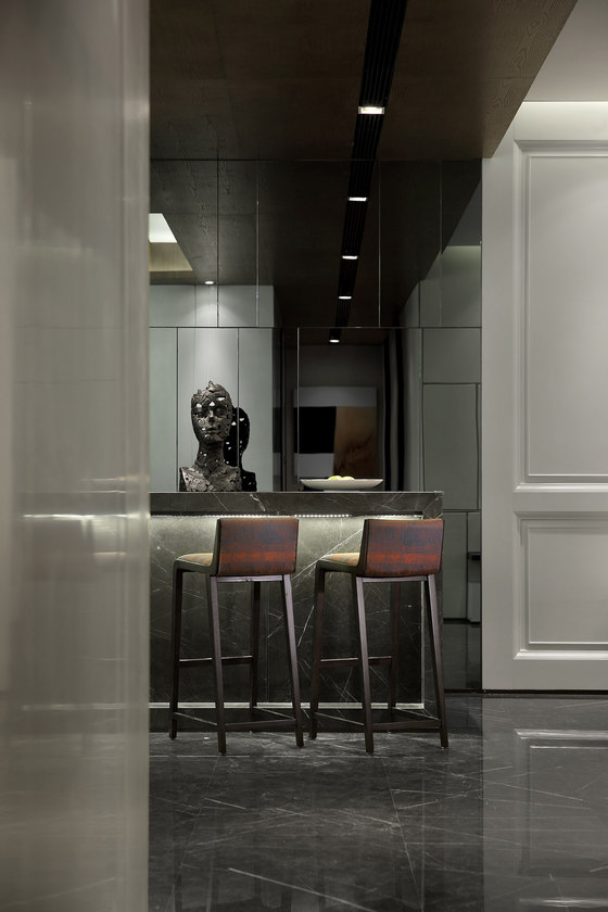
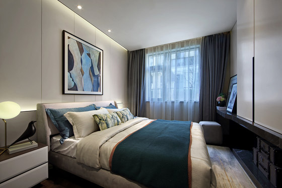
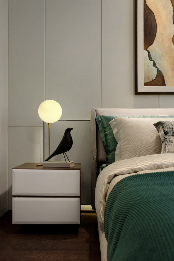
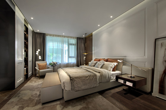
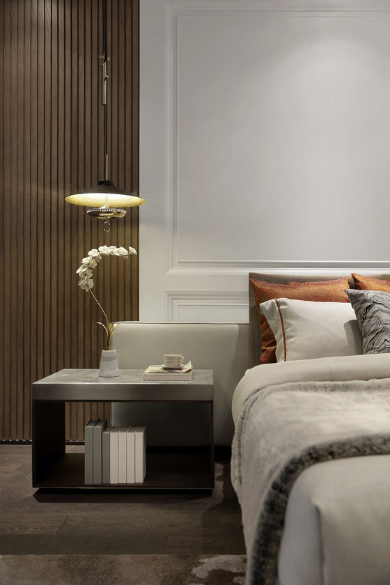
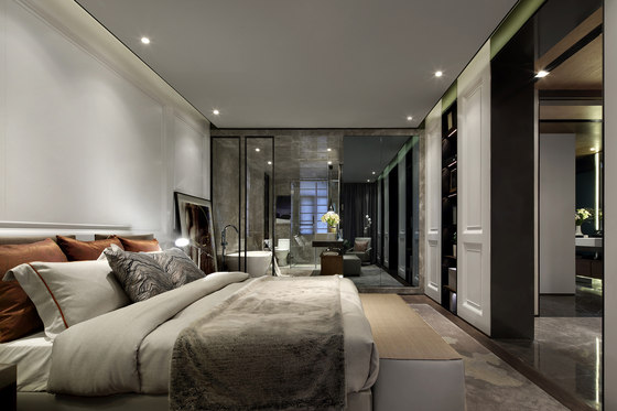
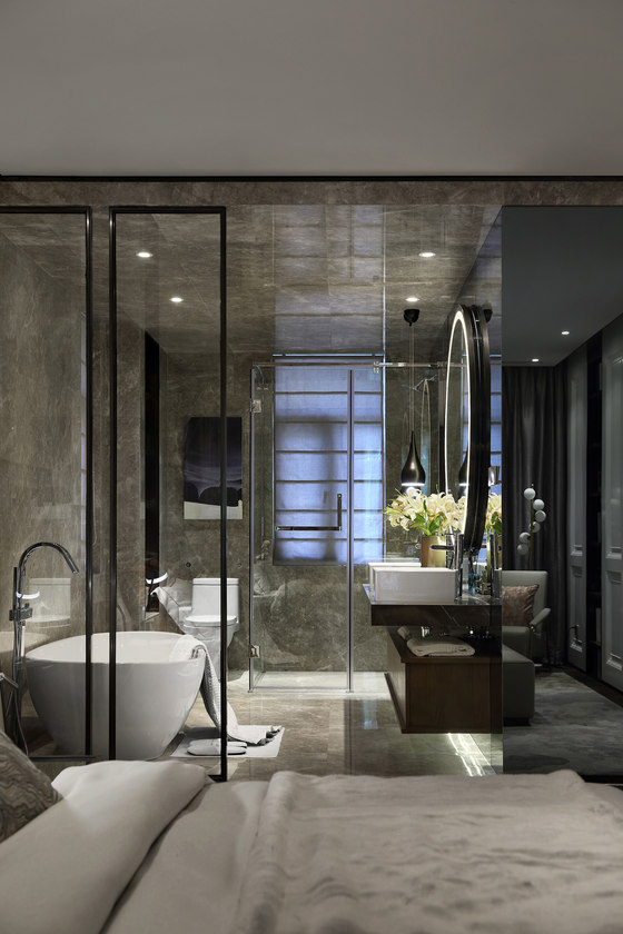
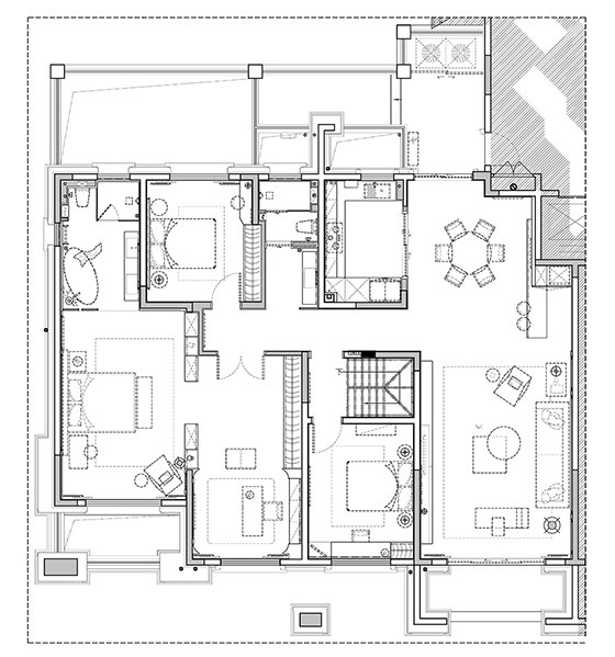
The bar counter design is a spice of life, which blurs the boundary between the dining room and living room, so that the entire space is an integration. The dining room adopts a classic round table, as well as soft diffuse light sources, where the collision of the black wood grain against the white mat even becomes pretty warm and sweet. The tone in master bedroom follows the simple, soft, and harmonious visual effect of the living room. White, gray and dark orange blend with each other.
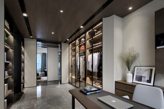
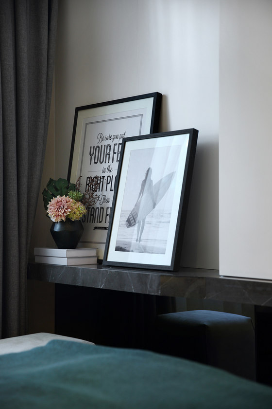
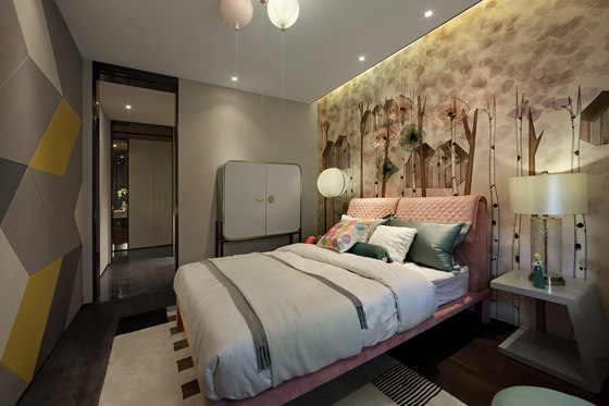
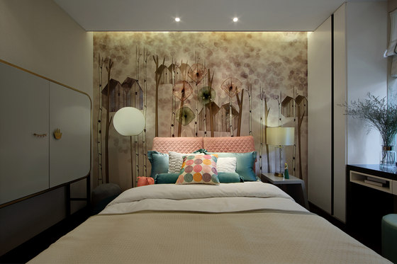
Together with the light embellishment, it brings some sense of mystery. Connected to the master bedroom, yet cleverly separated from it with a floor-style bookcase, the cloakroom includes a study space where the owners can enjoy their private reading time. The overall feeling of the room is comfortable and solemn, while the partial art details neutralize the atmosphere to improve the sense of relaxation. The design for princess room is much more lively.
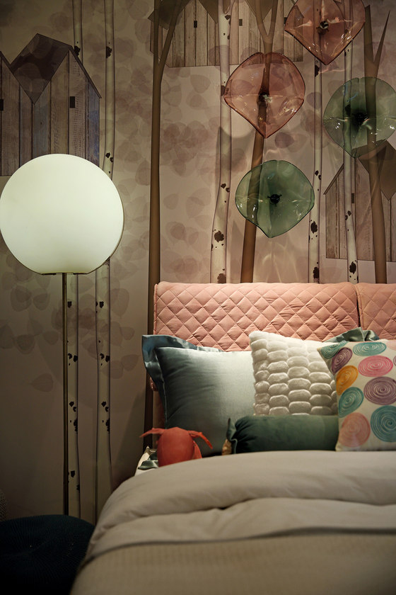
The macaron translucent decorations lay an overall basis of cute and pleasant feeling. One wall is decorated with lovely wallpaper which interacts with the hanging wall installation, forming a two-dimensional and three-dimensional dreamlike sense; while the opposite wallpaper adopts a contrasting color thread with gray, white and orange, in order to avoid a too childish space.
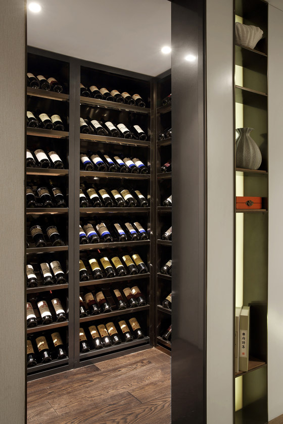
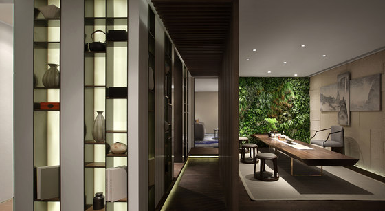
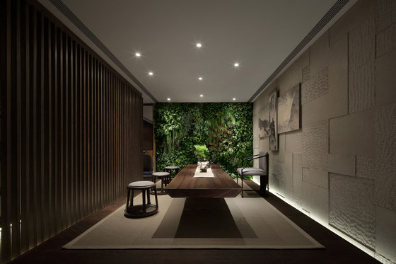
Compared with the living room, the furnishing decoration of the underground reception room is richer, making it more relaxed to have fun or communicate here.. When defining the space functions, the designer has designed an interest space for the owners to present their art accomplishment and tastes. In this way, while being a display space, it has a strong breath of life.
Shenzhen Qianxun Decorative Art and Design Co., Ltd.
