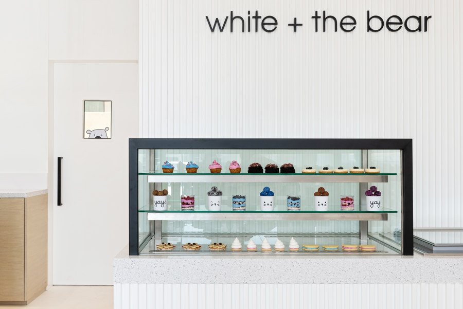
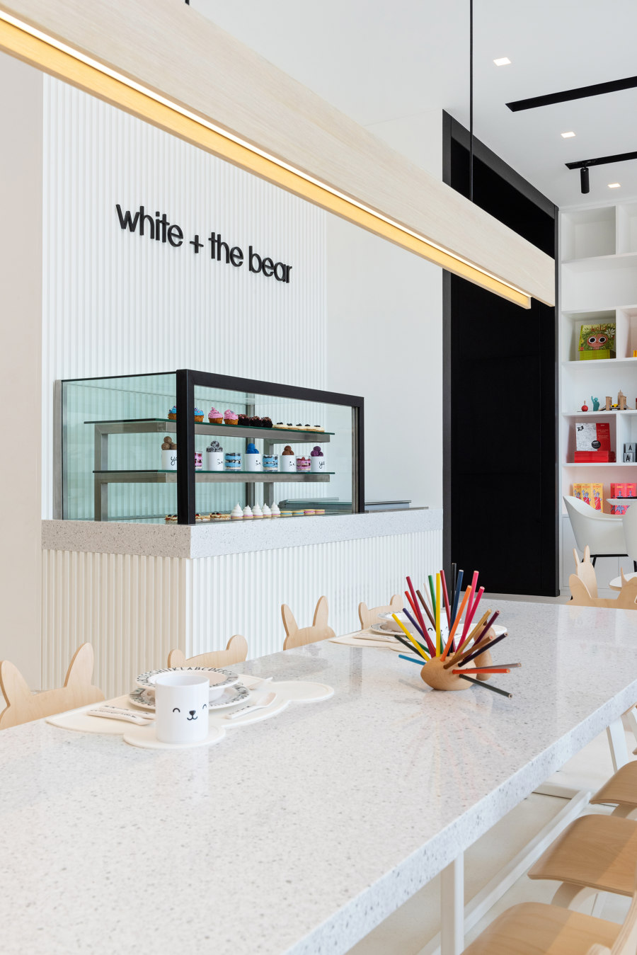
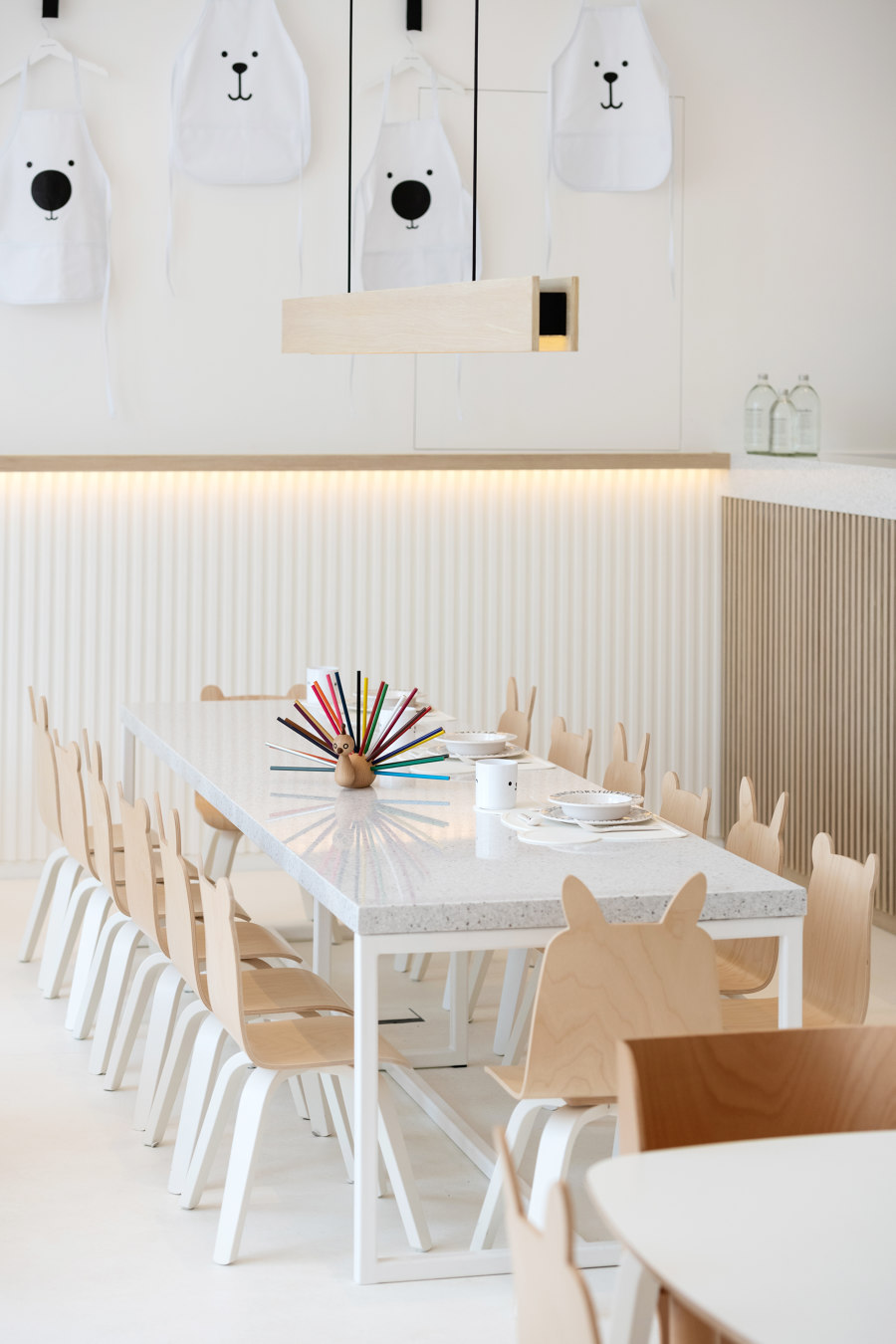
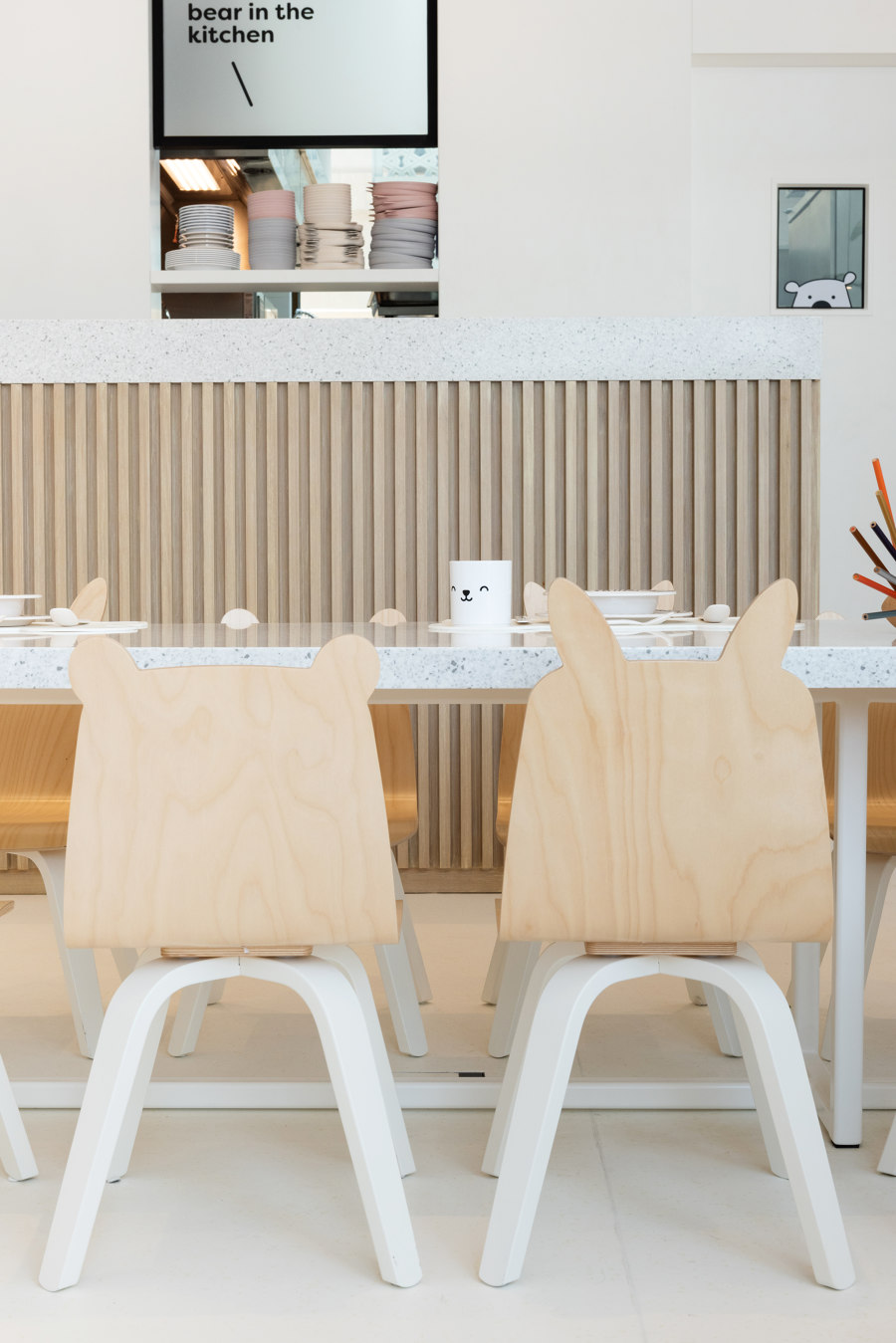
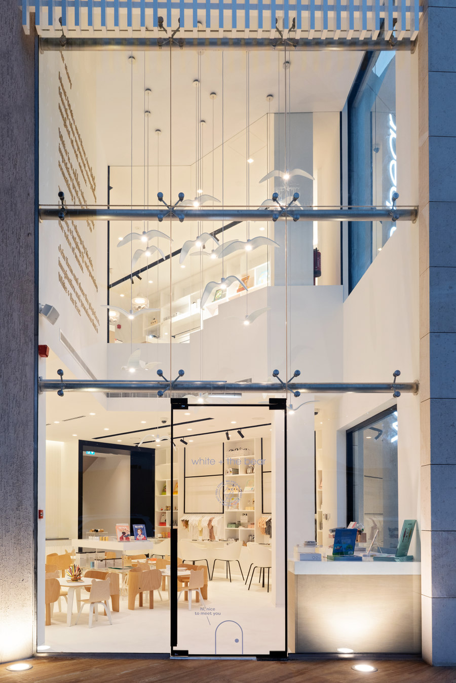
Sneha Divias Atelier is no stranger to creating playful, yet uncompromisingly minimal designs; from hospitality to retail, to residential, the firm has even tested their expertise at creating children-oriented creative playspaces. After the success of Oli Oli, the Atelier was at the center of the spotlight when it came to child-focused architectural spaces so it’s no secret that they’ve made a comeback with this venture.
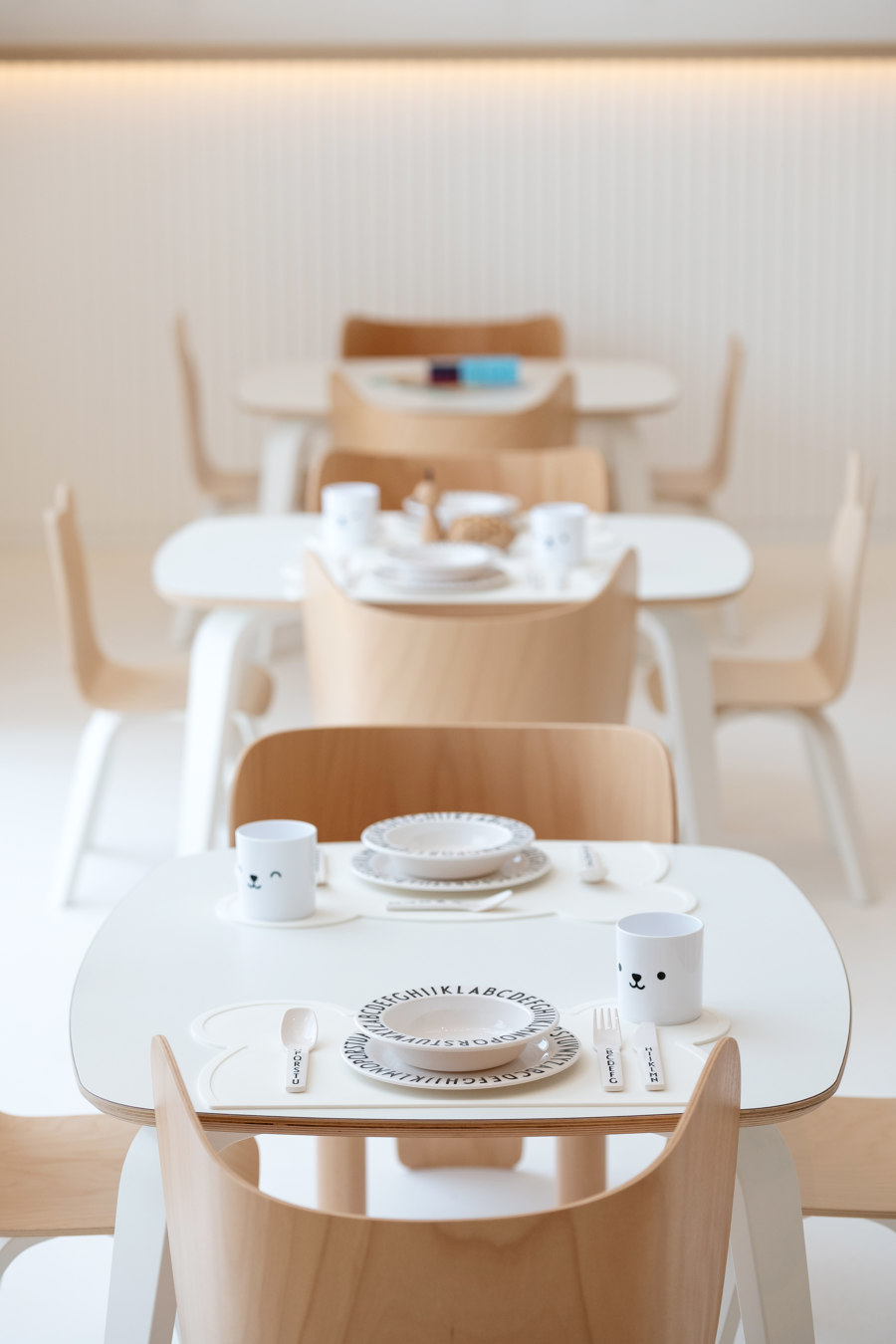
Aptly named ‘White & the Bear’ it is the world’s first children’s restaurant with a healthy and nutritious children specific menu that has been co-created by world renowned celebrity chef and children’s food expert, Annabel Karmel. White & The Bear is a destination for city dwellers seeking for a distinct vibe that appeals to the younger ones. The restaurant and concept store combination acts as a resting stop for parents who are out and about with their children.
The successful design is the result of a consistent collaboration and synergy between all parties. The owner, Hana Al Mula is forward thinking and envisioned the concept and the partnership with Annabel Karmel. The Atelier, together with the contractor Neotech and the graphic design team Yellow brought the space to life.
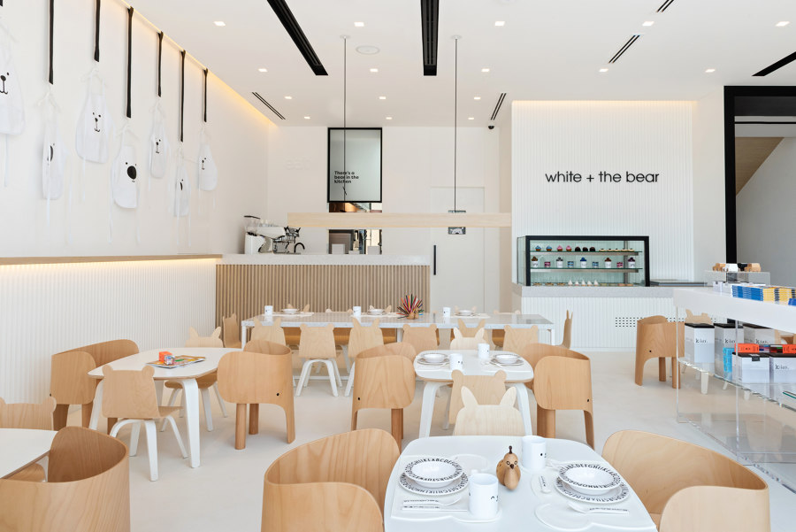
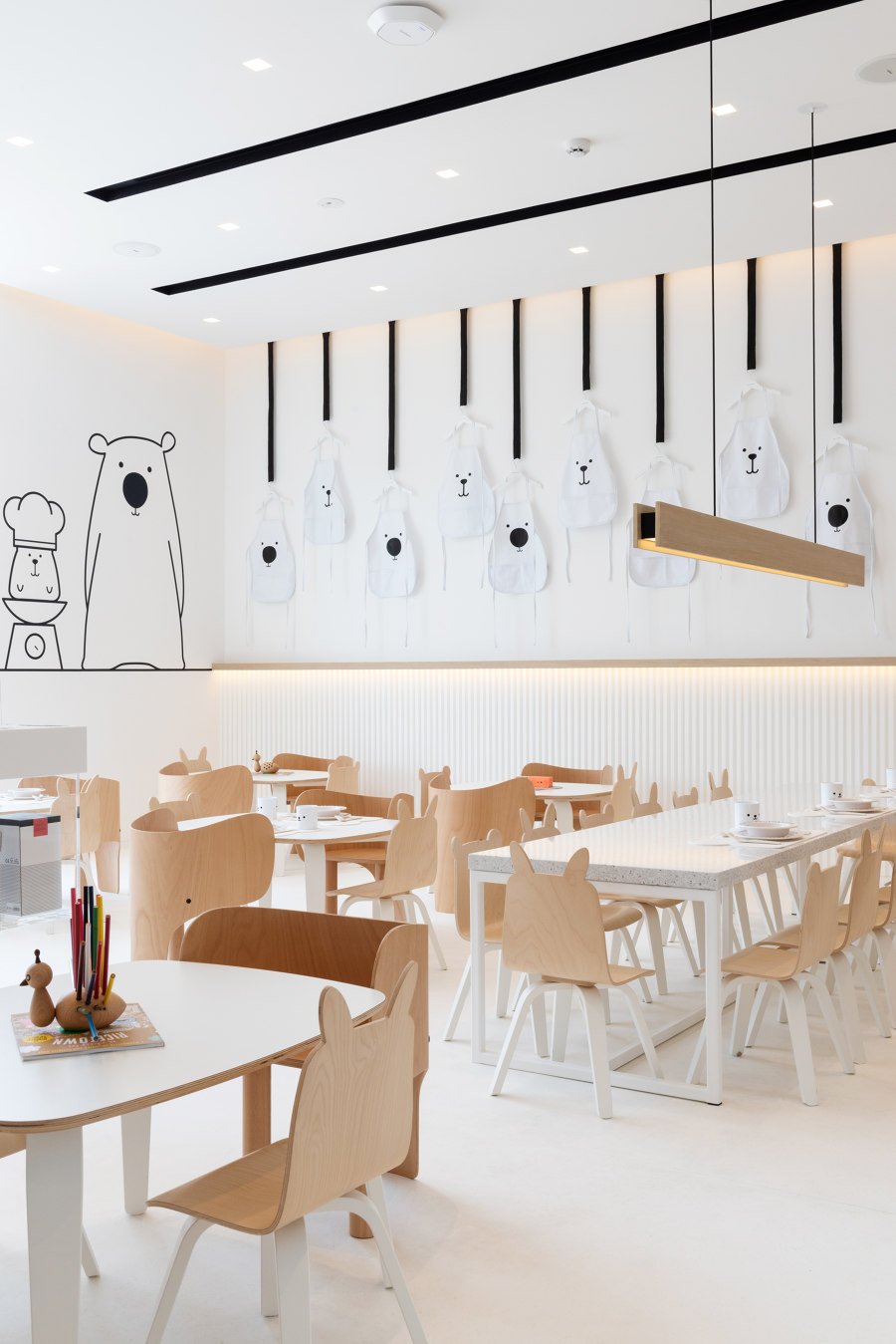
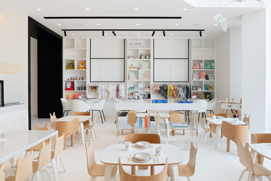
Unlike other child-centered spaces highlighted by bright colors and pop-culture characters, White & The Bear embraces a unique aesthetic that’s urbane and effective for learning.
Spatial Layout
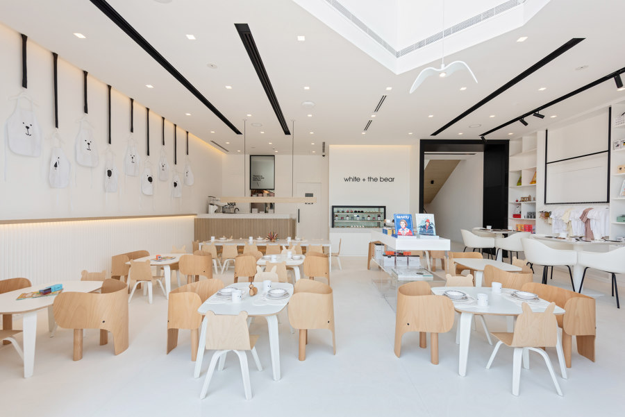
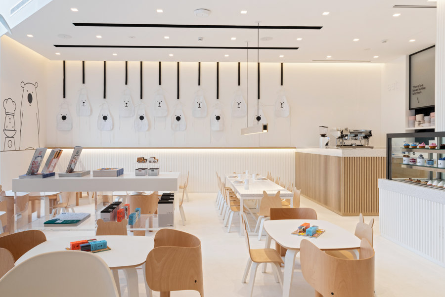
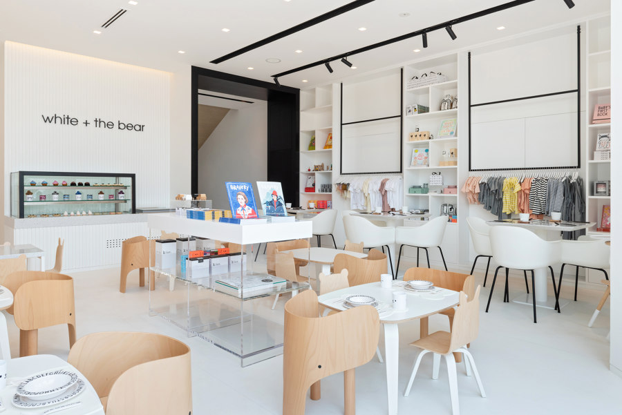
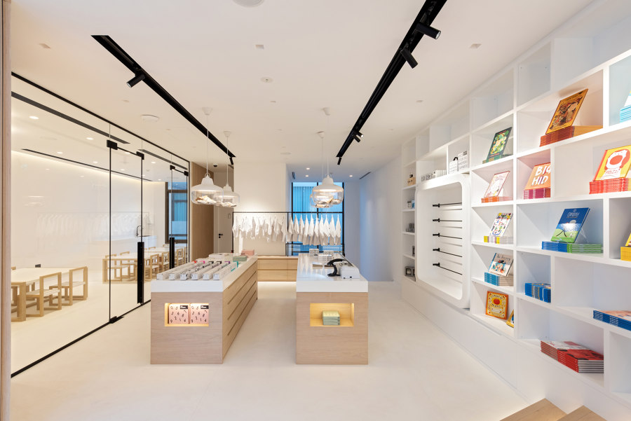
The concept store comprises two floors which means that there’s plenty of space to accommodate children and parents who want to take a break or buy something from a vast collection of products. Both the store and restaurant are blended into each other - so upon entering one can immediately notice the seamless transition and blurred lines between the ground and first floor.
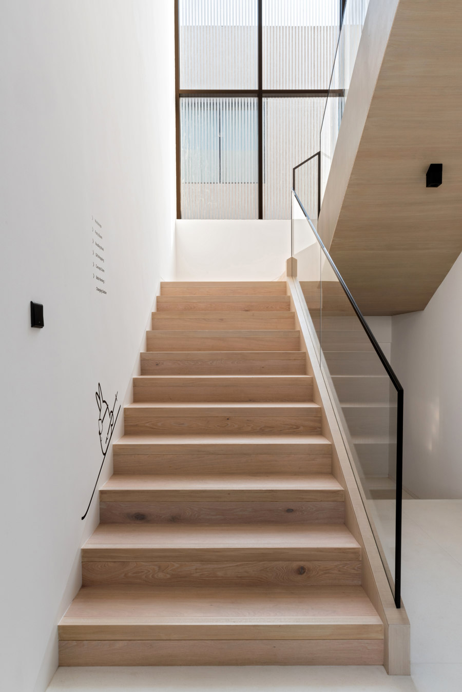
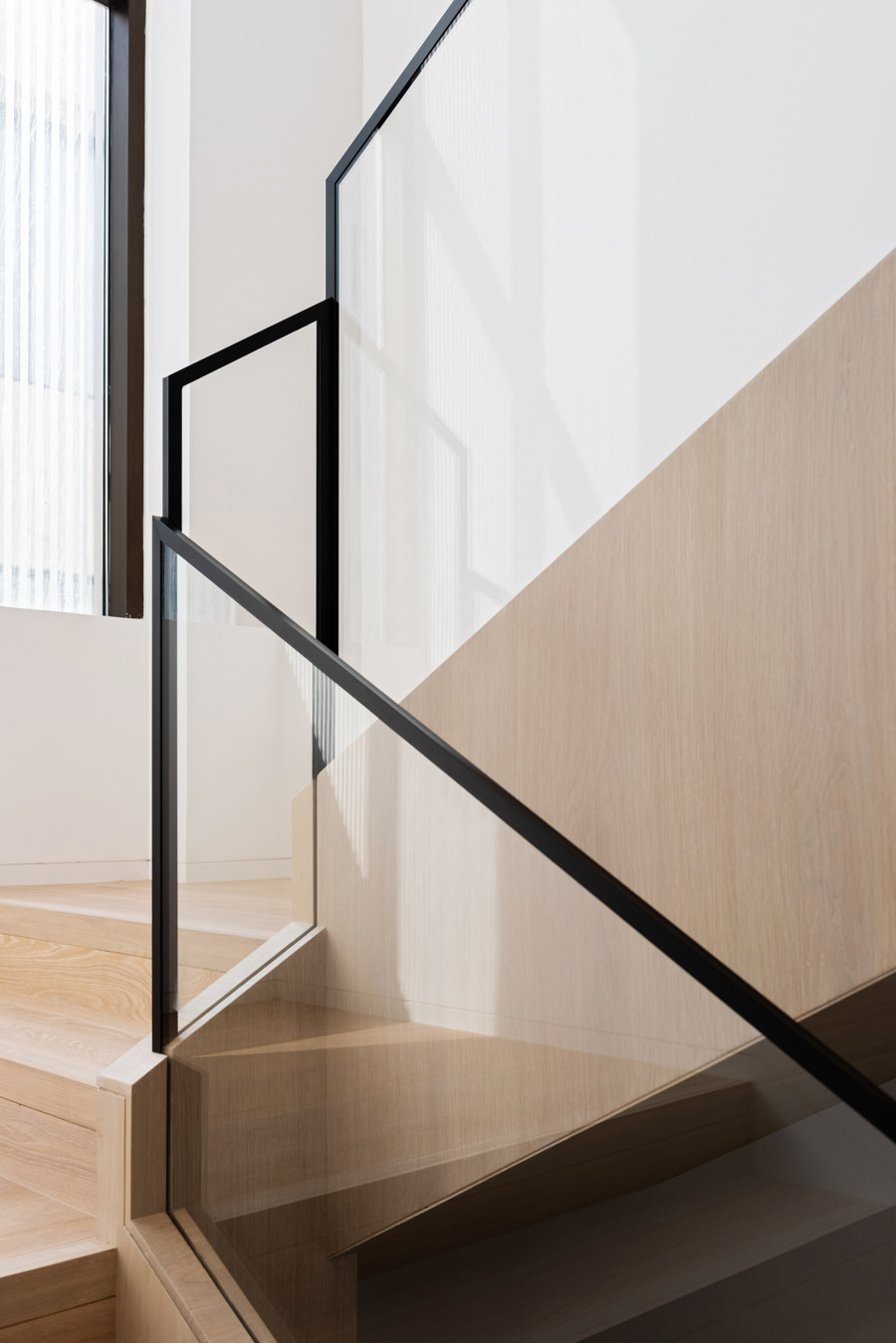
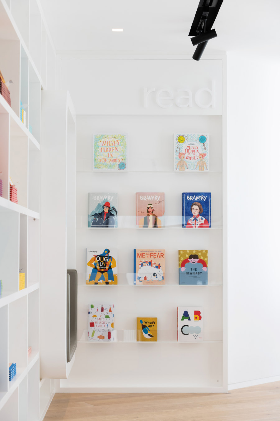
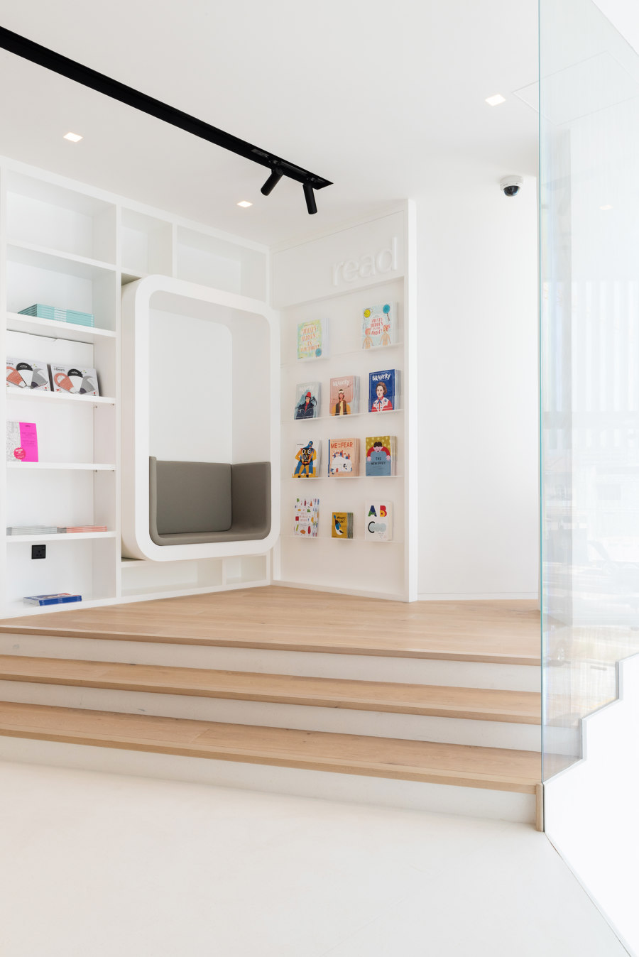
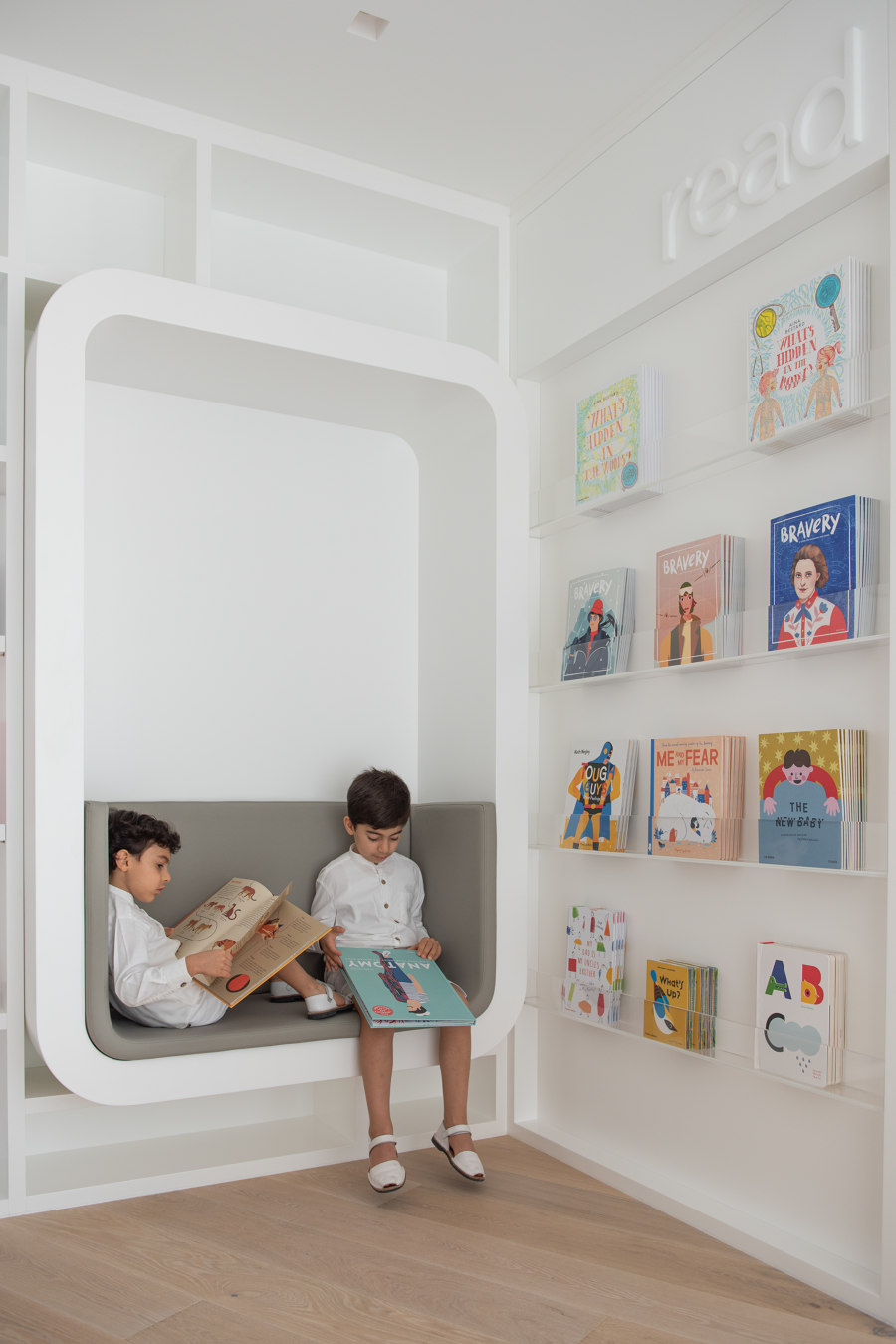
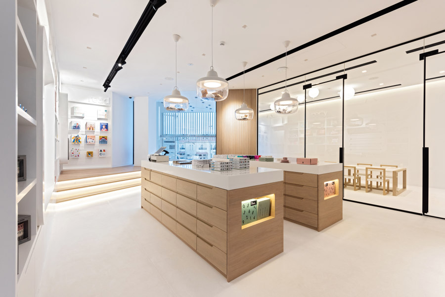
On the ground level, the café lies amidst the retail along with the kitchen and washrooms. The retail moves up to the first floor through wooden stairs and a black metal arch that intices the users to go up. Here, a reading corner and space for special events like workshops and birthday parties are made to delight young visitors. It also includes a nursing space and a store. The Atelier intended for young visitors to form a deep connection with the design, and recognize the space layout as a safe and easy environment.
Concept
Sneha Divias Atelier delivered a holistic design that would possess all things that parents would want their children to be surrounded by; healthy food, a safe environment, and productive learning as per the brief.
The color theory that is aligned with the graphic design makes up a great part of the design analysis, which is why visitors at White and the Bear can observe the application of a neutral color palette rather than one that would overstimulate the children’s senses.
The design concept behind White & the Bear is to create a multi-faceted experience for children and parents. Children explore different sensory triggers while eating, learning, reading, and exploring, and share these findings with their parents. This improves the interaction between parents and children.
Design Features
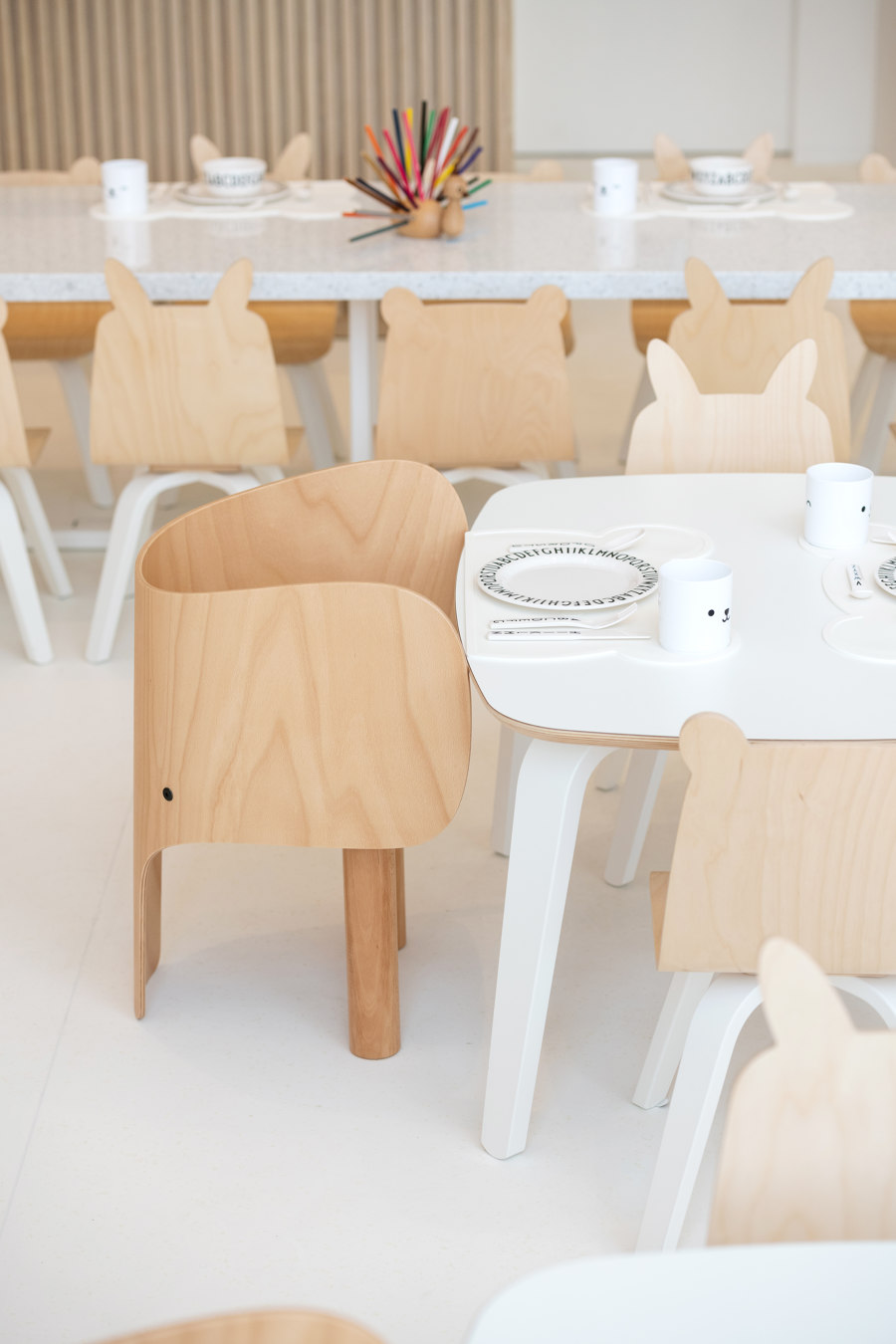
To enhance children’s creativity and imaginative skills, the atelier refrained from complex strategies. Instead, they chose clean lines and a minimalist space but retained a warm atmosphere thanks to a distinctive range of textures.
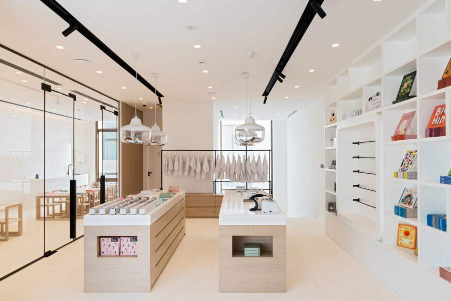
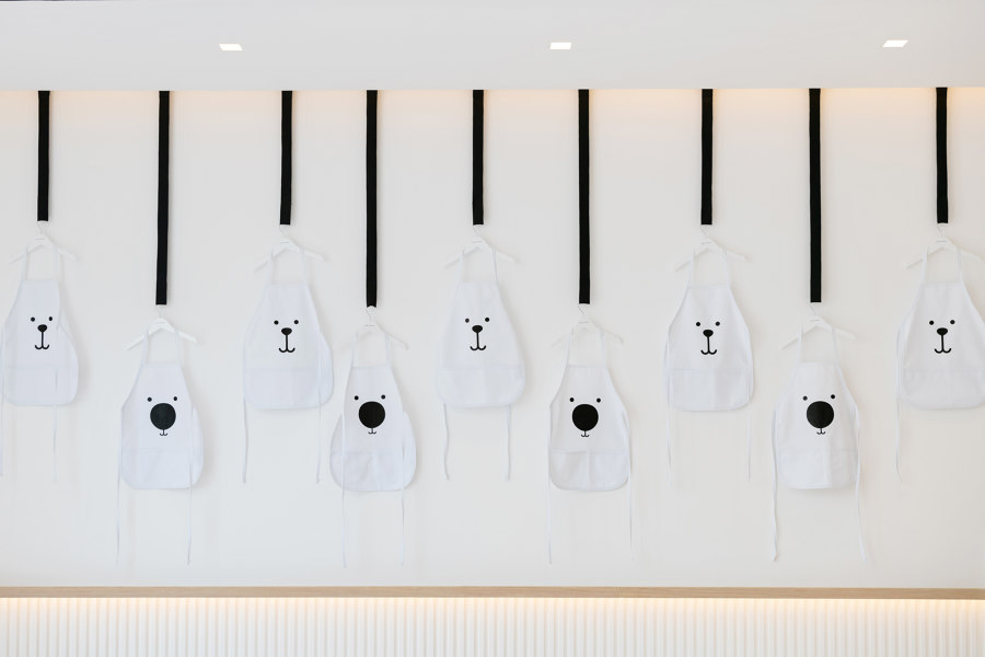
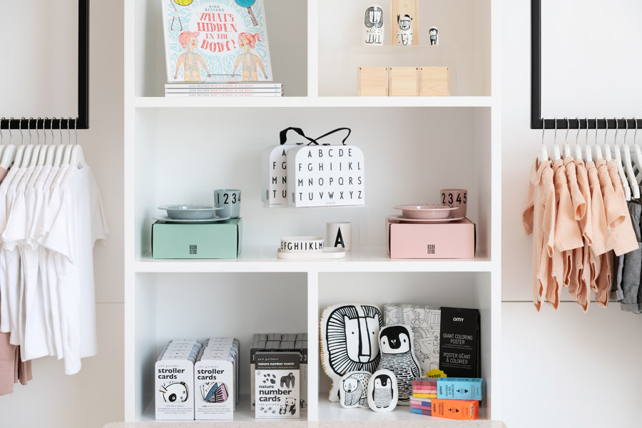
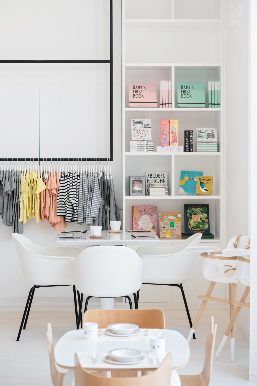
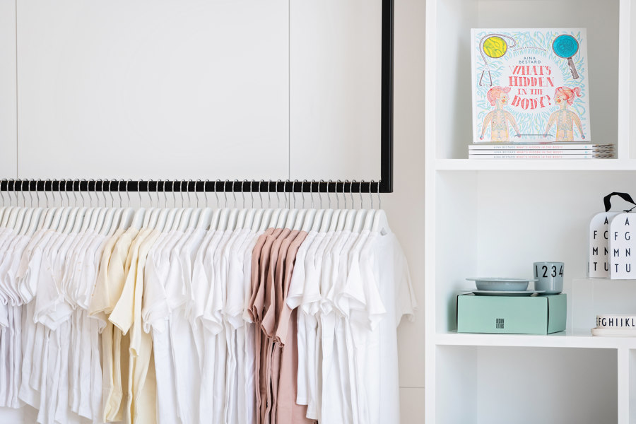
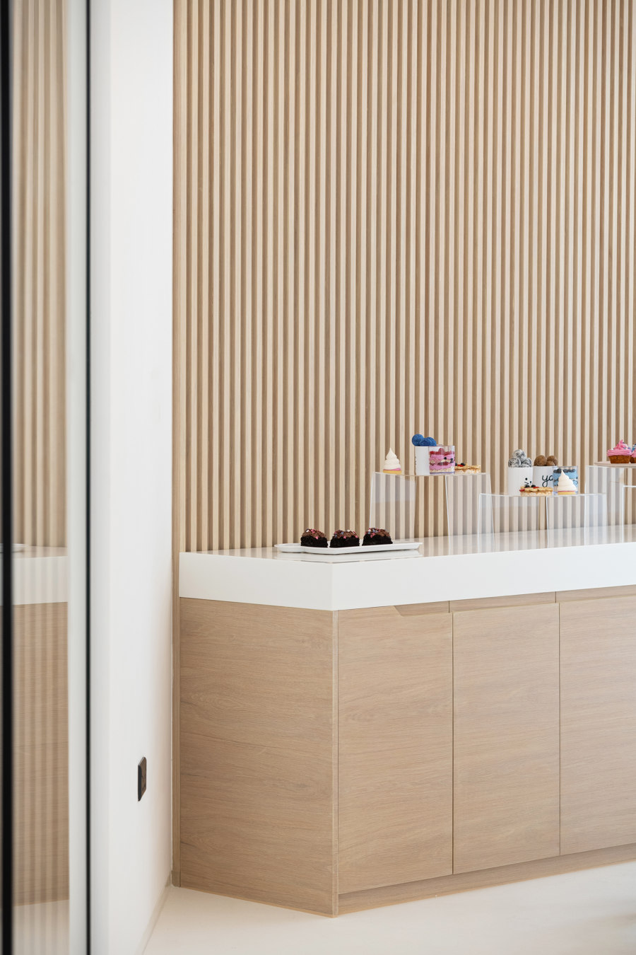
Bespoke full height shelving to display merchandise, wood slated counters and bespoke joinery design that integrates all the elements are some of the key features. There is also a feature wall with suspended metal hangers that again, seamlessly relates the design to the functionality of displaying items.
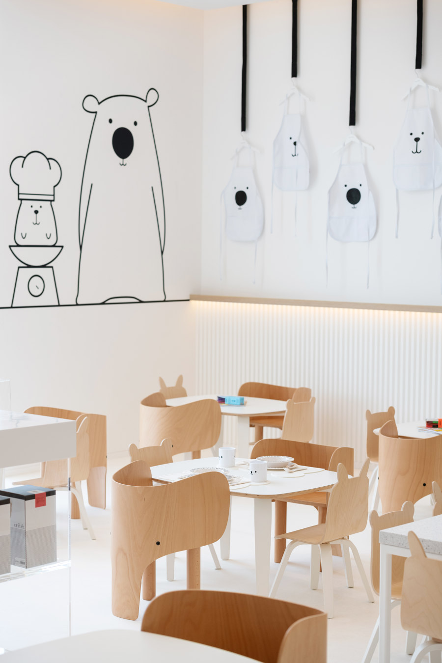
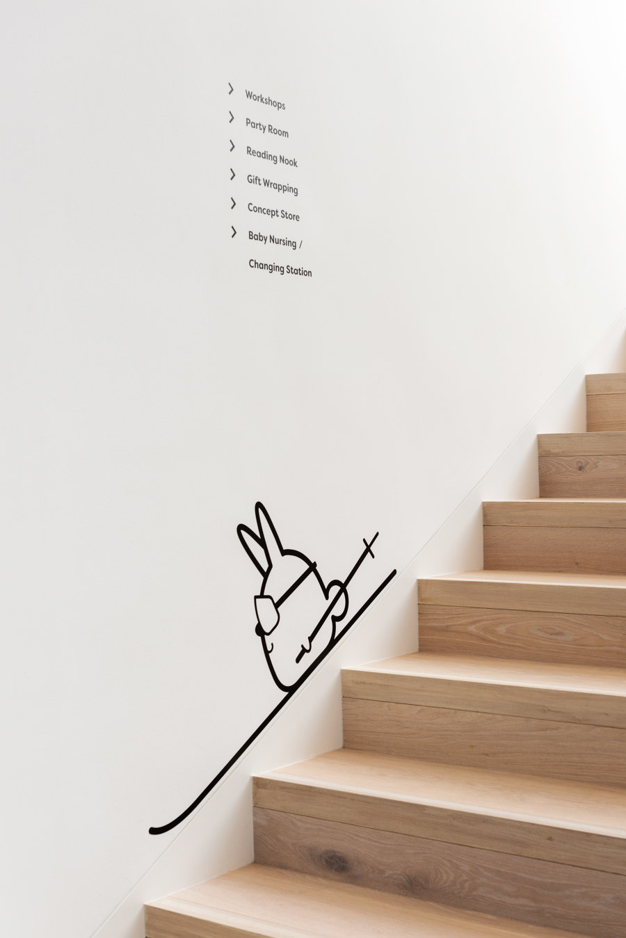
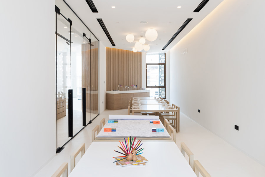
The first floor has a breathable area with glass partitions separating the private rooms from the shop. Throughout the space, playful and quirky graphics elements greet the children and ignite their artistic senses. It also promotes imagination, so they feel confident about new ideas and inspired by the space.
Materials and furniture
Consistency was adapted when incorporating a color scheme keeping in line with the branding story and concept - white and black, minimal, serene and fresh. Simple materiality elements were implemented focusing on lacquer, veneer, metal, corian and vinil flooring. The selection of finishes was based on their aesthetic and maintenance value.
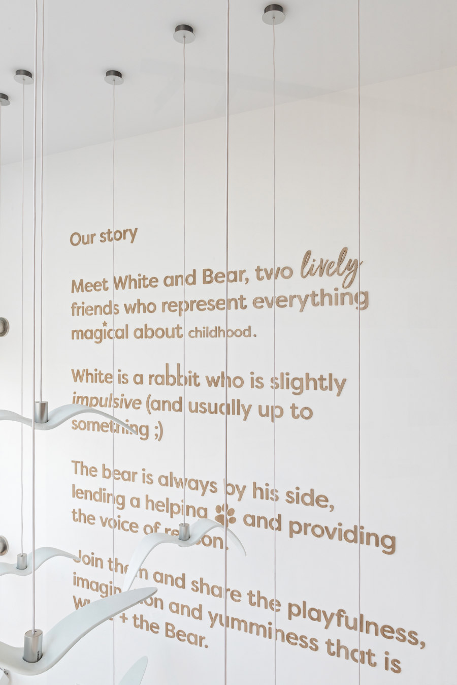
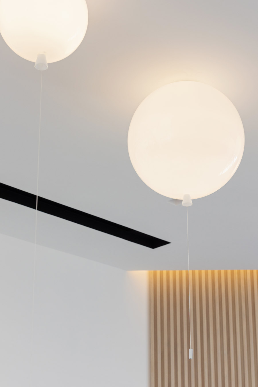
As soon as visitors will enter the expanse, an installation of hanging bird lights from Brokis will welcome them. Children can get comfortable in the seating area, whilst parents have their own seating area with Haworth Harbor chairs.
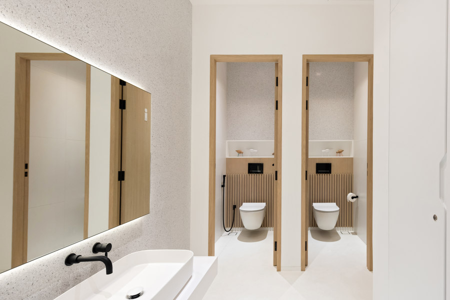
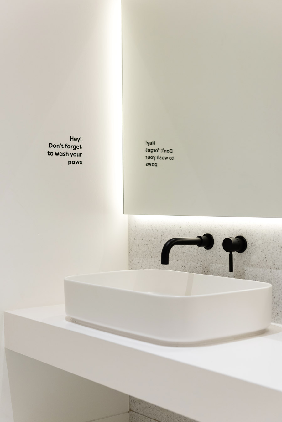
The washrooms are ergonomically designed for children’s height and incorporate washbasins from Cielo and sanitary ware from Bagno Design. The ceilings were kept straight and clean with recessed black light slots that accentuate key elements.
Design Theory
A simple but functional aesthetic prevails, but with wonderful details and honest materiality. The space was aptly divided into partitions so that their focus and attention could be retained. We aimed for a color palette to provide a sleek white background that would put the products at center stage.
Details like the children’s ages were considered during the design process. As a result, the final product contained numerous opportunities for children of all ages to interact and socialize with others. There are spaces to eat, play, read, shop and simply observe.
In today’s world, children should be left to explore their surroundings and find their ‘own space’ where they feel comfortable, which is why White and the Bear was designed to contain many of such places where children can find others with similar interests and make friends. Our design is focused on humanizing the interior architecture, bringing a sense of proportion and scale for children to feel integrated.
Design Team:
Sneha Divias Atelier
