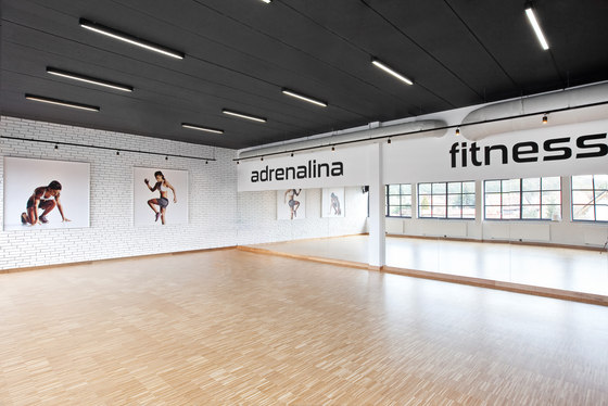
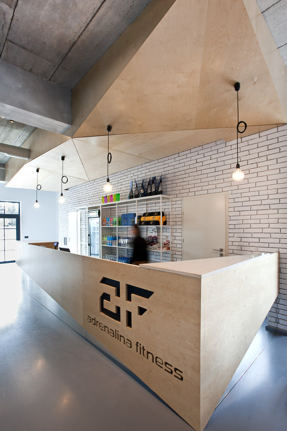
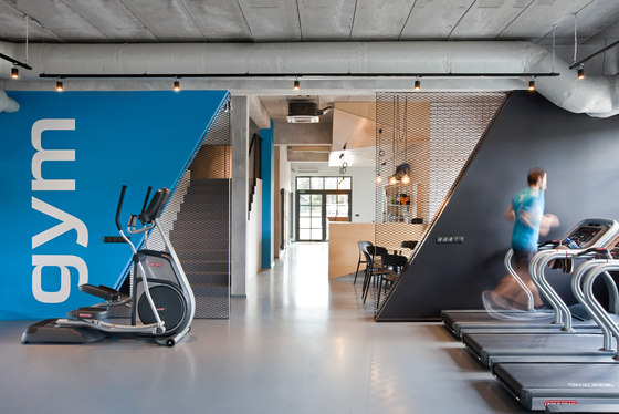
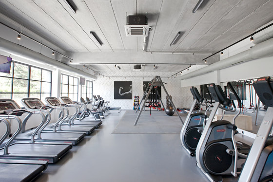
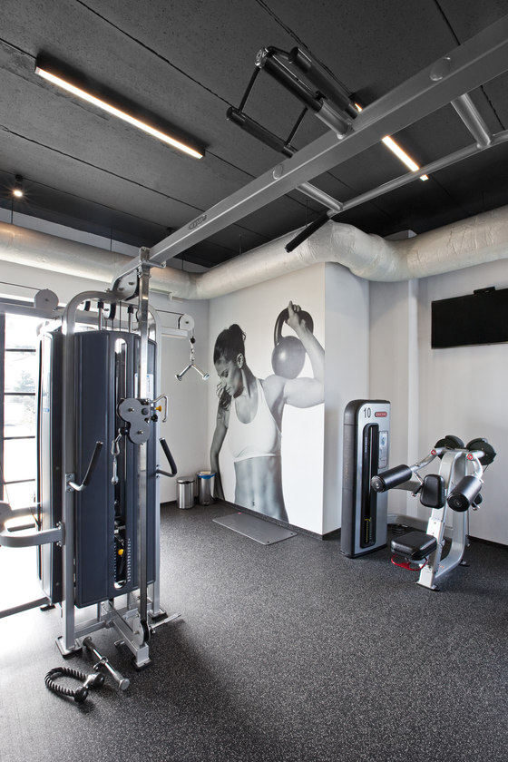
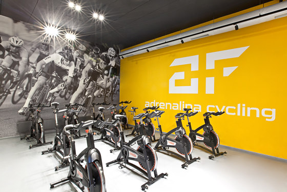
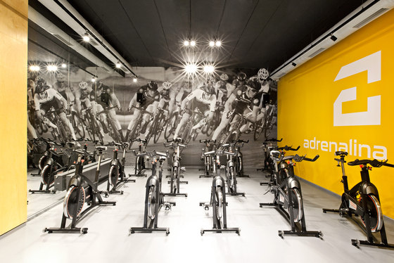
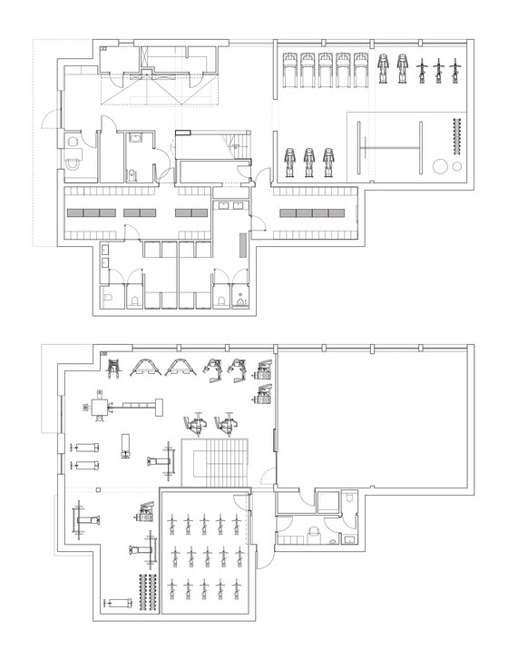
Adrenalina Fitness is a sports facility with a usable area of 580 sq.m, with the following areas: fitness, weight training and functional training; aerobic indoor cycling and a sports bar next to the reception desk on the ground floor. Spacelab developed the integrated interior design and the facades design.
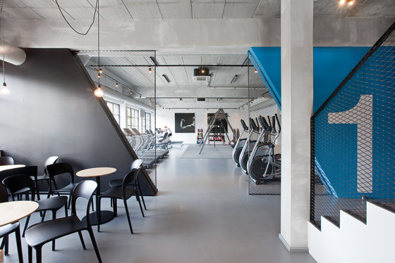
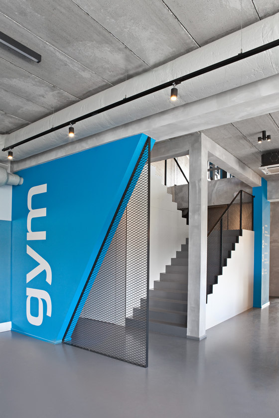
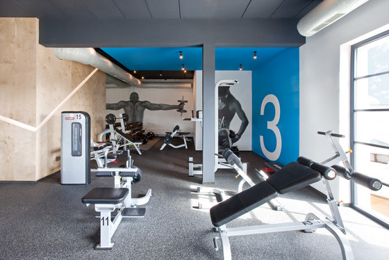
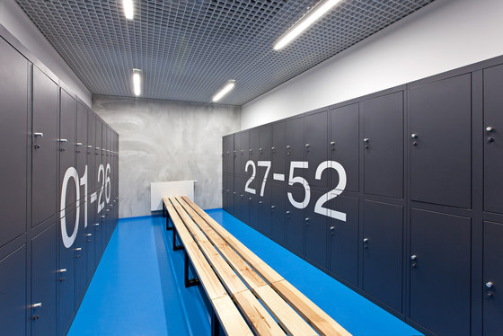
What colour is Adrenalin? The interiors were finished in a warm shade of blue, adding energy during training. The local plan ruled out the use of the same colour on the facades - therefore, intensive yellow prevails outside.
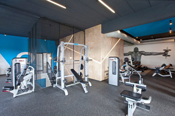
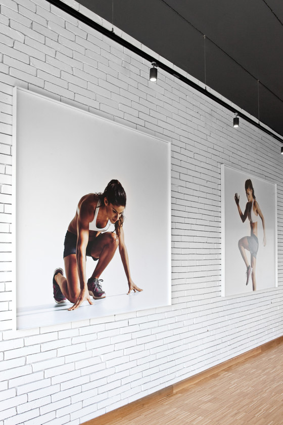
During the initial meetings with the Investor, Spacelab proposed rather austere interiors, except those few colour details. They were designed to match the concept of generally accessible sports areas, often arranged in industrial buildings, workshops or garages. This idea was matched by shop style windows, raw unplastered ceilings (this was also an extra advantage for the project budget), industrial floors, and mesh partitions. Instead of high budget solutions, several prominent ideas were developed to determine the overall atmosphere of the facility. Intensive colours were used, along with plywood and overscaled graphics.
The main feature in the Adrenalina Fitness space is the cut plywood wall. In the evenings the backlit gaps in the wall deliver a pronounced graphic effect, clearly visible from the outside. PU resin floors are the base for the large quantity of sports equipment. Resin was also used as finishing material for stairs.
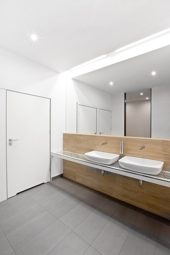
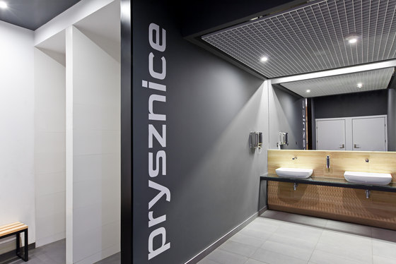
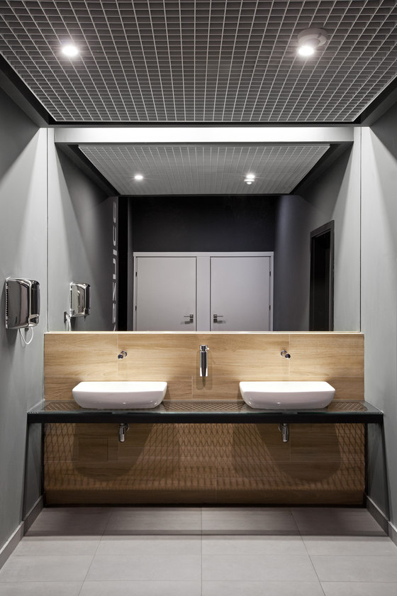
An important part of the interior design work was the coordination of the ventilation and air conditioning design, as well as the modification of the ventilation duct routes design, as they were expected to be left uncovered in the main spaces. Next to the changing rooms, the original layout of bathroom and toilet facilities had to be rearranged, so that the shower zone could be designed conveniently. In terms of shapes and materials, the bathrooms within the changing rooms area are quite subdued.
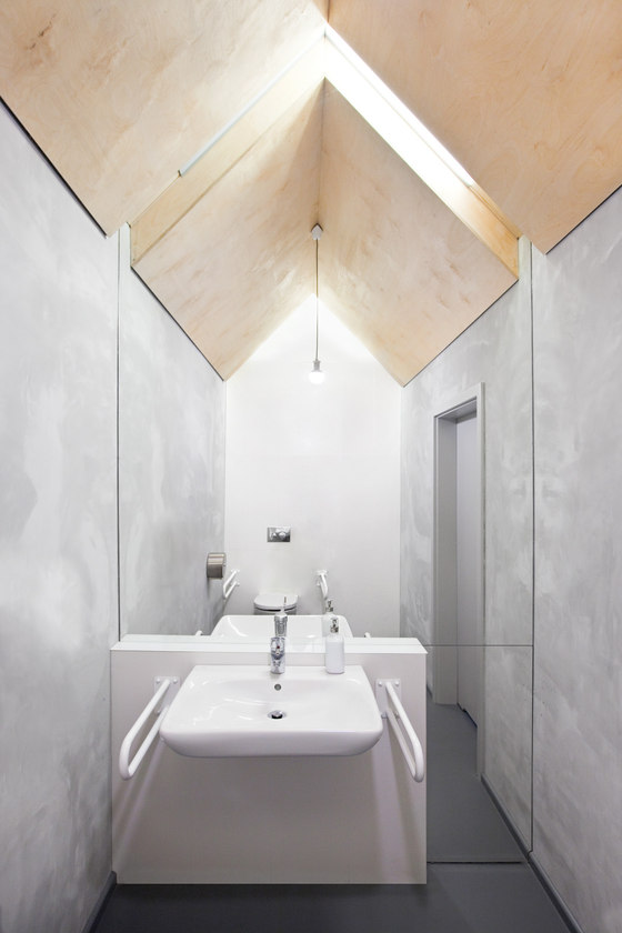
The public bathroom, on the other hand, was designed quite contrary to the default bathroom and toilet formats. With its oblique plywood roofs, it was developed into a unique archetype house shape.
Spacelab Agnieszka Deptuła Architekt
