The project of the New National Archives of France draws its inspiration from the surrounding reality, from the city seen as coexistence of chaos and order. The concept is born and takes place from this duality which is reflected in the organization of the complex. The initial choice was to investigate the site and its characteristics in both territorial and socio-cultural contexts to reveal an unique identity. The work has therefore been thought following a cardinal principle of architecture to create spaces according to the needs of the communities that populate them.
The design of the New National Archives of France has followed the intent of enhancing the geographical and architectural landscape of the area Pierrefitte sur-Seine Saint Denis, where the building inserts itself. The complex has not been designed as a self-referring architecture, but as a work that could hold the memory and the collective identity, at the same time open to contemporary artistic expressions. It has not been thought in a contemplative perspective, but in a perspective of discovery, research and participation for the audience.
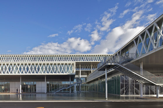
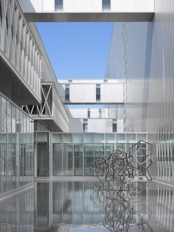
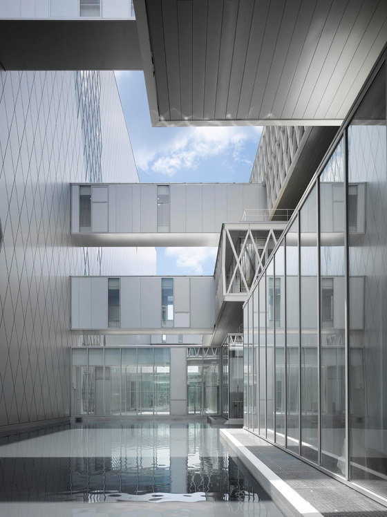
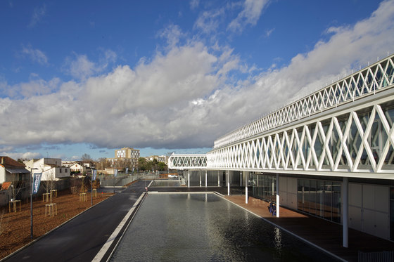
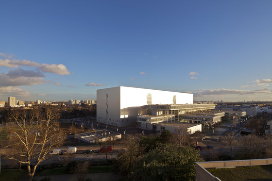
The project is composed of two main “bodies”: one that extends horizontally, “suspended, lightweight, transparent”; the other with a tension in height, “anchored to the ground, imposing, reflective”. The first, stretching out towards the city, consists of cantilevered volumes called “satellites” that accommodate the offices, the conference room and the exhibition room. The facades, mostly glazed, give lightness and transparency to the volumes of different proportions, that follow each other and overlap in “suspension” on the surfaces of the water.
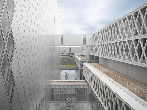
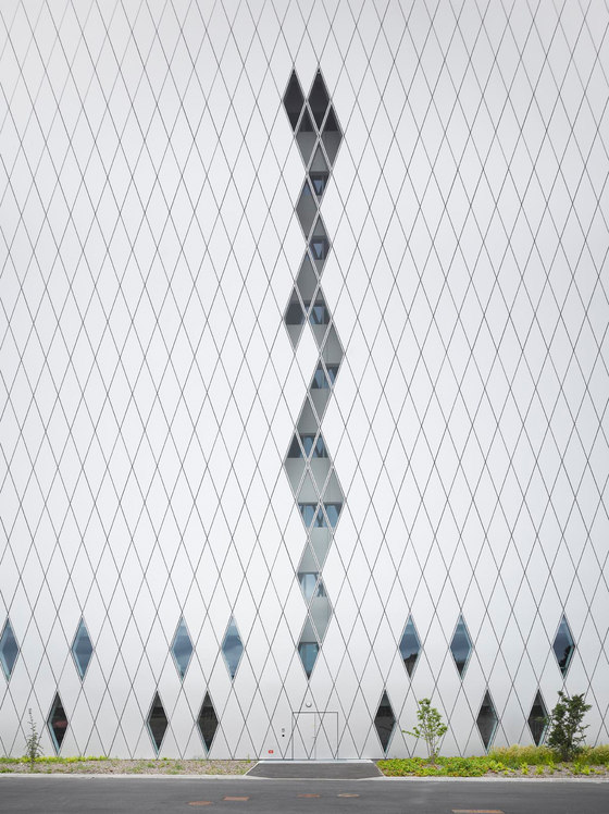
The building that accommodates the Archives is an imposing monolith thought as a place dedicated to memory and research. It houses the archival documents and the reading room. The facades of the monolith are coated with aluminium “skin” that runs throughout the volume, except for some glazed insertions that allow the amount of natural light in the reading room and the entry route. The “noble” sculptural building, with a basin in part lapped against it, reminds the idea of a precious object, a treasure chest, that is reflected in the water veil.
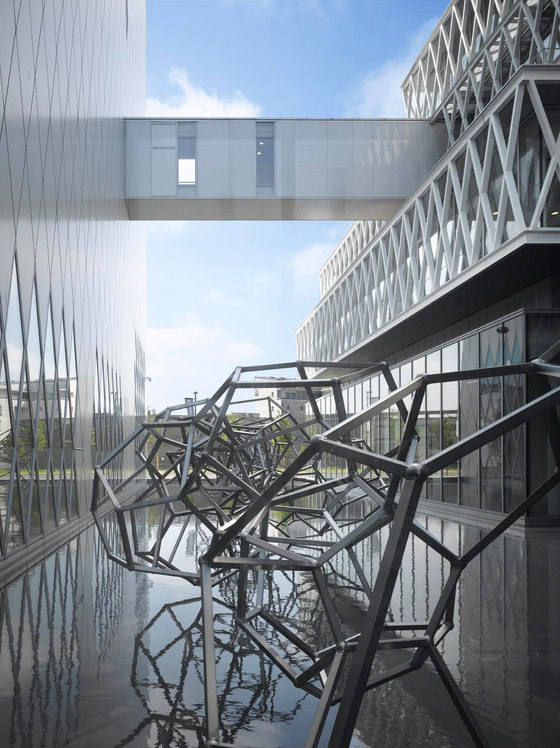
The basins insert themselves between the building of the Archives, the “satellite” volumes and at the foot of the satellite volumes. Walkways above them create a connection both between the cantilevered volumes and the two “bodies”. The water veil becomes a vehicle of change for the architecture, designing voids and new spaces, thanks to the reflections and the play of natural light created by the cuts of the suspended volumes and the “skin” of the monolith.
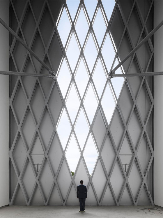
The facades of both “bodies” follow a lozenge geometry that is repeated both in the aluminium cladding of the building of the Archives and in the glass facades of the “satellite” volumes. Between the monolith and the “satellite” volumes stands the artwork by Antony Gormley. A precious sculptural object that rises from the veil of the water below, like to draw strength from it. This redesigns the spaces in a contemporary way, winding along the facades of the architectural complex. The geometric faces articulate the artwork along its passage and give life to the structure of a chain of dodecahedra, which reflects and projects itself between the basin of water and the mirror surfaces of the volumes.
The link with the memory is symbolically traced in the work of Pascal Convert, a series of concrete “strongboxes” set in the area in front of the “satellite” volumes. These show in relief the faces of some personalities that left their mark on the collective memory. The art installation is tightly anchored to the ground, as well as the volume of the monolith, like roots sinking into the depths of memory.
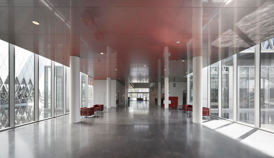
A double-height hall welcomes the visitor. The “suspended” effect of the “satellite” volumes is highlighted by the art intervention by Susanna Fritscher which, through a minimalist touch that consists of the realization of false ceilings as stainless steel “sheets” shaded in red, emphasizes the interaction between the architecture of the complex and the lines of the “satellites” volumes. The red colour gives depth to the volumes that stand out horizontally at different heights, creating at the same time a play of solids and voids, between material and immaterial.
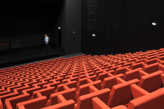
The entrance leads to areas dedicated to the public: the reading room, the exhibition room and the conference room.The seat for the conference room, "Carla" for Poltrona Frau, realized in red colour textile is by Fuksas architects. The chair is formed of two planes that intersect and rotate their way into the back, chair and armrests, just like a flower. A measured, minimalist shape.
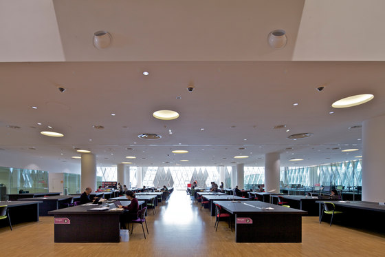
The interiors are characterized by large spaces that give an overview that makes immediately perceive the importance and the uniqueness of the place. The importance of context, and therefore the importance of the territory, assumes concrete form in the landscape intervention by Florence Mercier. His design of green spaces has created a real interaction between nature, architecture and the audience. The green walk that introduces and takes the visitor to the complex is like a stage that alternates geometries, shapes, colours and shades. A project that aims to give emotions. Two “bodies”, two “worlds”, symbolically connected by walkways that, in a constant cross-reference, creates an identity that is rooted in the memory of the past with an eye to the contemporaneity and the future. The project reflects identity and memory that belong to France and to all humanity.
Studio Fuksas
