THE KAPE is a new brand on the scene of modest women’s fashion, and has a different approach to garments, specifically the traditional Abaya. Needless to say, the message and name of the brand are soon to stick with women all over the UAE, and they needed an impactful interior design at their showroom in Dubai Design District. The name behind ‘THE KAPE’ is Hanadi al Hawi, and she approached SUPERFUTUREDESIGN* with a proposition.
To SUPERFUTUREDESIGN*, playing upon the brand’s disruptive attitude would be a demanding process, considering its products and the message it speaks. Through many meetings with the client, we helped her clarify the vision she has for the brand’s image. Through this creative process, SUPERFUTUREDESIGN* became more understanding as to the type of space that the client wanted. However, we had only just scratched the surface of a rigorous ordeal that required choosing between different moods, perspectives, color palettes, and textures.
The entire project took a few years to set up and it was an interesting view as it was being put together, piece by piece. Seeing it now, it’s a true reflection of SUPERFUTUREDESIGN*’s taste for meaningful aspects, something which was incorporated without undermining modern minimalism. This is such a valuable theme for our eclectic philosophy. In the ambient spaces, we implemented techniques that would result in a relaxing environment.
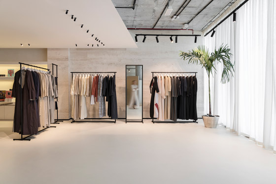
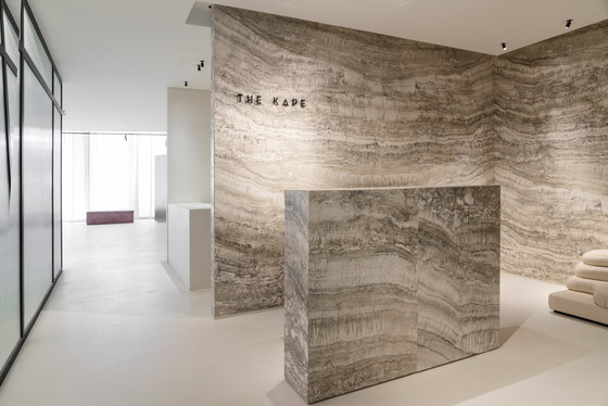
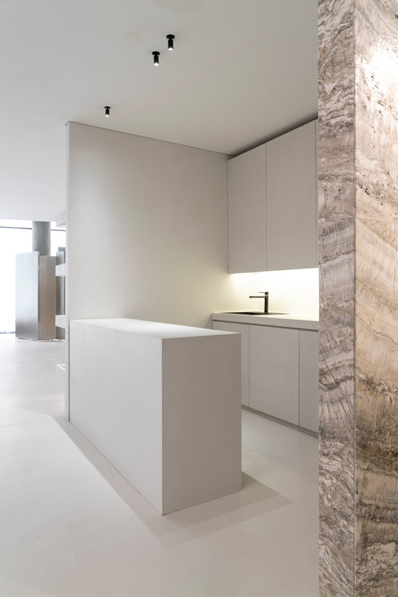
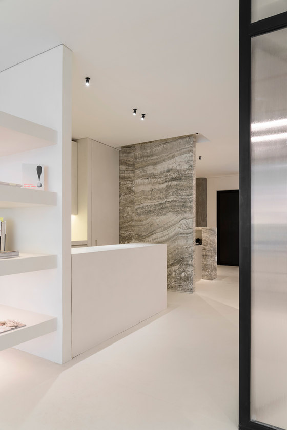
They contributed to a spatial effect that calms the mind, along with balanced elements that enhance the senses. For the showroom, we emphasized light as being the main factor because of the way it manipulated the earthy and futuristic masses of travertine stone and epoxy resin respectively. While both elements are distinctly opposite, they seamlessly transition from one to the other.
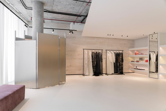
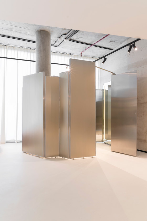
This core feature highlighted our Avant Garde attitude that is different from other one-sided approaches. We achieved balance and harmony between the overpowering features of both elements, specifically between the smoothness of one, and grainy accented veins of the other. The rest of the premise was adorned with decorations like sofas, hanging bars, and a chaotic fitting room that was gracefully set-up center stage. It was created using metallic screens with a champagne-tinted finish, by wrapping them around each other in a circular, whimsical pattern, which also disguised a colossal pillar.
For the boutique, simplicity had a lead role in defining the ambiance and mood, as a contrast was defined between the rough patterns and texture that was implemented for the exterior and the smoother finish of the floors. The façade in the boutique was a result of some experimentation with new materials and elements; prefabricated cement panels were delicately transformed using a patented molding technology to produce an interesting wave-like pattern and texture that would play upon the senses.
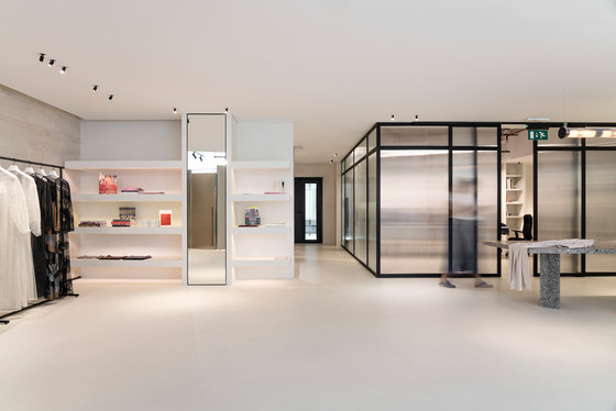
It crossed the surface in a diagonal direction and created an amusing effect that would grasp the audience’s attention. The exterior is delicately finished by adding a futuristic shop window that protrudes out of the expanse and appears similar to a fish tank. Inside, the epoxy resin flooring gives way to the other attractive features of the boutique, like the stunning red fitting room and the elegant black frames that define the displays.
SuperFutureDesign
