Vudafieri-Saverino Partners once more re-define the welcoming themes in the food & beverage sector. Starting out from one of the most noted brands in the sector: DRY Milano. It is really with the second opening of the celebrated Milanese brand that Tiziano Vudafieri and Claudio Saverino had the chance to re-elaborate the relationship between people and services, aesthetics and function: between a message and making a mark.
Differently from the first Dry Milano – open only in the evening, in 2013 in via Solferino and quickly becoming a case history – this new Dry Milano has a day and evening “double soul”, and an even more versatile collocation. Located in the heart of one of the new Milanese movida areas, on the corner of viale Vittorio Veneto and via Manuzio, the project enhances the location’s two-sided exposition thanks to its thirteen windows and an external dehors facing the Bastioni.
Concept
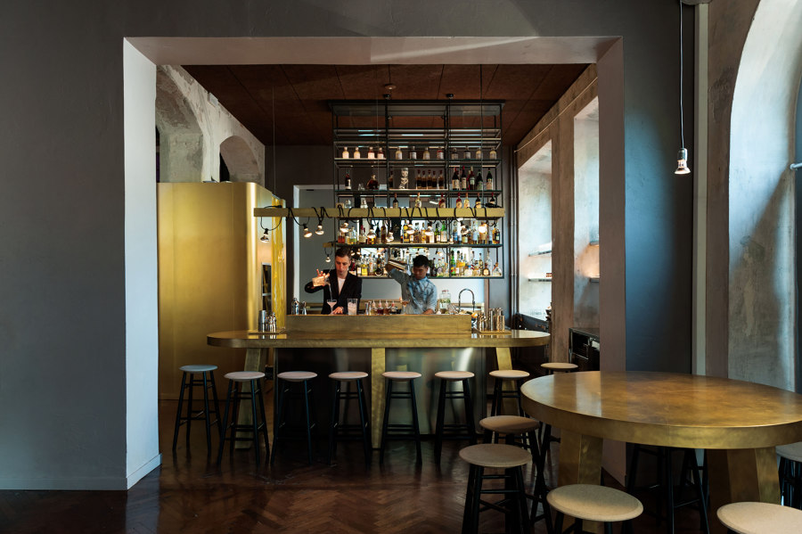
The architectonical theme puts the relationship between people at the centre of the project design. A theme which is evident by the choice to eliminate the filter between those working and those being served: breaking the idea of the bar as a laic altar. As a consequence there is a non-hierarchical space distribution between the customer and staff areas.
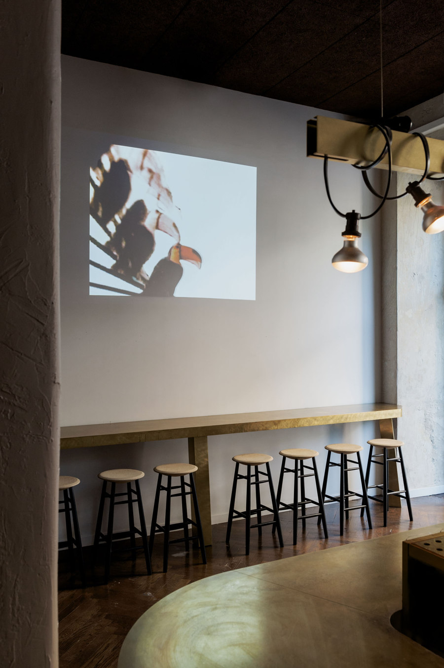
Dry Milano is a pizzeria in which the classical aesthetic codes have been turned upside down: with a non-visible oven, art instead of sports videos, a persistent non-homogeneity between functions and spaces. All aimed at determining a new system of comfort for the relationship between people who meet to enjoy the space, and for the relationships between food, drink and social interaction.
Designing relationships
Until the 1970s drinking and eating were not separate activities. Restaurants were also bars, a characteristic which gradually disappeared over time, leaving space to the specialisation of public places. Dry Milano has reconciled these two souls, determining a perceptible degree of empathy between the different space functions.
The insertion of the bar, interrupting the central nave, forces the customers to move in an S-shape: creating a relationship with different environments which change according to the time, the number of people, the light intensity. The space quality impacts on the relationship dynamics, aimed at creating comfort even for people alone.
Designing the space
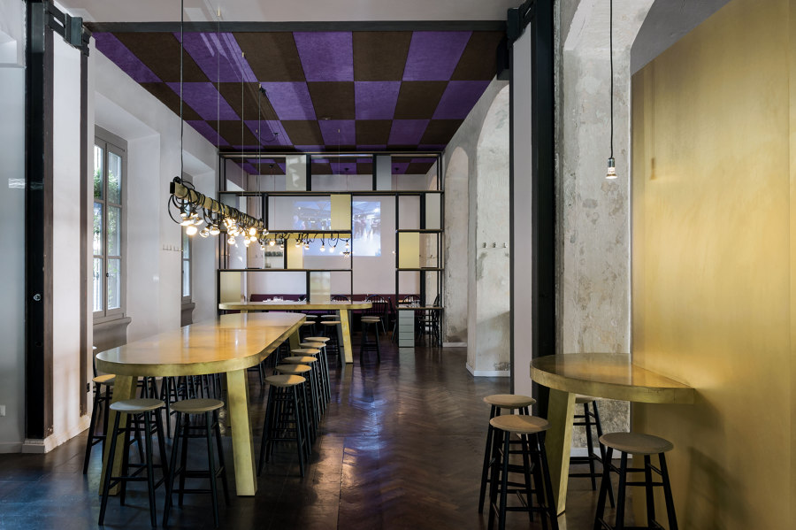
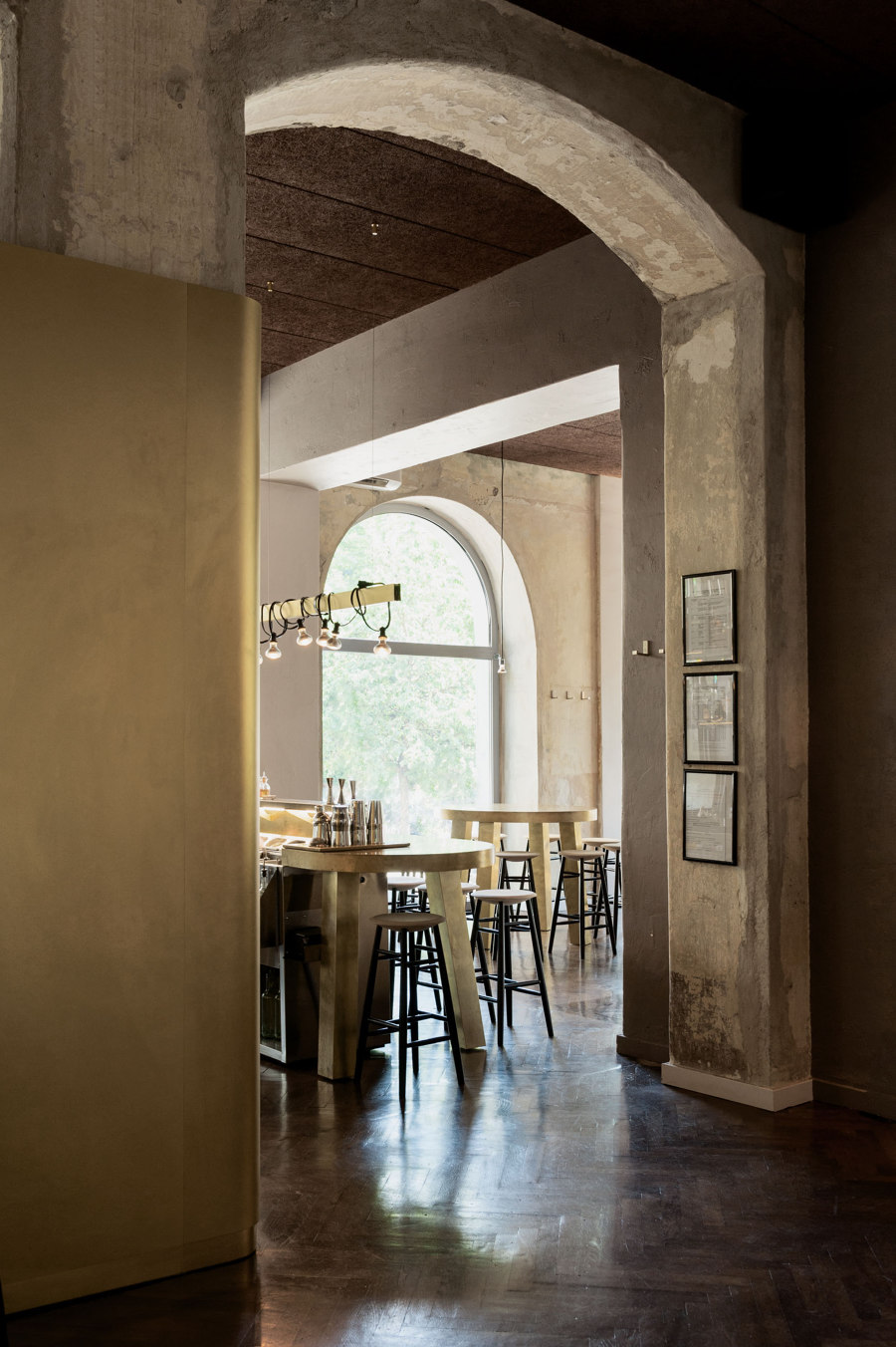
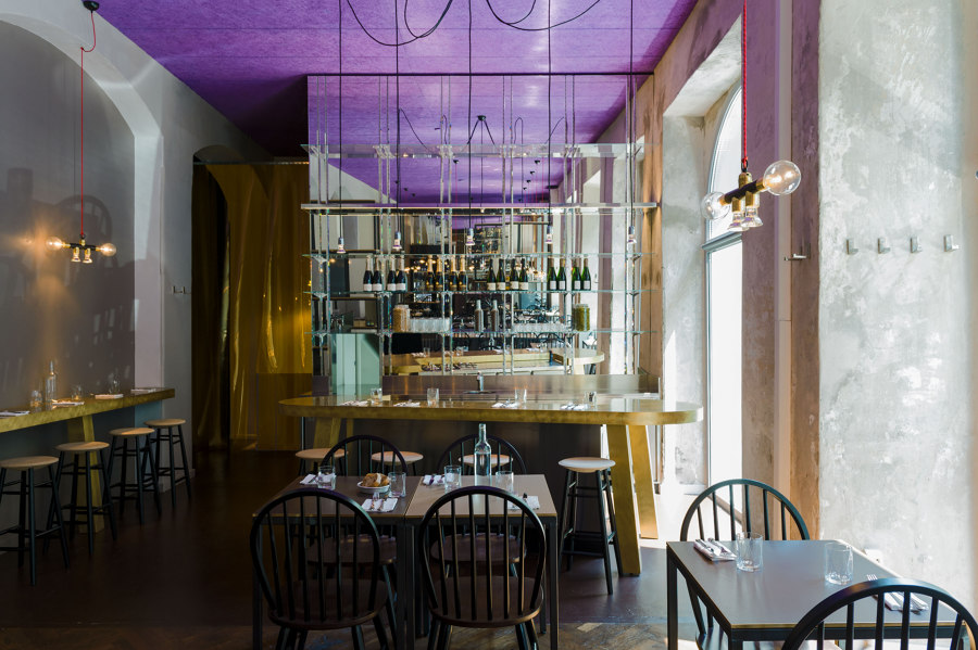
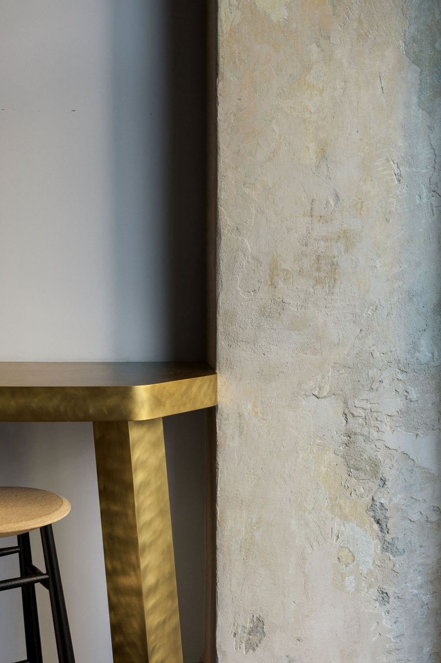
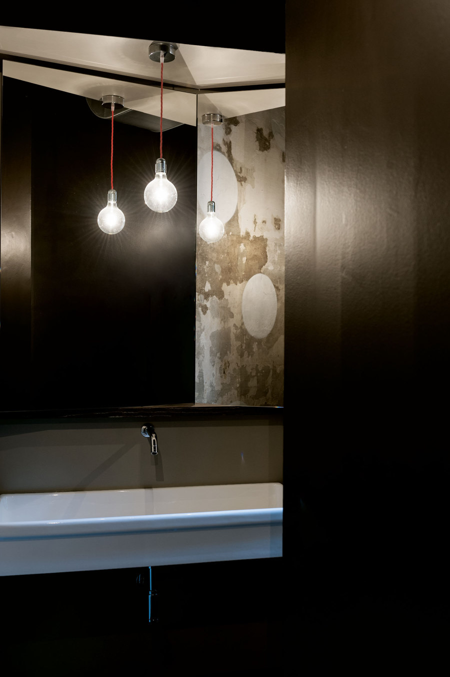
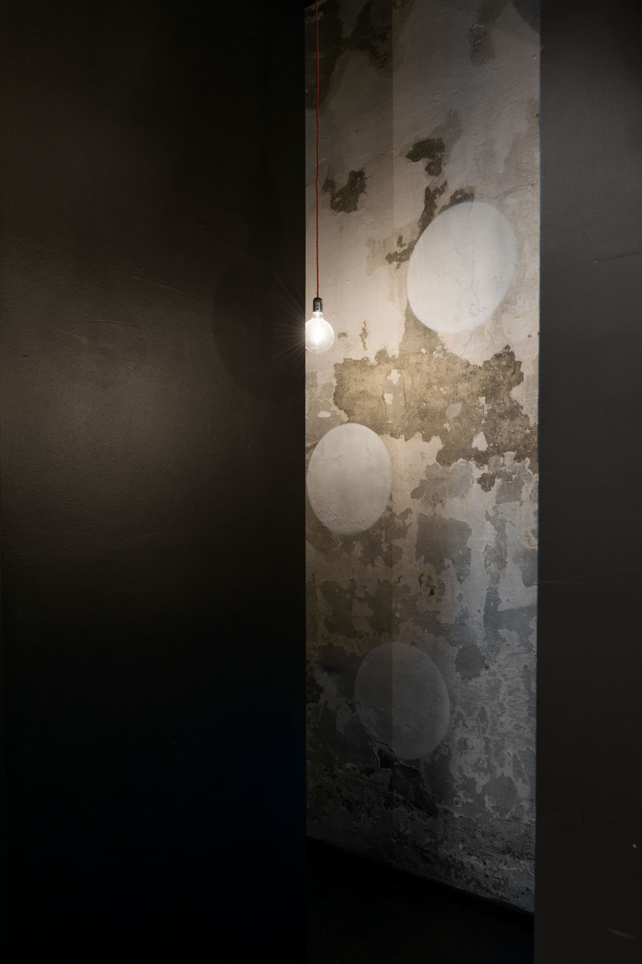
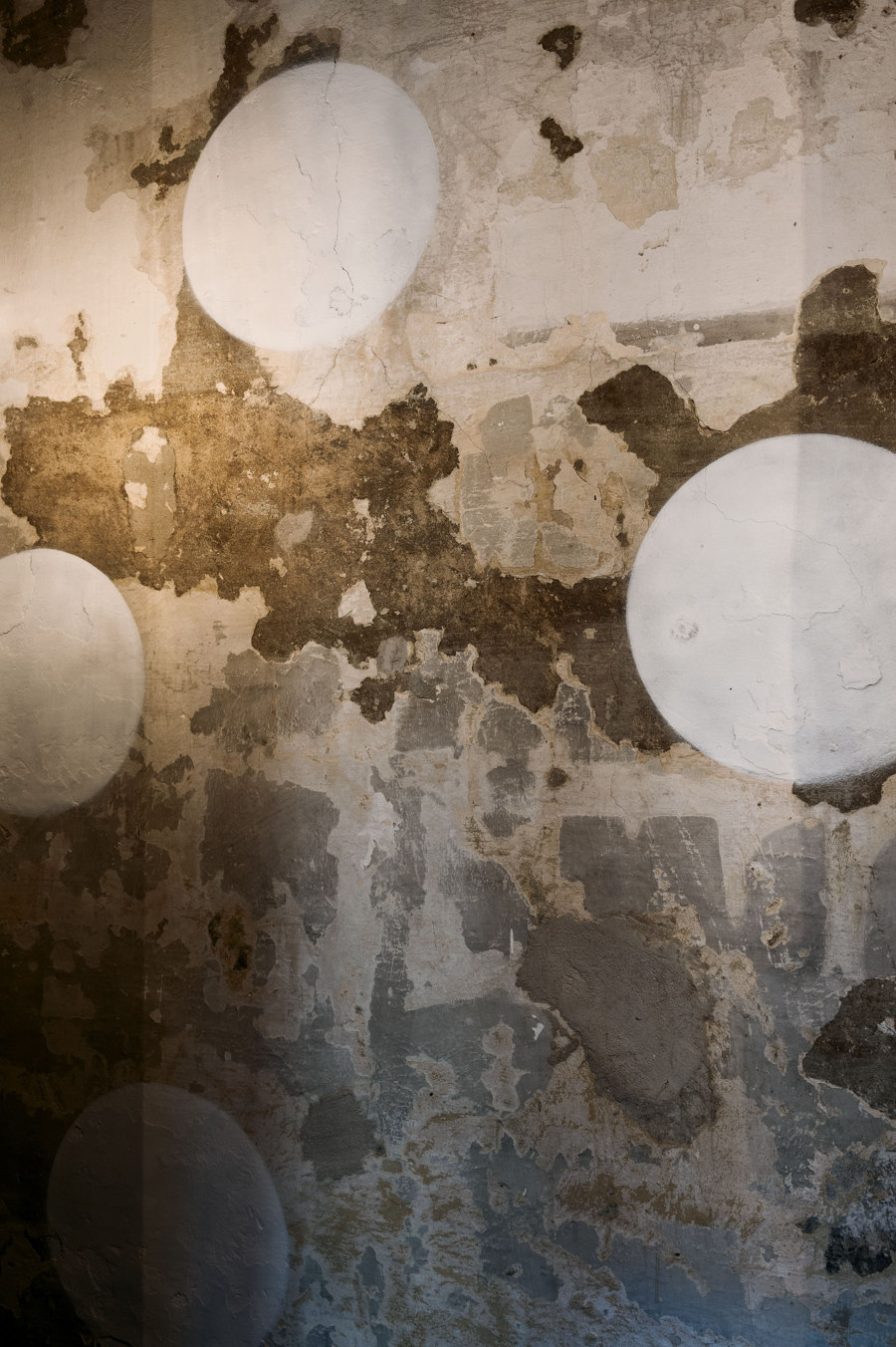
The ambience is strongly characterised by the place’s spirit, charged with memories which surfaced during the restructuring. The architectural project has re-interpreted in a modern way the original period style in which the building was built. Where beauty does not come from single elements, but from the ability to put in harmony the pre-existing with the new designed elements.
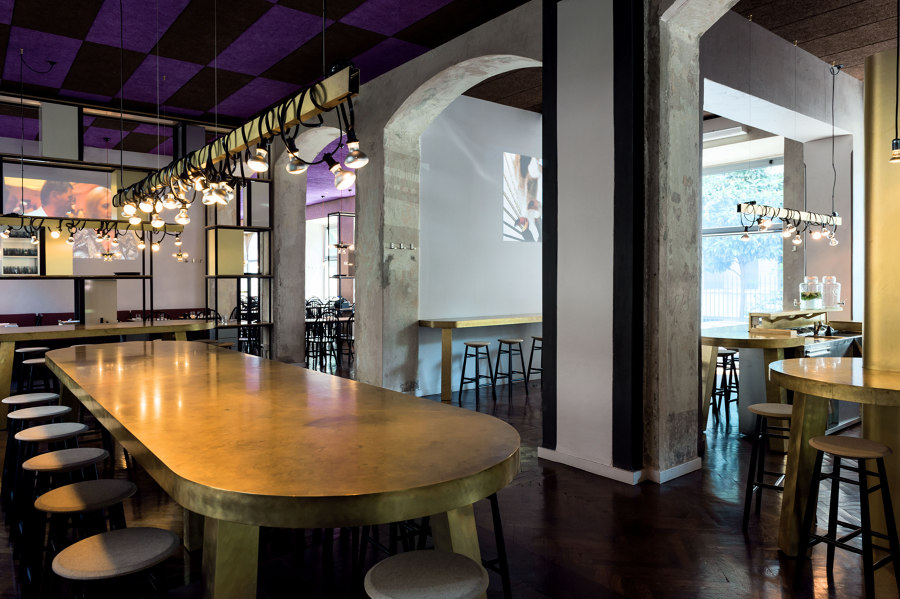
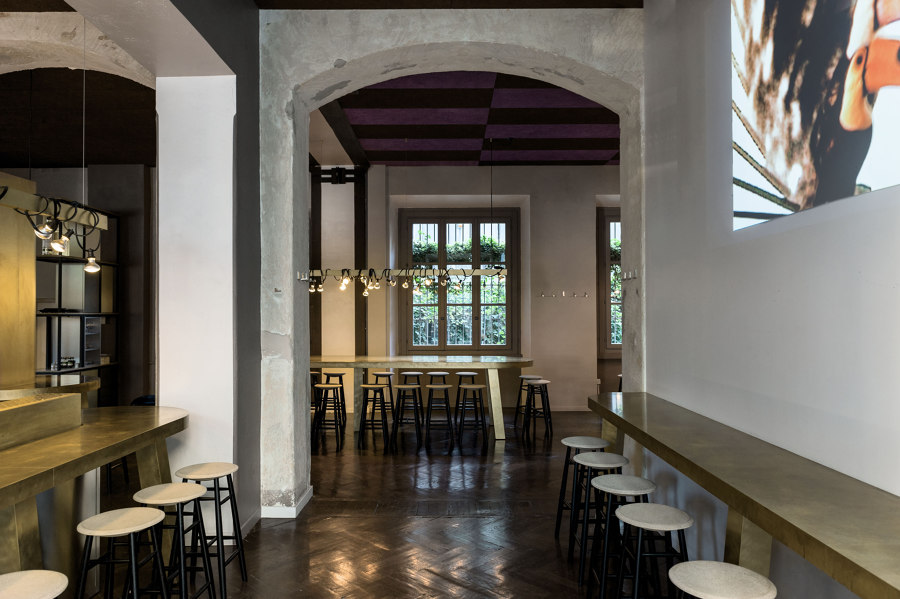
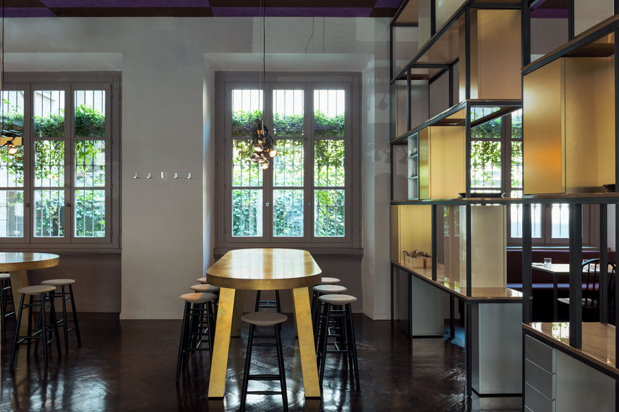
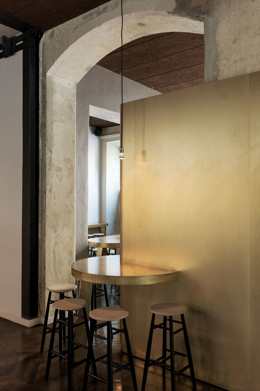
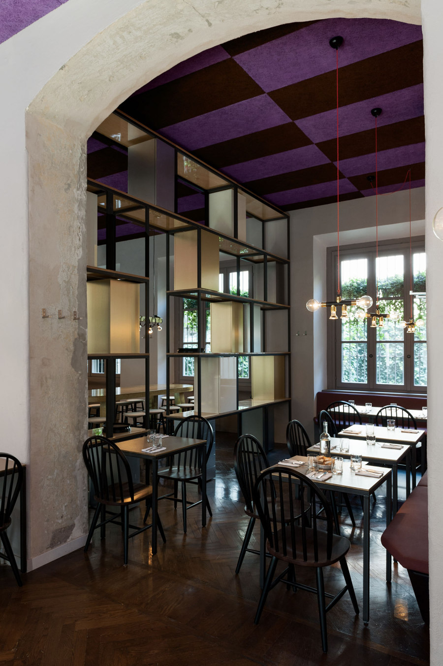
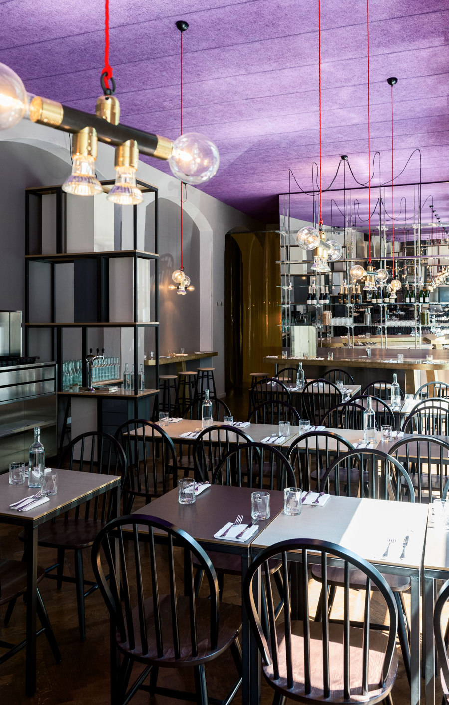
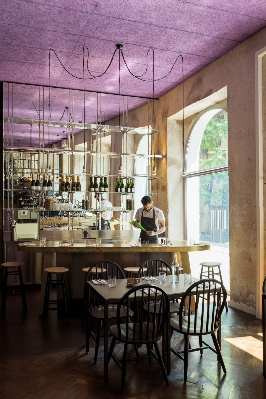
The entrance is dominated by an imposing cocktail station where the la mise en place takes place, organized in three atolls and surrounded by shared tables. Instead, the second room is dedicated to the pizzeria-restaurant. The decor mixes original with other more modern elements, for a contemporary layout. The wooden floor contrasts with the original walls, in part left unfinished. The tables’ design - infantile, or primary in their simplicity – is a homage to Aldo Cibic’s poetics. Materials have been worked in unusual ways, like the floor ceramic used for the three colour tone table surfaces, with rough brass edgings.
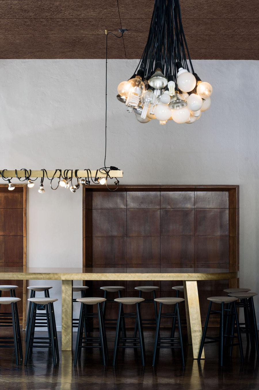
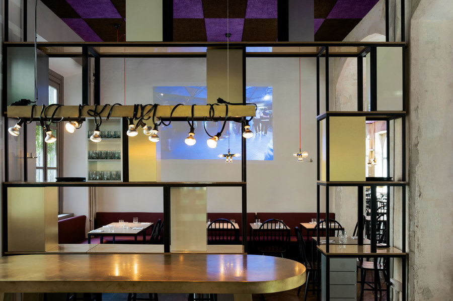
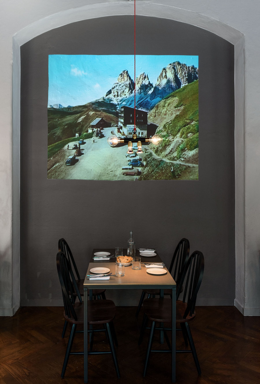
Brass is DryMilano’s iconic material element, characterising most of the furniture finishings, just like for the lighting. The second life lamps are made by screwing on old lampshades, with recycled incandescent bulbs, or twisting luminous garden garlands around simple bars. The full-length separé – obtained by placing tables and kitchen shelves over each other – delimits the open spaces, making them more intimate. Extra Dry, the contemporary video art installation curated by Paola Clerico/Case Chiuse, contributes to strengthen the place’s urban atmosphere, and opens to the city through its projections onto two windows, which are also visible from outside.
The Kitchen philosophy
Once again the Chef Andrea Berton invents a food different theme, enriching the first Dry Milano’s winning formula. Cocktails, gourmet pizze, a variety of salads, exceptionally seasoned meats and sliced meats (like the Panatti bresaola or the slowly seasoned raw ham). As far as foccace and pizze are concerned, there are of course Le Classiche (the customer can add condiments served at the table at will), but the menu also includes a choice of specially studied ad hoc Proposte dello Chef.
The bar area, situated between two cocktail stations, is the place’s fulcrum. The openplan back station allows the customers to observe the drink preparation, made from high quality ingredients, creativity and technology. Also in this case it is possible to order some of Dry’s must drinks, like the “French 75” or the “Corpse Reviver”, but the real novelty are the Signature, based on wine and shrubs (home-made ingredients obtained from fruit fermentation) with low alcohol content and a high level of novelty.
A vertical wine list, created through a choice of only two vines: Pinot Nero and Riesling, enriched by sparkling wine, Champagne and Crémant, besides a Red and a White, served by the glass. Instead, the choice of soft drinks comprises a wide choice of aromatized waters obtained through infusion and cold extraction processes.
Finally, on a sweet note. A new pastry laboratory alongside the pizzeria and kitchen. A selection of desserts completes the traditional range of ice-creams and sorbets, which have contributed to Dry’s fame.
Design Team:
Vudafieri-Saverino Partners
