Design concept:
Since ancient time, there have been two choices for the rich and established; to flaunt wealth and fame, or to keep modest and low-profile; which partly reveals one’s view of life. For the owner, an elder with great fortune and rich experience, the definition of “home” is more about a delicate balance, a tender atmosphere, and “a piece of pure land”. Red, yellow and blue are the colors that win huge popularity for traditional royal favor.
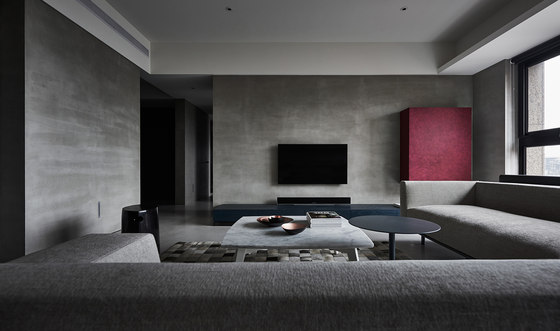
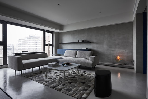
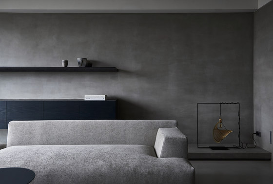
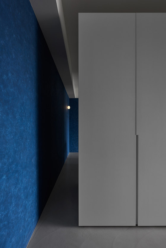
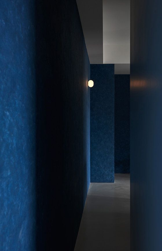
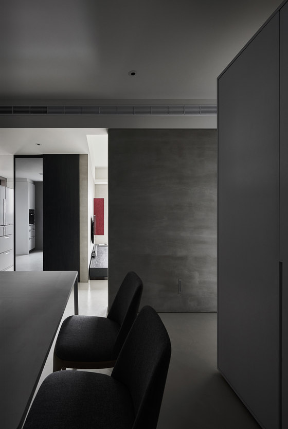
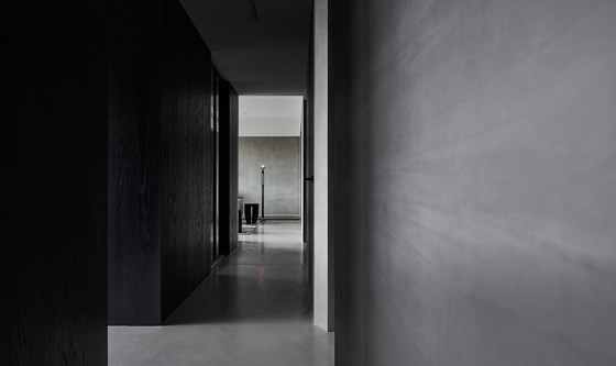
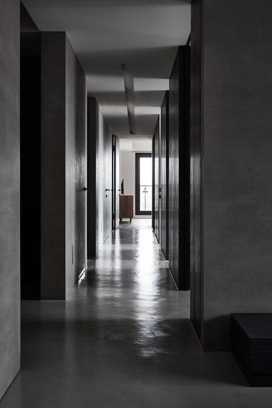
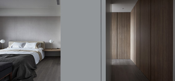
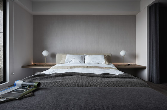
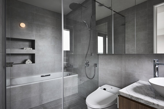
Instead of the more chosen red or yellow, designers deliberately set the spatial tone with blue, as its quiet elegance and deep sensibility perfectly convey the owner’s state of contentment, spiritually other than materially. Widely used gray-level materials, such as exposed cement, gray-black veneer, together with colors of low-brightness and low chroma, are seen in the structural space, showing imperfect perfection and irregular order. Perfect or not, it completely depends on the standard in one's heart. So does the earthly troubles and the inmost peace!
Design description:
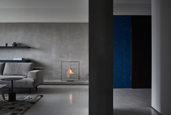
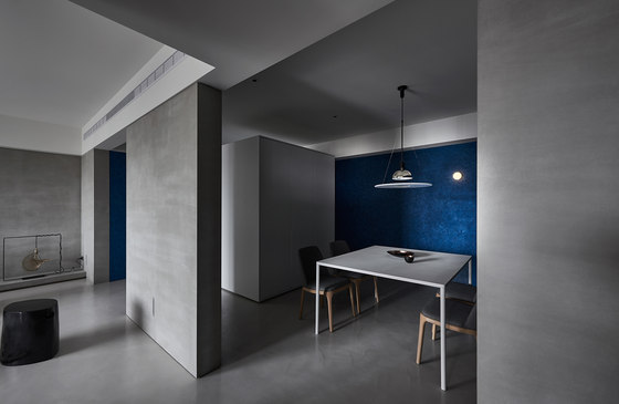
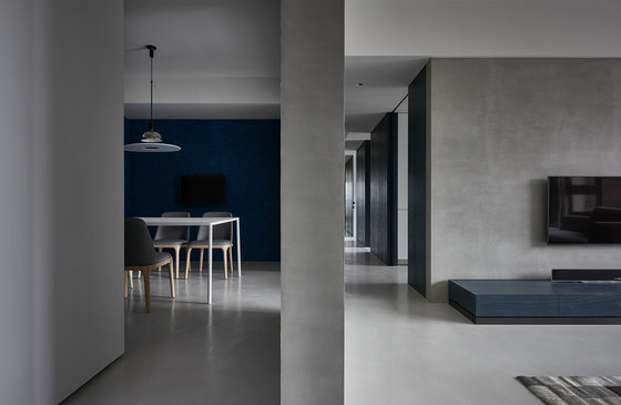
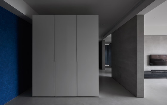
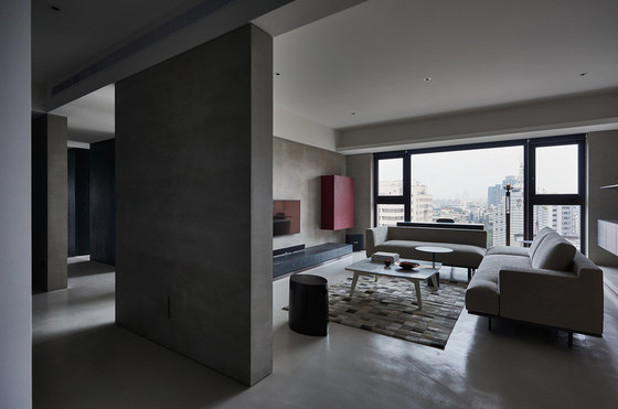
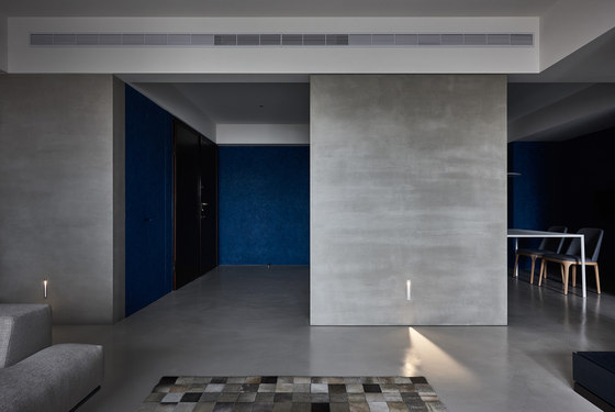
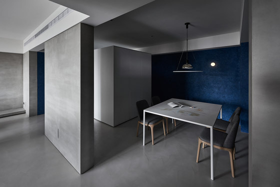
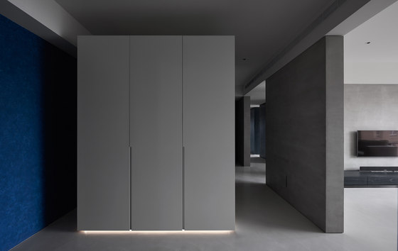
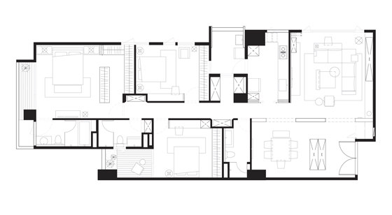
The entrance is extended to the restaurant, where a large blue wall in the shape of Chinese character "ㄇ"forms uneven changes of shadeswith irregular layers of bumps in the lacquer surface. The partition wall is thickened symmetrically, which is not only the spatial division, but also the spiritual boundary, as if earthly life and pure land are separated by a line. Technically speaking, the rationality of modernism is the main axis in the overall planning of space; while from the perspective of spiritual essence, it interprets "Zen" and "Wabi-Sabi" based on Confucianism, Taoism and Buddhism; where simplicity of Song Dynasty aesthetics is integrated in the treatment of details.
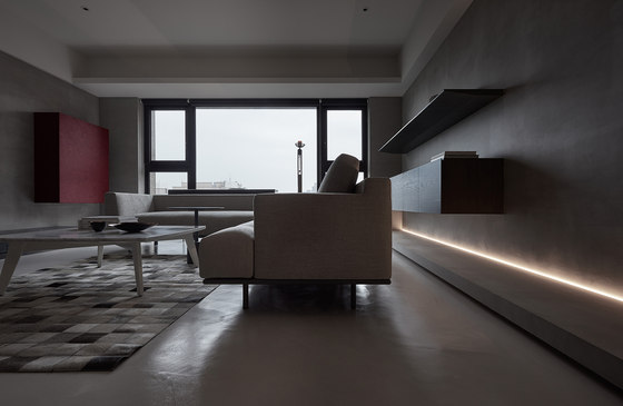
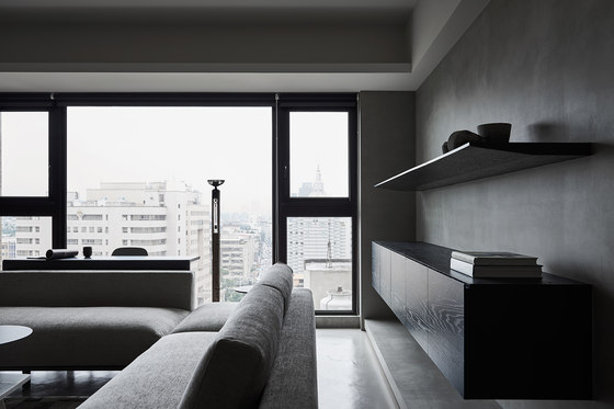
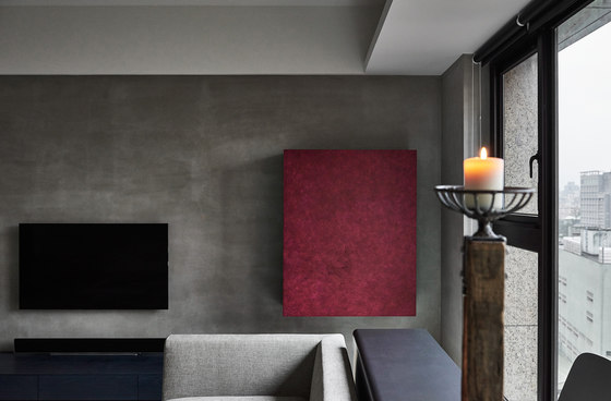
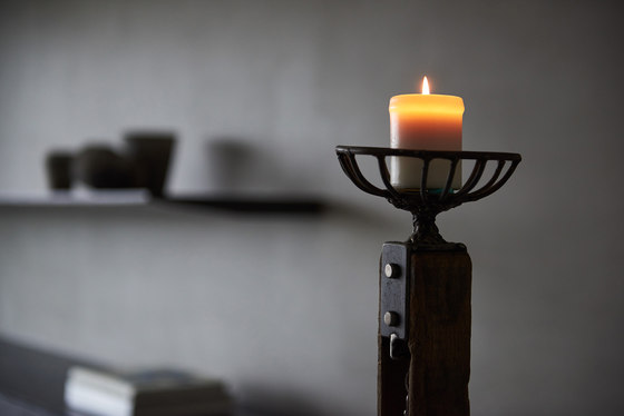
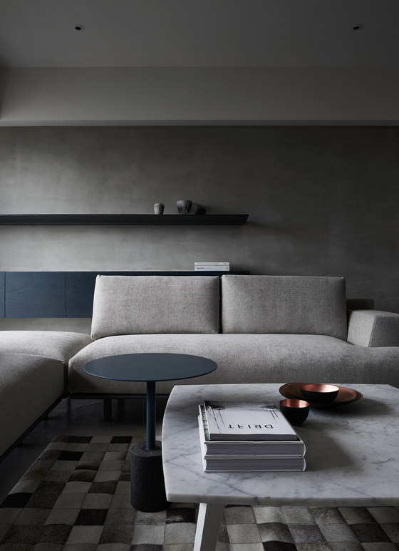
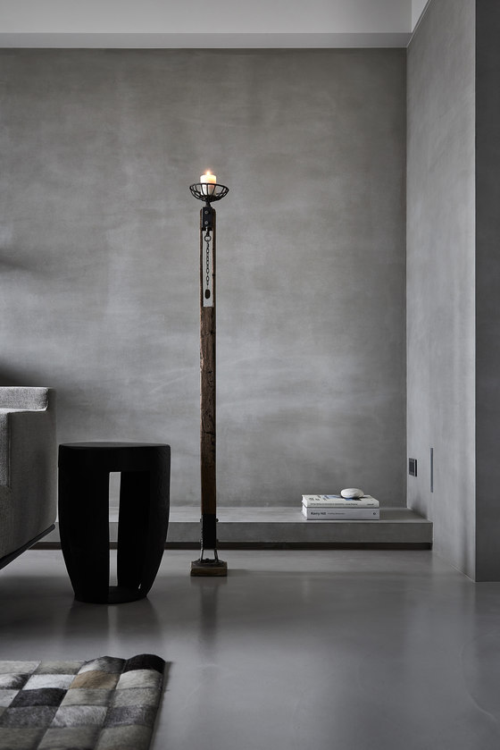
Habitation, should not just be the designer's arena, but the expression of habitants' deep inside. Based onmodernism, the division and volume areprecisely proportioned. With handmade touch, the blue wall presents various gradations in single color. Function as boundaries. The exposed concrete walls are like backgrounds of canvas, where color blocksof black (TV) and red (storage cabinet) are dotted. The opening and closuringcreate different effects of light and shadow, thusPandomo appears like water ripples inlandscape painting. The use of candlesticks enlightens thoughts on environmental protection and sustainability.
Wei Yi International Design Associates
