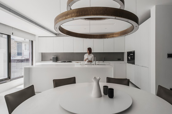
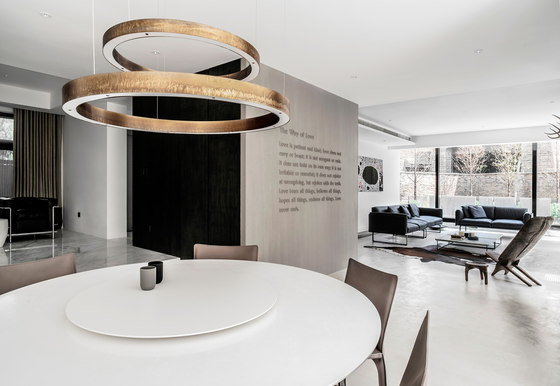
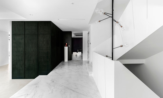
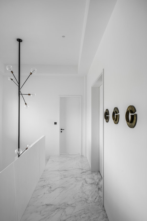
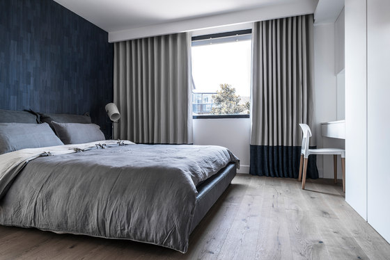
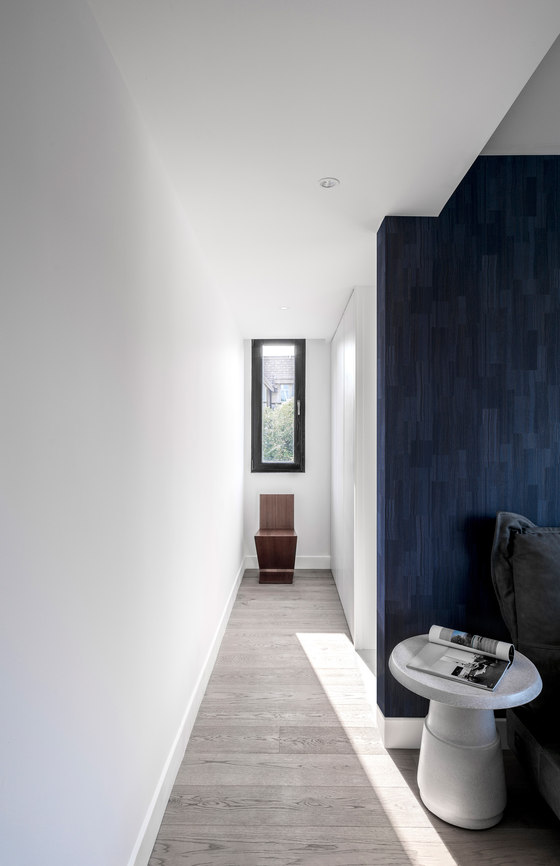
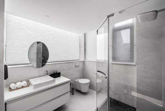
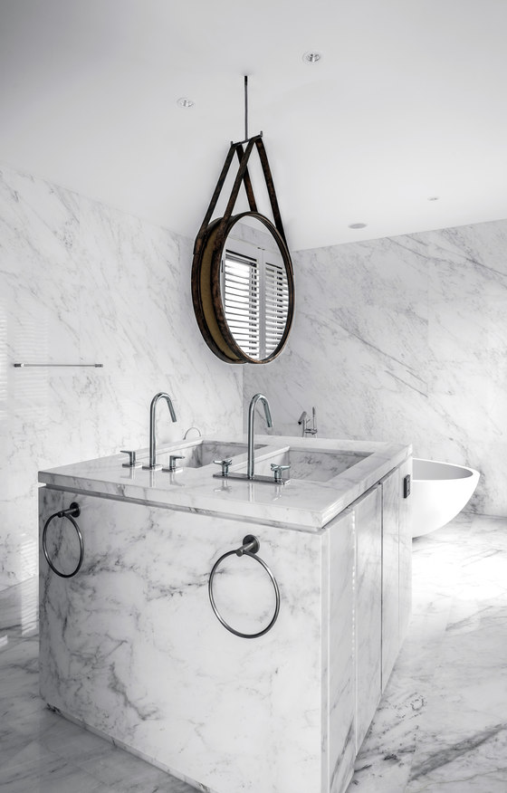
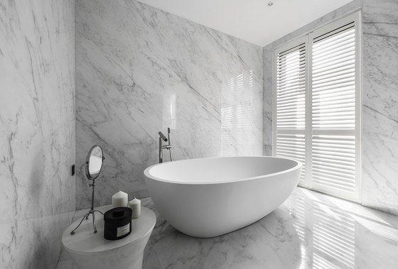
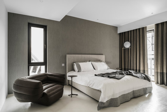
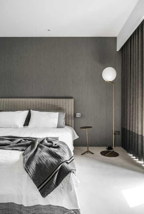
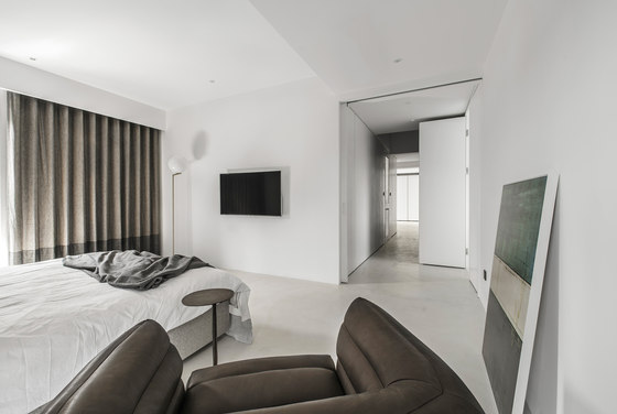
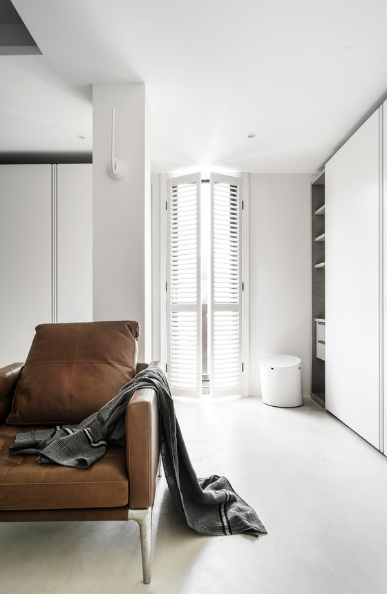
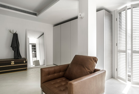
For sometimes, people may have a special bond with significant part of the memories about the past. Focusing on the feelings of people, continuing the past life experience as well as creating the new ones for the dwellers is the most fascinating and main core for this project. White is the most important memory factor in this project. This simple factor is placed into the space through various architectural and geometric forms, and it shapes functional spaces of every floor, creating a clear, cozy and refined atmosphere appropriately. At same times, white also appears in multiple materials.
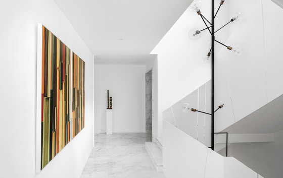
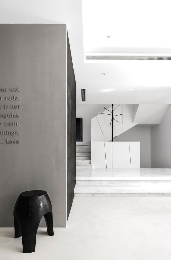
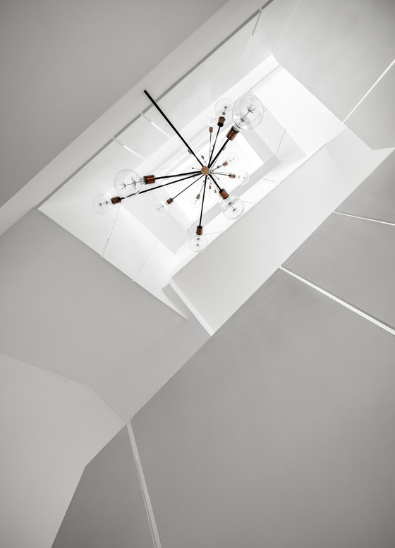
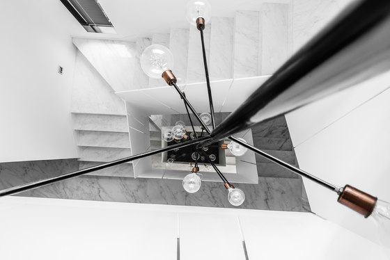
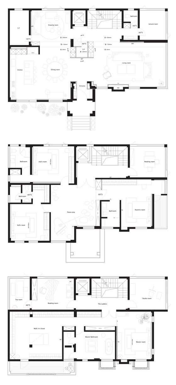
The flake-shaped stair handrails and star-like glittery vertical chandeliers penetrate and connect each of floor, spaces are thus divided and connected. In this way, the space gets rid of rigorous geometrical shapes and creates a feeling of leisure. For the first floor, at the entrance is the image presented as BOX in the center, which divides the whole space into living room, dining area (including open kitchen), sub living room and reading room. The BOX at the central of the space also indicates the core of the family, just as what the words on the wall of BOX describes – “love”. Following with the box, the floating-form stairs which is two steps raised sharpen the boundaries between areas within the space.
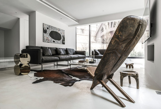
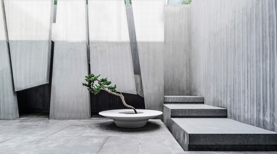
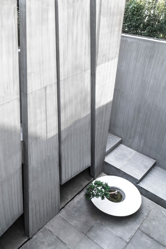
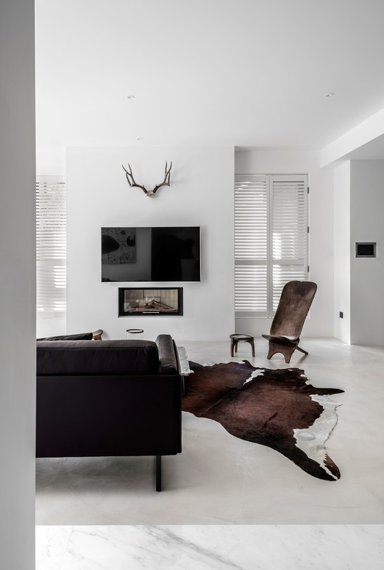
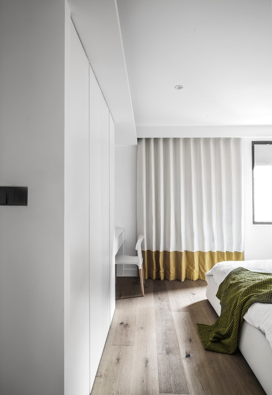
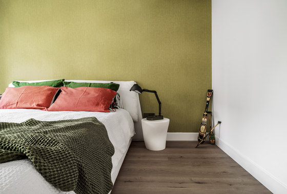
Walking to the living room, with the main factor “white” as the background, the dark leather sofa, brown carpet and the vintage furniture in dark wood brings variation to the space. On another side, the large scale window in the kitchen ensures good ventilation and plenty of natural light into the space. At same time, it corresponds with the courtyard outside, thus the residents can easily experience the flow of time and the variation from season to season. Space required by children’s growing up is the main ink of the second floor. Some bright colors and irregular shapes adapted into the space create a warm and soft environment which also corresponds to the active nature of children.
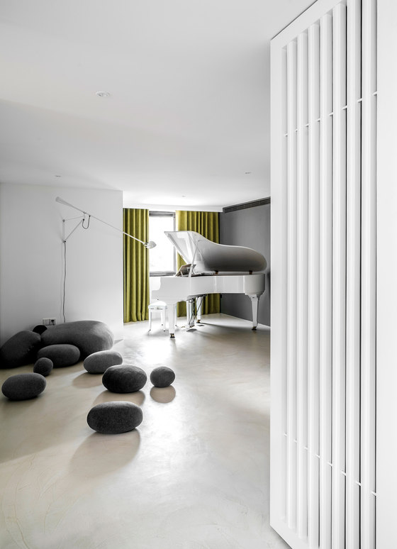
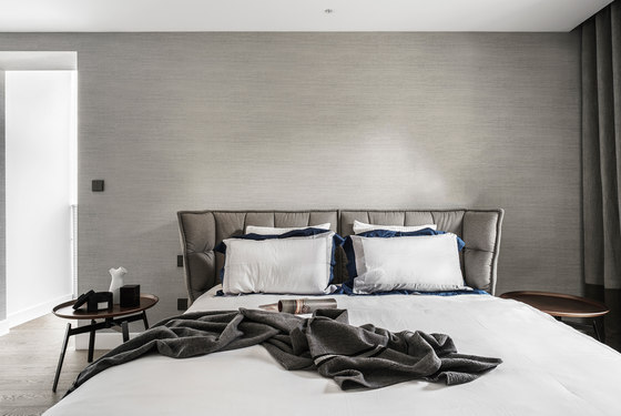
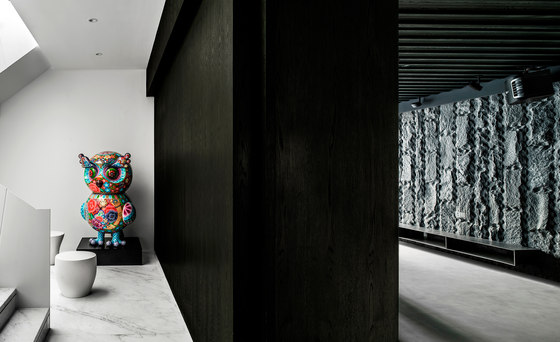
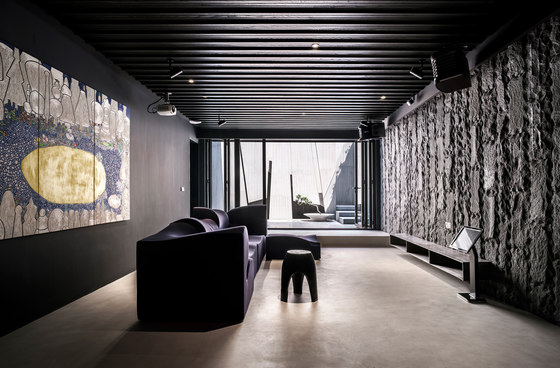
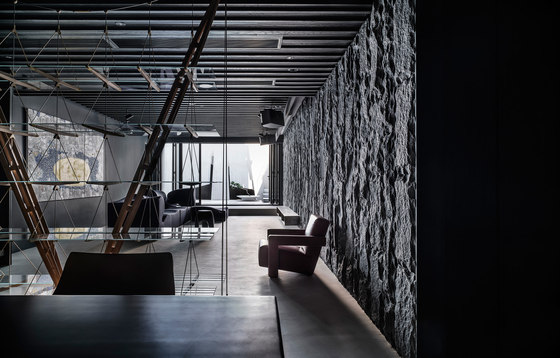
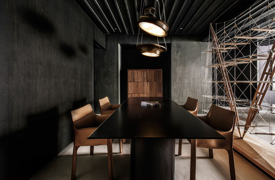
Walking down to the basement where the space is for leisure and entertainment of the host. Art works are placed precisely to make division as well as transformation of tonality in the staircase. Grey and black are adopted as main colors into this space, making it magnificent, stable and passes certain sense of Zen. The design is restrained and keeps an understated path. It perfectly satisfies the needs for every member in this family and creates a tranquil space for them.
Wei Yi International Design Associates
