Fotógrafo: Oliver Maier

Fotógrafo: Oliver Maier

Fotógrafo: Oliver Maier
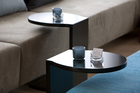
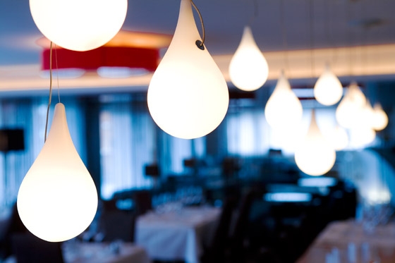
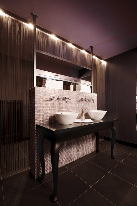
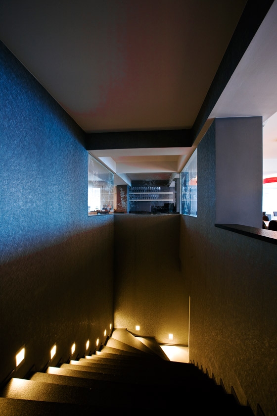
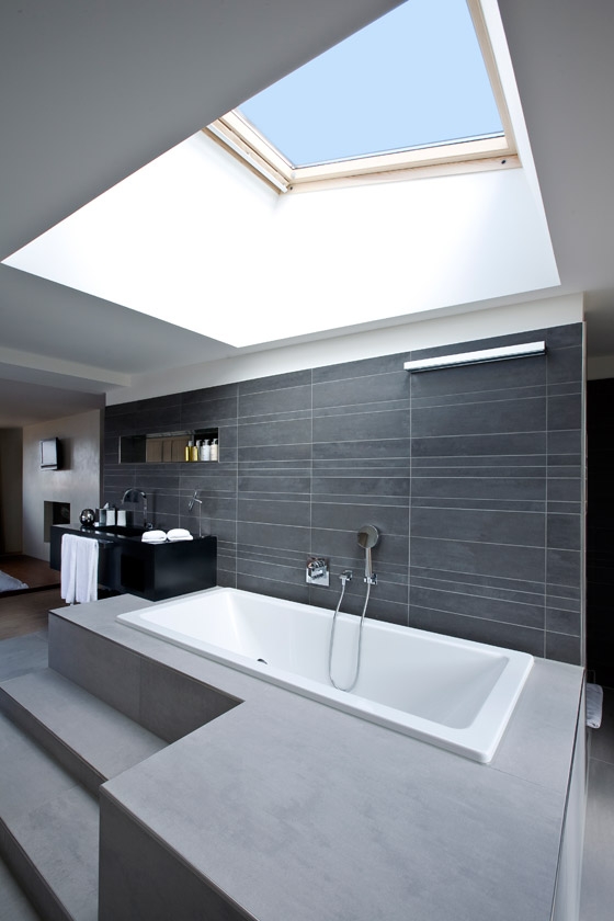
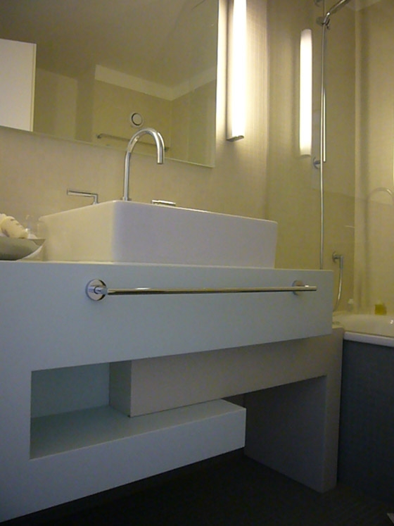
This retrofit inserts several new, varied programmatic areas and elements into a tight existing space. New layouts, new staircases, new connections between ground and first floors, new public bathrooms, and more rooms are part of a comprehensive re–thinking of the role and use of the typology of the alpine resort. The retrofit strives to relate to the surrounding mountain region through hinting at, never copying, the immediate environment or a typical alpine style. The design uses smooth lines, curved shapes, cool, calm tones, meticulous lighting, and abstracted images of nature in a contemporary and comfortable aesthetic, away from traditional expectations of "gemütlichkeit". This cosiness is achieved through a strong, contemporary visual language, which is repeated throughout the hotel: furniture, objects, seating areas, partitions between public and private.
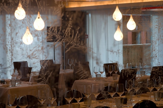
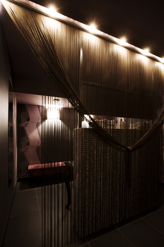
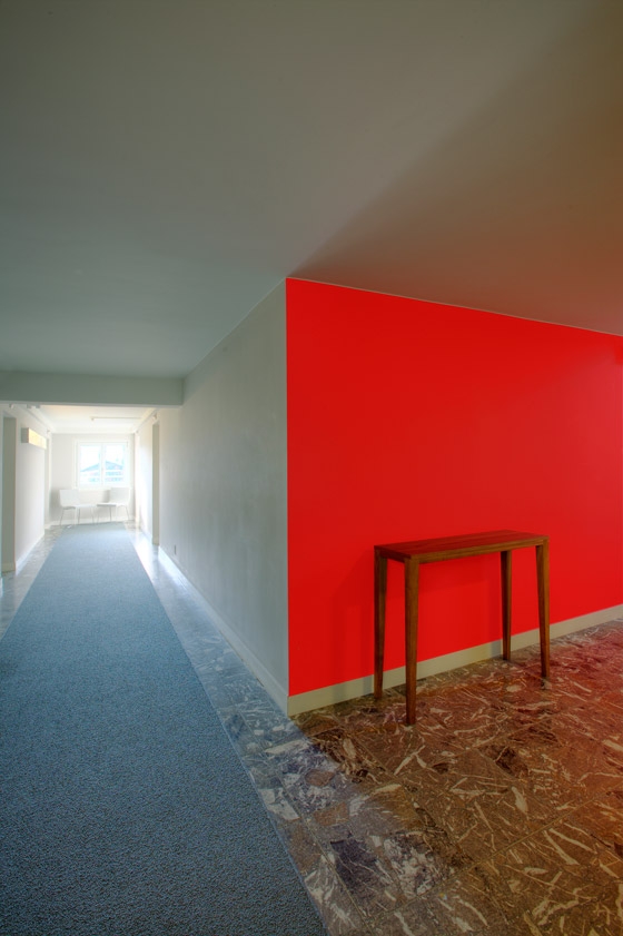
The public areas of the hotel are designed with a conscious idea of openness, an openness that allows people from without to peek into the interior excitement and energy within. This excitement draws people into the deeper recesses of the hotel, unfolding the spaces and unveiling a richer material palette at every turn. Variations in material and lighting, in etching or high–relief, in volume occupied (protruding or recessed), are themes developed throughout the interior space.
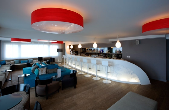
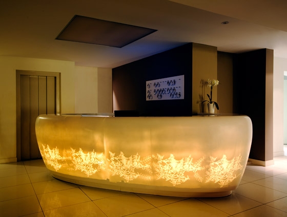
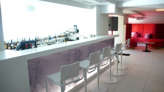
The entrance of the nevai is dominated by the organic shape of the engraved corian reception desk, a clear sign and vessel of the symbols of the concept: ice, ice crystals, snow, snow flakes. At night, the images etched out of the Corian and Perspex surfaces set the mood for the reception and bar areas.
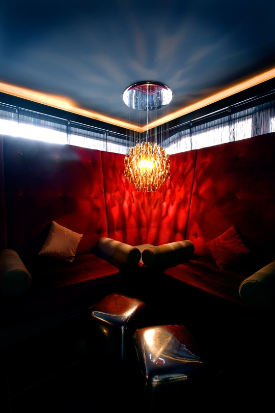
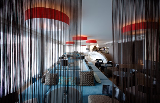
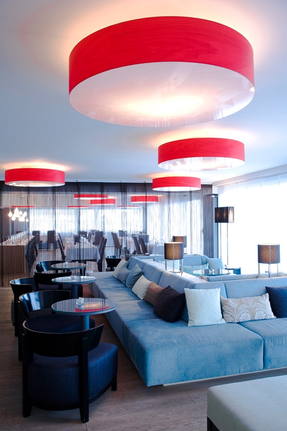
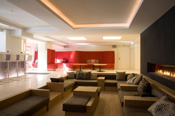
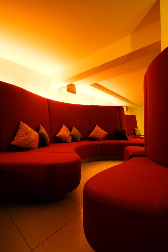
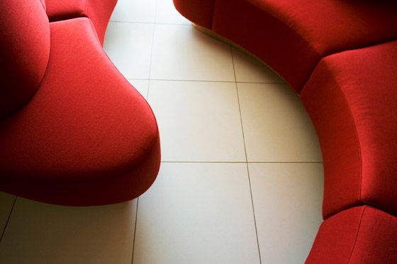
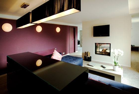
Special attention has been given to public seating areas: as a response to the low ceiling height in the existing structure, the intimate seating area facing the bar –dominated by a large gas fireplace– is sunken, protecting it against high–traffic zones. the French – inspired boudoir lounge, with its red seating, creates a cosy area that lends itself to intimate conversation or allows one to just relax quietly with a drink. The bar counter was inspired by a sled.
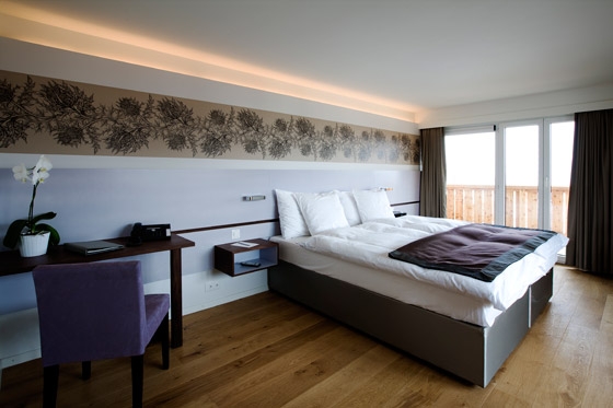
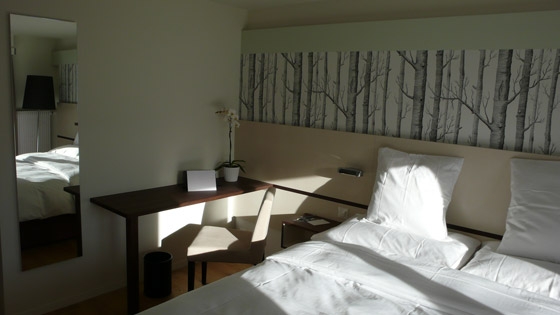
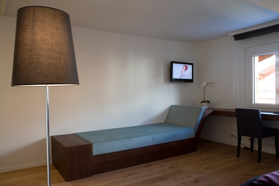
In the guest rooms, there is a strong visual dialogue between the materials and surfaces inside and the mountain scenery outside, blending the archaic with the modern. Furniture and fabrics are set in cool, calm tones with smooth lines and good lighting. In some rooms, wallpaper with branch motifs reflects the natural surroundings, without direct replication. This small but meaningful gesture evinces to our efforts to translate the environment and traditional design into a language relevant to our time.
At present, a sign of the success of our intervention is the ultimate popularity and full booking of the hotel, without any compromises in exclusivity.
King's Verbier

Fotógrafo: Oliver Maier

Fotógrafo: Oliver Maier

Fotógrafo: Oliver Maier

Fotógrafo: Oliver Maier

Fotógrafo: Oliver Maier

Fotógrafo: Oliver Maier

Fotógrafo: Oliver Maier

Fotógrafo: Oliver Maier

Fotógrafo: Oliver Maier

Fotógrafo: Oliver Maier

Fotógrafo: Oliver Maier

Fotógrafo: Oliver Maier

Fotógrafo: Oliver Maier

Fotógrafo: Oliver Maier

Fotógrafo: Oliver Maier

Fotógrafo: Oliver Maier

Fotógrafo: Oliver Maier

Fotógrafo: Oliver Maier

Fotógrafo: Oliver Maier

Fotógrafo: Oliver Maier
