Do the math: AGROB BUCHTAL
Historia de la marca de Gerrit Terstiege
Schwarzenfeld, Alemania
14.12.20
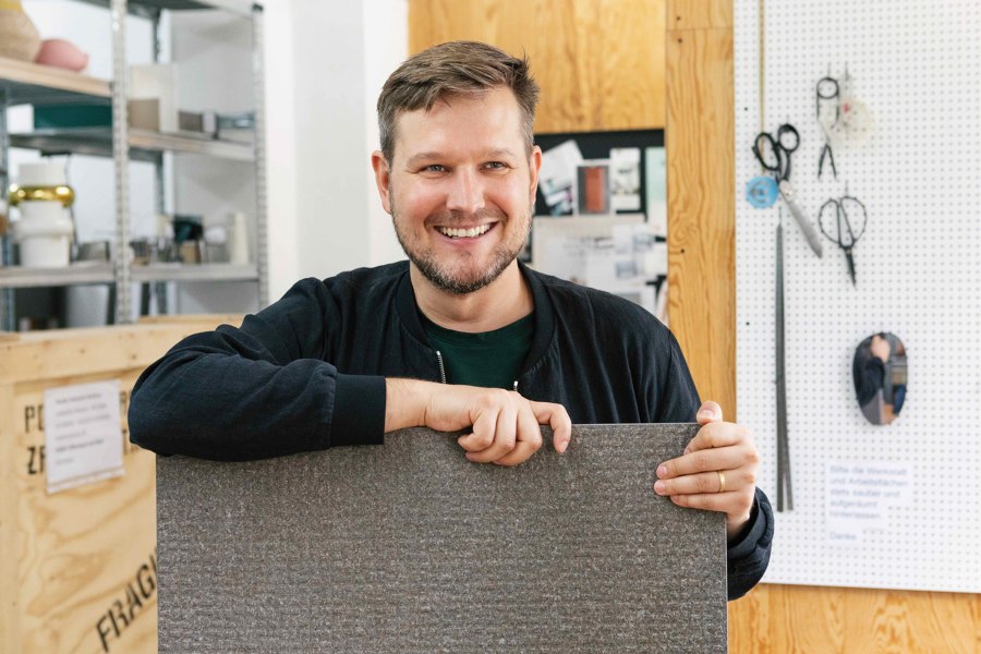
His latest project for AGROB BUCHTAL has led Sebastian Herkner into a new field, one where a symbiosis of creativity and physics saw the go-to product designer dig out his old maths book.
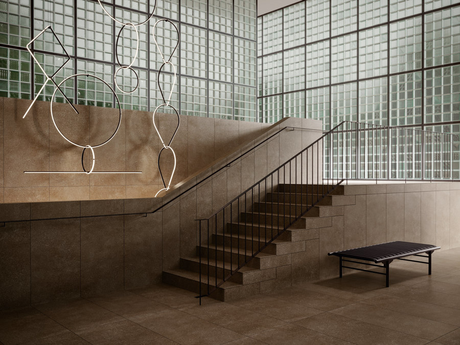
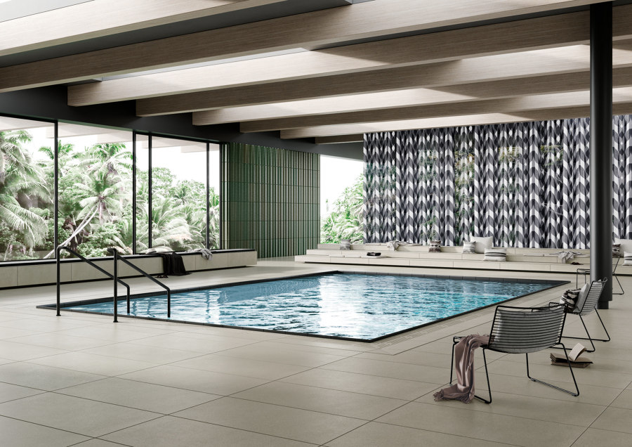
A harmonious overall impression: floors, stairs and walls can be fitted with Agrob tile collections – making rooms appear harmonious in terms of colour and form

A harmonious overall impression: floors, stairs and walls can be fitted with Agrob tile collections – making rooms appear harmonious in terms of colour and form
×For a design journalist, it is always exciting to observe the development of a particular designer as time passes; watching as he or she moves into new areas or takes on an unfamiliar challenge. In this respect, Sebastian Herkner is a fascinating example of a designer who always manages to surprise with his designs and who, along with his team, evolves from project to project.
The Design Award of the Federal Republic of Germany committee named Herkner ‘best newcomer’ in 2011, and since then, he has gone on to find elegant and innovative product solutions for such renowned international furniture companies as Fritz Hansen, Cappellini, ClassiCon and Thonet. Last year, he was named ‘Designer of the Year’ at Maison&Objet.
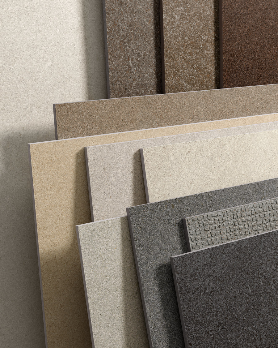
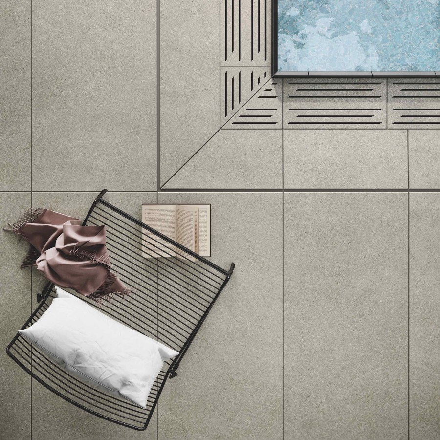
Both the range of colour shades and the structure of surfaces speak the same language at Agrob, making numerous exciting combinations achievable

Both the range of colour shades and the structure of surfaces speak the same language at Agrob, making numerous exciting combinations achievable
×But his latest project has led Herkner into a field of design that has nothing to do with furniture. Rather, it involves the design of floors and walls with tiles, the material composition, texture and structure of which have been adapted to the particular needs of a space or room. It’s no coincidence that the specially designed surface we are talking about here is called Grid, and is part of the new Area Pro tile collection by Agrob Buchtal.
‘For the design, I had to use my knowledge of maths from school. The result is a symbiosis of creativity and physics’
Incidentally, Agrob Buchtal draws from a tradition that goes back to the 18th century, and architects and interior designers, in particular, have trusted the manufacturer for years – the name standing for quality made in Germany. Specialising in ceramic facade systems and residential and architectural ceramics, Agrob Buchtal sees itself as a partner of designers who appreciate products in which function and aesthetics form a coherent whole.
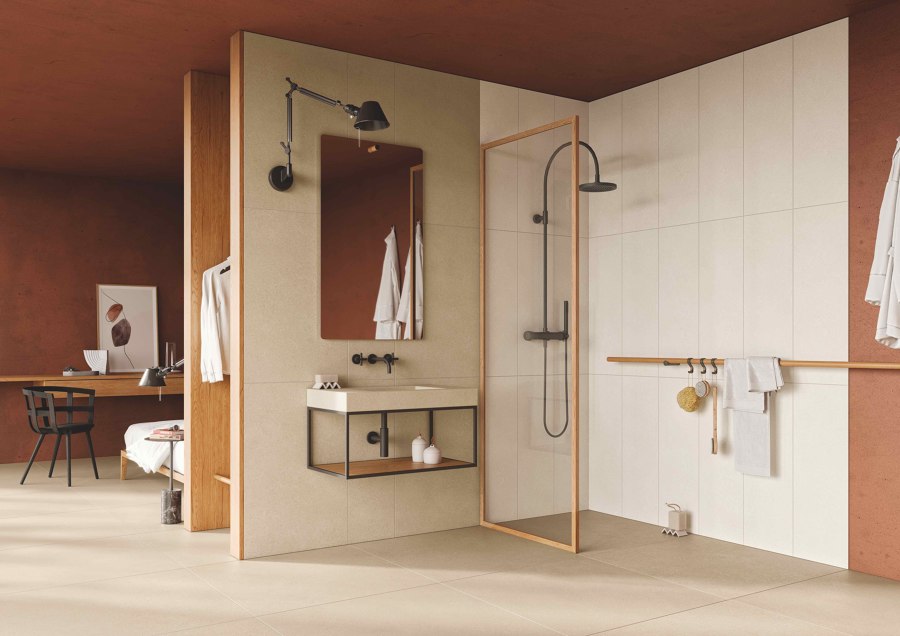
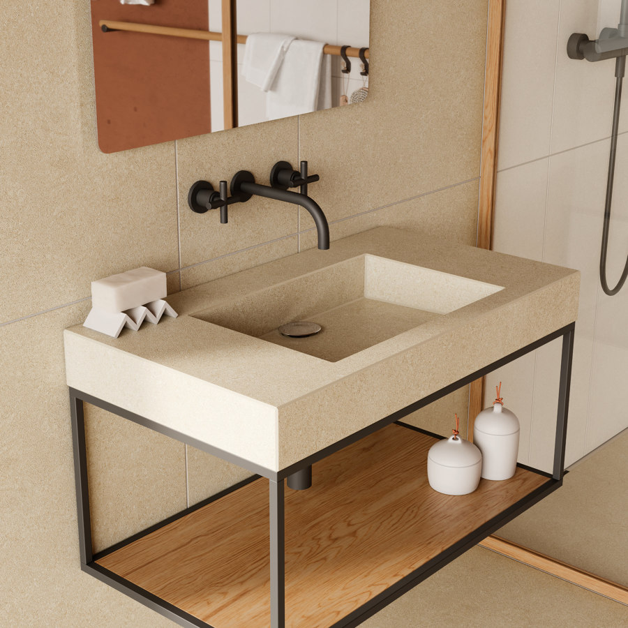
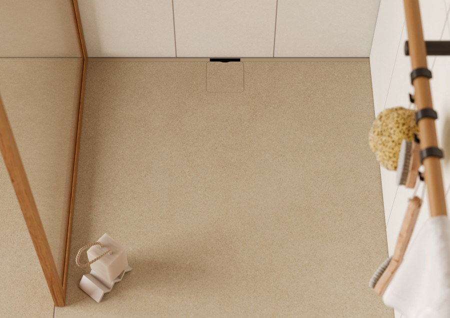
Walls, washbasins or shower floors in uniform cladding allow the various functional areas of a bathroom to formally merge. Here, warm sand tones harmonise with wooden elements

Walls, washbasins or shower floors in uniform cladding allow the various functional areas of a bathroom to formally merge. Here, warm sand tones harmonise with wooden elements
×I asked Sebastian Herkner how exactly this collaboration came about: ‘Agrob Buchtal deliberately approached my studio, and we were immediately taken with this thematic focus, with which we had not dealt before. On the one hand, the design had to comply with certain standards and regulations. It was all about mathematics, i.e. the relationship between displacement space and the slip resistance of surfaces, for example. On the other hand though, we wanted to give the tiles a character that would convey a sense of safety while being visually appealing at the same time.’
The designer and his team have developed numerous patterns, which were then calculated with painstaking precision and compared with existing standards. Some were then discarded in favour of new approaches. ‘Finalising the Grid surface in collaboration with Agrob Buchtal was a truly intense process from which we learned a lot.’ Not surprising, considering the collection’s broad range of colours, formats and slip-resistant surfaces.
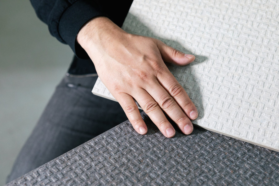
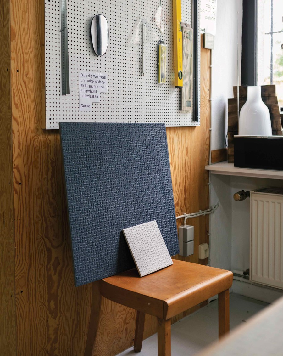
Designer Sebastian Herkner and his team created the Grid surface structure for the Area Pro tile series. The look, inspired by fine-grained limestone, has a timeless appeal

Designer Sebastian Herkner and his team created the Grid surface structure for the Area Pro tile series. The look, inspired by fine-grained limestone, has a timeless appeal
×Inspired by fine-grained limestone, the look of the series is timeless, with its warm earthy tones and finely nuanced shades of grey, and has been developed especially for commercial spaces, restaurants and canteen kitchens as well as leisure facilities such as swimming pools. Hence the addition of the word ‘Pro’ to the name – because these are heavily frequented spaces and it’s important, especially when water is involved, to ensure enhanced safety.
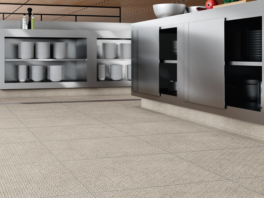
With seven different slip-resistance classes, Area Pro is a true all-rounder and caters for practically all relevant fields of application, while modern digital printing technology ensures a uniform design across all products. Even large tiles in the 60 x 60cm format qualified for the high slip-resistance class R12V4 for the first time. Due to new building regulations, these can now be used in commercial kitchens, for example, as they allow for so-called linear drainage.
Area Pro is specially designed for commercial premises, commercial kitchens and swimming pools. With seven different anti-slip classes, the series is a real all-rounder and covers practically all relevant fields of application

Area Pro is specially designed for commercial premises, commercial kitchens and swimming pools. With seven different anti-slip classes, the series is a real all-rounder and covers practically all relevant fields of application
×In the case of Grid by Sebastian Harker, the development of the surface structure was a decisive factor. ‘I wanted to find a pattern that looks spontaneous and yet still exhibits a certain logic. That is how I came up with the repeating, trapezoidal rectangles and the pattern which can be extended in all four directions. For the design, I had to use my knowledge of maths from school to calculate the depth of the relief and the size of the raised areas. The result is a symbiosis of creativity and physics.’
In large commercial kitchens, it is very possible that people will soon be walking on floors that can be regarded as real designer pieces. And, in this case at least, they will not have to worry about slipping if distracted by this interesting fact.
© Architonic

