Alma matters: new university buildings
Texto por Alyn Griffiths
London, Reino Unido
06.09.17
Like their students, universities are investing in their futures – calling on architects for long-lasting buildings that will not only promote flexible working, community interaction and new approaches to learning, but also function as highly visible brand statements.
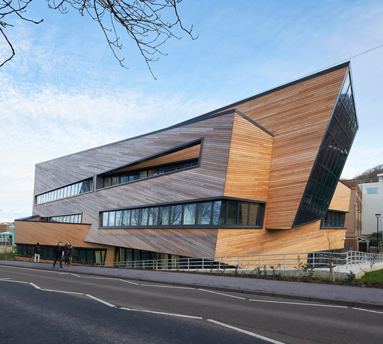
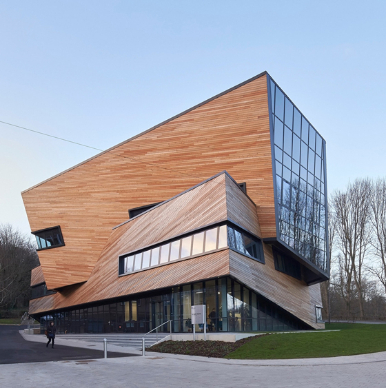
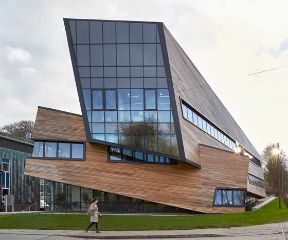
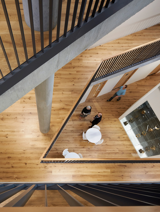
Studio Libeskind’s geometric Ogden Centre for Fundamental Physics at Durham University in England is actually a series of continuous, stacked and interlocking forms organised in a spiral plan. Photo: Hufton and Crow

Studio Libeskind’s geometric Ogden Centre for Fundamental Physics at Durham University in England is actually a series of continuous, stacked and interlocking forms organised in a spiral plan. Photo: Hufton and Crow
×Parents are typically told that education should be seen as an investment in their child’s future, and likewise the best universities view investing in architecture as a good way to ensure their own ongoing success. High-quality buildings designed by leading architects help these institutions stand out from their competitors, and provide the sort of inspirational and engaging environments expected by Millennial students.
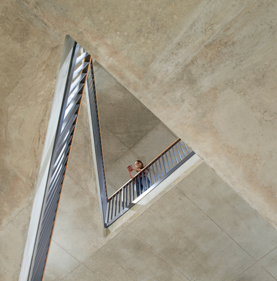
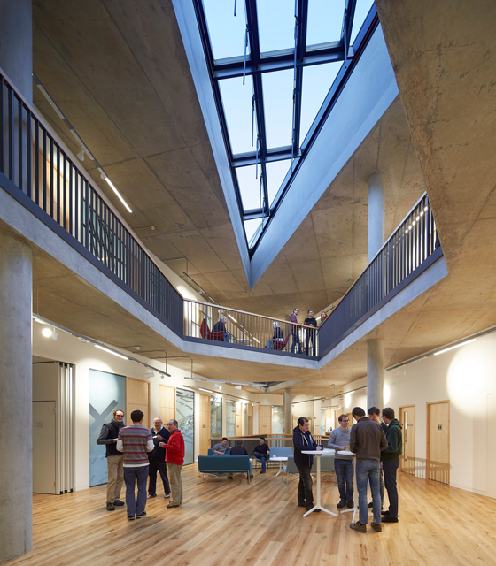
When New York-based Studio Libeskind was asked to create a more inspirational environment for the sort of blue-sky science explored at the Ogden Centre for Fundamental Physics at England’s Durham University, it responded with a mathematically influenced design featuring two interlocking stacked volumes. The building’s 72 offices are arranged in a ring around a central atrium, with bands of windows ensuring they each receive natural light and outward views. The atrium and meeting areas are topped with skylights that frame views of the night sky, while the building's precise geometric form alludes to its scientific purpose.
The £11.5 million Ogden Centre required creative engineering solutions like sloping columns that allow for more flexible floorplans and wayfinding, serving the facility’s current and future needs. Photo: Hufton and Crow

The £11.5 million Ogden Centre required creative engineering solutions like sloping columns that allow for more flexible floorplans and wayfinding, serving the facility’s current and future needs. Photo: Hufton and Crow
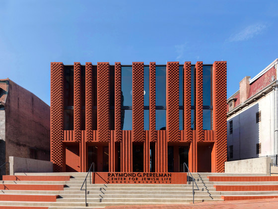
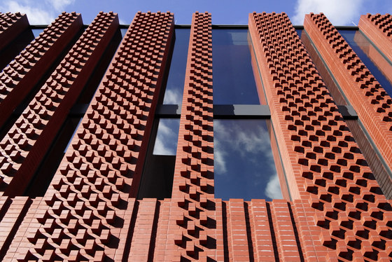
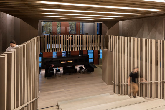
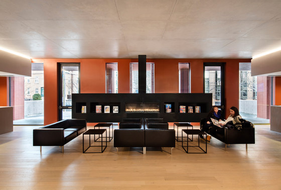
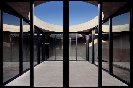
×Providing community support is part of facilitating inspirational learning environments. With this in mind, Stanley Saitowitz’s firm Natoma Architects organised the four levels of Drexel University’s Hillel House around an open staircase which functions as a place of gathering as much as movement. At the top, the library and worship spaces are situated around open patio with a circular skylight, representing a sanctuary dome. The patterned relief of the Hillel House’s facade resembles a menorah and prayer shawls used in Jewish ceremonies, while the striking red brick was sourced locally in Philadelphia.
Stanley Saitowitz’s Natoma Architects used local Philadelphia red brick to create a stepped terrace and striated facade that resembles an abstract menorah for Drexel University’s Hillel House. Photos: Richard Barnes and Stanley Saitowitz

Stanley Saitowitz’s Natoma Architects used local Philadelphia red brick to create a stepped terrace and striated facade that resembles an abstract menorah for Drexel University’s Hillel House. Photos: Richard Barnes and Stanley Saitowitz
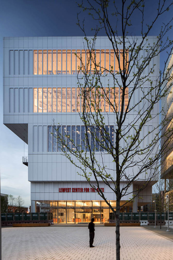
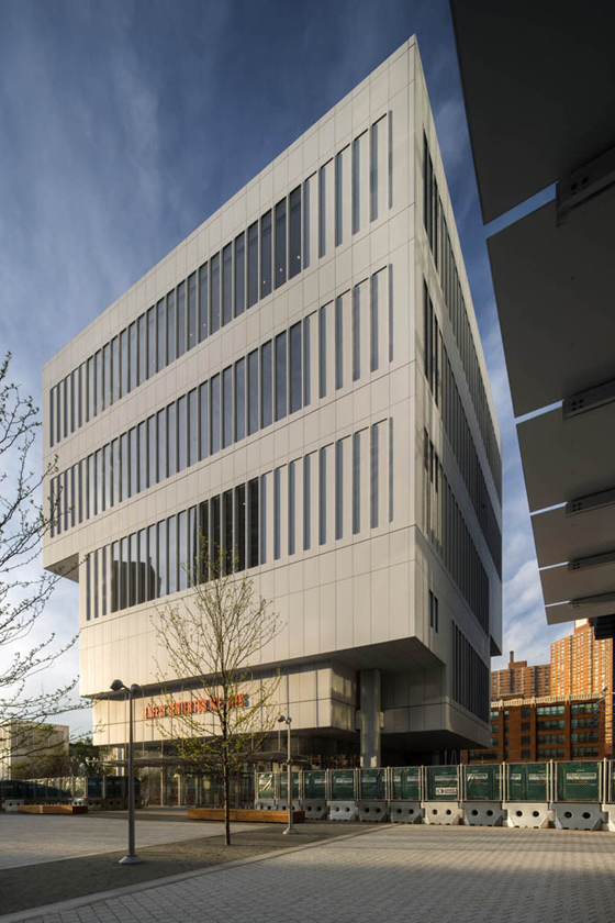
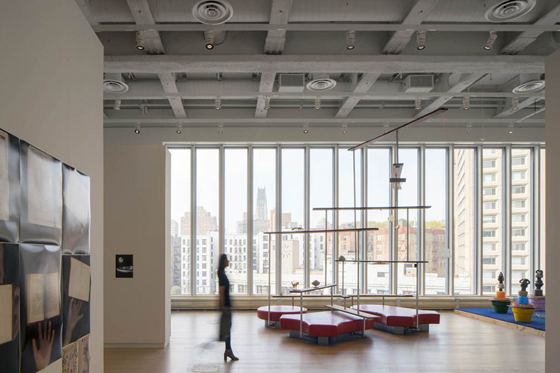
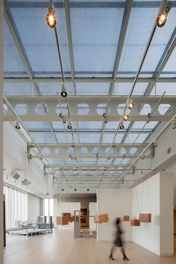
×Creating spaces suited to specific types of learning drives the design of some of the best educational architecture. At the Lensfest Center for the Arts at Columbia University, for example, Renzo Piano Building Workshop employed innovative engineering methods to create column-free spaces with high ceilings that are ideally suited to the performing arts. The monolithic building, clad in white aluminium panels, sits on a prominent site in upper Manhattan, and also features narrow windows that allow glimpses of the interior from the surrounding neighbourhood.
The top-heavy Lenfest Center for the Arts at Columbia University features a monumental mass that provides ample presentation, exhibition and multi-purpose spaces, including a 150-seat screening room. Photos: Renzo Piano Building Workshop

The top-heavy Lenfest Center for the Arts at Columbia University features a monumental mass that provides ample presentation, exhibition and multi-purpose spaces, including a 150-seat screening room. Photos: Renzo Piano Building Workshop
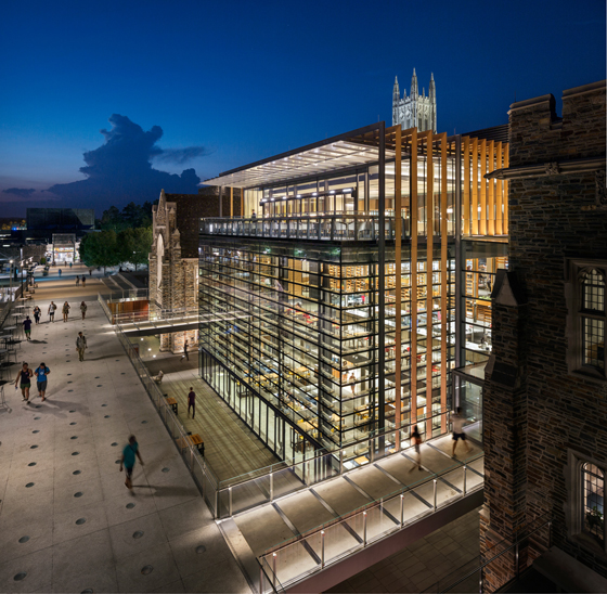
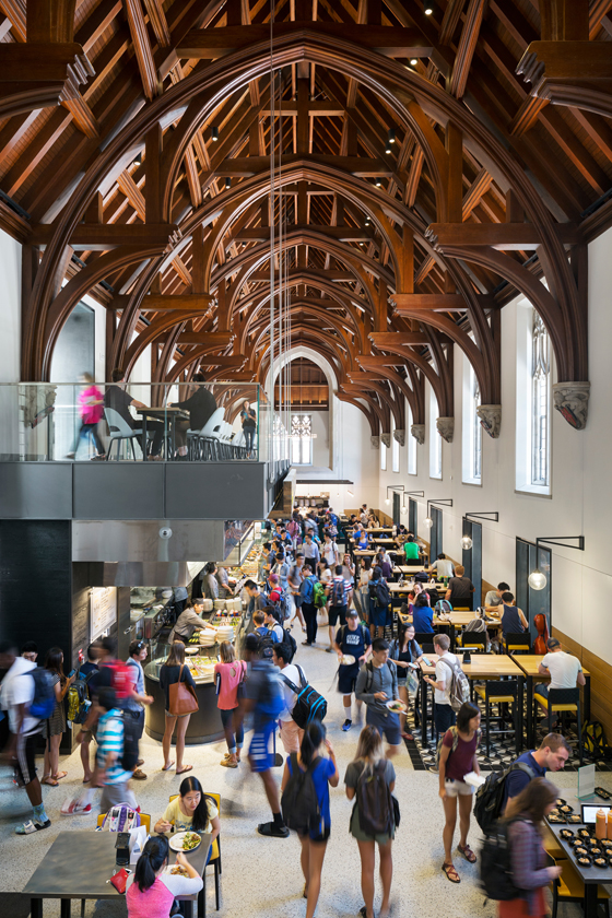
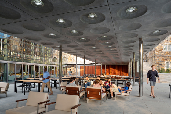
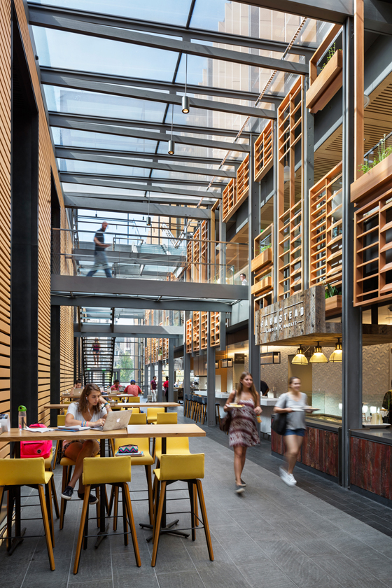
×Many universities have a long and distinguished heritage, but are often in need of more modern facilities. When UK-based firm Grimshaw was tasked with upgrading the student union at Duke University in Durham, North Carolina, it introduced a glazed atrium flanked by the preserved stone facades of the original 1930s buildings. Existing details such as the dining hall’s gothic-style wooden roof trusses are complemented by contemporary interventions including steel balconies lined with glass balustrades. Respecting the past is important, but bringing educational architecture right up to date is key to ensuring the optimum return on this investment in the future.
Grimshaw’s renovation and expansion of Duke University’s West Campus Union involved replacing the core of a nearly 100-year-old structure to create a transparent atrium with steel and glass balconies framed by historic elements. Photos: James Ewing

Grimshaw’s renovation and expansion of Duke University’s West Campus Union involved replacing the core of a nearly 100-year-old structure to create a transparent atrium with steel and glass balconies framed by historic elements. Photos: James Ewing
ש Architonic
