Hole Lot of Sense: smart uses for perforated façades and partitions
Texto por Alyn Griffiths
London, Reino Unido
20.08.11
Perforated walls, panels and screens have been used for centuries as a way to control the level of light entering a building or to offer privacy to the occupants. The functions of perforations have remained largely the same, but the materials and methods of manufacture have altered considerably. No longer cut or carved by hand, developments in computer-controlled technologies mean that detailed patterns can now be quickly and easily etched into various materials for interior or exterior use. Architonic looks at some recent projects demonstrating the contemporary effects that can be achieved using perforated materials.
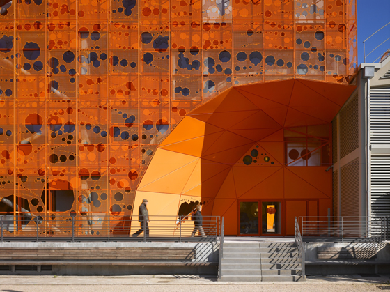
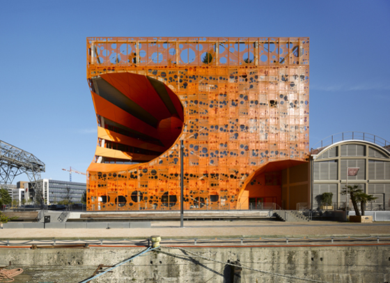
Jakob + Macfarlane’s Orange Cube in Lyon is covered in a perforated steel mesh; photo: Roland Halbe

Jakob + Macfarlane’s Orange Cube in Lyon is covered in a perforated steel mesh; photo: Roland Halbe
×Perforated screens and shutters can help to add a distinctive personality to a building’s exterior, as well as performing an important function. In the Mediterranean region, louvred shutters painted in bright colours give the towns and villages a cheerful visual style. When closed, they reduce the impact of directly sunlight and provide an extra degree of privacy and security. Intricately patterned screens are a typical feature of many buildings in parts of Asia, the Middle East and North Africa, where they would traditionally have been cut by hand by skilled craftsmen. The complexity of the latticework denotes the wealth or importance of the occupier, with the most complex and delicate often found in temples, mosques or other places of worship. These traditional applications for perforated surfaces have inspired and informed contemporary architects interested in exploring new functional and aesthetic possibilities.
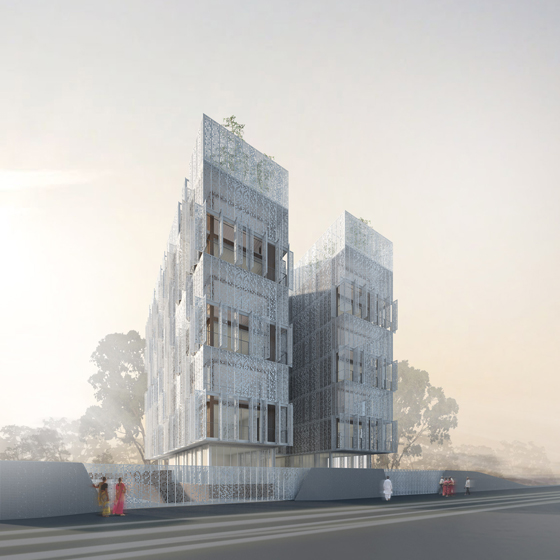
The perforated steel façade of Piercy Conner Architects’ Restello apartment building provides natural ventilation and shade; image © Piercy Conner Architects

The perforated steel façade of Piercy Conner Architects’ Restello apartment building provides natural ventilation and shade; image © Piercy Conner Architects
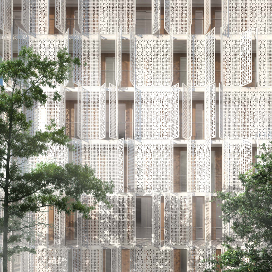
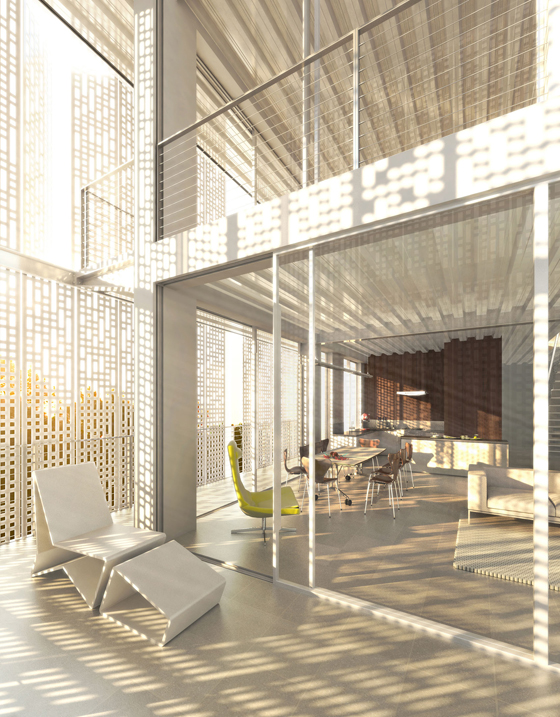
×In climates where harsh levels of heat and sunlight can create uncomfortable conditions, striking a balance between light and shade, warmth and ventilation is an important consideration. Piercy Conner Architects have confronted this issue in their design for the Restello apartment building in Kolkata (Calcutta), India, which is due for completion early next year. Floor-to-ceiling glazing is wrapped in an outer layer, comprising perforated steel screens that offer protection from sun and rain, controlling the amount of light that enters the interior whilst maintaining the spectacular views. Between the glazing and the screens are double-height terraces that blur the boundaries between inside and outside space. The delicate patterning used on the screens references the local vernacular and produces a dappled light that brings an impression of natural shade to the interior.
The etched pattern displays clear Eastern influences; image © Piercy Conner Architects
The screens cast a dappled pattern of light and shade on the interior surfaces; image © Piercy Conner Architects

The screens cast a dappled pattern of light and shade on the interior surfaces; image © Piercy Conner Architects
×The use of steel for this project was influenced by the high levels of humidity that the area experiences, which can cause structures made from less robust materials to deteriorate and decay quickly. Steel’s imperviousness to moisture means that it will not shrink or swell, and exposed areas can be galvanised or treated to reduce corrosion. Aimed at the growing market of high-income professionals, the apartments retain the aspirational qualities of light and space that steel and glass structures offer, while combatting the issues posed by the harsh sunlight, providing a comfortable and luxurious living environment.
Two huge voids in the Orange Cube help provide light, ventilation and views of the city; photo: Roland Halbe

Two huge voids in the Orange Cube help provide light, ventilation and views of the city; photo: Roland Halbe
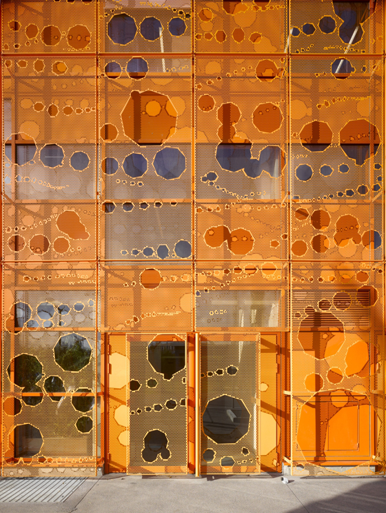
×The entire building is covered in a random pixellated pattern; photo: Roland Halbe
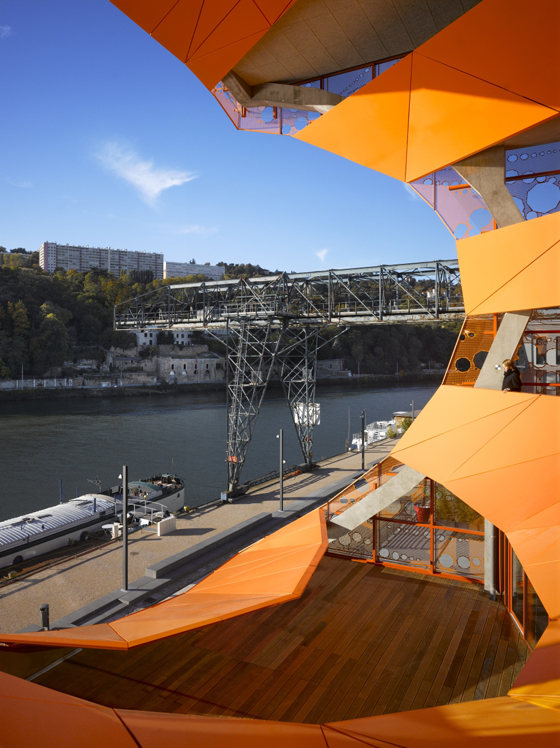
Perforations large and small give the Orange Cube in Lyon its distinctive personality. Designed by Paris-based practice Jakob + Macfarlane as a design showroom and office complex, its coloured metal mesh façade is covered in an irregular pattern of perforations and is dramatically punctured by two large openings. At the corner of the building, a curved chunk has been removed to create the entrance, while a larger void, formed from two intersecting curves, carves a section through the structure, creating atriums, corridors and terraces that offer a dynamic, shifting view of the nearby river and the surrounding offices.
One of the large voids cuts a section through the floors, creating balconies and communal areas; photo: Roland Halbe

One of the large voids cuts a section through the floors, creating balconies and communal areas; photo: Roland Halbe
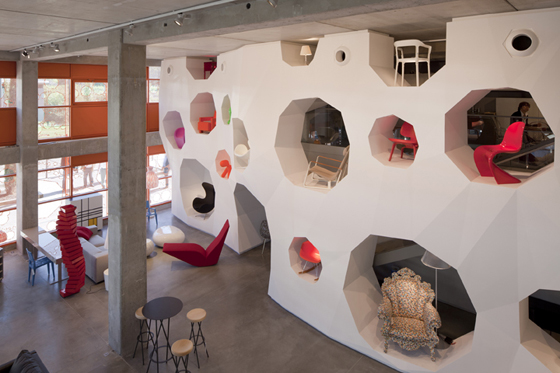
×Polygonal apertures in the display wall mirror the form of the holes in the façade; photo: Nicolas Borel

Polygonal apertures in the display wall mirror the form of the holes in the façade; photo: Nicolas Borel
×Visually, the perforated surface references the dappled effect of light reflecting on the surface of the nearby river, while its russet hue is inspired by the harbour-side location. The functional performance of the patterned façade is achieved by careful research into optimal light levels and thermal performance. Inside, the perforated theme is continued in the showroom where a long, L-shaped wall is punctured by angular cavities of varying sizes, in which iconic design pieces are displayed.
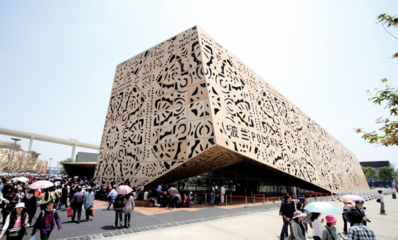
Traditional Polish folk art inspired the perforated pattern applied to the surfaces of the Polish Pavilion at last year’s Shanghai Expo by WWAA Architects; photo © WWAA

Traditional Polish folk art inspired the perforated pattern applied to the surfaces of the Polish Pavilion at last year’s Shanghai Expo by WWAA Architects; photo © WWAA
×The narrative possibilities of perforations were explored by WWAA Architects in their Polish Pavilion at the Shanghai Expo 2010. The angular structure was clad in plywood panels featuring a pattern inspired by the Polish folk art of paper-cutting. The traditional motifs were etched into the panels using a CNC plotter, encapsulating the importance of retaining the country’s cultural heritage while promoting its current progressive, design-led attitude.
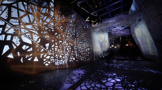
Internally, the patterns changed as the visitor moved through the exhibition; photo © WWAA
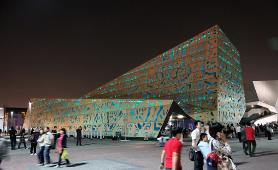
At night, the pavilion was lit from within, with multi-coloured lighting emanating from the perforations; photo © WWAA

At night, the pavilion was lit from within, with multi-coloured lighting emanating from the perforations; photo © WWAA
×The perforations projected light into the interior spaces, filling them with complex patterns, while at night, the building was lit from within and a constantly changing spectrum penetrated the façade. Internally, the perforations functioned as a wayfinding tool, guiding the visitor through the various stages of the presentation and morphing into new forms that responded to the images and films describing aspects of Polish history, culture and everyday life.
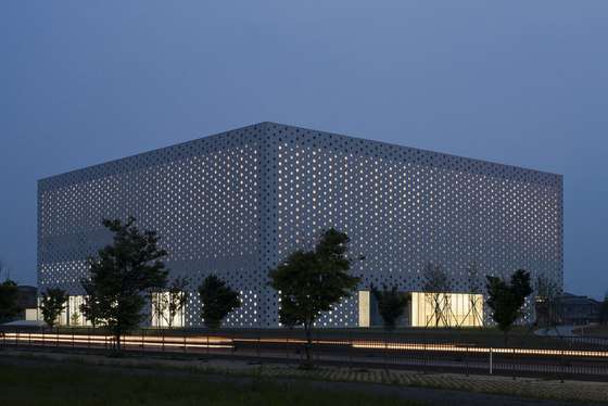
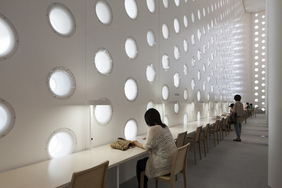
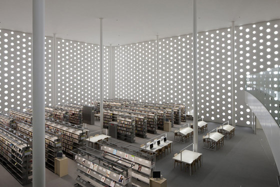
6,000 holes allow light to enter the Umimirai Library by Coelacanth K&H Architects; photo: Satoshi Asakawa

6,000 holes allow light to enter the Umimirai Library by Coelacanth K&H Architects; photo: Satoshi Asakawa
×The holes provide soft, natural light to the cavernous interior; photo: Satoshi Asakawa
The reading room features 12-metre-high ceilings, supported by 25 slender pillars; photo: Satoshi Asakawa

The reading room features 12-metre-high ceilings, supported by 25 slender pillars; photo: Satoshi Asakawa
×Perforated façades enable interior spaces to benefit from natural light, filtered in such a way that it reduces the glare of direct sunlight and resulting in an environment that is conducive to relaxation and working. This was the principle applied by Japanese firm Coelacanth K&H Architects in their design for the Umimirai Library in the Ishikawa prefecture of Kanazawa City. They recognised that the quality of light would play a key role in creating an atmosphere that would encourage visitors to linger and use the facility as a social hub. By punching 6,000 small openings into the surfaces of the large orthogonal volume, they were able to create a tranquil environment, reminiscent of a forest glade, with soft light and expansive spaces punctuated by soaring pillars that climb through the building. The frequency of the apertures in the walls ensures a uniform light, ideal for reading and contemplation.
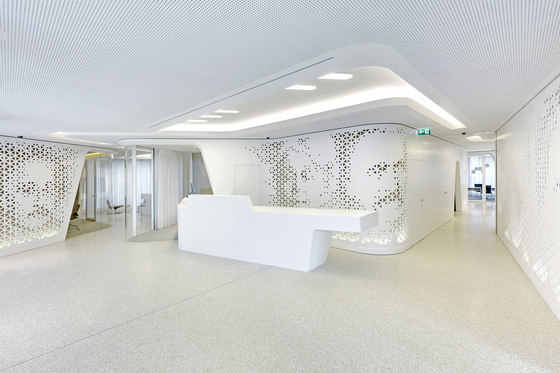
Openness and light are the key characteristics of DGJ+NAU’s bank building for Raiffeisen; photo: Jan Bitter

Openness and light are the key characteristics of DGJ+NAU’s bank building for Raiffeisen; photo: Jan Bitter
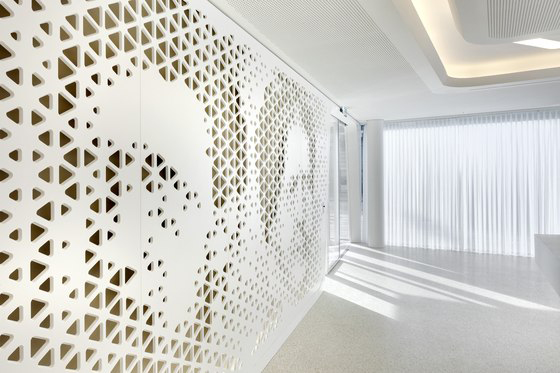
×Light was a key consideration for architects DGJ+NAU when designing the flagship branch for Swiss bank Raiffeisen in Zurich. Their aim was to create an open environment that was removed from the stuffy perception of traditional banking and in which customers and staff can engage in a lounge-like environment inspired by high-end retail spaces. The open, light-filled space is divided by flowing walls, gauzy curtains and a perforated screen. The screen is used to control views of private areas while maintaining excellent levels of light throughout the interior. The surface of the screen is adorned with the abstracted images of some of the area's foremost past residents, helping the bank to link its futuristic outlook with the cultural heritage of the region. The images are milled into a white Hi-Macs composite surface with a lucid quality.
The detailed pattern was created using digital processes and then cut by a CNC milling machine; photo: Jan Bitter

The detailed pattern was created using digital processes and then cut by a CNC milling machine; photo: Jan Bitter
×Whether used internally or externally, perforations create a dialogue between spaces; obscuring or inviting views as required and keeping temperature and brightness at a pleasant and practical level. With new technologies come new options for architects and designers interested in exploring the potential for perforations to tell stories and create statements. It is now possible to produce detailed patterned surfaces quickly and easily and on a scale large enough to wrap entire buildings. Shade and privacy will continue to be the key practical purposes of perforations, but the potential applications are greater than ever.
....
