Quiet Musings: Michael Govan
Texto por David Sokol
Washington, DC, Estados Unidos
12.05.11
A series of new architecture commissions and exhibitions suggests that museums might no longer be in the business of pageantry. In this third, and final, part of a series examining the notion of the post-spectacle museum, Architonic meets Michael Govan, director and CEO of the Los Angeles County Museum of Art.
Michael Govan has been showered with laudatory designations that range from the simple 'rising star' to the art world’s 'shrewdest eye...since the legendary tastemaker Clement Greenberg'. He laughs at the former description, saying, 'Young is not a word I would use. I’ve been doing the same thing since I was a sophomore in college, when I was drawing MASS MoCA designs for Thomas Krens with the first CAD programs, because we couldn’t afford an architect. I’ve counted up the museum construction or planning projects I’ve been involved in, which was like 13, so I think of myself as having slugged away at this with successes and failures for a very long time.'
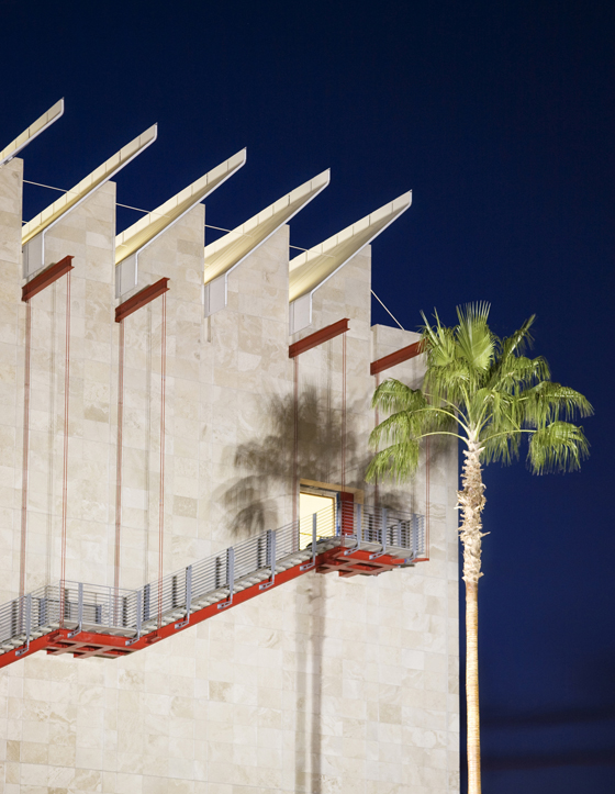
When Michael Govan joined the Los Angeles County Museum of Art as Chief Executive Officer and Wallis Annenberg Director in 2006, construction was wrapping up on the Broad Contemporary Art Museum, or BCAM; © Weldon Brewster

When Michael Govan joined the Los Angeles County Museum of Art as Chief Executive Officer and Wallis Annenberg Director in 2006, construction was wrapping up on the Broad Contemporary Art Museum, or BCAM; © Weldon Brewster
×Govan’s college memory dates to Krens’s directorship of the Williams College Museum of Art, where he helped initiate the conversion of the former manufacturing complex of Arnold Print Works and Sprague Electric Company into MASS MoCA, the instantly renowned contemporary art museum. Just as Krens went on to spearhead the construction projects that transformed the Guggenheim and the world of museum architecture, Govan has rendered equally dramatic changes – most notably, as president and director of the Dia Art Foundation, of a former Nabisco paper plant into Dia:Beacon, designed by artist Robert Irwin with the now-defunct architecture studio OpenOffice. Govan may have aged out of up-and-comer status; instead he is firmly a star, currently as director and CEO of the powerhouse Los Angeles County Museum of Art (LACMA).
Known for his facility with capital-construction projects, the charisma and astuteness with which he engages donors, and, most important, that shrewd eye that has also produced several lauded exhibitions, Govan is perceived to defer to artwork in his building projects. Indeed, Dia:Beacon is widely praised as a transcendent container for art. Govan’s LACMA projects with Renzo Piano have earned similar reviews. And the Broad Contemporary Art Museum, a building that predates Govan’s arrival at LACMA, and the recently opened Lynda and Stewart Resnick Exhibition Pavilion, are almost equally modest in appearance as Dia’s former box factory.
Before arriving at LACMA, Govan was President and Director of New York's Dia Art Foundation, where he was responsible for converting a Nabisco warehouse into the Dia:Beacon with artist Robert Irwin and Open Office; © 2010 Museum Associates/LACMA

Before arriving at LACMA, Govan was President and Director of New York's Dia Art Foundation, where he was responsible for converting a Nabisco warehouse into the Dia:Beacon with artist Robert Irwin and Open Office; © 2010 Museum Associates/LACMA
×Yet Govan refutes the perception slightly. Besides commissioning and producing museum architecture to serve artwork, he says that urbanistic principles are a driving force of his work. 'It’s a simple, silly thing,' he says of his awareness of the city fabric. 'I grew up in DC and even as a kid I was interested in how L’Enfant planned Washington, and why there was a master plan in that city and not in Brooklyn where my grandparents lived.' Govan attributes his studies at Williams and in Rome to that question, as he does his curatorial research of the artist Dan Flavin, whose oeuvre, he says, 'has a lot to do with the relationship between art and architecture, and environment and sequence. What the work looks like, as surface, is not really the interesting issue to me.'
'I’ve had a huge amount of exposure to the pragmatics and the serious planning of museums,' Govan concludes. Here, he discusses the state of museum architecture, poses that empty visual pageantry wasn’t the initial purpose of spectacle museums, and analyses his relationship with architecture, spectacle and community engagement at LACMA.
BCAM was designed by Renzo Piano and funded by the billionaire philanthropists Eli and Edythe Broad. In August 2010 they selected Diller Scofidio + Renfro to design a separate eponymous museum in Los Angeles; © 2007 Museum Associates/LACMA

BCAM was designed by Renzo Piano and funded by the billionaire philanthropists Eli and Edythe Broad. In August 2010 they selected Diller Scofidio + Renfro to design a separate eponymous museum in Los Angeles; © 2007 Museum Associates/LACMA
×.....
In an earlier interview for this series, Brad Cloepfil made a distinction between museum clients that commission architecture versus those that collect it.
People are getting upset by that – the convenience and lack of individualistic or creative thought. There’s a lot of anger in critical circles exactly against this copying of the Bilbao Effect. At Bilbao itself, though, Frank picked the toughest spot and he found a way to weave the town down to this industrial site and to this not-quite-pretty river and the bridge. Bilbao wanted a Sydney Opera House, but Frank took on a deeper civic problem and provided the city with connective tissue. I still find that design to be extremely compelling, although since the Guggenheim’s opening most people have only thought about it as surface. And many museums have since tried to duplicate it in its lowest-common-denominator form.
Why would you say Renzo Piano has become a go-to architect for museums?
Ostensibly it’s the same thing: his architecture for the Menil Collection and his proposal for the Pompidou with Rogers were really radical at a time when museum architecture was simply dark boxes with stuck-on decoration. Renzo stuck to his guns and dealt with the idea of permeability, of natural light in interior space. For all the right reasons, he became well known. And because there was not really anything bad to say about him, every museum board wanted to play it safe. He became the architect of choice because there was nothing controversial. Which is not to say he wasn’t challenging. With the new [Resnick] pavilion, he hit every note perfectly. Its use of daylight, the consideration of the exterior…
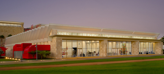
Govan oversaw design and construction of the Lynda and Stewart Resnick Exhibition Pavilion, which followed completion of BCAM; © 2010 Museum Associates/LACMA

Govan oversaw design and construction of the Lynda and Stewart Resnick Exhibition Pavilion, which followed completion of BCAM; © 2010 Museum Associates/LACMA
×When you came to LACMA, the Broad Contemporary Art Museum was nearing completion. You ostensibly inherited Renzo not just for that project, but also for the design of the Resnick Pavilion.
It would have been silly to work with anyone but Renzo, because the point of the Resnick wasn’t to try new ideas that oppose the Broad building, but to work hard at making the existing ideas better. It’s about practice. That’s why I like to work with artist and architects more than once, because you discover new possibilities in a dialogue over time. And perhaps that’s why Renzo had requested to design a master plan when he was invited to design the Broad initially.
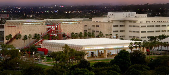
Also designed by Piano, the Resnick Pavilion serves as a low-slung foil to BCAM. It also unifies the western half of the 20-acre museum campus; © 2010 Museum Associates/LACMA

Also designed by Piano, the Resnick Pavilion serves as a low-slung foil to BCAM. It also unifies the western half of the 20-acre museum campus; © 2010 Museum Associates/LACMA
×The Broad isn’t exactly a resolved design.
I was very conscious of that. My first day on the job was April 1, 2006, and I did feel that the box by itself was problematic, that the entrance structure was problematic. It was another faceless building pressed against Wilshire Boulevard. And frankly, a blank facade doesn’t help your relationship with people. Since we built the Resnick, our attendance is up 17 percent, even on weekdays. The second building works with the first, and with the contiguous park, to achieve more of a composition and a campus feel.
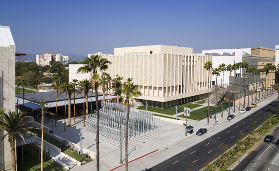
The Chris Burden installation ['Urban Light'] also has had a huge impact on the welcoming nature of the place. It provides a landmark in a city where it’s hard to know where you are, especially for tourists. As a museum, we’re here to function as the mediating device between art and people. It’s not just about making them stop in awe, but about removing the discomfort that’s often associated with the threshold of the museum. I had always found that stairs or columns or whatever identified a place as authoritative would frighten prospective visitors from engaging museums. I wanted to create an image that had an identity in the city. Here, it’s the formalised presence of two pieces of the common LA streetscape: the palm trees [part of a landscape design by Robert Irwin] and Chris’s streetlamps. They’re icons of LA.
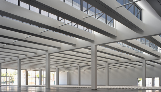
The Resnick Pavilion's jauntily sawtooth roofline fills the cavernous interior with abundant ambient light; © 2010 Museum Associates/LACMA

The Resnick Pavilion's jauntily sawtooth roofline fills the cavernous interior with abundant ambient light; © 2010 Museum Associates/LACMA
×In engaging potential museum visitors, you’re really well versed in engaging the urban context. Yet, in thinking about your work on Dia:Beacon and the Resnick, most people would say your interest really lies in creating containers for art.
This is a really rich issue. When we were proposing MASS MoCA, we were looking at existing models like Schaffhausen, the Dia warehouse, or Frank Gehry’s renovation of the police garage into the Temporary Contemporary (The Geffen at MoCA); we were thinking about art’s need for space. But in a 1990 article, Rosalind Krauss charged that MASS MoCA was spectacle – that its cavernous minimalism was the flip side of installation art and theatre and spectacle – [implying] that it was a step toward Bilbao for Thomas Krens.
Many would say I prefer to deal with reused buildings, or, since Renzo is modest, putting the art in front of the architecture. But I don’t think of it that way. You can’t say Bilbao is a spectacle and MASS MoCA or the Resinick isn’t. If we’re moving toward anything, we are getting beyond a simplistic approach to cultural buildings and beginning to understand them as solutions to problems and contexts.
Both building projects are part of LACMA's so-called 'Transformation' project. Another component of work was the installation of the streetlamp pageant Urban Light, by the artist Chris Burden; © 2008 Museum Associates/LACMA

Both building projects are part of LACMA's so-called 'Transformation' project. Another component of work was the installation of the streetlamp pageant Urban Light, by the artist Chris Burden; © 2008 Museum Associates/LACMA
×So spectacle is still important.
But you have to be playful with it. Let’s put it in practical terms in LA: in order to create civic identity, artistic identity, identity of place, you can’t do away with monuments. But you have to have self-examination built into the monument. 'Urban Light' functions extremely well that way. It’s monumental, it’s spectacular, it’s like a marquee, but it’s art instead of architecture – though it’s made of architectural elements, the streetlamps. It is a quasi-historic assembly of artifacts that’s clever, because in this totality the streetlamps resemble the temple facades of traditional East Coast museums. The LA streetscape, the palm trees, sunshine, the film-noir streetlamps – they’re all getting formalised into an architectonic entrance, even though it’s really immaterial. There’s no roof, there’s nothing there. In a post-spectacle age, you can’t confirm or deny spectacle; you have to fold criticism into it.
.....

