From a Great Height
Texto por Dominic Lutyens
London, Reino Unido
11.07.13
As ever-taller skyscrapers increasingly dominate the urban landscape, London-based architecture and design journalist Dominic Lutyens asks how designers can push the boundaries of interiors ever further upwards.
_
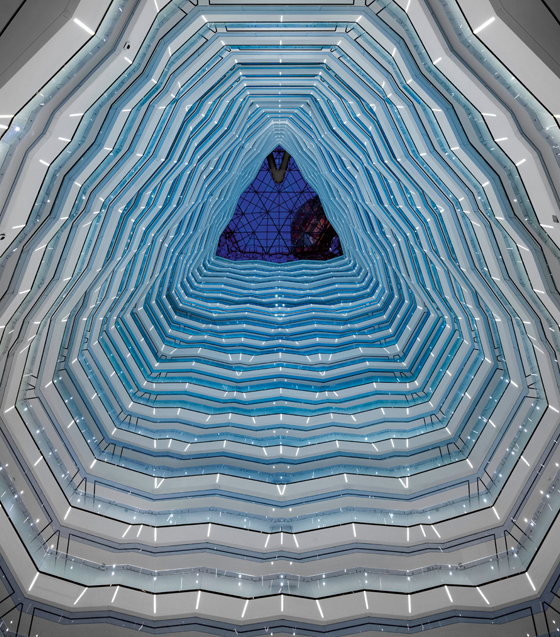
Four Seasons Hotel. Interior by Hirsch Bedner Associates. Location: Guangzhou International Financial Center (by Wilkinson Eyre Architects), Guangzhou; photo Will Pryce

Four Seasons Hotel. Interior by Hirsch Bedner Associates. Location: Guangzhou International Financial Center (by Wilkinson Eyre Architects), Guangzhou; photo Will Pryce
×Tall buildings traditionally provoke controversy: establishment figures poured scorn on the new Eiffel Tower, while the recently completed Shard was initially reviled, though its fans now outnumber the naysayers. In fact, opposing the rise of skyscraper architecture today seems as futile as King Canute trying to hold back the waves. The proposed Kingdom Tower in Jeddah, Saudi Arabia, due for completion in 2018, is projected to be at least 1km high – and taller than the 829.8m-high Burj Khalifa tower in Dubai, currently the world’s tallest building.
And skyscrapers are becoming more varied aesthetically, often more softly contoured and tapered as they rise: think the Shard, 30 St Mary Axe (aka The Gherkin) and the 103-storey Ghuangzhou International Finance Center, designed by Wilkinson Eyre, with interiors by international interior design firm Hirsch Bedner Associates (HBA).
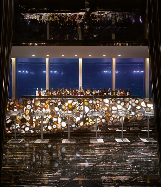
Four Seasons Hotel. Interior by Hirsch Bedner Associates. Location: Guangzhou International Financial Center (by Wilkinson Eyre Architects), Guangzhou; photo Will Pryce

Four Seasons Hotel. Interior by Hirsch Bedner Associates. Location: Guangzhou International Financial Center (by Wilkinson Eyre Architects), Guangzhou; photo Will Pryce
×Accompanying this proliferation of ‘supertalls’, as some call skyscrapers, is a skyrocketing demand for interior design for them. So to what extent does a high-rise building’s architecture determine the style of its interiors? There appear to be two main trends: on the one hand, interior designers strive to highlight the skyscraper’s structure and cohesively marry this with the interiors, on the other they make dramatic interventions in the interiors to enhance the high-octane glamour associated with being so high up without making much of a feature of the architecture. That said, all these designers share one goal: to maximise a skyscraper’s views.
Take Four Seasons Hotel Guangzhou, which occupies the top floors of the 103-storey Ghuangzhou International Financial Center, and makes a virtue of the tower’s fashionable diagrid structure (diagonal support columns creating a latticework of triangular forms also found in the Gherkin and New York’s Hearst Tower) and the way the building tapers as it rises. ‘Our objective was to create a harmony between the interior design and architecture because this building is so daring and bold,’ says Connie Puar of HBA in Singapore and the hotel’s main designer. The diamond-like triangular pattern on the building’s exterior is echoed in its interior, which features a spectacular, 30 floor-high, skylight-topped atrium that soars above the 70th-floor lobby. Taller than St Paul’s Cathedal, it’s lined with gigantic glass panels arranged at zigzagging angles that, says Puar, ‘echo the building’s fractal design’.
SushiSamba Restaurant. Interior by Shimon Bokovza (Samba Brands Management) and Cetra Ruddy. Location: Heron Tower (by Kohn Pedersen Fox Associates), London

SushiSamba Restaurant. Interior by Shimon Bokovza (Samba Brands Management) and Cetra Ruddy. Location: Heron Tower (by Kohn Pedersen Fox Associates), London
×With the tower narrowing as it rises, the support columns – left undisguised and so integral to the interior – intersect the floor plans at different points, making the latter all slightly different. Even so, one constant exists: in all the guest rooms, the bathrooms and beds are positioned to offer panoramic views of the Pearl River Delta beneath.
‘Designing a hotel that starts on the 70th floor dictated its interior design,’ says Puar. ‘The vista of Guangzhou determined our creative concept. In each bedroom, where an 8m-long by 3m-high wall of angled glass projects slightly outwards, HBA embraced the light and height. We moved furnishings away from the glass, inviting guests to move to the edge. From any floor, guests can look up and down the building and take in its diamond-like façade.’
For Chris Wilkinson, a director of Wilkinson Eyre, this meshing of the exterior and interior was highly desirable: ‘Four Seasons Guangzhou is successful because its architecture and interior design are intrinsically linked: the building’s distinctive diagrid structure isn’t hidden away but celebrated inside the hotel.’
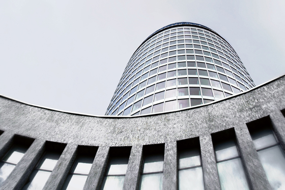
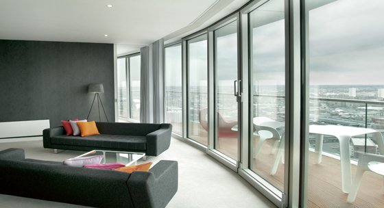
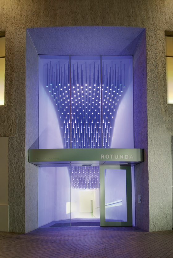
Rotunda, an office block converted into apartments by Glenn Howells Architects. Location: Birmingham

Rotunda, an office block converted into apartments by Glenn Howells Architects. Location: Birmingham
×The escalating height of skyscrapers is also affecting their interior design. ‘If you’re above around 500m high, all you see outside is sky, so designers now encourage people to move away from the core of the building and come right up to the windows,’ says Forth Bagley, a director at New York-based architects Kohn Pedersen Fox Associates, which designed CTF Guangzhou in China, a mixed-use, 116-storey skyscraper, and London’s 40-storey Heron Tower which houses hip restaurants Sushisamba and Duck & Waffle. ‘At CTF Guangzhou, we’ve done this by putting seating right up against the glass or creating more outdoor spaces.’
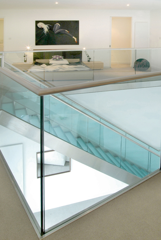
Outdoor spaces – specifically winter gardens incorporated into balconies enclosed by glass – are a feature of Rotunda, a 60s, Grade II-listed high-rise office block in Birmingham converted into apartments by Glenn Howells Architects. ‘These are sheltered from wind and rain,’ says Glenn Howells, the project’s architect. While an abundance of light is undoubtedly an attraction of high-rise living, it can be excessive, says Bernhard Karpf, an associate partner at New York architects Richard Meier & Partners, which designed the 34-storey Mikitah office tower, destined to open in Mexico City in 2014. ‘The biggest challenge in designing interiors of high-rise buildings is how to control natural light which is also solar energy,’ says Karpf. ‘Reducing solar energy by using darker glass reduces transparency and may mean increasing artificial lighting inside. Good design in high-rise buildings balances these conflicting issues.’
Rotunda, an office block converted into apartments by Glenn Howells Architects. Location: Birmingham

Rotunda, an office block converted into apartments by Glenn Howells Architects. Location: Birmingham
×He cites his firm’s project Coffee Plaza in Hamburg (HQ of Neumann Kaffee Gruppe, a collective group of coffee-growers, roasters and suppliers specialising in green coffee). ‘It has a computer-controlled shading system on the outside that tracks the sun’s path and opens and closes sun shades made of rotating glass panels. This eliminates direct sunlight in the offices – and maximises views. And this idea continues in the building, with glass partitions between offices bringing natural light deep inside.’
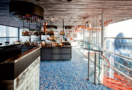
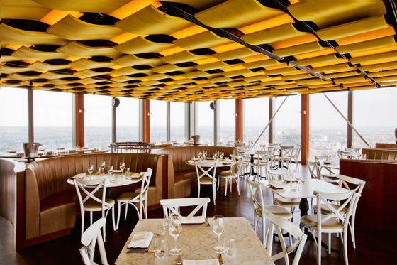
Some designers, however, don’t make a feature of a skyscraper’s architecture. Sushisamba and Duck & Waffle, designed by Shimon Bokovza, founder of Samba Brands Management, and New York architects Cetra Ruddy, boast stunning interiors, floor-to-ceiling windows and outdoor dining terraces. However, neither eaterie directly capitalises on the building’s architecture or its context. The ceiling of the dining room of Sushisamba, which specialises in a blend of Japanese and Brazilian cuisine, is concealed by a latticework of bamboo that references Japanese architect Shigeru Ban’s design Paper Arch, exhibited at New York’s Museum of Modern Art in New York in 2000. That said, Sushisamba nods to its skyscraper architecture via one of its features – an 8m-high orange sculpture of a tree on one terrace that was designed to symbolise the connection between earth and sky.
Duck & Waffle Restaurant. Interior by Shimon Bokovza (Samba Brands Management) and Cetra Ruddy. Location: Heron Tower (by Kohn Pedersen Fox Associates), London

Duck & Waffle Restaurant. Interior by Shimon Bokovza (Samba Brands Management) and Cetra Ruddy. Location: Heron Tower (by Kohn Pedersen Fox Associates), London
×Similarly, Four Seasons Guangzhou riffs on the idea of the sky with ‘watercolour-like, customised carpets evocative of skies,’ says Puar. ‘The idea is to make people feel like they’re living among the clouds.’ Conversely, a monumental bar fronted in stone in the hotel’s Kumoi restaurant and a bar encrusted with multicoloured agate in the Tian Bar consciously nod to the earth.
So far so ambitious, but with the skyscrapers trend firmly in the ascendant, designers are bound to experiment with their interiors more radically in years to come.
....
This article first appeared in Mix magazine, issue no. 32
