Lean On Me: wall-supported furniture and lighting
Texto por Dominic Lutyens
London, Reino Unido
18.02.14
We all need a little support sometimes. Behind the growing trend in furniture and lighting for wall-leaning or wall-mounted designs is a diversity of factors, among them the practical, the social and the aesthetic. Architonic gets up close and personal.
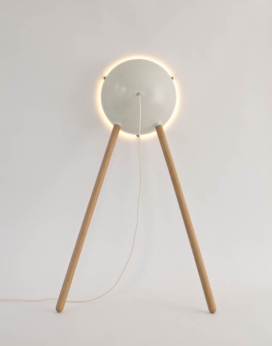
Daphna Laurens’s ‘Cirkel’ floor lamp is part of an eponymous collection designed for Paris’s Galerie Gosserez. Laurens imagines it, in anthropomorphic terms, penetrating the wall and looking on to the other side

Daphna Laurens’s ‘Cirkel’ floor lamp is part of an eponymous collection designed for Paris’s Galerie Gosserez. Laurens imagines it, in anthropomorphic terms, penetrating the wall and looking on to the other side
×Designers today are fascinated with furniture that interacts with walls. One conceit in particular captures their imagination: two-legged or even one-legged furniture and lighting that leans nonchalantly against walls. These pieces might look insouciantly casual, but there’s more to them than meets the eye.
Designers are in thrall to them partly because they’re generally pared-down and skeletal and so space-saving. What’s more, they’re flexible as they can be easily moved about. Their informality also appeals for its modernity. And these pieces are often dual-functional or multifunctional, making them even more space-saving. Some are even wall-hung.
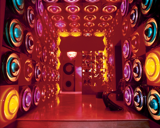
Verner Panton’s 1969, modular wall or ceiling panels, incorporating his ‘Spiegel Lamp’, give an architectural, space-defining importance to lighting; photo copyright Verner Panton Design

Verner Panton’s 1969, modular wall or ceiling panels, incorporating his ‘Spiegel Lamp’, give an architectural, space-defining importance to lighting; photo copyright Verner Panton Design
×There’s nothing new, of course, about wall-hung furniture: in the 19th-century homes of the Shakers in the United States, chairs and mirrors were hung, when not in use, on peg rails fixed to walls to maximise space and make it easier to sweep floors. The Shakers also favoured built-in furniture for being space-saving. More recently, designers Tom Loeser (in the 1980s) and Michael de Forest and Christy Oates (in the Noughties) have created wall-hung, 2D, abstract artworks which convert into furniture. These save space, and, significantly, blur the boundaries between design and fine art.
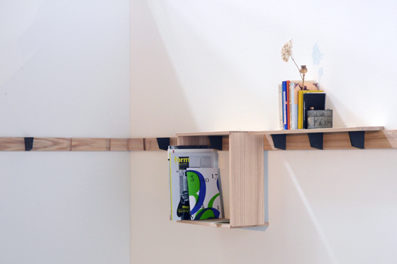
Christoph Goechnahts’s prize-winning, multifunctional ‘Ordnungshalber’ storage system pays homage to the 19th-century Shaker custom of wall-mounted peg rails

Christoph Goechnahts’s prize-winning, multifunctional ‘Ordnungshalber’ storage system pays homage to the 19th-century Shaker custom of wall-mounted peg rails
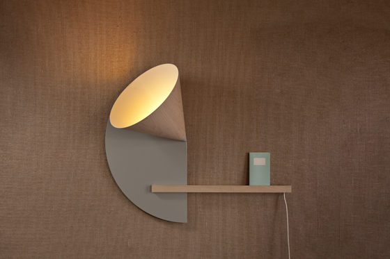
×This wall lamp-cum-shelf – from Daphna Laurens’s ‘Cirkel’ collection – is inspired by artist Laszlo Moholy-Nagy. Hugely influenced by art, Laurens prioritises form over function in her work

This wall lamp-cum-shelf – from Daphna Laurens’s ‘Cirkel’ collection – is inspired by artist Laszlo Moholy-Nagy. Hugely influenced by art, Laurens prioritises form over function in her work
×The Shaker approach to design is influential today. Swiss designer Christoph Goechnahts recently designed his wall-mounted, multifunctional ‘Ordnungshalber’ storage system, a reinterpretation of the Shakers’ peg rails, which skirts round an entire room. A wooden rail with hooks doubling as brackets to support shelves, it won first prize in the D3 Contest at imm cologne this year. ‘You can hang posters from it, and it provides space for clothes, books and ornaments,’ he says. ‘It’s a home for everything.’¨
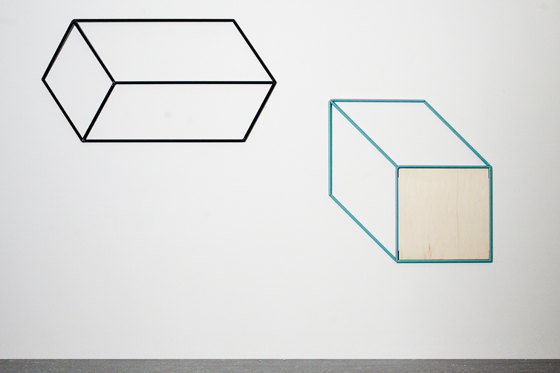
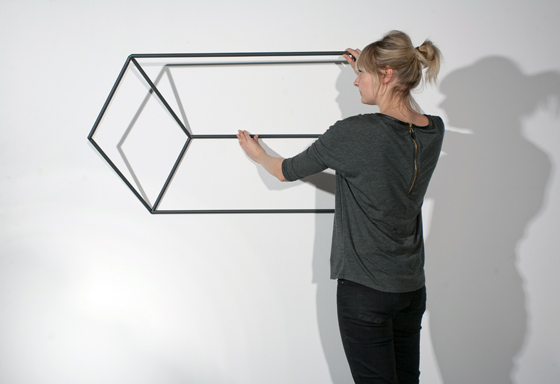
Ostensibly 2D, German designer Tina Schmid’s wall-mounted, cuboid forms pull out from the wall to create highly original, 3D clothes rails

Ostensibly 2D, German designer Tina Schmid’s wall-mounted, cuboid forms pull out from the wall to create highly original, 3D clothes rails
×Designers who create pieces that lean against walls also like to play on the tension between their stability and precariousness. (While walls support these pieces, the latter look unstable compared with their more conventional, four-legged counterparts.) Some designers even embrace the fact that this instability slightly compromises the pieces’ functionality, producing furniture that straddles design and fine art. Designers are also drawn to the surreal look created by furniture that leans against walls, appearing to penetrate them like a ghost.
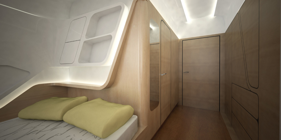
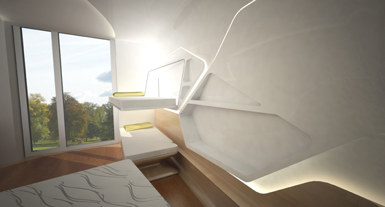
Architect Zaha Hadid gives equal attention to walls, floors and ceilings, often blurring the boundaries between them, as evident in her design for this apartment in a Ronald McDonald charity house in Germany, which opens in summer 2014

Architect Zaha Hadid gives equal attention to walls, floors and ceilings, often blurring the boundaries between them, as evident in her design for this apartment in a Ronald McDonald charity house in Germany, which opens in summer 2014
×Moreover, some designers and architects are bent on reinterpreting the function and aesthetic of walls and on incorporating space-saving, built-in furniture into interiors. The latter also has a long history, stretching back to the built-in settles of the Middle Ages and later to Austrian architect Margarete Schütte-Lihotzky’s ‘Frankfurt Kitchen’, designed in 1926 for the New Frankfurt social housing project in Germany. Compact and space-saving, it’s widely considered to be the forerunner of modern fitted kitchens.
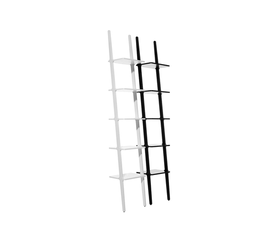
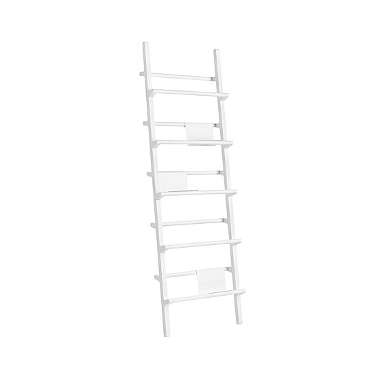
Swedese’s ladder-like ‘Libri’ shelving unit in ash with a black or white finish is highly versatile: it can be combined with any number of others to provide more shelves

Swedese’s ladder-like ‘Libri’ shelving unit in ash with a black or white finish is highly versatile: it can be combined with any number of others to provide more shelves
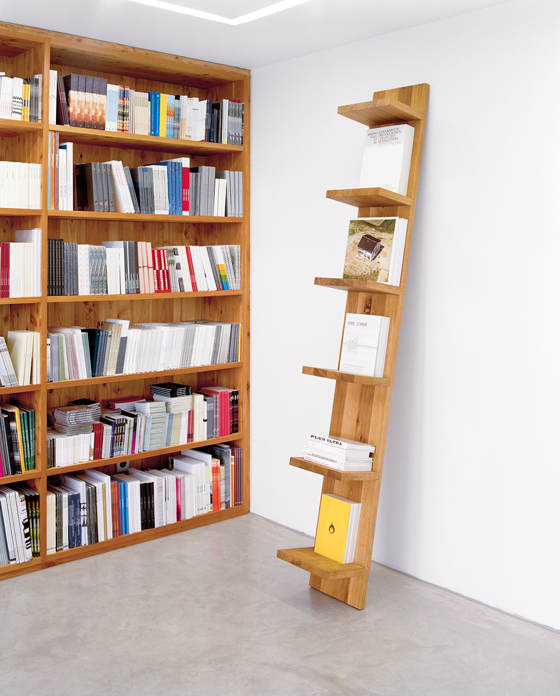
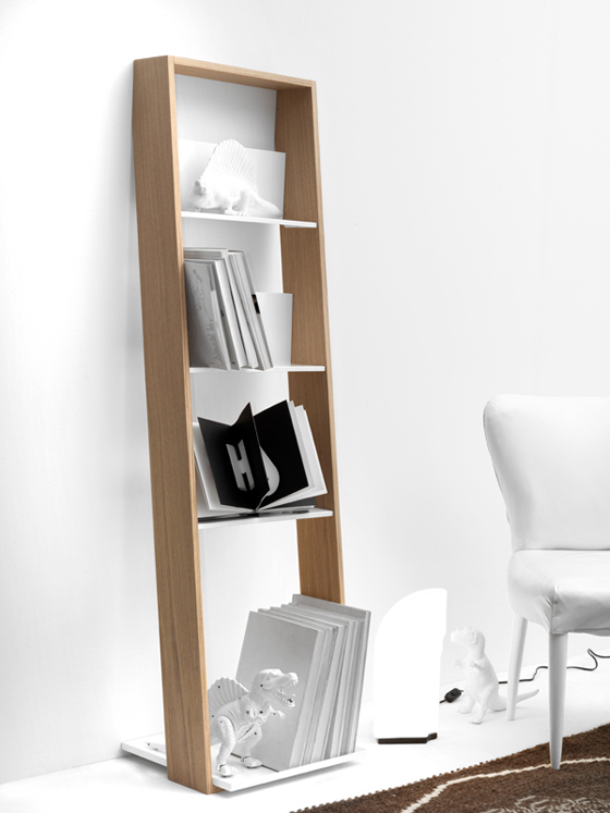
×German firm e15’s ‘Mate’ bookcase is all the more informal for being made of rugged-looking wood. ‘Leant against the wall, it’s a modern solution for shelving in any environment,’ says e15’s co-founder Philipp Mainzer

German firm e15’s ‘Mate’ bookcase is all the more informal for being made of rugged-looking wood. ‘Leant against the wall, it’s a modern solution for shelving in any environment,’ says e15’s co-founder Philipp Mainzer
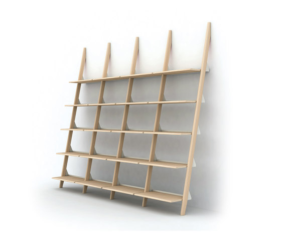
×Magis’s Tom & Jerry easy-to-assemble, flat-pack shelving system with height-adjustable shelves, designed by Konstantin Grcic, comprises simple wooden poles that can be added to in order to enlarge it

Magis’s Tom & Jerry easy-to-assemble, flat-pack shelving system with height-adjustable shelves, designed by Konstantin Grcic, comprises simple wooden poles that can be added to in order to enlarge it
×Today, Zaha Hadid is renowned for breaking with classical, conventional architecture and rejecting right-angled walls, floors and ceilings in favour of voluptuously curvaceous, freewheeling planes. She also sometimes incorporates built-in furniture into her projects, for example in her recently designed apartment for the new Ronald McDonald charity house in Hamburg, which will accommodate relatives of seriously ill children who are in hospital nearby. Its wooden floor curves upwards to form the lower part of the walls, thereby collapsing the boundaries between them. The walls incorporate built-in furniture like those in a ship’s cabin — including a cantilevered bed — rendering the interior more streamlined and space-saving.
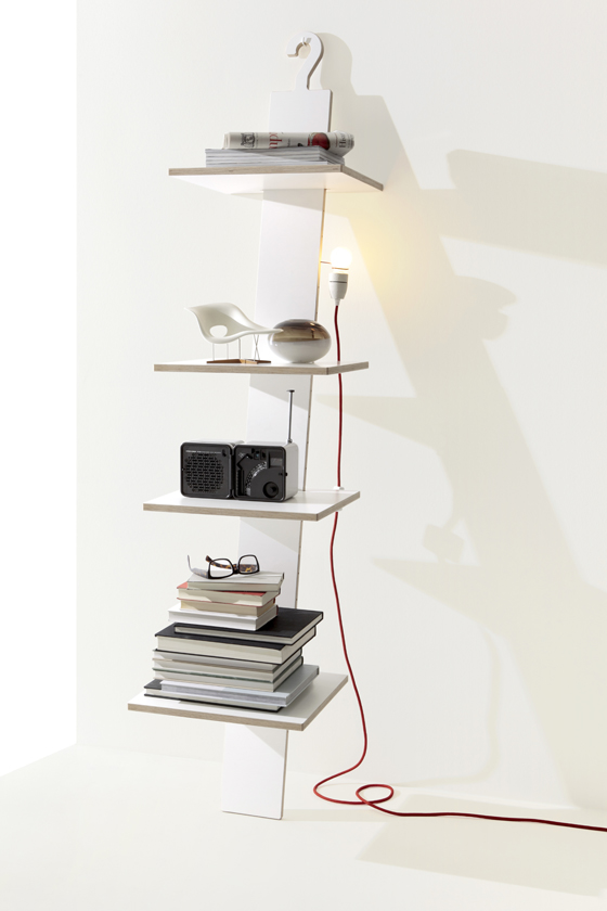
German designer Moritz Putzier’s Hangup storage unit for manufacturer Müller Möbelwerkstätten is metaphorically and literally laid-back. Only one screw is needed to support its coathanger-like hook

German designer Moritz Putzier’s Hangup storage unit for manufacturer Müller Möbelwerkstätten is metaphorically and literally laid-back. Only one screw is needed to support its coathanger-like hook
×Designer Mikko Halonen created this easy-to-assemble, versatile ‘Verso’ storage unit for Finnish manufacturer One Nordic — handy for storing books, magazines, clothes and myriad other items

Designer Mikko Halonen created this easy-to-assemble, versatile ‘Verso’ storage unit for Finnish manufacturer One Nordic — handy for storing books, magazines, clothes and myriad other items
×A seminal example of wall-mounted lighting — we’re not talking delicate wall sconces here — is Verner Panton’s modular ‘Spiegel Lamp’ of 1969. This comprises a crimson, magenta or yellow wall or ceiling panel – to which others can be added ad infinitum – that incorporates hollows containing light bulbs. Fronted with hemispherical shades, these cast an indirect, ambient light.
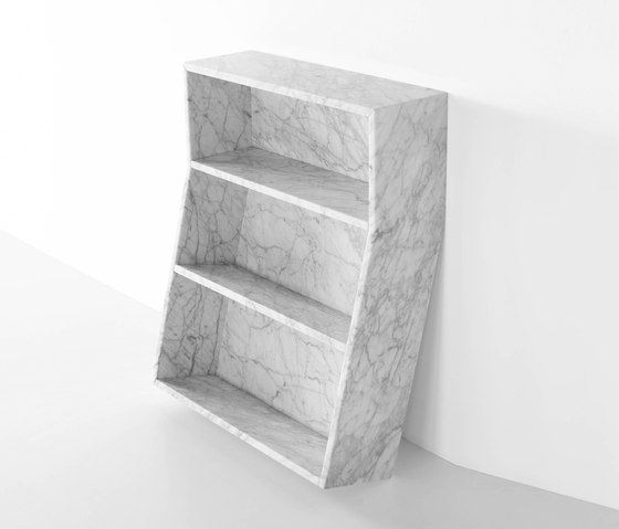
Thomas Sandell’s ‘Melt Tilt Tiltino’ shelving unit for Marsotto Edizioni plays on the contrast between formality – made as it is of marble – and informality since it leans against the wall

Thomas Sandell’s ‘Melt Tilt Tiltino’ shelving unit for Marsotto Edizioni plays on the contrast between formality – made as it is of marble – and informality since it leans against the wall
×Alex Bradley’s ‘Storage Lean’ unit for Ex.t has removable trays used to stash or display objects. Gravity helpfully plays a part in this leaning piece — there’s no need for screws to secure the shelves

Alex Bradley’s ‘Storage Lean’ unit for Ex.t has removable trays used to stash or display objects. Gravity helpfully plays a part in this leaning piece — there’s no need for screws to secure the shelves
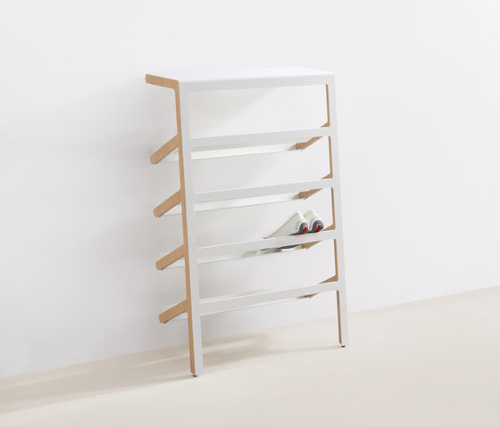
×Yuniic Design’s ‘Mila’ console for Mox serves as a visually tidy shoe stand – facing the wall on sloping shelves, the shoes are partly concealed – while a top shelf is useful for storing other items

Yuniic Design’s ‘Mila’ console for Mox serves as a visually tidy shoe stand – facing the wall on sloping shelves, the shoes are partly concealed – while a top shelf is useful for storing other items
×A simpler variation on this is Dutch designer Daphna Laurens’s two-legged, wall-hugging ‘Cirkel’ floor lamp of 2011, inspired by the Bauhaus and its penchant for simple, geometric forms. Surreally facing the wall, its circular shade emits an eclipse-like halo of light. Considering form more important than function, her intention, she says, is for the lamp to resemble an ‘art piece’ when switched off.
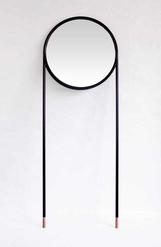
One of La Mamba’s easily moveable mirrors leans casually against the wall. ‘The idea is you can move it to wherever you want, whenever you want,’ say its designers

One of La Mamba’s easily moveable mirrors leans casually against the wall. ‘The idea is you can move it to wherever you want, whenever you want,’ say its designers
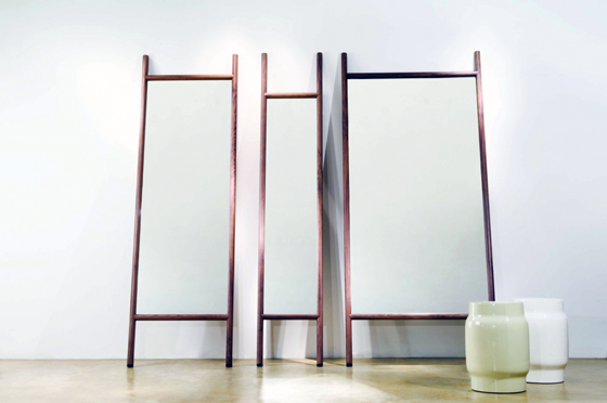
×Chinese studio Neri & Hu’s ‘Extend’ mirrors – manufactured by De La Espada – are inspired by multifunctional, bamboo ladders once common in Chinese homes and used to hang anything from clothes to tools

Chinese studio Neri & Hu’s ‘Extend’ mirrors – manufactured by De La Espada – are inspired by multifunctional, bamboo ladders once common in Chinese homes and used to hang anything from clothes to tools
×Mirrors are another manifestation of the trend for design that leans against walls. It’s hardly surprising since people often prop full-length ones against walls rather than hang them up. Take Spanish company La Mamba’s super-elegant mirrors designed in 2011 for the brand Omelette-ed, which lean against the wall on tubular, scratch-proof legs tipped with cork.
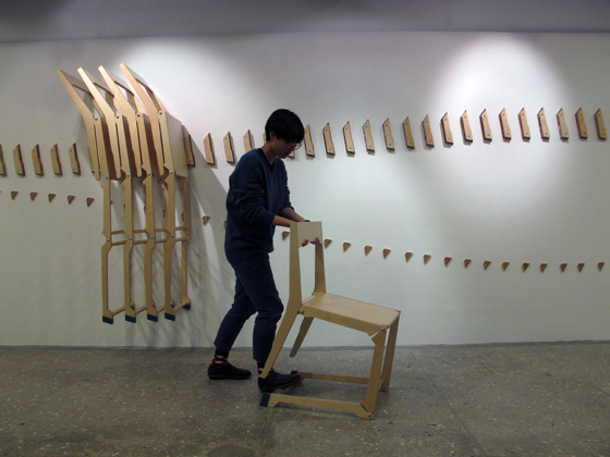
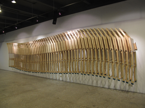
Designed for an auditorium in Taipei-based bookshop and events space libLAB, Pilot:Wave’s 60 collapsible ‘L22’ chairs are wall-hung when not in use, forming a vertebrae-like pattern doubling as an ‘art installation’

Designed for an auditorium in Taipei-based bookshop and events space libLAB, Pilot:Wave’s 60 collapsible ‘L22’ chairs are wall-hung when not in use, forming a vertebrae-like pattern doubling as an ‘art installation’
×In the US, design studio Pilot:Wave has created its folding, birch-ply ‘L22’ chairs for an auditorium in libLAB, a bookshop and events venue in Taipei. These are wall-hung when not in use to save space – Shaker-style – and, again, are perceived as art. ‘This storage system serves as an art installation when the chairs are hung on the wall, appearing to dance along it in a gentle curve,’ say its designers Matthew Burke and Kyle Kennedy.
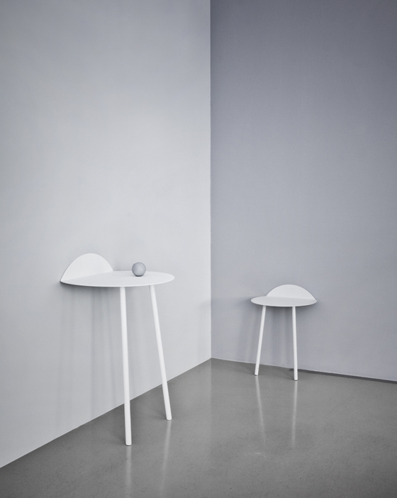
Taipei-based Kenyon Yeh’s powder-coated steel ‘Yeh’ console for manufacturer Menu. ‘It’s perfect to rest books, flowerpots, lamps or your afternoon coffee on,’ he says. ‘Use it in your hall or as a bedside table’

Taipei-based Kenyon Yeh’s powder-coated steel ‘Yeh’ console for manufacturer Menu. ‘It’s perfect to rest books, flowerpots, lamps or your afternoon coffee on,’ he says. ‘Use it in your hall or as a bedside table’
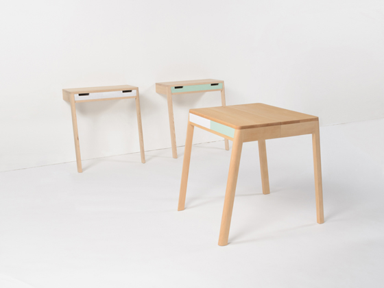
×Some wall-hugging furniture even comes with a narrative: Yuki Matsumoto’s ‘Lovebird’ consoles are conceived as being owned by two singletons who, on pairing up and cohabiting, join them to create their dining table

Some wall-hugging furniture even comes with a narrative: Yuki Matsumoto’s ‘Lovebird’ consoles are conceived as being owned by two singletons who, on pairing up and cohabiting, join them to create their dining table
×Similarly space-saving are Japanese designer Yuki Matsumoto’s two-legged ‘Lovebird’ consoles. These can either lean against the wall or be joined to create a table. As their name suggests, their design is symbolic: ‘Before marrying, a man and a woman each have a half-table in their homes,’ says Matsumoto. ‘When married and living together, the couple amalgamate their half-tables – previously used to put a laptop on or store mementoes like photos in its drawer – to make a dining table.’
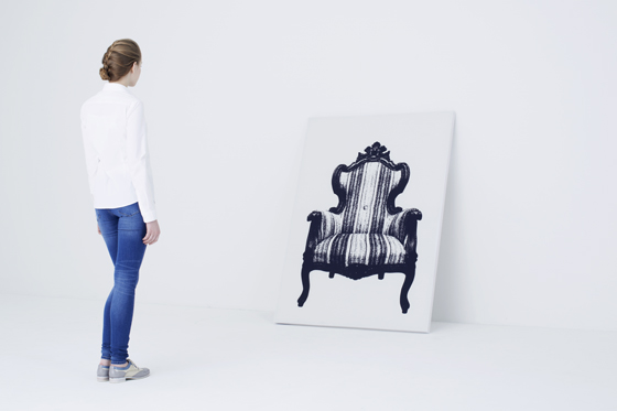
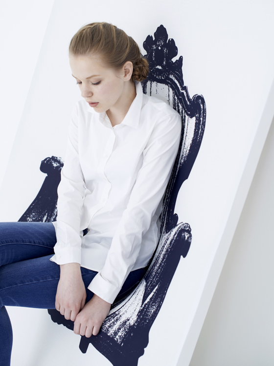
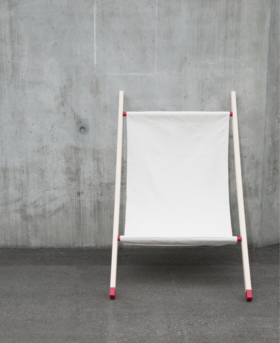
Yoy’s ‘Canvas’ chair (top and middle) for Innermost moves from 2D to an actual seat; strong, stretched canvas allows users to perch on its trompe-l’oeil armchair. Swiss studio Bernhard Burkard’s wall-leaning, but stable, ‘Curt’ chair (above)

Yoy’s ‘Canvas’ chair (top and middle) for Innermost moves from 2D to an actual seat; strong, stretched canvas allows users to perch on its trompe-l’oeil armchair. Swiss studio Bernhard Burkard’s wall-leaning, but stable, ‘Curt’ chair (above)
×Also hailing from Japan is art and design studio Yoy’s ‘Canvas’ chair, manufactured by UK brand Innermost. This highly elastic rectangular canvas, which rests against walls, bears a trompe-l’oeil image of an ornate chair or sofa, on whose seat you can actually sit.
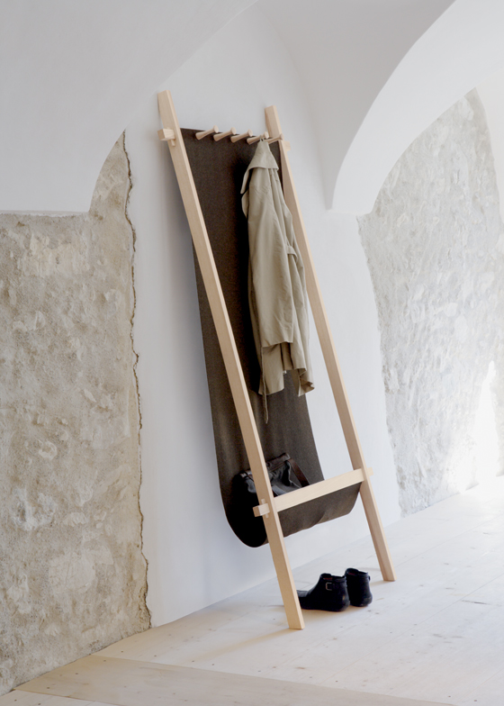
Some designers, meanwhile, are creating informal wardrobes that lean against walls. Witness German firm Nils Holger Moormann’s ‘Lodelei’ coat stand. Fixed to the upper part of its ash frame are coathooks and a deckchair-like rectangle of cloth with a pouch at its base where other items can be stored. Its designers Martin Pärn and Edina Dufala-Pärn took inspiration from the low-tech informality of ‘adhoc coat hangers on building sites made of planks of wood and nails’.
Inspired by an improvised coat stand on a building site, Nils Holger Moormann’s ‘Lodelei’ coat stand reflects a desire among many designers and manufacturers to create super-informal storage; photo Jäger & Jäger

Inspired by an improvised coat stand on a building site, Nils Holger Moormann’s ‘Lodelei’ coat stand reflects a desire among many designers and manufacturers to create super-informal storage; photo Jäger & Jäger
×Alexander Schenk’s understated, MDF ‘Platz’ shelving unit for Tojo Möbel leans against the wall yet is stable. It stores six pairs of shoes or a mix of other items

Alexander Schenk’s understated, MDF ‘Platz’ shelving unit for Tojo Möbel leans against the wall yet is stable. It stores six pairs of shoes or a mix of other items
×Another slant on the trend is the leaning bookcase. One example is Swedese’s ladder-like ‘Libri’, which either stands as a solitary shelving unit or can be combined with others to create bigger, free-standing bookshelves or a room divider.
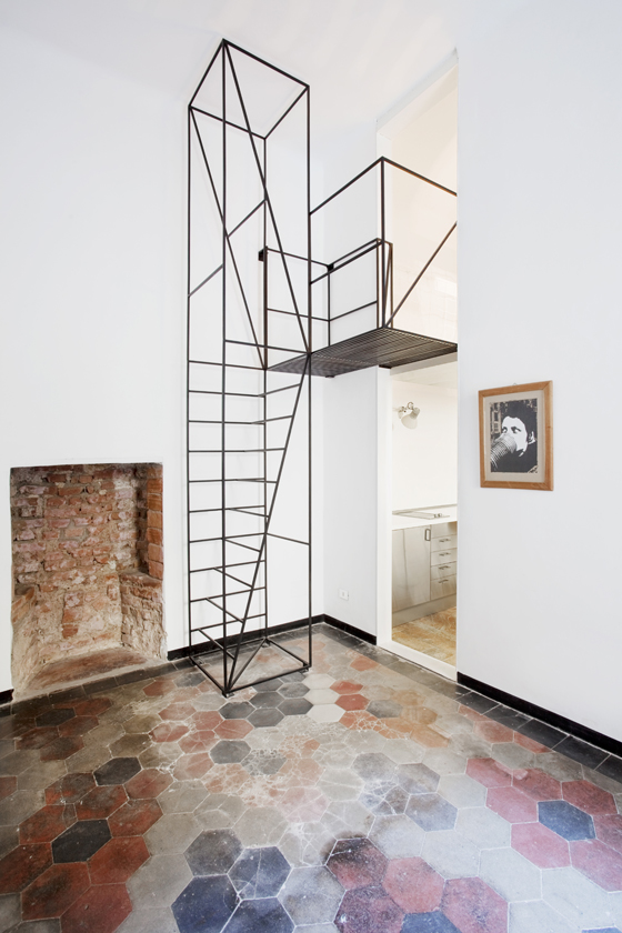
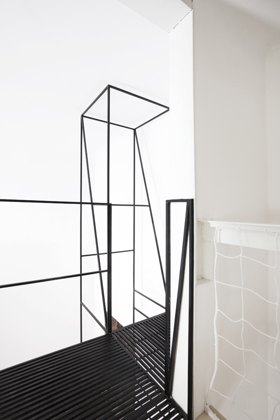
For architects, walls provide the necessary support for many of their interventions. Italian architect Francesco Librizzi, for one, has created a skeletal staircase in a tall, narrow house, which ascends to a new bedroom on a mezzanine level. At this point, the staircase, which is attached to the floor and a wall, forms a solid platform.
Supported by the walls and floor, Francesco Librizzi’s staircase in this narrow, 1900 house leads to a new bedroom on a mezzanine level, creating an extra floor and much-needed additional room

Supported by the walls and floor, Francesco Librizzi’s staircase in this narrow, 1900 house leads to a new bedroom on a mezzanine level, creating an extra floor and much-needed additional room
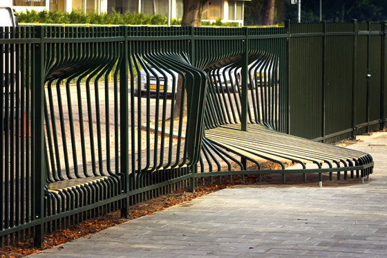
×Finally, in two projects by Dutch practice Remy & Veenhuizen, walls fluidly morph into seating platforms or benches. The first, ‘Social Fence’, situated in a park, features a metal fence whose rails slope back at intervals to create backrests for benches. The walls of the second, called ‘Clubhouse’, a slatted-wood structure for public use, metamorphose into seating platforms.
In short, architects and designers are satisfying their leanings for informality with work that bypasses conventions. And, thanks to their pared-down, economical aesthetic, they’re doing it with the lightest touch.
Walls cleverly morph into benches in Remy & Veenhuizen’s Social Fence (top). In another of its projects, Clubhouse (above), some walls peel away to form seating platforms, echoing Zaha Hadid’s habit of conflating vertical and horizontal planes

Walls cleverly morph into benches in Remy & Veenhuizen’s Social Fence (top). In another of its projects, Clubhouse (above), some walls peel away to form seating platforms, echoing Zaha Hadid’s habit of conflating vertical and horizontal planes
×