Picture This: new cinema architecture
Texto por Dominic Lutyens
London, Reino Unido
22.04.17
In the age of the ubiquitous multiplex, a raft of recent cinema projects have chosen to write their own architectural script, eschewing the mainstream in favour of indie creativity.
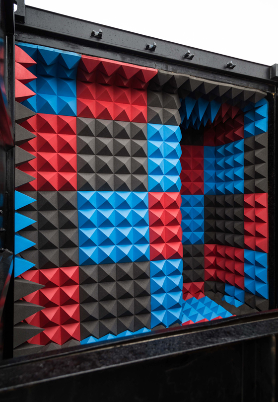
Scott Whitby Studio’s Caution Cinema might be housed inside an unassuming shipping container but its interior is dramatic, lined as it is with 1,000 foam pyramids in cobalt blue, hot pink and black. Photo: Osman Marfo-Gyasi

Scott Whitby Studio’s Caution Cinema might be housed inside an unassuming shipping container but its interior is dramatic, lined as it is with 1,000 foam pyramids in cobalt blue, hot pink and black. Photo: Osman Marfo-Gyasi
×If the cinemas of yesteryear were glamorous buildings whose flamboyant styles enhanced the excitement of going to the pictures – think the Beaux-Arts architecture of the Edwardian era or the Art Deco splendour of 1930s odeons – the multiplexes that have thrived since the 1960s have often been soulless structures. But the refurbishment since the 1990s of many independent movie-houses – a classic one being London’s Electric – has seen contemporary cinema architecture flourish.
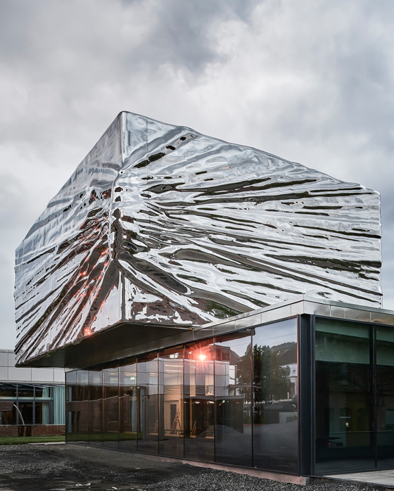
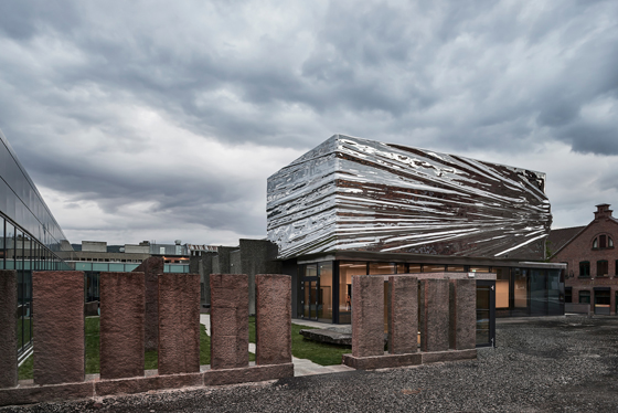
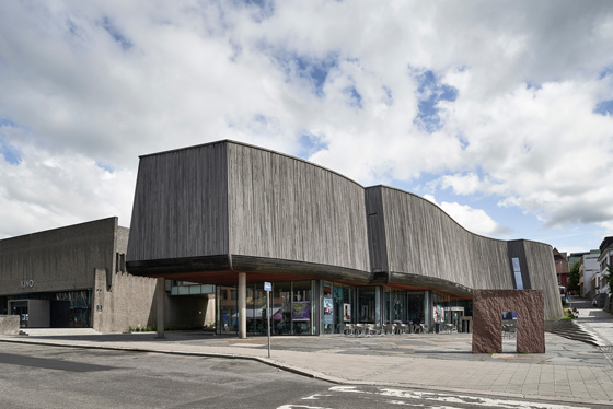
Whereas cinemas once conformed to fashionable styles of the day, architects are now being increasingly experimental when designing them. One particularly arresting example is Snøhetta’s extension of Norway’s Lillehammer Art Museum and Lillehammer Cinema, originally designed in 1964 by Erling Viksjø. It boasts a new cantilevered, stainless-steel façade, reminiscent of a building wrapped by the artist Christo (although its inspiration is a shooting star). Designed by the late artist Bård Breivik, this crowns the glass-fronted ground floor.
Snøhetta’s new extension to the Lillehammer Art Museum and Cinema boasts a polished stainless-steel box designed by the late Norwegian artist Bård Breivik. The project incorporates two cinemas as well as a gallery. Photos: Mark Syke

Snøhetta’s new extension to the Lillehammer Art Museum and Cinema boasts a polished stainless-steel box designed by the late Norwegian artist Bård Breivik. The project incorporates two cinemas as well as a gallery. Photos: Mark Syke
×Snøhetta had already created an extension for the building in 1994, and the new, recently completed addition, which adjoins it, houses two new cinemas and more gallery space. The challenge for Snøhetta was to link these disparate elements, including a garden in between the buildings (also created by Breivik). One way that this has been achieved has been by renovating its circulation spaces.
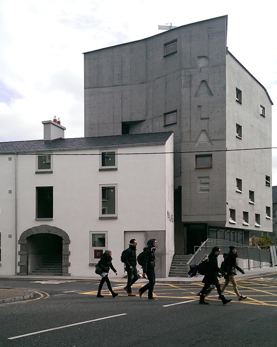
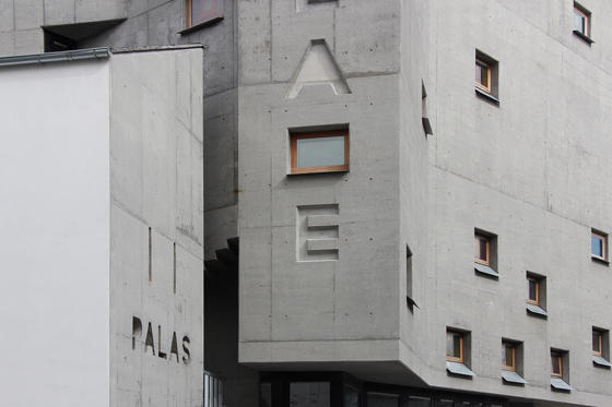
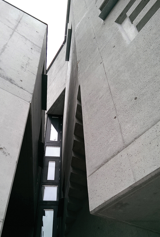
Picture Palace in Galway juxtaposes old and new architecture. Visitors enter via an archway leading into a former Georgian merchant’s house, while the cinema occupies a new concrete edifice behind it. Photos: Anna Hofheinz (1,3), Peter Maybury (2)

Picture Palace in Galway juxtaposes old and new architecture. Visitors enter via an archway leading into a former Georgian merchant’s house, while the cinema occupies a new concrete edifice behind it. Photos: Anna Hofheinz (1,3), Peter Maybury (2)
×A striking new façade is also the main attraction of the Picture Palace Galway in Ireland, which marries the austere with the expressive. Designed by dePaor Architects, the project mixes old and new elements: the cinema’s entrance is via a Georgian merchant’s house, which now houses the foyer and ticket office. The latter leads to a tearoom, then to a first-floor bar and to two cinemas on the second and third floors. The largest, 276-seater cinema is in the basement.
Mitigating the brutalist aesthetic of the building’s concrete façade are windows punctuating it in an apparently haphazard fashion, while carved out of it are the project’s name in English and Irish (‘Palace’ and ‘Palas’) in a contemporary-looking, chunky typeface. Inside, warmer materials are used, such as plush red fabrics in the cinema and wood in the bar.
Caution Cinema screens films that demonstrate potentially life-saving health and safety procedures to Britain’s port workers. Foam-lined walls soundproof it against loud noises. Photos: Osman Marfo-Gyasi

Caution Cinema screens films that demonstrate potentially life-saving health and safety procedures to Britain’s port workers. Foam-lined walls soundproof it against loud noises. Photos: Osman Marfo-Gyasi
×Seen from the outside, Scott Whitby Studio’s Caution Cinema – a mobile screening room where Britain’s port workers can be taught life-saving health and safety procedures – appears more utilitarian, housed as it is within a shipping container. Yet its interior is anything but ordinary: it’s lined with 1,000 foam pyramids in electric blue and fuchsia pink (an effect that recalls Danish designer Verner Panton’s futuristic, 1960s interiors). Although spiky-looking, the spongy walls create a surprisingly comfortable environment and soundproof the room.
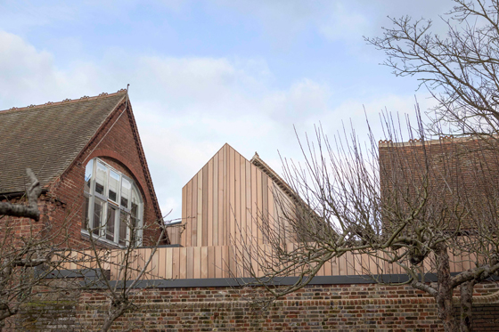
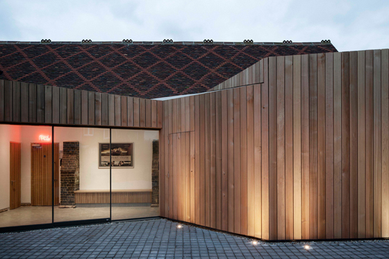
At The Kino, traditional materials in both its Victorian buildings and contemporary extensions help to unify their contrasting architectural styles. Photos: Oliver Perrott

At The Kino, traditional materials in both its Victorian buildings and contemporary extensions help to unify their contrasting architectural styles. Photos: Oliver Perrott
×More understated still in terms of its external appearance is Jonathan Dunn Architects’ transformation of a Victorian school in Rye in the UK into a two-screen cinema and arts centre called Kino Digital. The architects have added extensions clad in red cedarwood, which connect the two auditoria. These harmonise with the existing building since one incorporates a pitched roof which echoes that of the former school. Moreover, the cedarwood is in a warm tone similar to the red bricks of the Victorian building.
Jonathan Dunn Architects’ relatively subtle architectural interventions widen the repertoire of cinema architecture, demonstrating that understatement can be as appealing as the showier styles of movie-houses of old.
© Architonic

