Dutch Architecture
Texto por Eleonora Usseglio Prinsi
18.04.17
Esta página ha sido archivada y ya no se actualiza
For decades a test bed for bold, experimental projects, the Netherlands continues to function as an architecturally compelling landscape – both in terms of design practice and consumption.
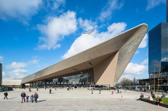
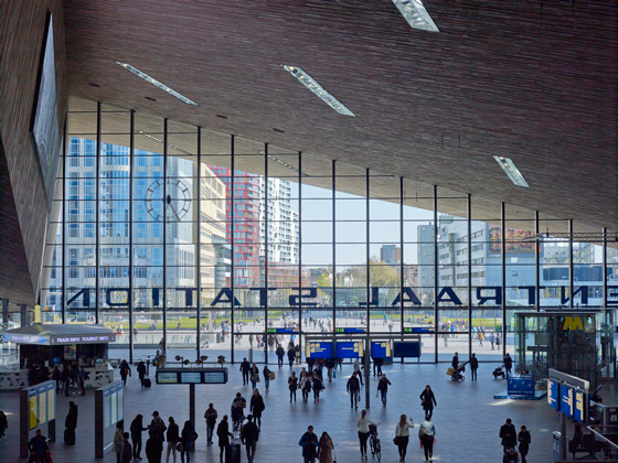
West 8 in collaboration with Benthem Crouwel Architects and MVSA, Rotterdam Central Station
As the new Mecca for Europe´s architects, the Netherlands has become a must-see playground for architecture addicts. Ever since the 1990s when the landscape design firm West 8 developed Borneo Sporenburg, the third extension of Amsterdam’s Eastern Docklands project, Dutch architecture and urban planning strategies have become a world-recognised reference. Almost 60 architects contributed to this urban project in the capital city of the Netherlands. Borneo Sporenburg is characterised by three bridges, which connect the different neighbourhoods on the peninsulas. West 8 reinvented the patio house to maximise outdoor space.
Contemporary Dutch architecture maintains strong roots in the vanguard arts and architecture movement from the 1920s. The avant-garde designs of De Stijl and Theo van Doesburg, together with the work of Piet Mondrian, inspired new ways of connecting indoor and outdoor spaces and creating volumes and geometries that blend into the urban fabric.
West 8 in collaboration with Benthem Crouwel Architects and MVSA, Rotterdam Central Station
Internalised architecture
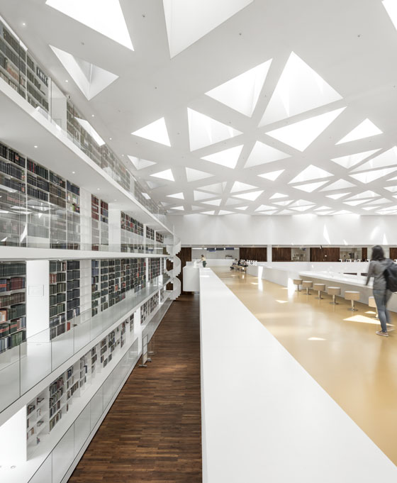
The Kaan Architecten-designed Education Center at Erasmus MC in Rotterdam impresses with its ability to visually expand the space through the use of light, shapes and furniture that is perfectly proportioned for the space. Rather than place the programmes for different medical disciplines on separate, adjacent wings, the centre brings all of them together in one central square. In its renovation and extension of the Education Center, Kaan Architecten included many structural elements from the academic hospital designed by Arie Hagoort and Jean Prouvé.
Walking around the public park in Assen, the new Drents Museum extension is barely perceptible. The sinuous landscape is in fact the green roof of the hidden museum designed by Erick van Egeraat. The new underground wing is directly connected to the old building, which has become the museum´s main entrance. The contemporary look of the new, all-white gallery creates a conversation with the old structure without interfering with it. A spectacular glass plinth brings you down into the new wing, which is marked by its strong, sculptural interior design.
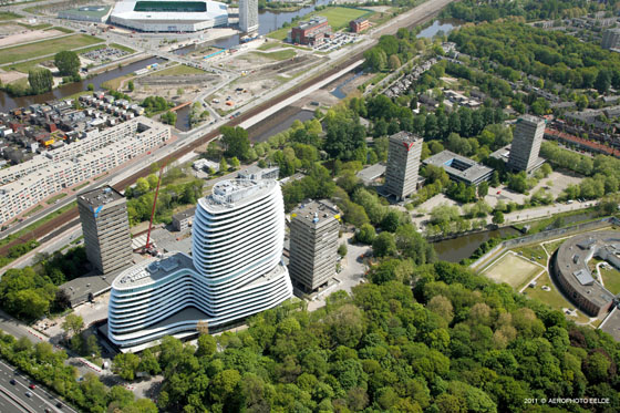
UNStudio, Groningen Education Executive Agency and Tax Office
Unconventional housing
Amsterdam’s Het Kasteel is definitely not a conventional, predictable housing block. The apartment complex designed by Studioninedots resembles an office building with its homogeneous, glassy exterior and impersonal aesthetic. The project’s strong point is its ability to manage external conditions, namely the noise pollution resulting from the building’s proximity to a rail yard. Studioninedots devised a smart technological solution whereby each panel sits at a different angle to reflect light and noise in different directions.
Urban integration
Ever since it was selected for the Borneo Sporenburg development project, West 8 has become one of the most well-known landscape architecture firms in Europe with a long list of outstanding international projects to its name. The firm’s most recent accomplishment is Rotterdam Central Station, designed in collaboration with Benthem Crouwel Architects and MVSA. The team opted for two different solutions in order to integrate the station into the urban fabric. The north side features a modest entrance design that gradually connects the station to the city. In contrast, the grand entrance on the city side is clearly the gateway to the high-rise urban centre.
Rethinking institutions
The Groningen Education Executive Agency and Tax Office building designed by UNStudio stands at a curvy 92 meters tall. UNStudio aimed to create a structure that would be accessible and would welcome people rather than giving the appearance of a powerful, inaccessible stronghold. The focus of the project became the way that people would move about the space and the relationship between the interiors and the lush landscape outside. “The office spaces are designed in such a way that they don’t create simple linear corridors leading to dead ends. Instead, each corridor is a route that introduces a kind of landscape into the building,” explains UNStudio founder Ben van Berkel.
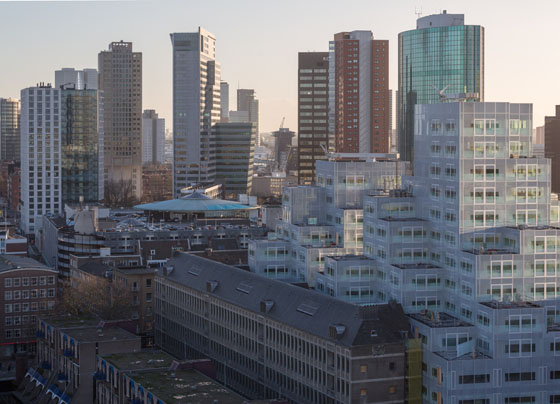
Timmerhuis resembles a huge Tetris block. The mixed-use building designed by OMA to house Rotterdam’s municipal offices and Museum Rotterdam blends in seamlessly with the surrounding neighbourhood of Laurenskwartier. Lightening its bulky volume is a translucent facade that has been recognised as the most sustainable facade in all the Netherlands. Timmerhuis’ cantilevered steel structure allows for uninterrupted public space on the ground floor, which is home to the museum as well as a large public walkway.
Mecanoo, Kaap Skil Maritime and Beachcombers Museum
Fun with shapes
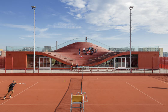
Colours and catchy shapes are among MVRDV's signature architectural elements. The firm designs playful architecture as a way to attract people and create a sense of community. In the case of The Couch, a new tennis club house, the resulting building works as a central gathering place “where the building becomes part of the community, like a piece of outdoor furniture.” The giant red couch overlooks the tennis courts while its wide glass façade on the north side brings in abundant natural light and offers views out over the IJ-lake.
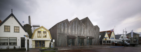
The wooden façade of the Kaap Skil Maritime and Beachcombers Museum, designed by Mecanoo, is a good example of materials recycling and playful design. The building takes its inspiration from the natural rhythm of the surrounding rooftops. Located on Texel Island in the Wadden Sea, the museum building looks strong and ephemeral at the same time. On one side, vertical wooden boards integrate the building into the aesthetic of the small village. On the other side, the glass facade allows light to pass through the building, imbuing the whole structure with a sense of lightness.
A selection by Eleonora Usseglio Prinsi.
