Architonic stories of the year 2023: Projects
Texto por James Wormald
12.12.23
These most popular project-referencing stories from Architonic’s magazine feature micro-offices, playful bathrooms and nature-set spas as well as examples of how to successfully create facade-inspired surfaces and timeless interiors.
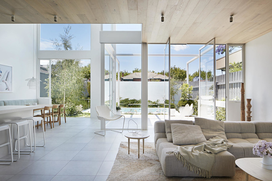
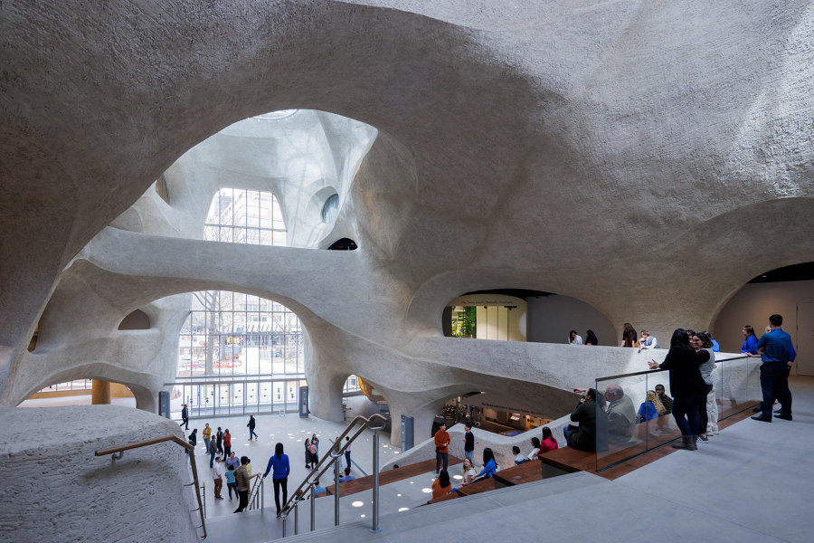
One of the most-read stories published in the Architonic magazine section in 2023, was an article that marks out six of the biggest contemporary design elements for interiors. Photo: Shannon McGrath

One of the most-read stories published in the Architonic magazine section in 2023, was an article that marks out six of the biggest contemporary design elements for interiors. Photo: Shannon McGrath
×Over the past year, one of the major focuses when designing interior and environmental spaces has been on mindfulness and wellbeing. But while mindfulness used to be – and often still is – characterised by clean, minimalist spaces and calmingly neutral colour palettes, professional architects and designers have also been recognising the value of durability in design trends, the importance of inviting nature and greenery inside as well as retaining it outside and the positivity of individualism – how making colour and material choices that better reflect our individual personalities – has the power to bring joy and whimsy to the everyday.
As this list of the most popular project-referencing stories published in the Architonic magazine in 2023 shows, creating long-term spaces that we can continue to use and enjoy long into an uncertain future, has been at the top of everyone’s list.
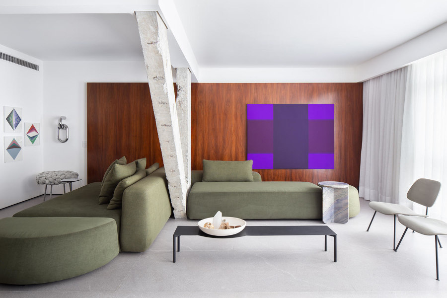
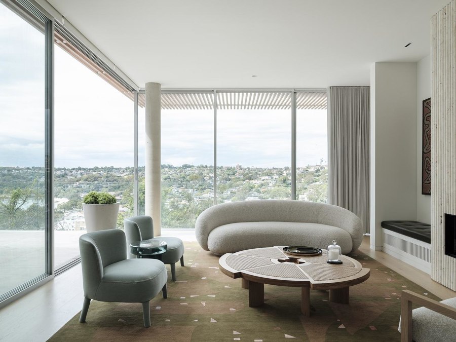
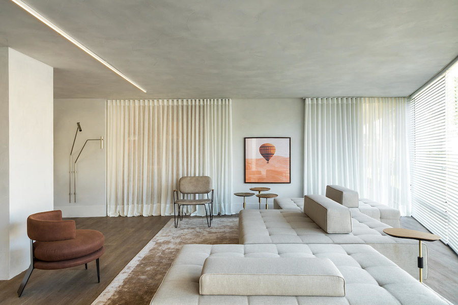
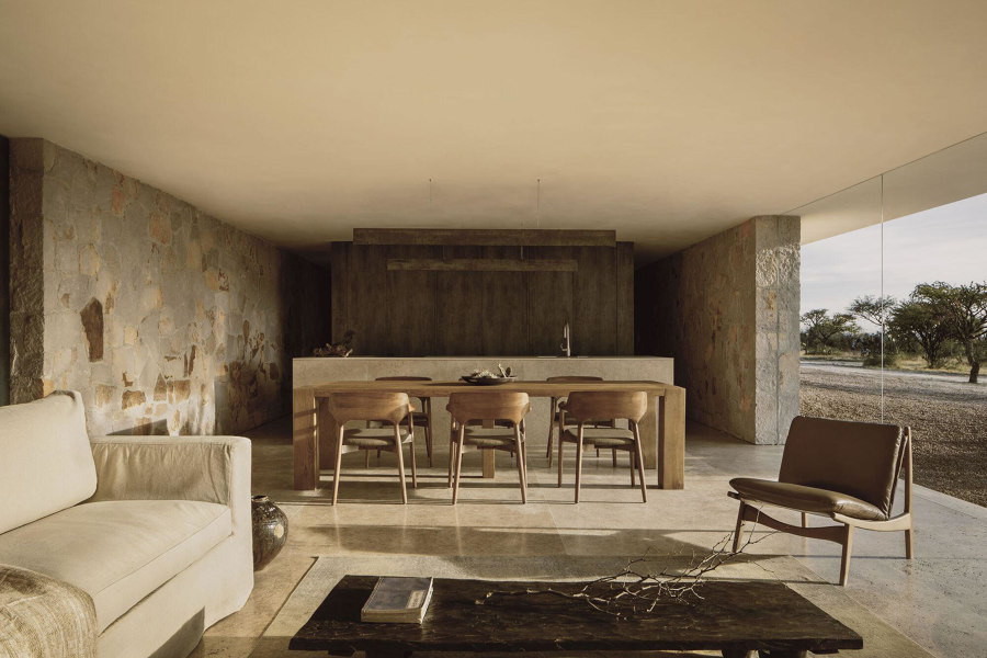
Adaptability and timelessness are key factors in contemporary interior design. This story looks at six of the style’s defining elements. Photos: André Mortatti (top), Tom Ferguson (middle), Eduardo Macarios (bottom)

Adaptability and timelessness are key factors in contemporary interior design. This story looks at six of the style’s defining elements. Photos: André Mortatti (top), Tom Ferguson (middle), Eduardo Macarios (bottom)
×Six evergreen design elements that define contemporary interiors
When it comes to forward-thinking interior design, adaptability and timelessness are two key factors that can guarantee a home will look just as current years from now as it does today. One interior style that makes use of them more than any other: contemporary. By borrowing elements from several prominent styles and combining them into a harmonic whole, contemporary interiors stay current even as trends move on.
Fast forward a half-century and contemporary interiors are still evolving at a rapid speed
Contemporary interior style was a natural evolution of midcentury-modern aesthetics and was first coined as its own term around the 1970s. Signifying a mix of predominant styles at the time, it borrowed heavily from popular aesthetics such as modernism, postmodernism and Art Deco. By combining elements of each to varying degrees, contemporary homes reflected a certain in-the-know-quality without risking an imbalance in favour of one or the other.
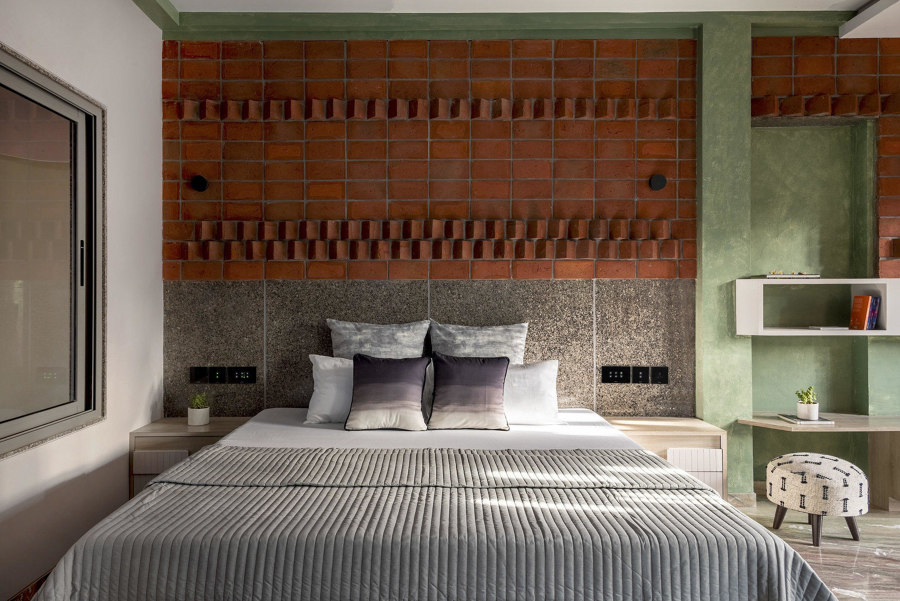
Continuing the merger of outdoor and indoor space in contemporary interiors, these projects match surfaces and materials inside and out. Photos: Cesar Bejar (top), 2613 apertures (middle), Iwan Baan (bottom)

Continuing the merger of outdoor and indoor space in contemporary interiors, these projects match surfaces and materials inside and out. Photos: Cesar Bejar (top), 2613 apertures (middle), Iwan Baan (bottom)
×Interior surfaces inspired by their exterior facades
The priority when it comes to a building’s exterior surface material is durability. Having to literally stand up to the tolls of rainwater, wind, sunlight, temperature fluctuations and many other weather conditions, we demand a lot of them. On the opposite side of the insulated coin, meanwhile, interior surfaces instead tend to prioritise their finish – with the characterful colour, pattern and texture of materials such as paints, ceramic tiles or wood panels.
Our external and internal environments continue to collide
Traditionally, these two worlds, exterior and interior, never need meet. Opposing requirements, it was thought, need opposing surfaces. But as our external and internal environments continue to collide into a singular typology of simply liveable space, more and more projects both large and small, commercial and private, are taking surface design inspiration from the outside world. Dragging the materials, themes and the history of facades inside.
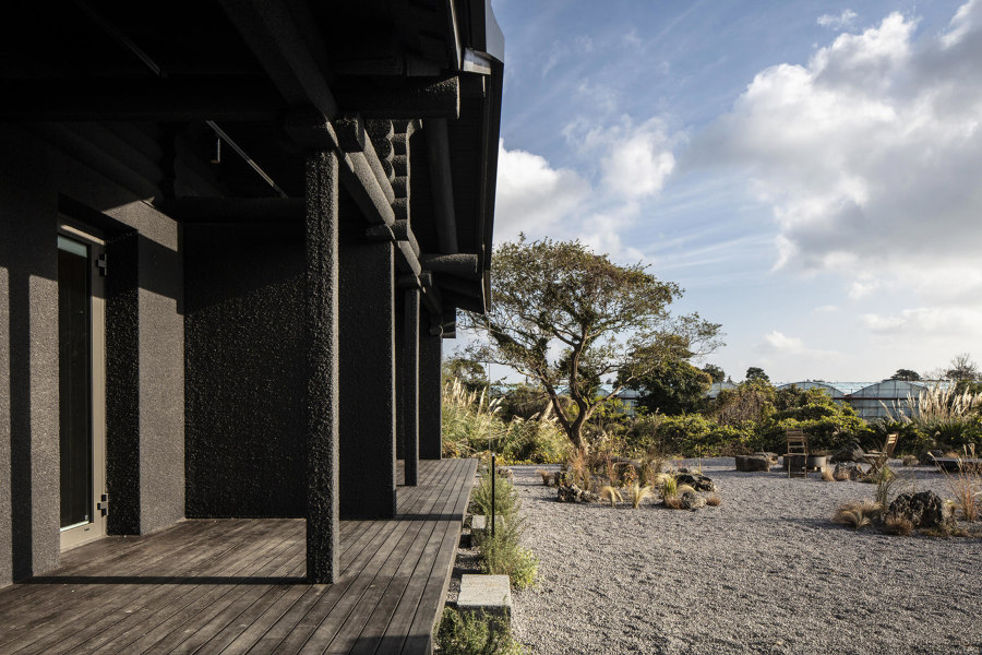
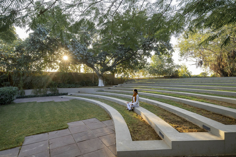
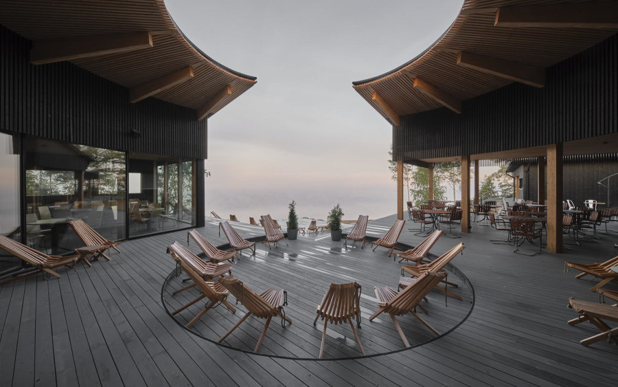
Choice of location is paramount when it comes to creating serenity. These luxury wellness centres use the natural design of their surroundings to bring peace to our hectic lives. Photos: Kiwoong Hong (top), Marc Goodwin (middle), Vinay Panjwani (bottom)

Choice of location is paramount when it comes to creating serenity. These luxury wellness centres use the natural design of their surroundings to bring peace to our hectic lives. Photos: Kiwoong Hong (top), Marc Goodwin (middle), Vinay Panjwani (bottom)
×Nature-set wellness centres that restore and rejuvenate
The wellness market is booming, predicted to grow by almost 60% in the five years since the COVID pandemic, with consumers taking greater care of both their physical and mental health. It’s now understood, of course, that wellness – the virtue of feeling good in both body and mind – is more affected by our environment than we used to admit.
Peaceful places for meditation and bathing are subtly drawn
Since 2020 we’ve been quickly migrating away from cities, with attitudes on work and living also shifting to include more natural beauty, and the hunt for the nirvana of greater wellbeing. These four wellness centres take care to complement the rejuvenating surroundings of the outdoors with healing activities and architecture, helping visitors to feel at peace with themselves and the world around them.
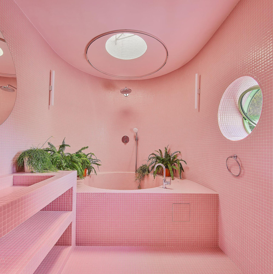
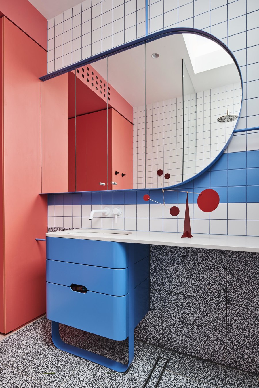
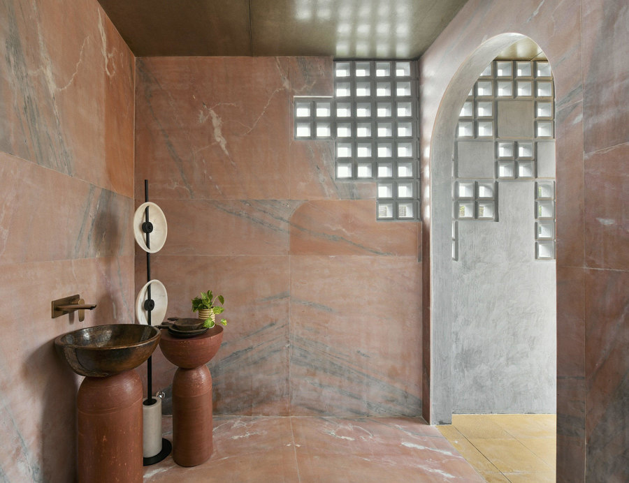
These bathrooms use unconventional colours, shapes, decor and materials to ignite the senses and spark childlike wonder. Photos: José Hevia (top), Tom Blachford (middle), Monika Sathe (bottom)

These bathrooms use unconventional colours, shapes, decor and materials to ignite the senses and spark childlike wonder. Photos: José Hevia (top), Tom Blachford (middle), Monika Sathe (bottom)
×Playful bathrooms from around the world that break the mould
Bathrooms are one of the first and last spaces we move through on our daily residential pilgrimage. As such, they are typically connected with ideas of practicality and order – utilitarian rooms that transport us from cosy slumber into necessary alertness and back again. Their design often follows suit, prioritising cleanliness and structure over creativity. Breaking the mould to add some playfulness, however, can result in a delightful fusion of functionality and character that transforms an otherwise mundane interior into a whimsical haven of fun and imagination.
Even the most pragmatic of spaces can become a canvas for boundless creativity and joy
From vibrant mosaic tiles to quirky accessories and innovative lighting concepts, playful bathrooms are a testament to the idea that even the most pragmatic of spaces can become a canvas for boundless creativity and joy. These four uniquely designed projects defy convention using colours, shapes and decor that ignite the senses and spark an invigorating, childlike wonder.
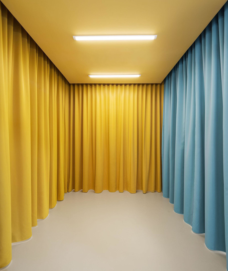
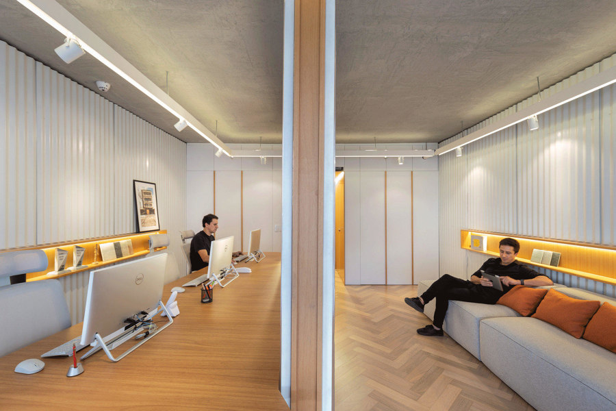
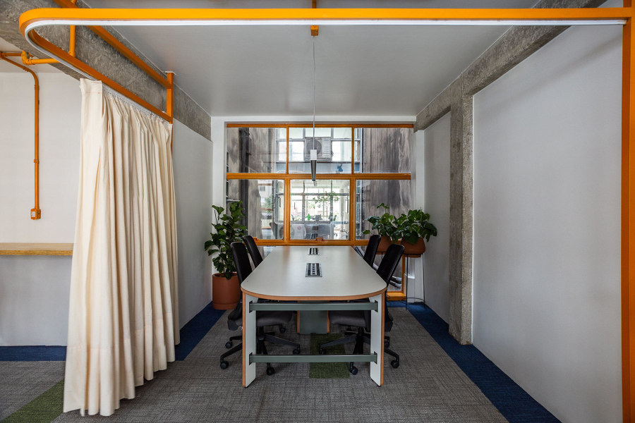
Small businesses can keep overheads down by literally reducing the area above their heads. These micro-offices give companies the opportunity for growth. Photos: Judith Casas (top), Marcelo Donadussi (middle), Isra Gollino (bottom)

Small businesses can keep overheads down by literally reducing the area above their heads. These micro-offices give companies the opportunity for growth. Photos: Judith Casas (top), Marcelo Donadussi (middle), Isra Gollino (bottom)
×Micro-office spaces for the modern small business
The traditional office space of the 20th century, with its huge filing cabinets, industrial-strength printers and high-capacity meeting rooms, is no longer the only way to do business. As technologies such as cloud computing, video conferencing and AI make our working lives simpler, all we really need is a flat surface and the wifi password.
Curtains are an excellent alternative to both doorways and more solid partitioning
In a commercial climate where even the largest companies pay as much notice to their social media accounts as their share price, it’s never been easier for small businesses to compete, but finding suitable office space for single-digit employers can be hard. These four small-scale workplaces show how, by keeping things small, they can do more with a lot less.
© Architonic
Head to the Architonic Magazine for more insights on the latest products, trends and practices in architecture and design.
>> Catch up on Architonic’s most popular stories from 2022 here./b>
